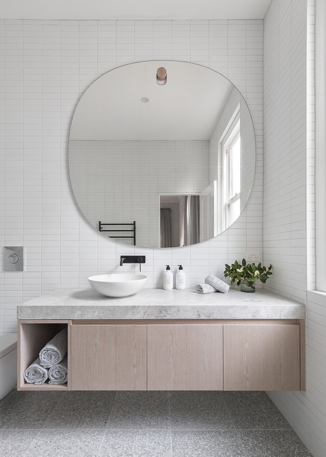
Remember the modern powder room design that Caroline and I recently began for a client? Well, I figured it’s time for an update, since it’s humming along quite nicely! Last week we presented three design options to the client, and while we liked all of them, let’s just say there was one that we really hoped the client liked best. Lucky for us, she was on board with our fave, and I cannot wait to share more about that as it comes together! But for now, I thought it would be fun to show you the designs she didn’t go for—because it’s a part of the process that isn’t always discussed. These two concepts are fun in their own right, and I’ll definitely be keeping these in my back pocket for another time!
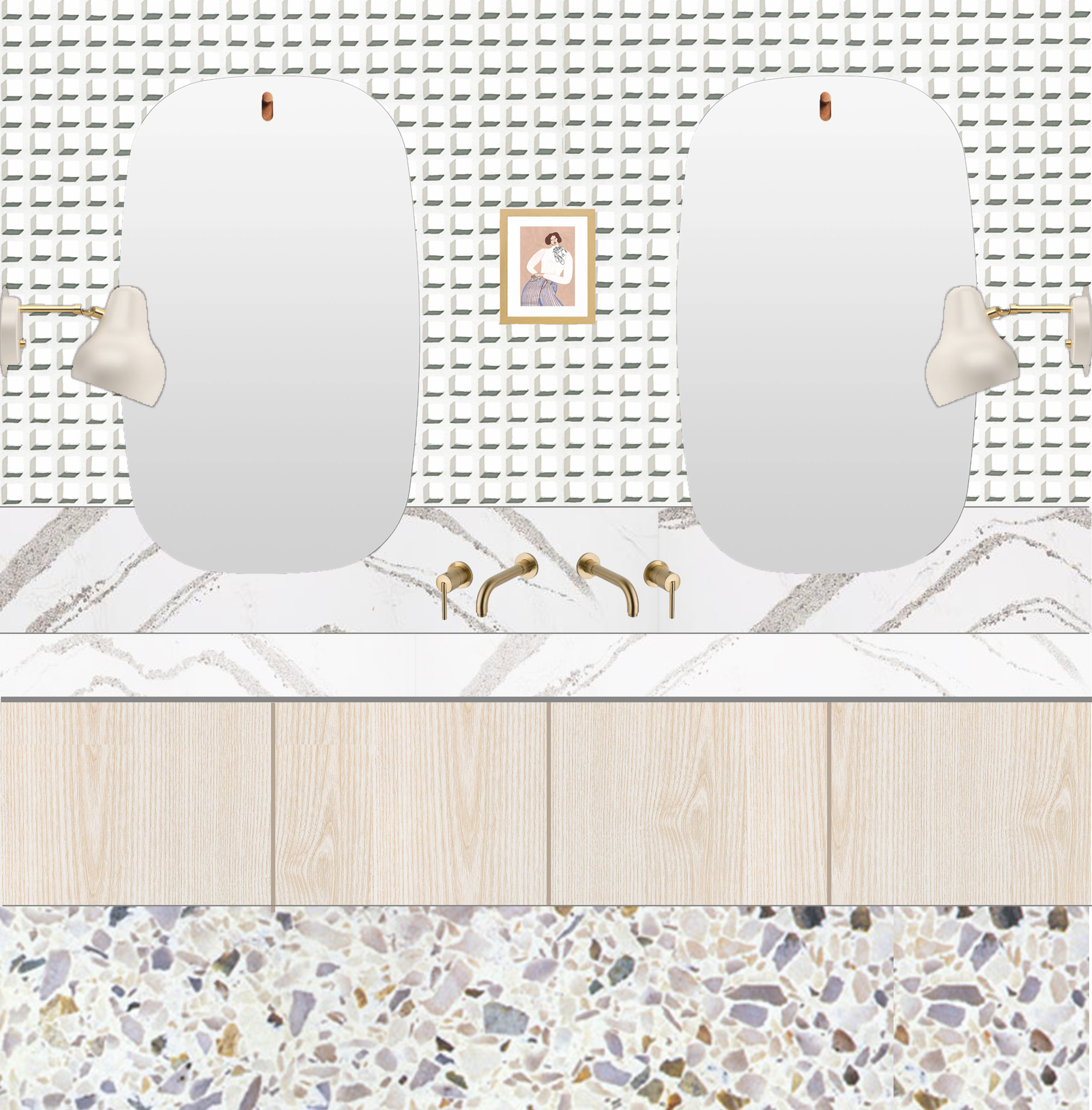
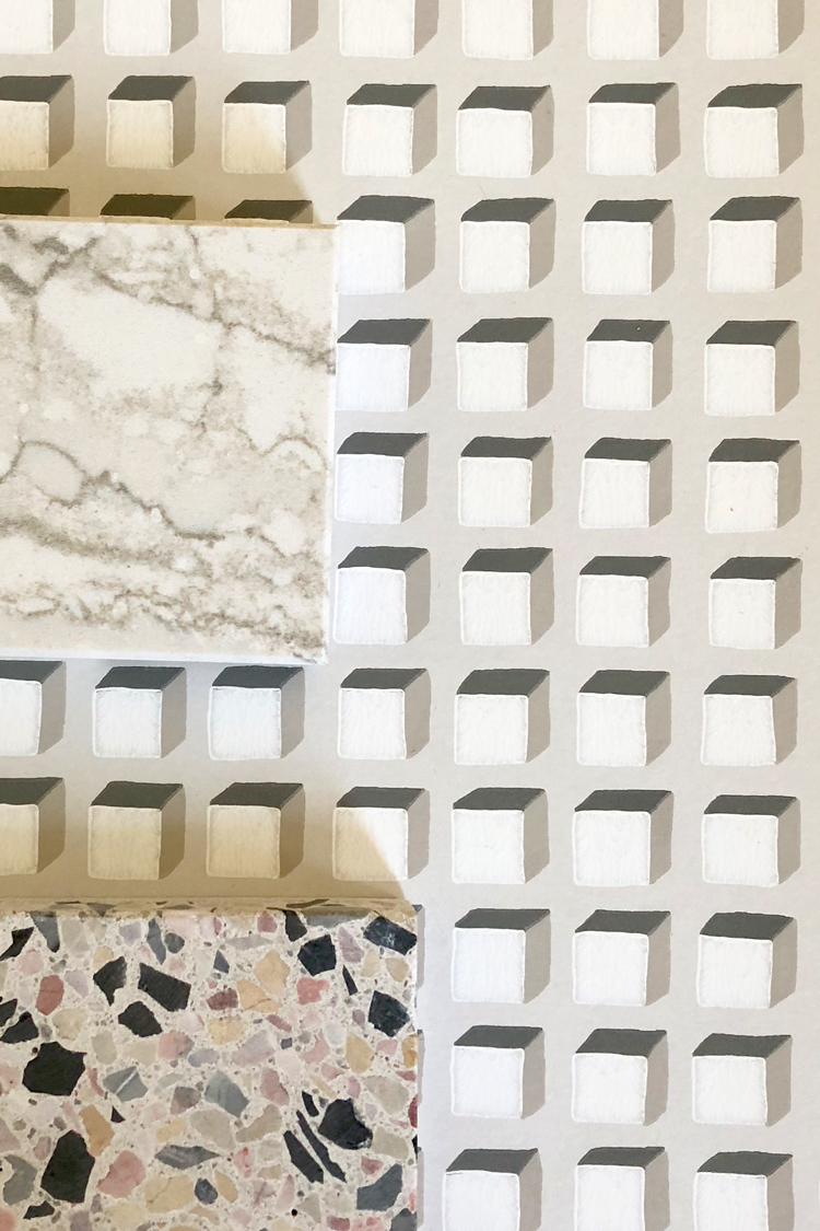
Option 1: The client knew she wanted to mix patterns by using terrazzo on the floor, a beautiful stone for the vanity surface, and an interesting wallpaper on the walls. We all really liked the geometric appeal of Cole and Son’s Mosaic wallpaper, as the wobbly little cubes gave a cheeky nod to tile without requiring an actual tile install. The warm greys looked lovely paired with the lilac inclusions in this Concrete Collaborative cement terrazo. Cambria Surfaces’ Annica design offered a grandly scaled marble effect that contrasted nicely with the smaller components of the flooring and wallpaper. Two sconces by Louis Poulsen flank a pair of minimalist “swoval” shaped mirrors from BluDot. In this iteration, we also explored a backsplash option, which is an especially nice way to offset a pair wall-mounted brass faucets.
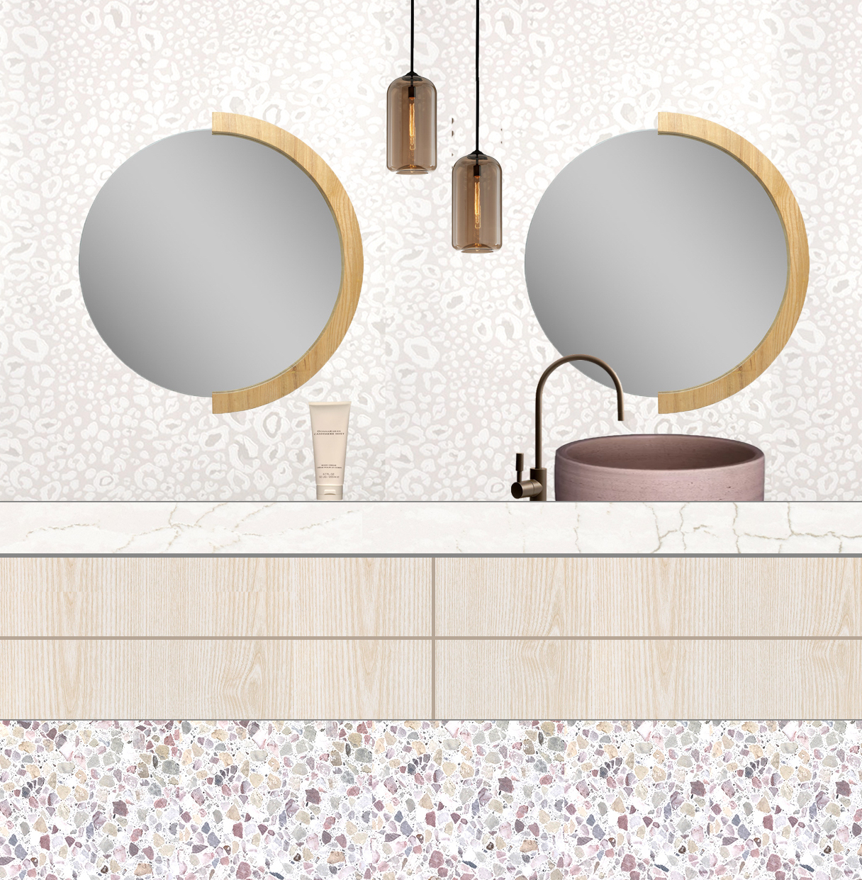
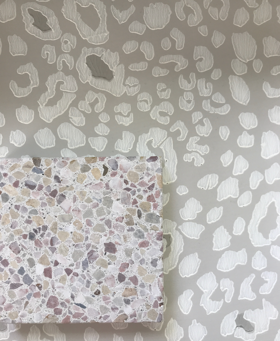
Option 2: This was definitely our girliest option! That soft blush terrazzo from Concrete Collaborative is such a perfect pastel complement to Farrow & Ball’s Ocelot wallpaper. (I’ve always wanted to do a powder room with an animal print so a part of me wouldn’t have been mad if our client had picked this one!) The subtle grey marble veining in Cambria’s Delgatie stone made for an elegant vanity surface. Had we gone this route we would have done a custom vessel sink like the one shown here, with a slim gooseneck faucet to offset the chunkier weight of the sink bowl. I had a tricky time coming up with a lighting solution to this one, but when I finally tried these Troy Lighting amber glass pendants, the addition of a colored glass felt just right for the design—especially once I added those quirky half-framed round mirrors!
Are you loving either (or both!) of these? Just wait til you see the direction we did take. It’s even better, so stay tuned for more progress updates!