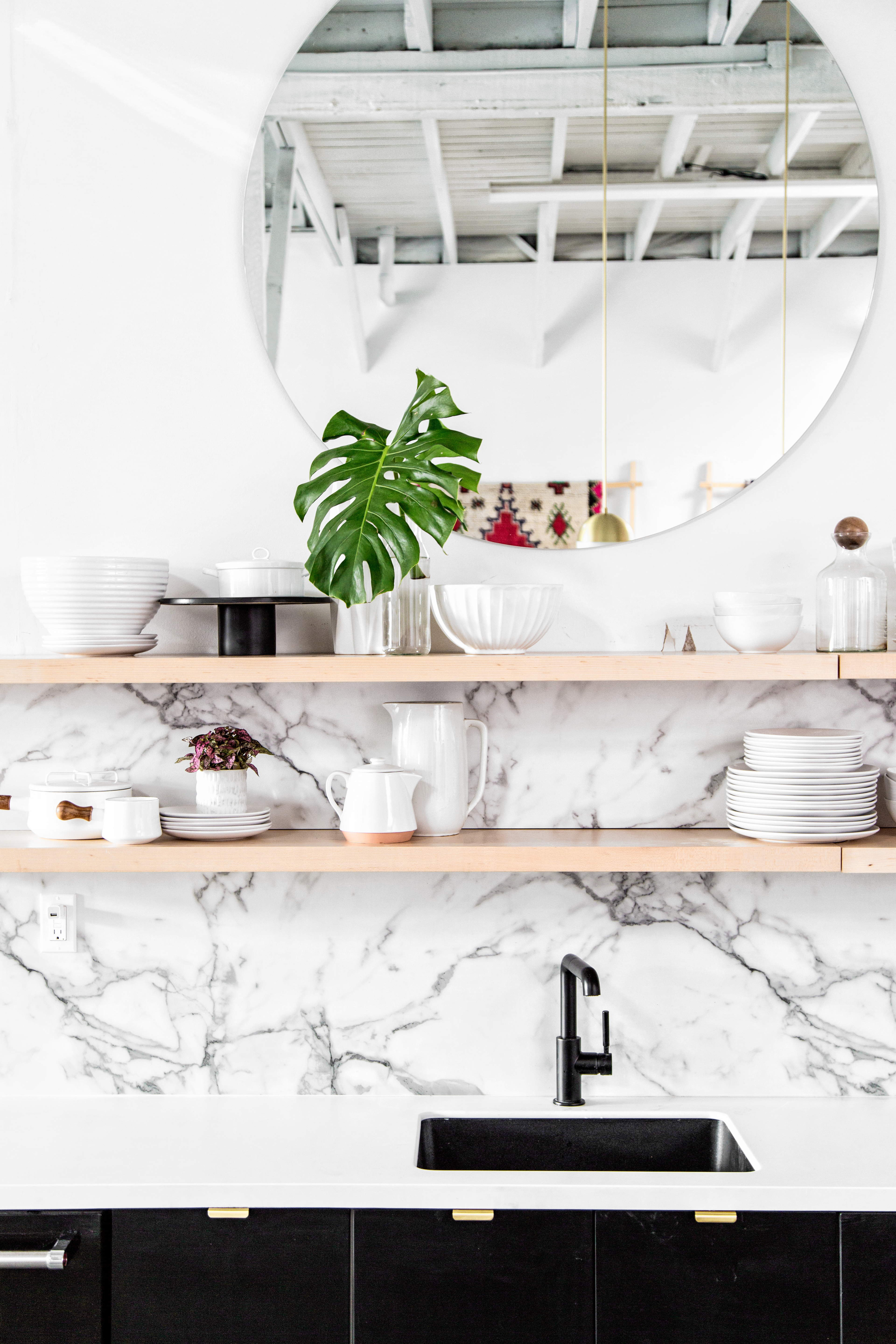
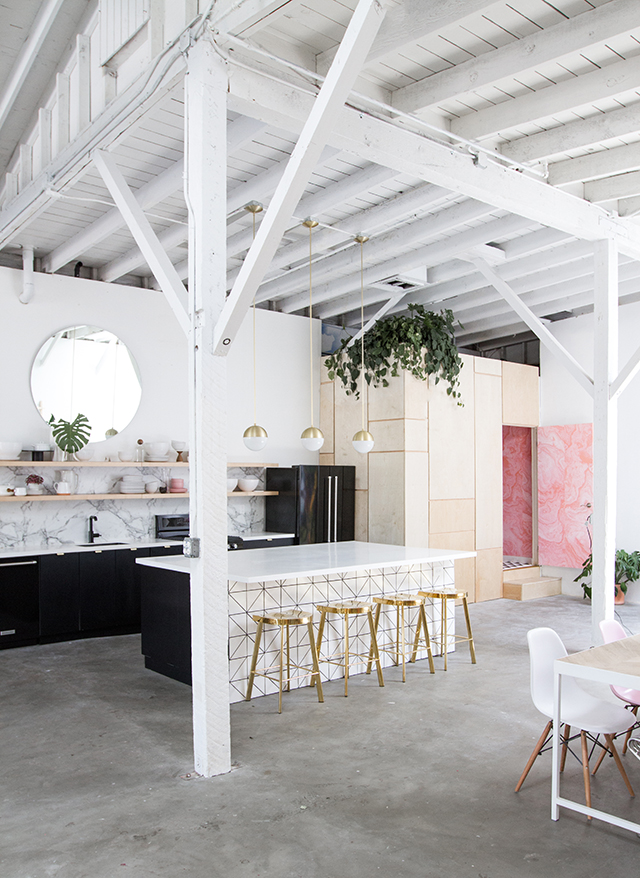
As a lifelong renter, the idea of having my dream modern kitchen has always seemed unattainable to say the least. So when we signed the least at Light Lab last December and started hatching our plan to have a fully functioning commercial quality kitchen that also looked incredible, I was a little skeptical that it would actually come together! But where there’s a will there’s a way, and now that we’ve made it happen, I’m standing as proof that anything is possible no matter how far off it seems! But I’m also familiar with how a big project can be so overwhelming at the start that you don’t even know where to begin, so I thought I’d break it down for you guys into the bite-sized approach we took.
The first and most important component in kitchen design is to have a partner who knows what she’s doing. For Caroline and me that meant enlisting the brilliant Sarah Sherman Samuel for her keen eye and extensive expertise. Sarah turned us on to several fantastic resources for DIY kitchen renovations, including Semihandmade—a company that makes modern and stylish doors for IKEA cabinet bases. We were able to get the upscale look of custom cabinetry and shelving for way less than you’d think! Sarah also knew we’d want to use the kitchen for photo shoots and events, so she designed an oversized island that’s the perfect work surface. We had it covered in matte finish Formica to ensure that it had major durability as well as style. Believe it or not, that “marble” backsplash is Formica too…another cost effective choice for the win! We rounded out the major components of the install with an appliance suite from KitchenAid, selecting their matte black finish to seamlessly exist with our monochromatic palette. The effect is a streamlined and sophisticated foundation onto which we could then layer some personality.

That’s when the fun really began! Because the island is so large we knew it needed to make a design statement too, so Sarah created a one-of-a-kind mosaic frontispiece using Fireclay tiles. Gold stools from High Fashion Home offer a bold silhouette that stands out against the graphic grout of the tile, and brass lighting and hardware from Rejuvenation picks up the metallic note and runs with it. Finally, because good design truly is in the details, a bold black Brizo faucet is at once angular and smooth. The kitchen is instantly recognizable, but totally neutral too—meaning we can host all manner of events and the decor will take a backseat to whatever is occurring in the space. We’ve got some seriously fun parties in the pipeline and I can’t wait to put this kitchen to work!
Shopping Guide: Fridge, Dishwasher, Oven, Beverage Cooler by Kitchenaid. Backsplash and Solid Suface Countertops (in Artic White) by Formica Corporation. Cabinet Doors & Drawer fronts and Floating shelves by Semihandmade Cabinets (in black Supermatte). Pendants by Cedar & Moss 8” lights from Rejuvenation. White wall paint, Nova White by Glidden Paint. Faucet by Brizo. Tile on Island by Fireclay Tile. Gold Stools by High Fashion Home. Photos: Image 1, Jeff Mindell. Images 2+3, Sarah Sherman Samuel.


[…] in case you missed it around here, we broke down the step-by-step on the modern kitchen renovation at Light Lab; ogled fall entertaining ideas inspired by my trip to Italy; shared tips on how to […]
[…] Serious kitchen inspiration over here… […]
[…] spring we were designing and installing the Light Lab kitchen, we were constantly amazed at the ability of a single small detail to take a space to the next […]