I’ve always felt a little weird about hanging pictures of myself around the house. Even when I was a kid, my mom was more likely to hang sepia-toned photos of ancestors than current images of our family. Objectively speaking, I think it’s fantastic when people surround themselves with photographic reminders of their most special moments. But I still can’t quite overcome the funny feeling I get when I think about seeing my own face staring back at me from a spot on the wall!
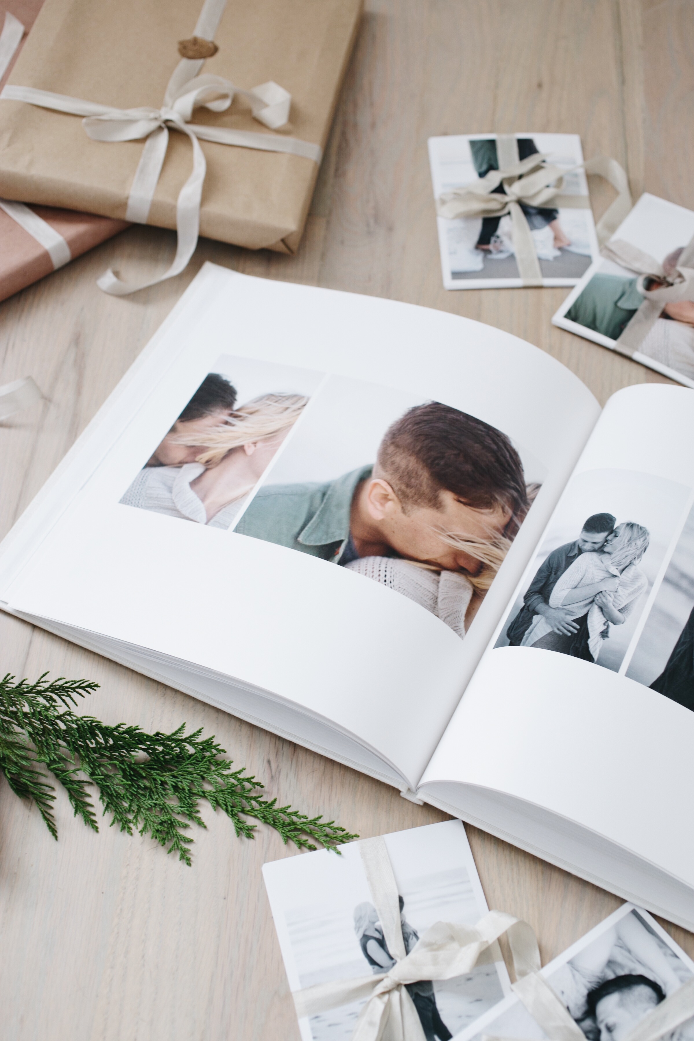
The result has been that in spite of some really lovely shots that exist of me with my fiance Ivan, I’ve never gone the extra mile to have them printed and framed. (I think this is probably true for more and more of us as we become increasingly more reliant on our devices to store our memories!) However, when my wedding photographer Elizabeth Messina insisted on doing an engagement session with us, I knew the moments she captured would be too precious to live only on a computer screen.
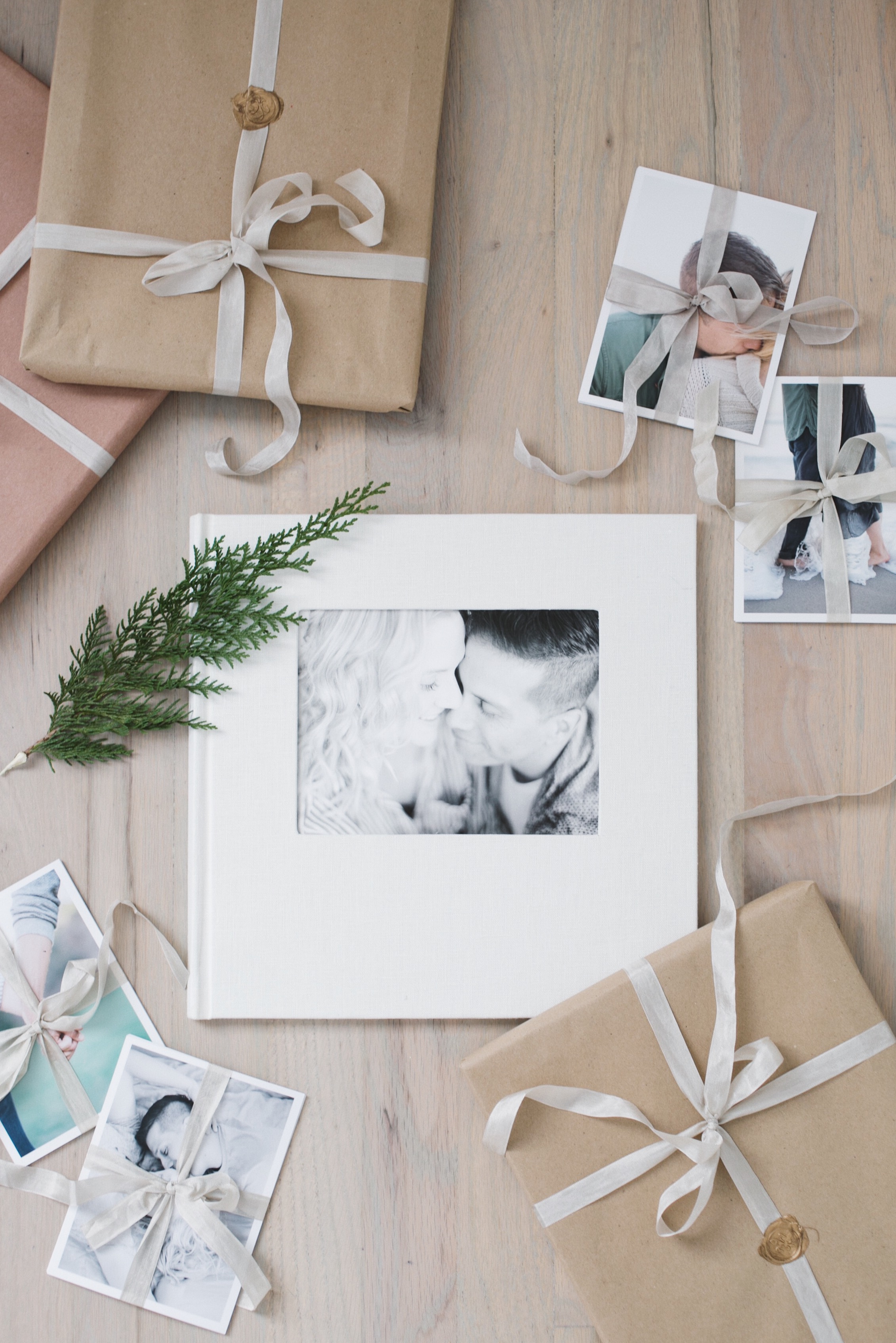
Sure enough, when Elizabeth sent us her favorite shots from the day—all 200 of them!—both Ivan and I were excited to incorporate them into our space. But I then found myself with another problem on my hands: more snaps than I had wall space to display! So I was thrilled when Shutterfly asked me to create a custom photo book using their intuitive online system. A printed album is the perfect way to transform as many photos as possible from pixels into the physical realm, and Shutterfly’s seemingly infinite options for designing your own album make for a photo book that’s 100% unique to your memories and your style.
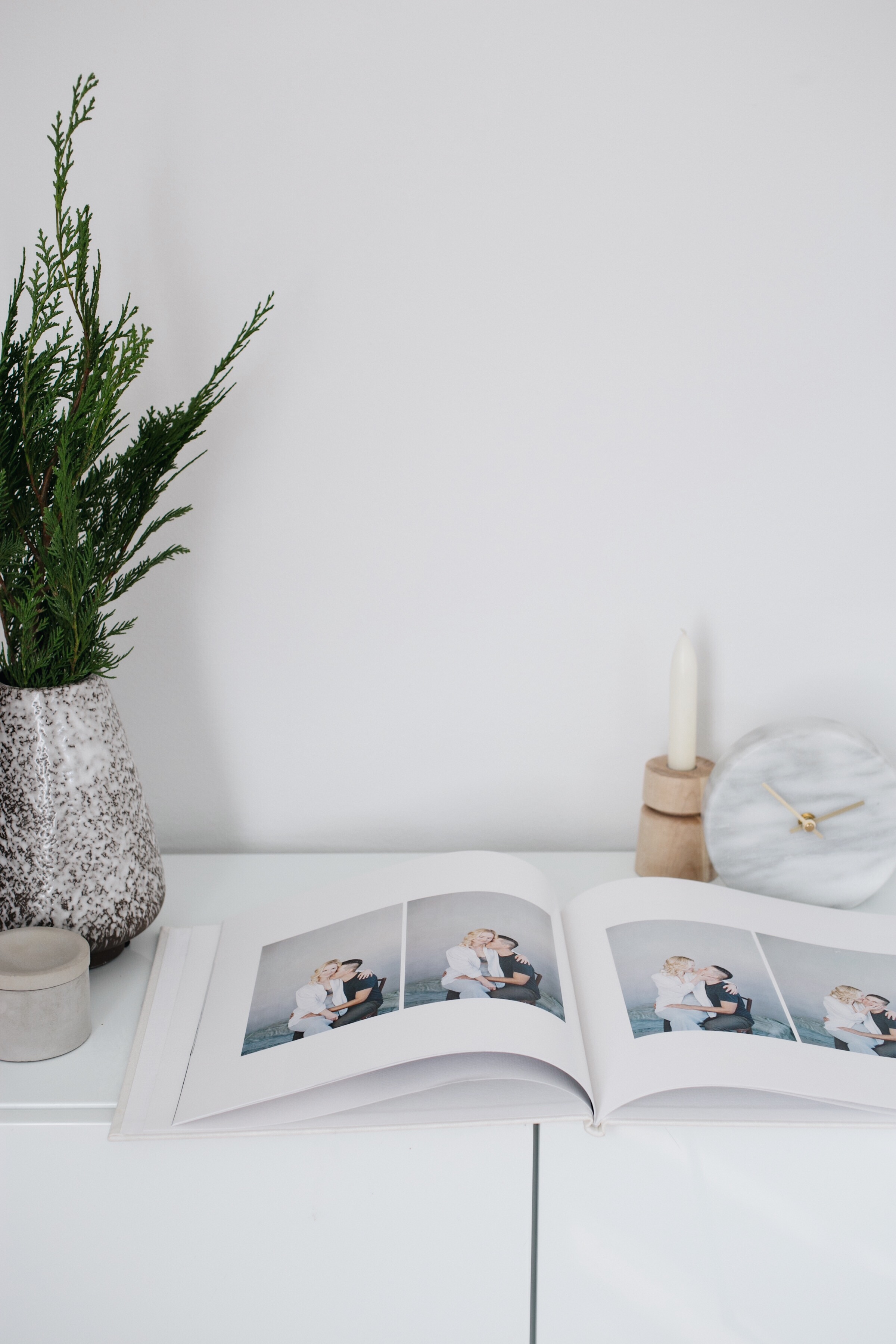
If I’m being totally honest, another reason I’ve never had any photos of us printed is because I’ve been lazy. I let myself get overwhelmed at the thought of choosing the right photo size, a frame and matte combination, and harmonious positioning on our walls. I was a little trepidatious to step into the book process for the same reasons—I have an eye for what I like, but I’m by no means a graphic designer!—but once I finally sat down at the computer I finished the layout in under an hour. The Shutterfly interface is ridiculously foolproof: You simply upload all the images you’d like to use, and it populates the book with the recommended sizing and sequencing. It’s really easy to move or replace images once they’re popped into the template, but I loved the default layout so much that I simply added it to my shopping cart and clicked ‘order’!
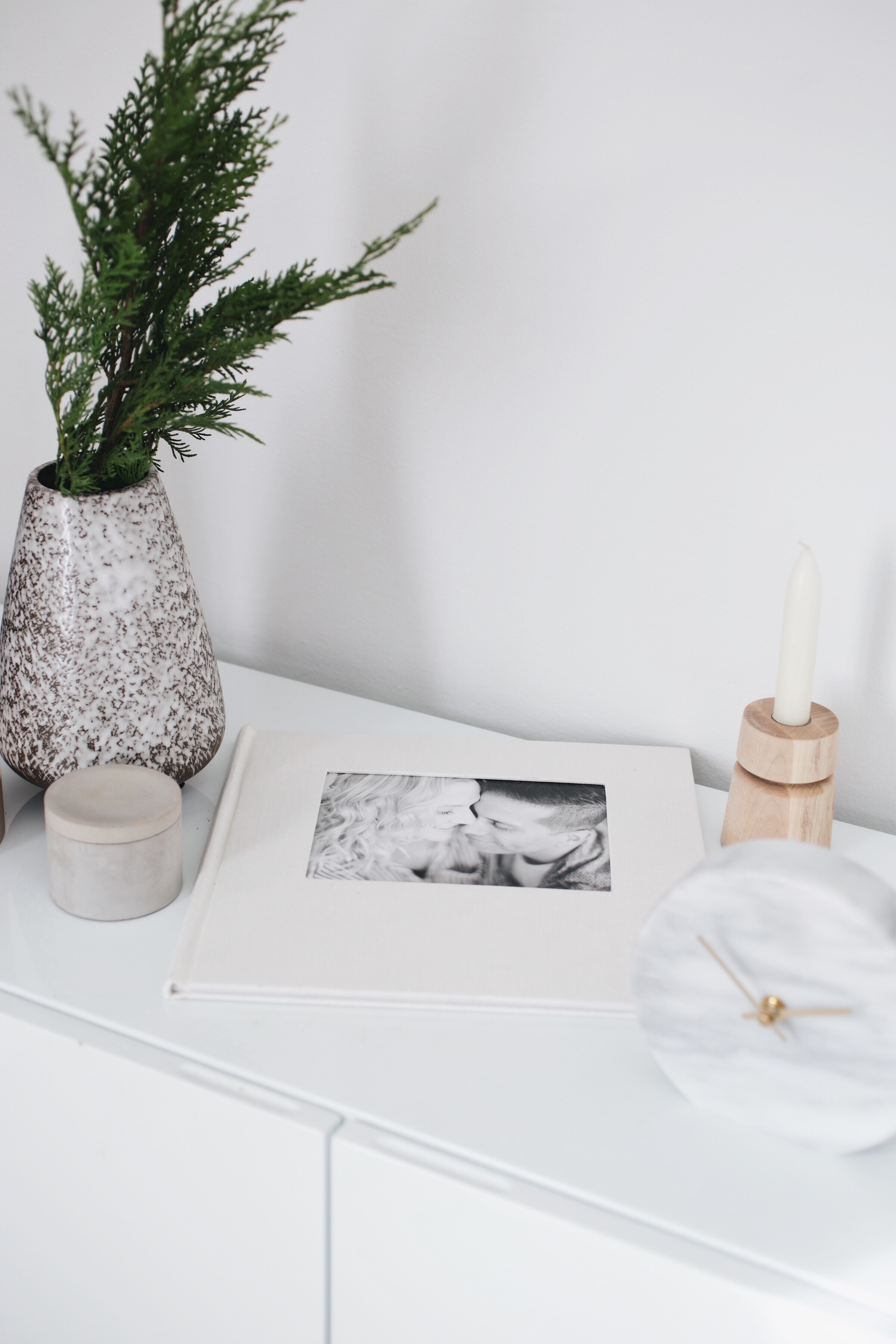
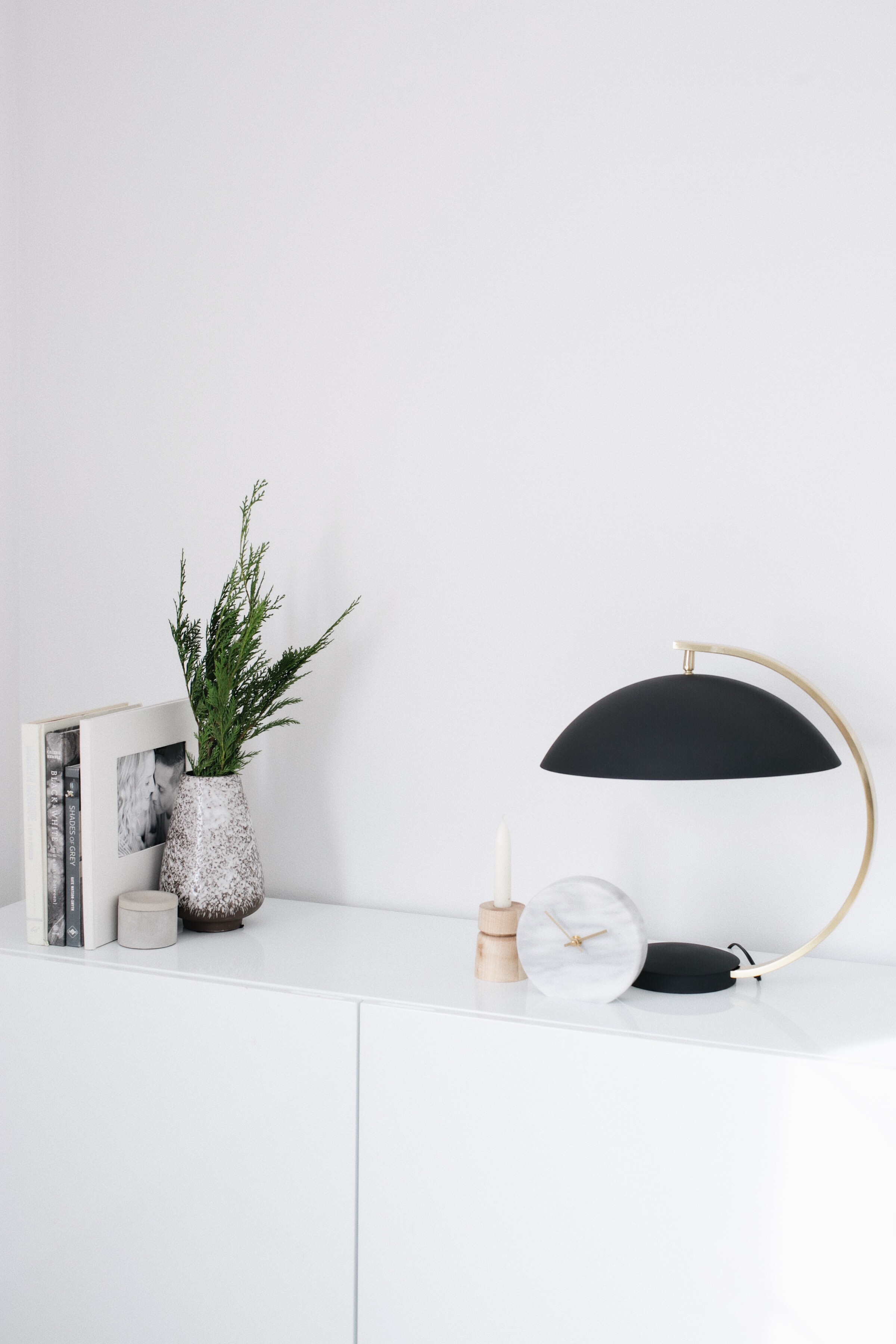
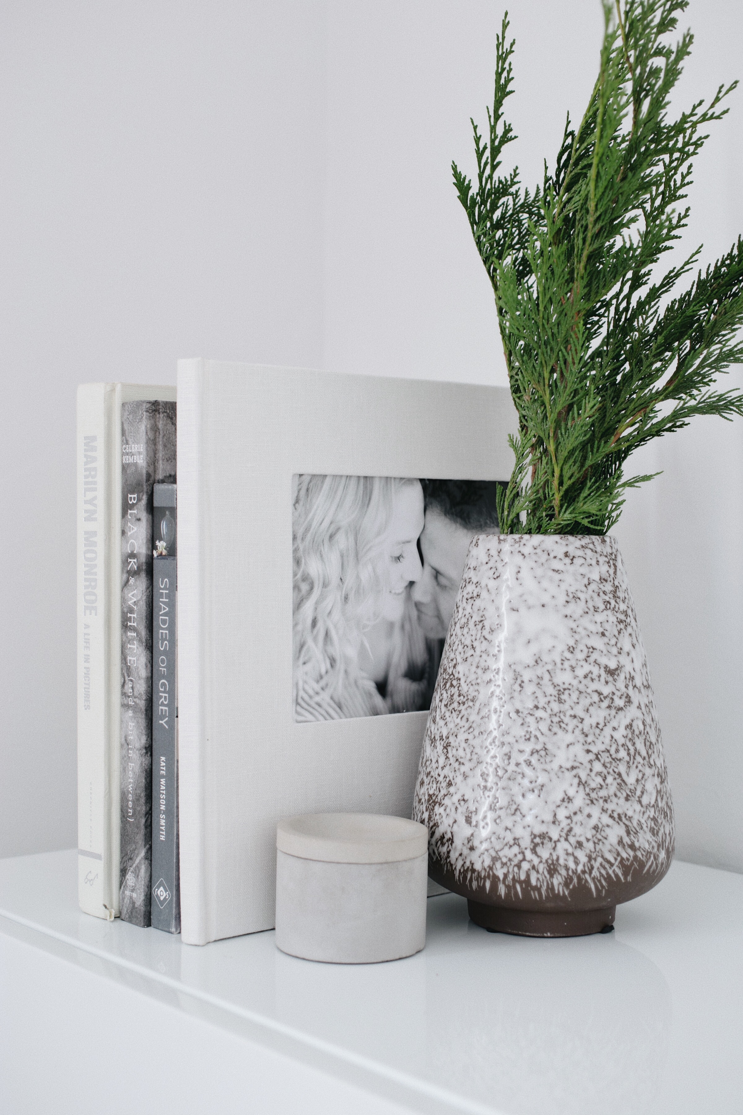
I wanted our album to have the feel of a sleek, minimalist art book, something that would slip seamlessly onto the shelves that I so carefully curate! I went with the 12 x 12 inch size to give it solid presence, then selected the textured natural linen cover with a simple cut-out to highlight one of my favorite photos from our engagement shoot. The double-thick matte pages are weighty and satisfying in the hand, and the binding is as carefully crafted as any of my pricey coffee table books. It’s subtle, it’s sophisticated, and it’s a welcome addition to our decor as well as being a treasured memento!
Oh, and a bonus? Since I saved this version of the album in my Shutterfly project archives, it’ll be the work of a minute to edit a G-rated version for our families. I’ll just swap the kissy photos for parent-friendly options and have instant Christmas morning brownie points on my hands. Plus now that I know exactly what I’ll be doing with our wedding photos, I’m more excited than ever for the big day!
Engagement photography: Elizabeth Messina. Still life styling and photography: Anne Sage. Disclosure: I partnered with Shutterfly to concept, style, shoot, write, and share this post. All opinions are and always will be my own. Thank you for supporting the brands that allow me to bring you fresh inspiration daily!
 This post is sponsored by Shutterfly. Memorable moments, lovely details. Celebrate them all in a wedding photo book personalized in your style, your way.
