Hello, and happy Friday, everyone! It’s been a heavy week, hasn’t it? I’ve been doing my best to keep up with daily life, while also staying present to current events—and supporting friends who are feeling particularly effected by them. And while I certainly don’t advocate burying ones head in work, I do feel grateful for a full calendar of inspiring and exciting projects that keep my spirits up when the news weighs my heart down. So, on that note, here’s the full resource list I promised for my Eat Sleep Wear living room and dining room makeover! When Kim and I decided to tackle this project, our goal was to to elevate the design sensibility of the space and give it a really intentional and sophisticated feel. At the same time, Kim has three pets and a brand new baby, so we needed the room to be practical and functional for a growing family! In the end, I’m so incredibly proud of how this space turned out. I can confidently say that we accomplished exactly what we set out to do and then some. So without further ado, here’s the complete breakdown of our process and all the pieces we chose!
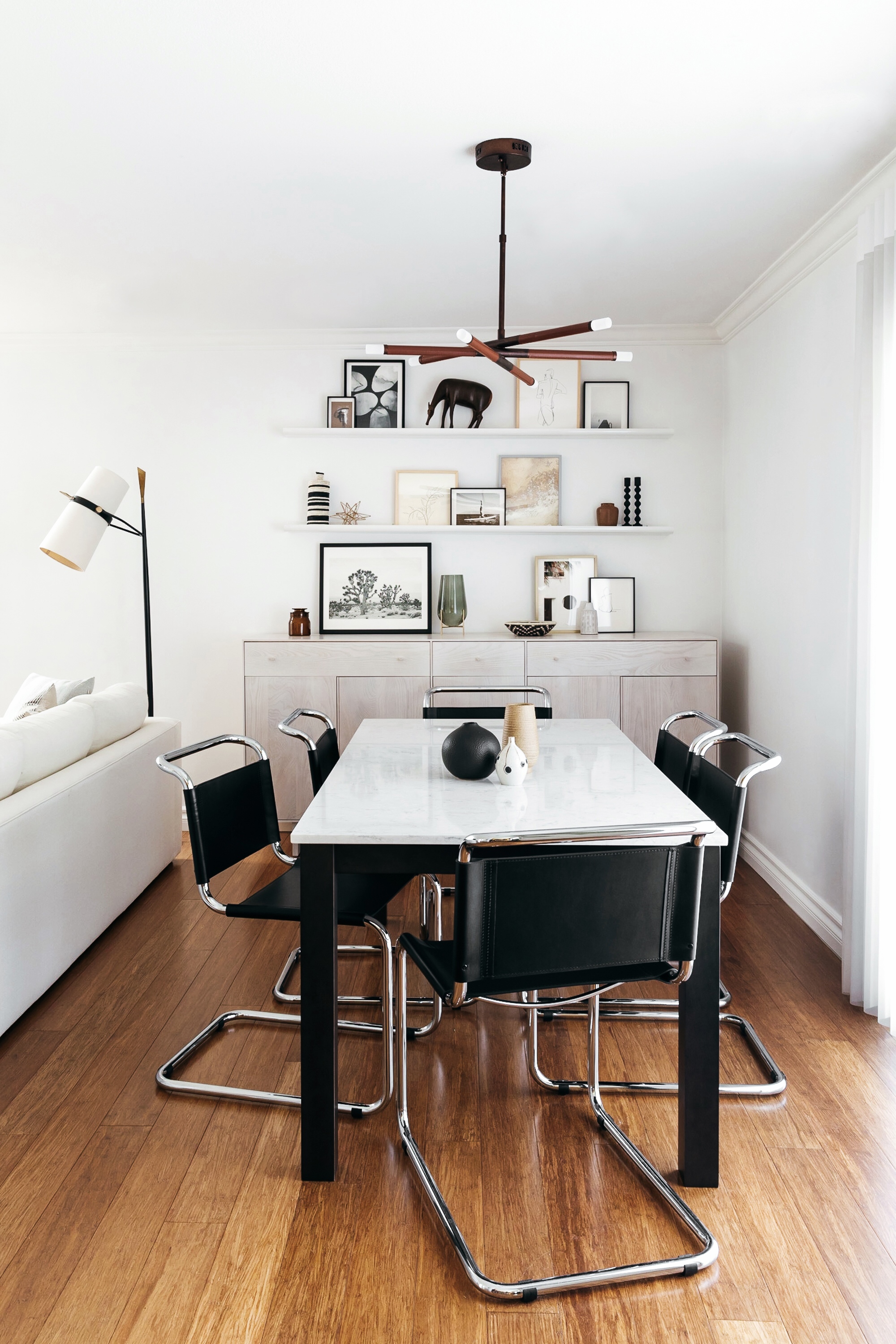
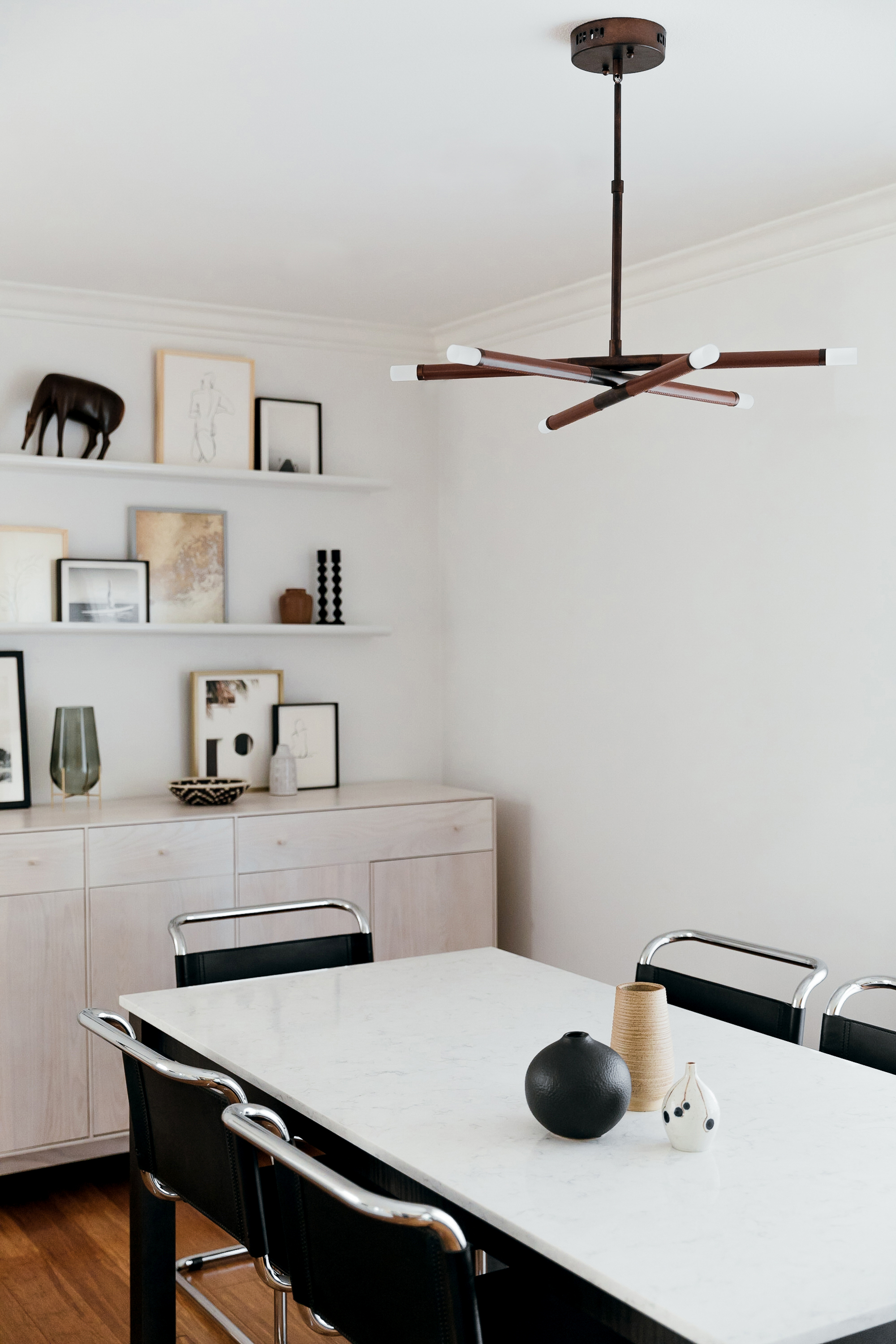
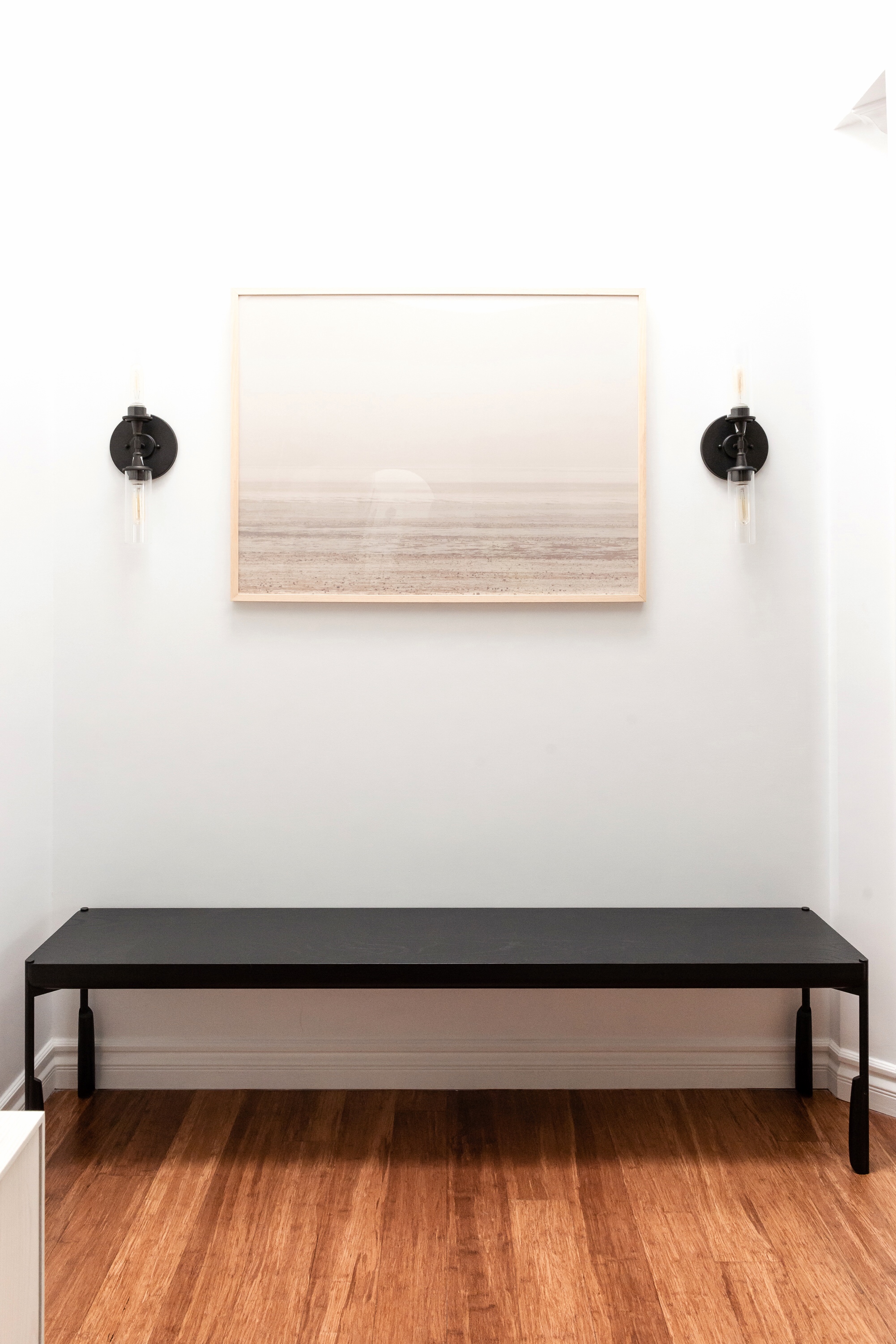
Let’s start with the room’s shell. We didn’t do any intensive renovations, but one thing we did do was add new hardwired lighting. This is one of my favorite low-effort/high-impact tweaks to make to any room, as it’s a really cost effective way to customize a space. (I even suggest it for people who rent their home!) In Kim’s case, we installed a chandelier by Craftmade over the dining table to carve out the dining area from the rest of the room. It’s got a streamlined industrial look that’s warmed up by its aged copper finish and gorgeous cognac leather accents. Such a unique piece! Then, on either side of the entryway art, we mounted two Craftmade sconces with glass shades and a deep bronze finish. The room has a relatively simple envelope, so I really I love how the sconces inject a sense of architectural significance!
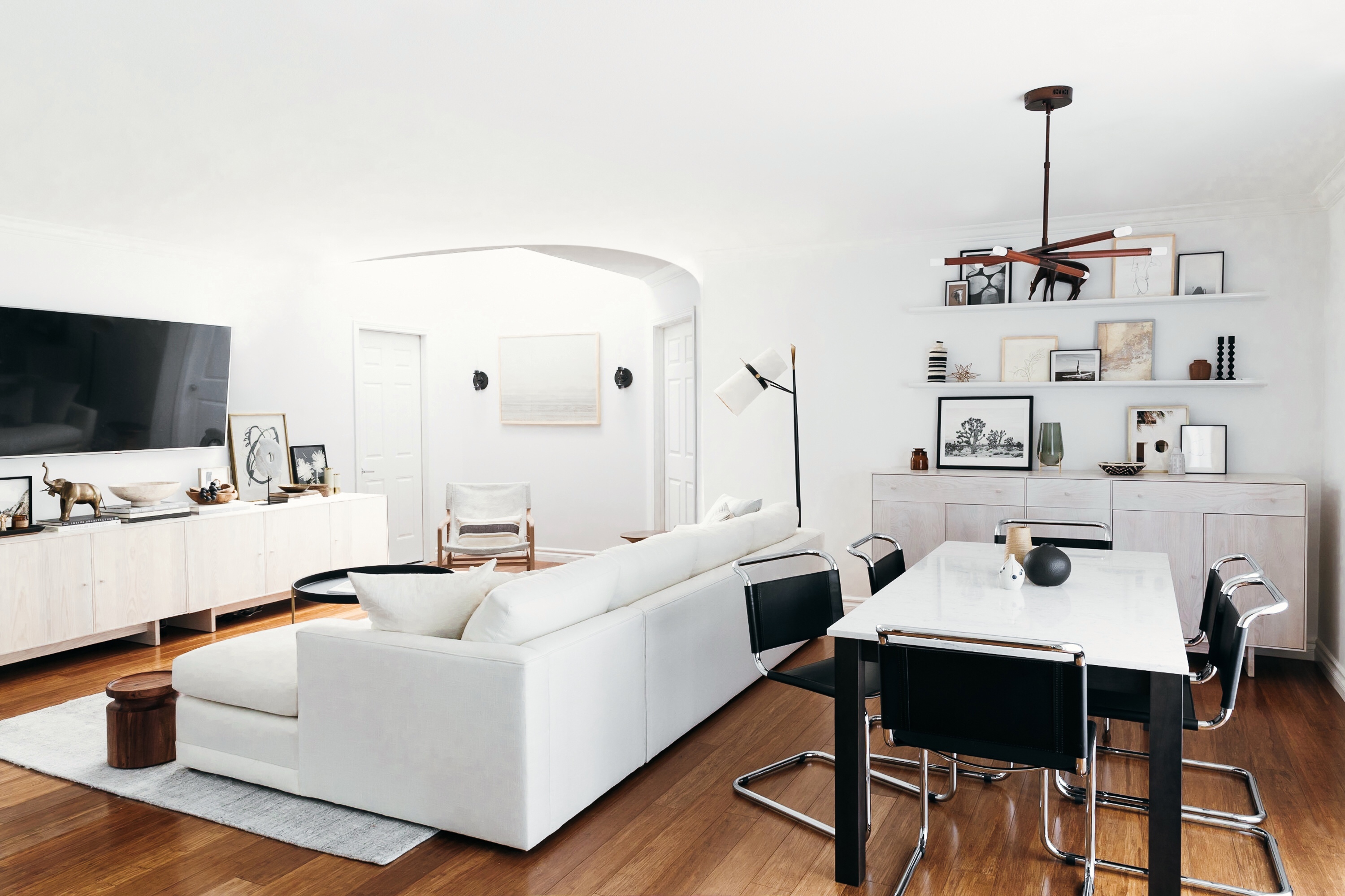
In terms of furnishings, the first major element we chose was the dining table and chairs, since they set the tone for so much of the rest of the space. Even though Kim’s space is nice and open, it’s not huge, so we really had to be precise with the sizing and proportion of every piece. For the dining table, Room & Board came to the rescue with their made-to-order options—in this instance, a custom dining table that we were able to personalize down to the very inch! The quartz top with marble-look veining is not only a beautiful organic element in the space, it’s also perfect for Kim to shoot flat lays and recipes. Plus because it’s quartz, it wipes clean in an instant‚ which is so key with a new baby in the house! We then paired the table with six steel and leather dining chairs inspired by an iconic Marcel Breuer chair. Not only do they lend serious design cred to the space, but their curved edges are kid-safe!
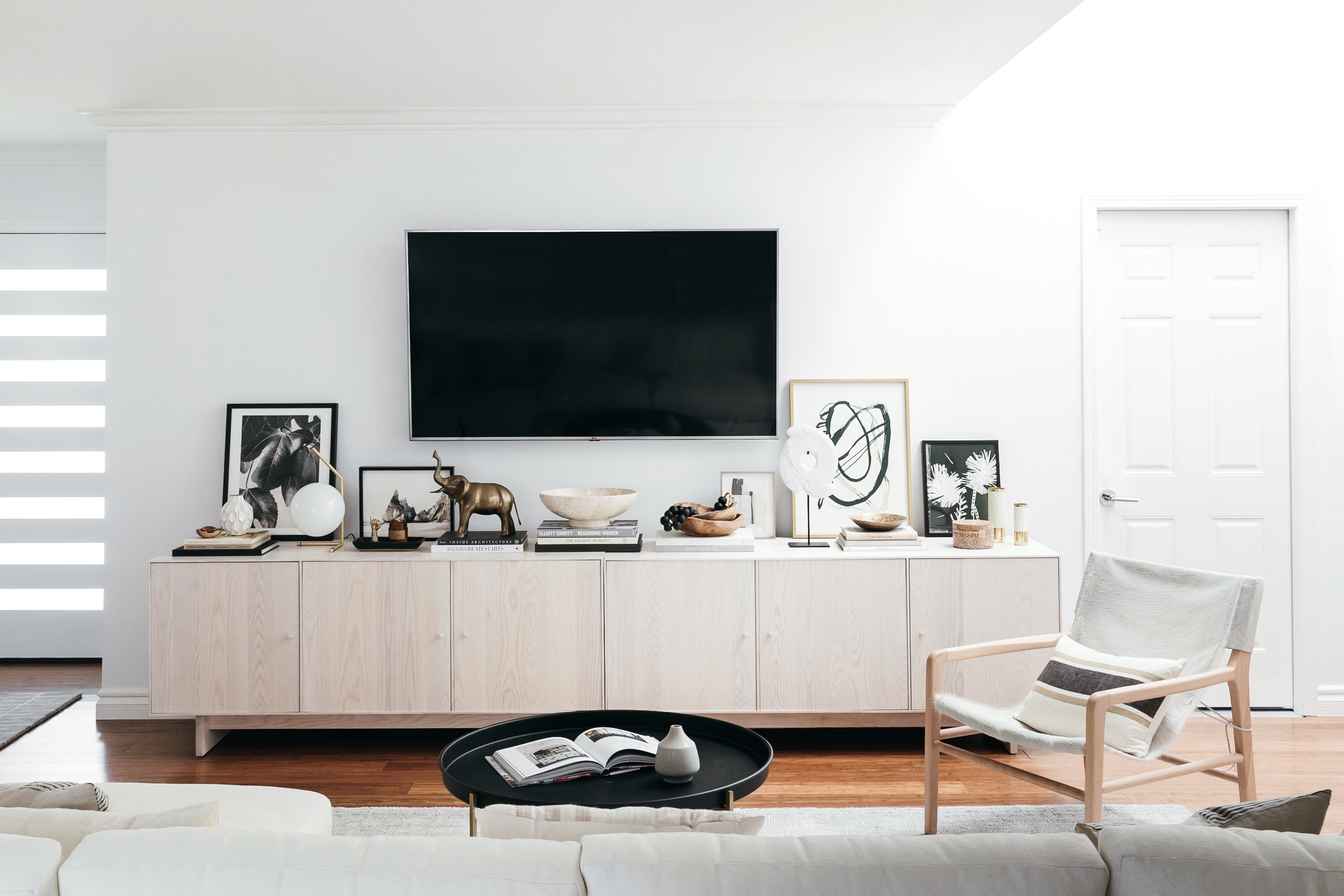
I also feel like we owe our lives to the custom casegoods program at Room & Board. It was really important to Kim that we maintain (or even increase!) her existing quantity of storage—and at the same time, it was critical to us both that the new storage pieces feel like an upgrade from her old IKEA units. We were able to fully customize Room & Board’s Hudson Cabinets for the media unit and the dining room console, choosing everything from total height and length to positioning of doors and handles, and even leg style! The result is storage units that fit perfectly in Kim’s open-concept room, without the pricetag of custom millwork.
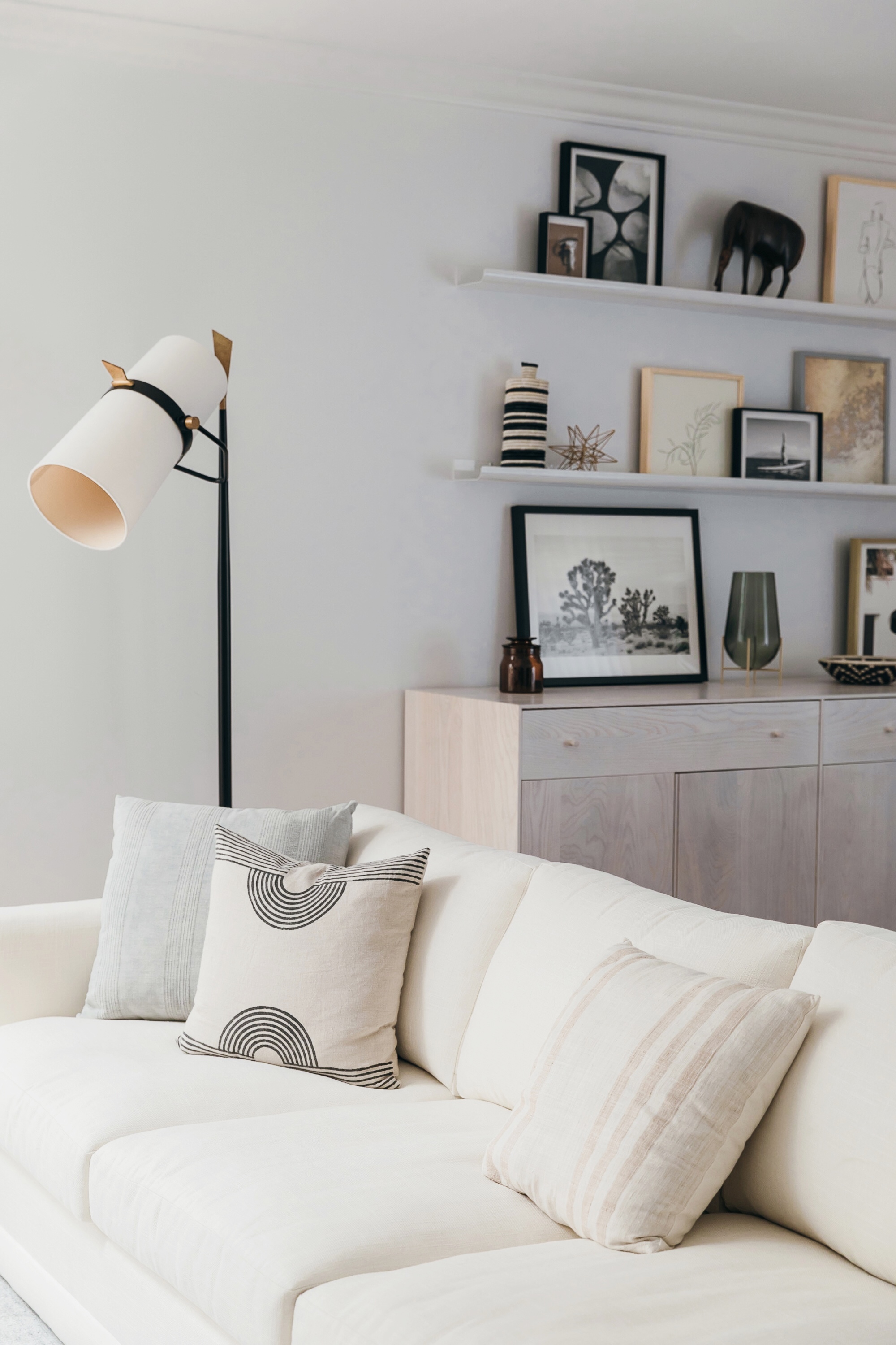
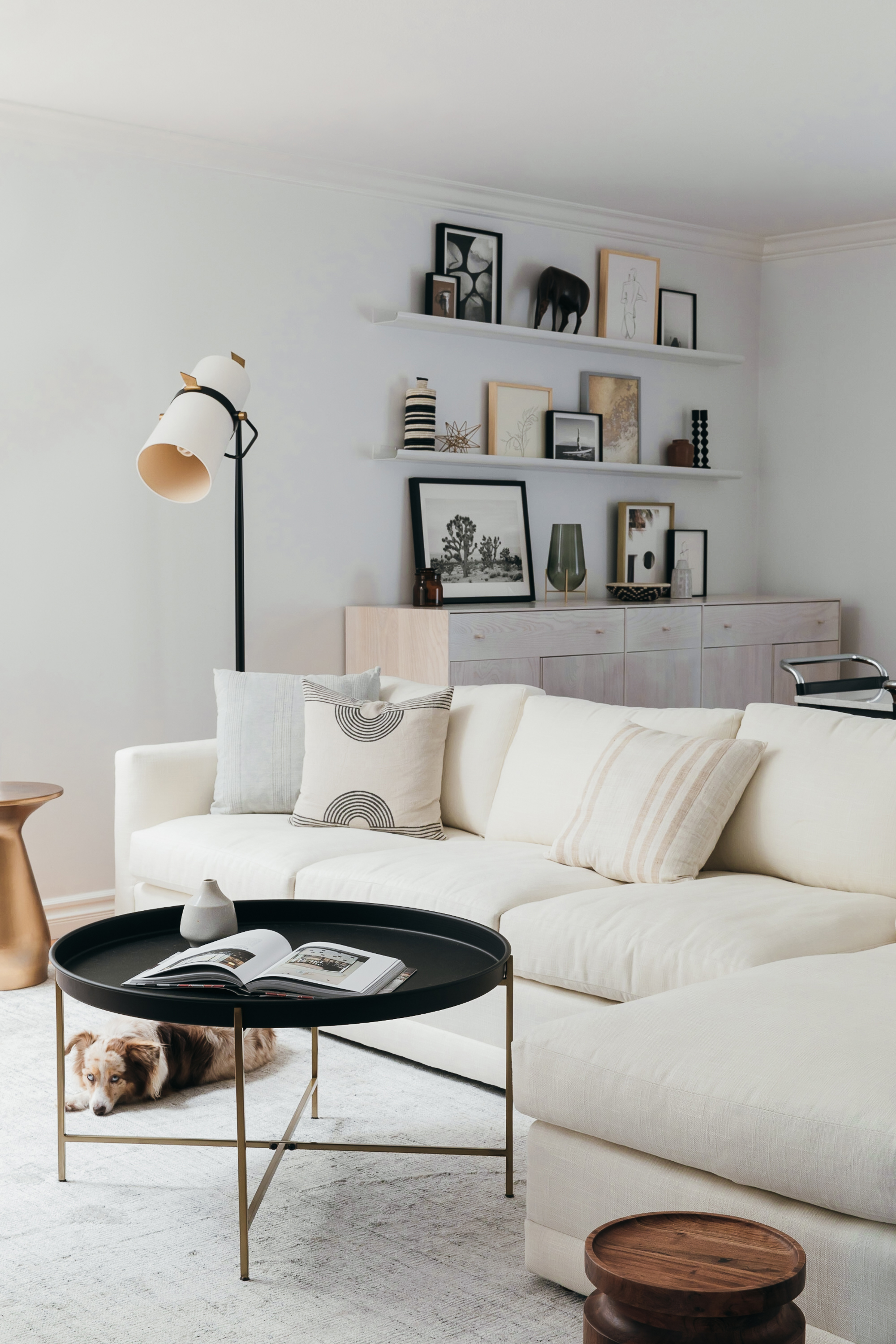
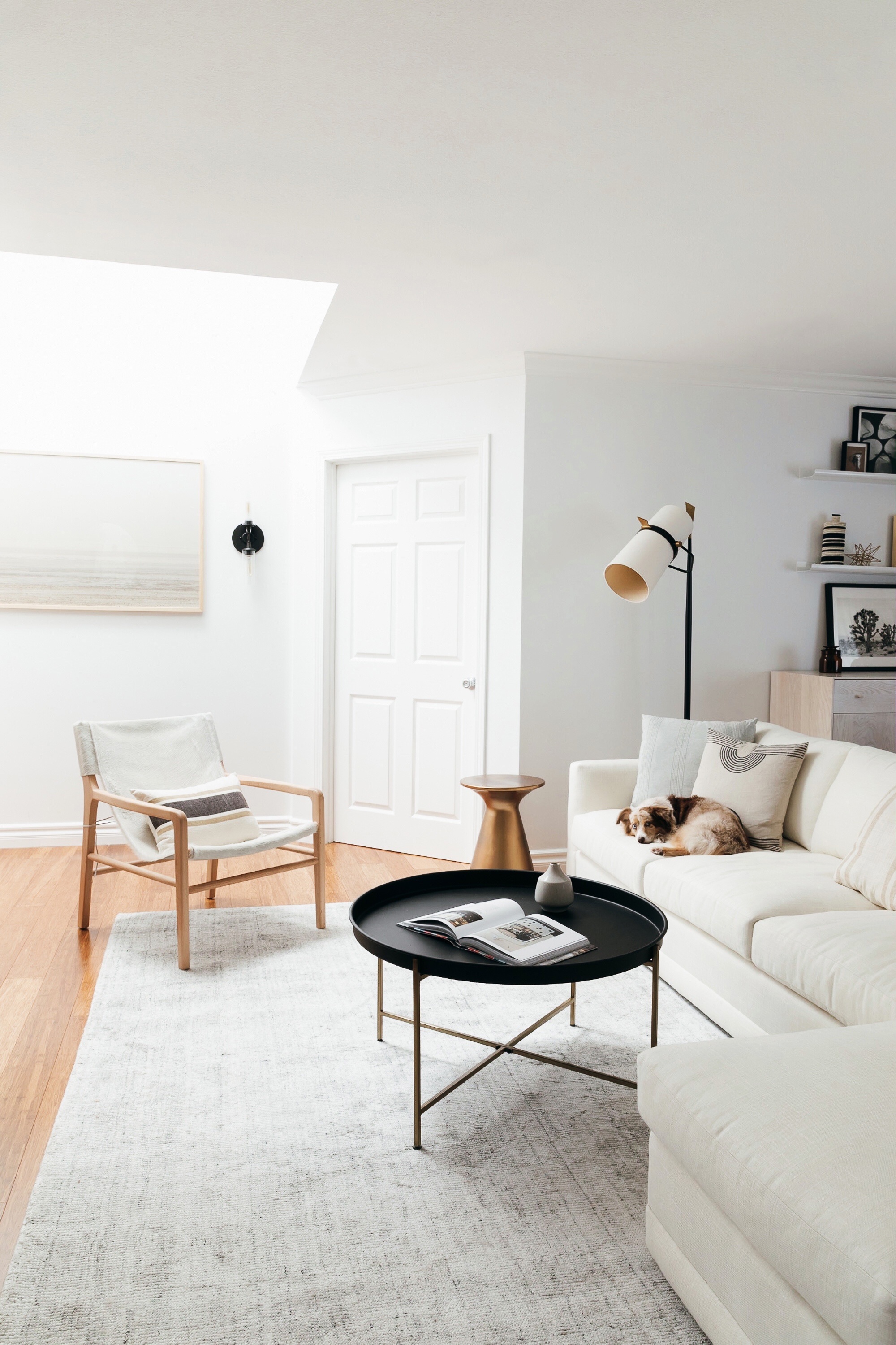
Now let’s talk seating, shall we? Without a doubt, finding the perfect sofa was the biggest challenge of the project! Kim had very clear specifications about what she needed for the space, and we couldn’t seem to find a single option that checked all the boxes! Then, we got a sneak peek at a just-released style from Maiden Home called The Warren, and we knew we’d found The One. This sofa truly has everything Kim wanted and more. It’s available in a cozy, loungeable sectional style with multiple size options to suit any size room, and while it’s deep enough to sink into, it’s not so deep that it takes up a ton of space. It has a low profile and slim arms so that it fits in with Kim’s sleek, modern aesthetic, but it’s still really welcoming, like a warm hug! Finally, it’s upholstered in Crypton Home fabric, which means its truly pet and kid proof: Even though it’s white linen, all Kim has to do if it gets dirty is wipe it off with dish soap and a wet cloth!
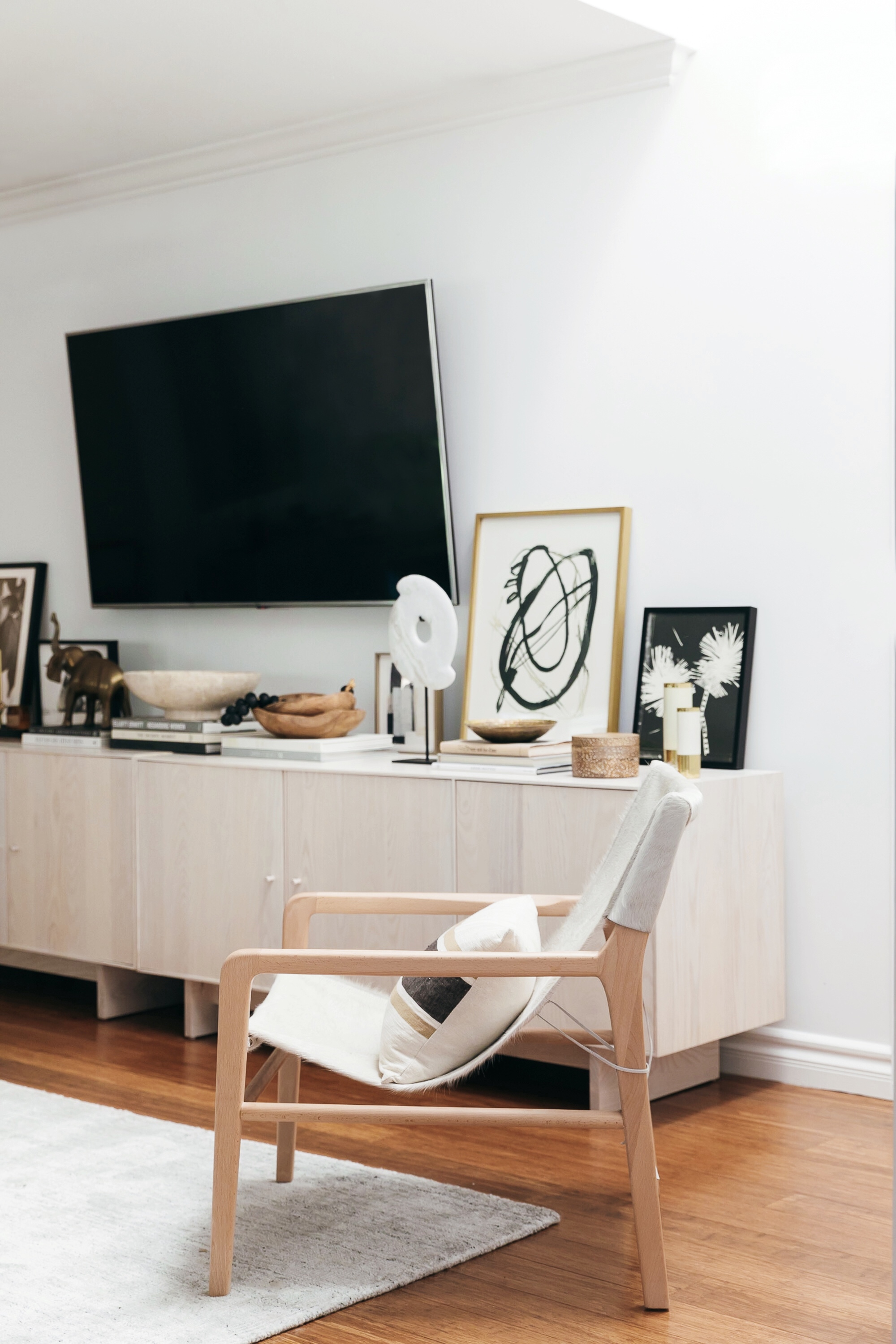
While we were peeping Maiden Home’s new sofas, we also saw their latest chair style too, and one look at their gorgeous Hayes chair told us our search for any remaining seating was over. The Hayes is made of cowhide and beech, so it brings a lovely earthy texture to the room, yet its sling style feels really light and breezy at the same time. (Look at that texture in the pic above! Swoon!) Plus both Kim and I love that all of Maiden Home’s pieces are made right here in the US by skilled furniture artisans in North Carolina.
Once we’d gotten those big elements in place, it was time to start filling in the smaller holes. I’ve waxed poetic about Perigold before, but I really can’t say enough good stuff about that site. They have a massive inventory of higher-end decor brands, many of which are previously only to-the-trade, and I really appreciate their search function for finding exactly what I need from their huge selection of quality options. For Kim’s home, I had a vision of mix-and-match end tables for the seating area, and with Perigold I was able to narrow my search to include only tables that fit the exact style and dimensions we needed. In the end, we landed on Arteriors Home’ Haven End Table and Blu Dot’s Turn Low Side Table. Both are petite but pack a real personality punch! Oh, and that fab black and brass coffee table? It’s an insanely budget friendly find from Target!
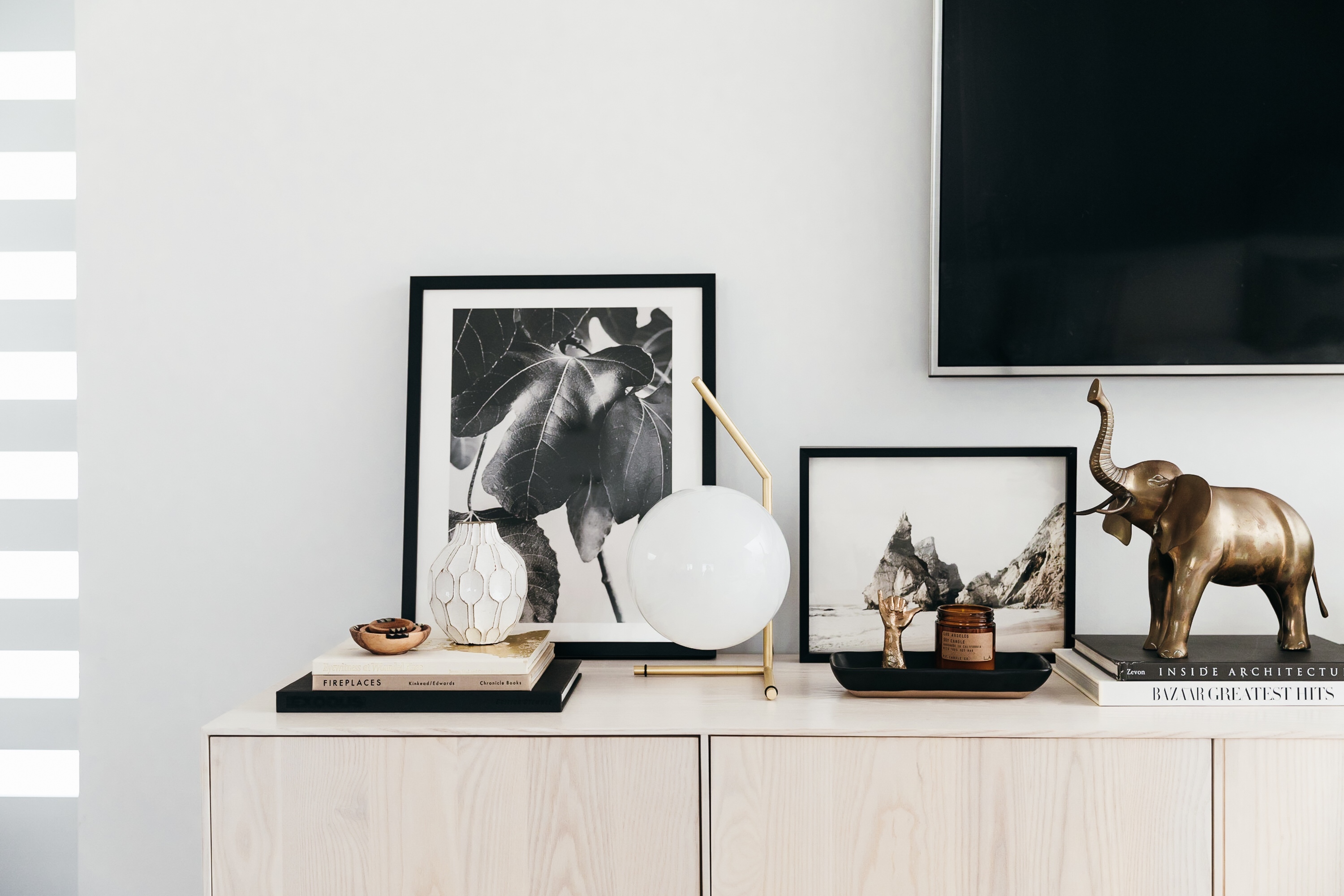
Styling a space this large was no joke, so I pulled out all the stops when gathering small decor accents! Perigold came through with killer statement accessories from some of my favorite modern decor labels, like a smoky glass and brass table vase by Menu for dressing up the dining buffet; an iconic brass FLOS IC Table Lamp and Marble Bowl by Noir for styling the media console; and a truly striking black and brass Floor Lamp by Arteriors Home for the seating area. With a project this large, it was so helpful to be able to snag all those great finds from one reliable site, rather than placing orders and tracking packages from multiple vendors.
We also focused on shopping from sites that have ethical and sustainability missions behind them, so Kim could feel good about what she’s bringing into her home. From Accompany, we picked up the prettiest Enamel vases with brass trim, great for adding vertical interest to any vignette. The brand’s Berkley Striped lumbar pillow sits perfectly in the sling chair for a subtle addition of pattern, and their Olive wood bowl set is a teeny tiny touch of warm wood on the media console! Kim and I both adore The Little Market for soft goods and woven accents. To make the sofa even cozier, we layered some of their pillows in a wide stripe, a narrow stripe, and a delicate grey linen. Then, on the dining console, a woven vase and woven bowl inject a hint of pattern.
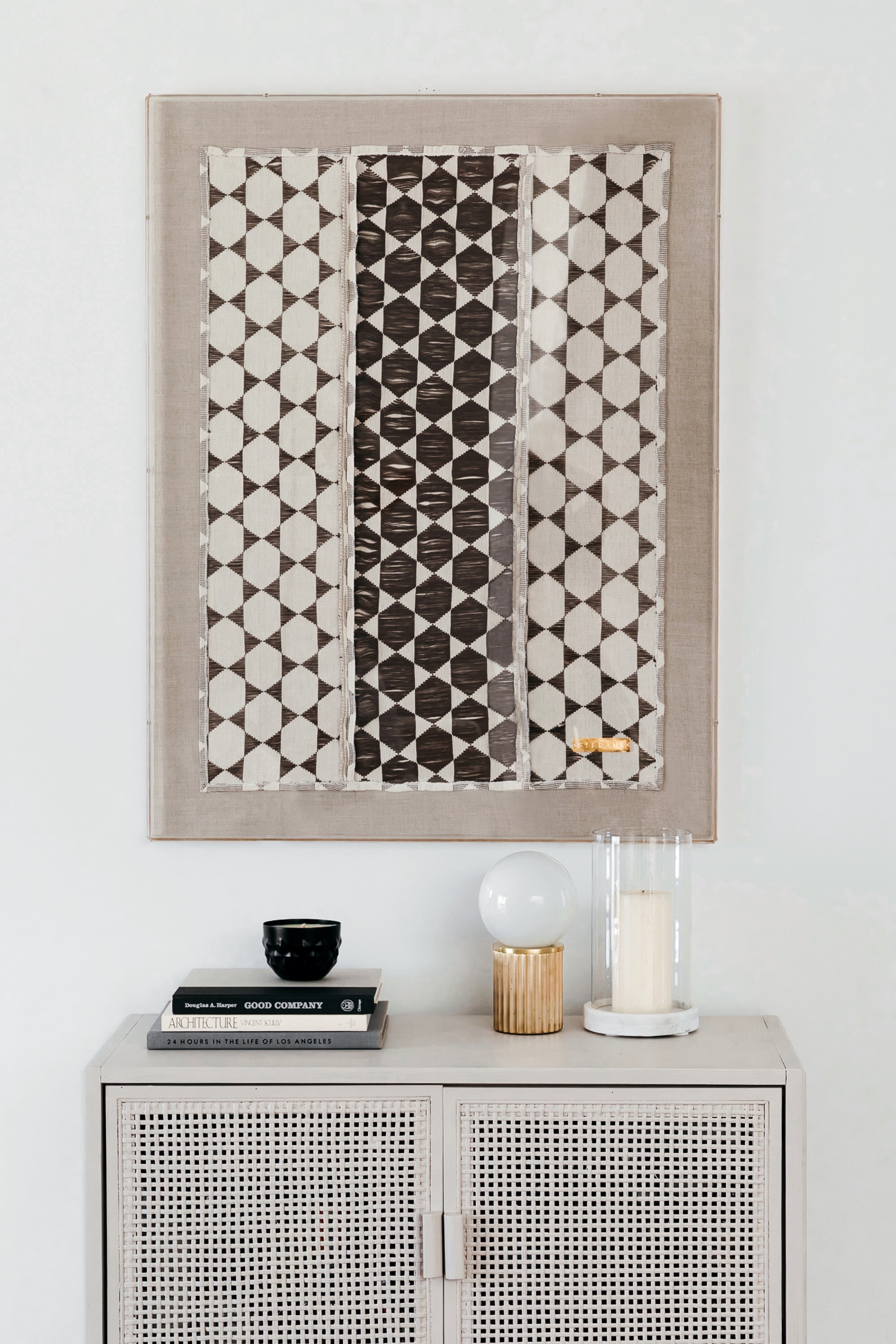
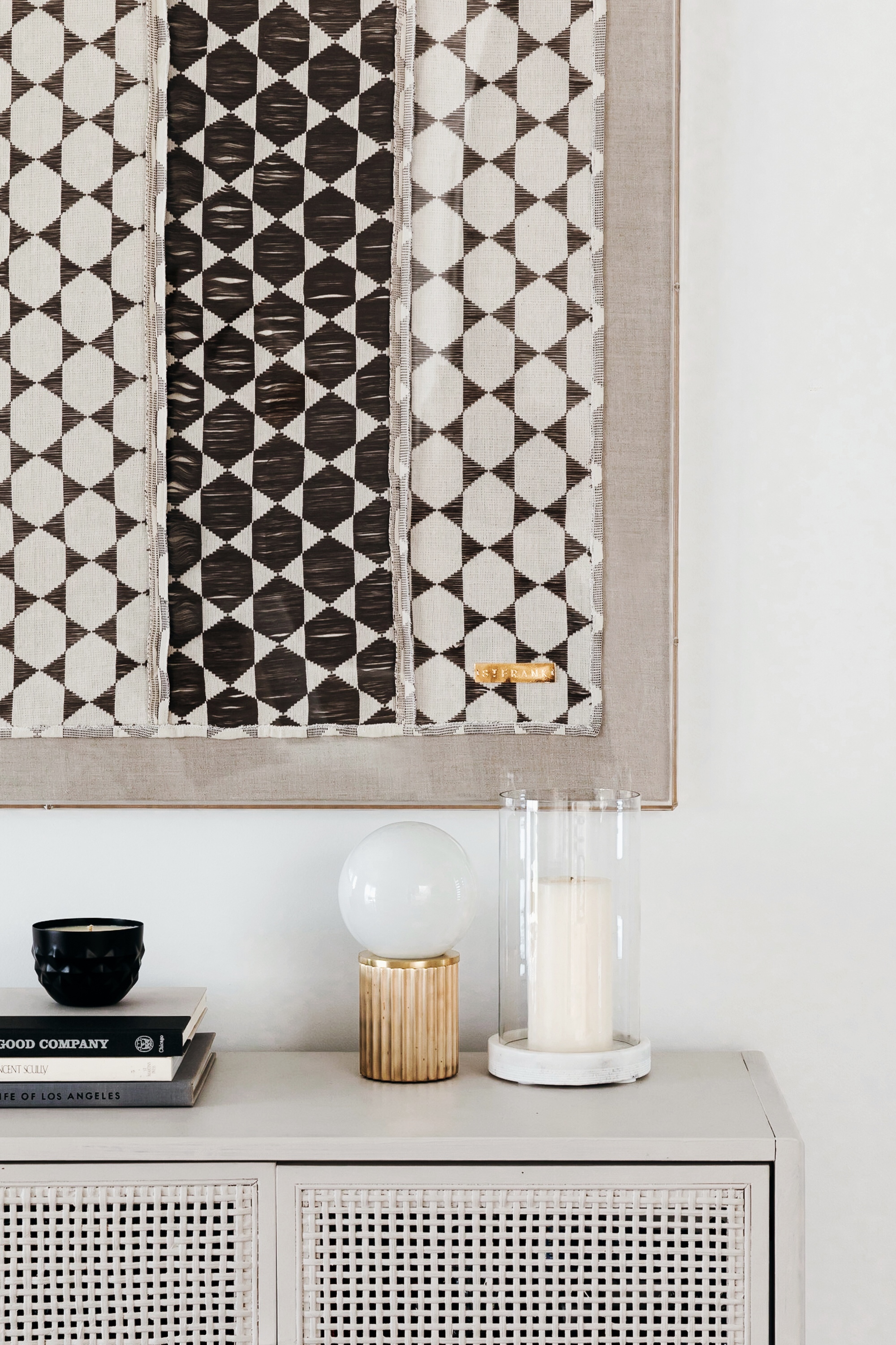
Finally, the accessories mix at St. Frank is so spot on, all of it sourced from traditional artisan communities around the world. I especially love St. Frank for rough-hewn pieces like hand-crafted glass beads, which look gorgeous draped over a teak tree root serving bowl, and sculptural statement accents like their Limestone Bi Disc. Of course, I can’t forget a shoutout their framed ethnic textiles; the lucite-framed Senegalese Biddew Gris fabric over the bar cabinet is such a stunner! Speaking of that bar cabinet, Kim and I put on our DIY hats to make that one happen! We both loved Target’s Caned Chest as a replacement to the bar cart she had in that spot, since it provided additional closed storage as well as nice woven detailing. However the color it came in matched her floors exactly, so for contrast we gave it a coat of Behr’s ‘Cappuccino Froth’ paint. (And by we, I mean Kim’s husband Blake. Haha!) It now has an understated matte taupe finish, and it looks utterly chic with Urban Electric Co.’s petite brass table lamp placed atop it!
We can’t forget about the entryway! It’s the first impression you get when you enter the house, after all, and first impressions count for so much. We selected a custom bench by the Skram Furniture Company for setting a polished yet welcoming tone the moment you enter Kim’s door. It’s the perfect place to sit and put on shoes when leaving the house, or to set groceries on when returning home. Skram is a family-owned company based in North Carolina that does impeccable custom woodworking, and the bench in Kim’s home is a beautiful ebonized White Ash. The unique shape straddles the line between weighty and delicate, and the shallow depth makes it ideal for tight spaces like the one here. It’s a piece Kim will cherish for decades! (More on this bench and Skram coming your way later…!)
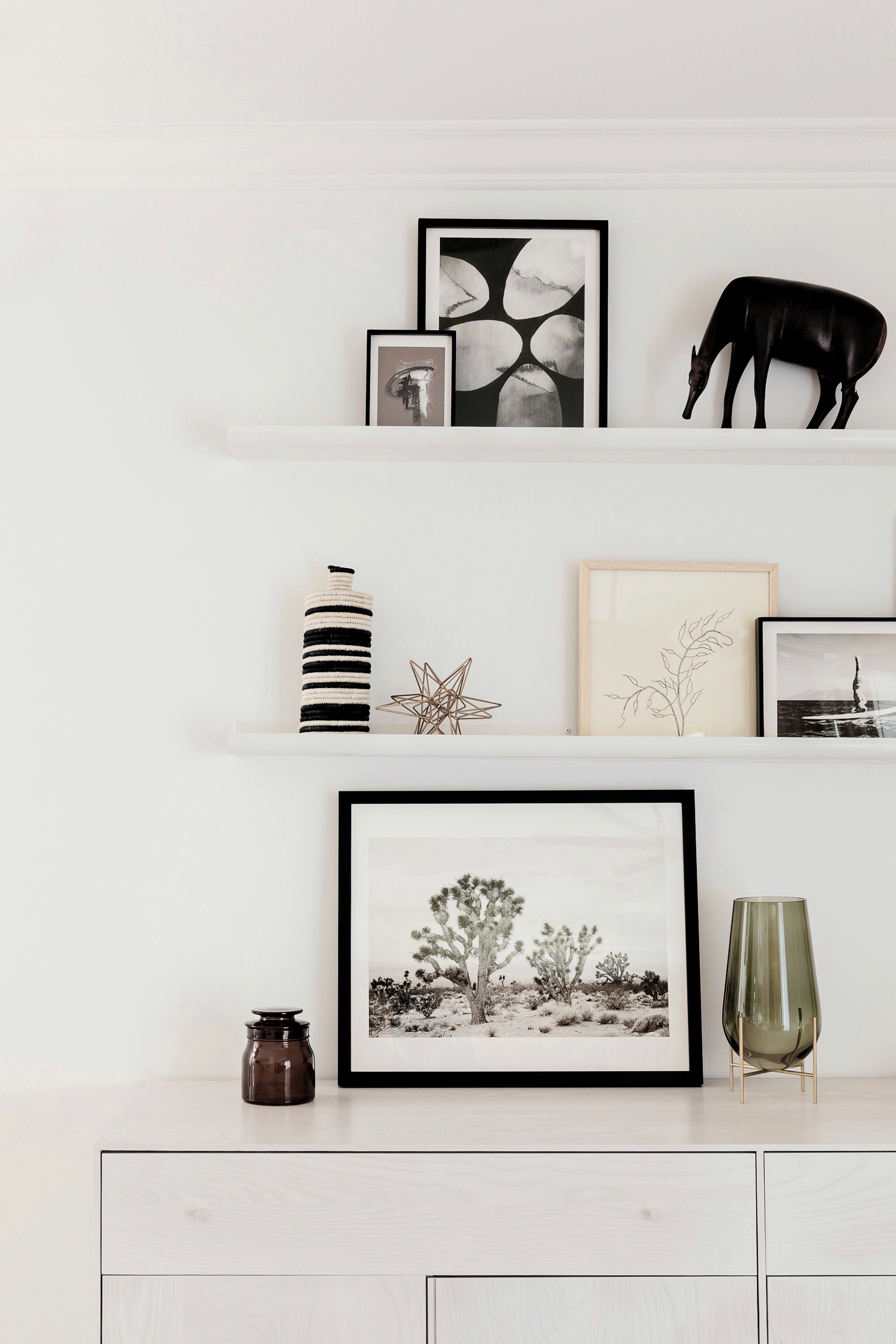
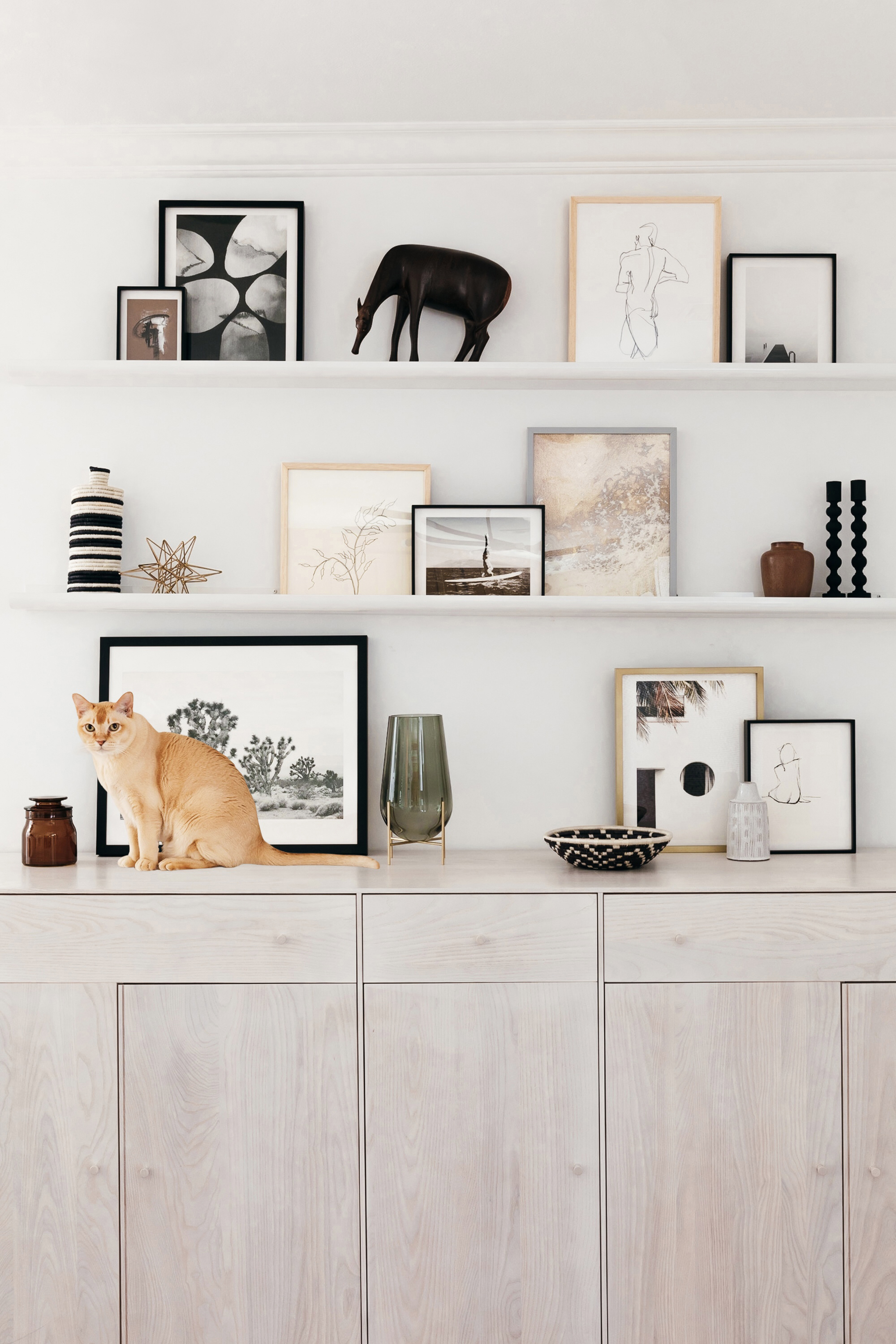
Last but absolutely not least, artwork is a major feature of the finished space. We knew we wanted to do an art installation over the dining area, but I didn’t want Kim to have to hammer a ton of holes into the wall. So we selected Room & Board picture ledges in white powder coated steel. We were able to choose from six different lengths to get the exact size we needed, and the white finish of the ledges gives the art a floating look without requiring each and every frame to be hung. Plus, pieces can be swapped out or rearranged as Kim adds new artwork to her collection!
For the artwork itself, Minted has an incredible selection of fine art prints with lots of customizable framing options, so we looked no further than their catalog for the actual artwork. Over the dining room console, we did a mix of illustration, photography, and paintings, all in neutral hues to match the rest of the room. I even put together a schematic plan in PhotoShop so Kim would know exactly how to position them. They are:
1. History Repeats Abstract Collage Art Print 2. Last Tuesday Abstract Wall Art Print 3. Quest Abstract Painting Art Print 4. Pebbles Mixed Media Art Print 5. The Edge Black and White Art Photo 6. Wild Radish Botanical Drawing 7. Island Yogi Black and White Photo 8. Joshua Tree Landscape Photo 9. Havana Architectural Art Print
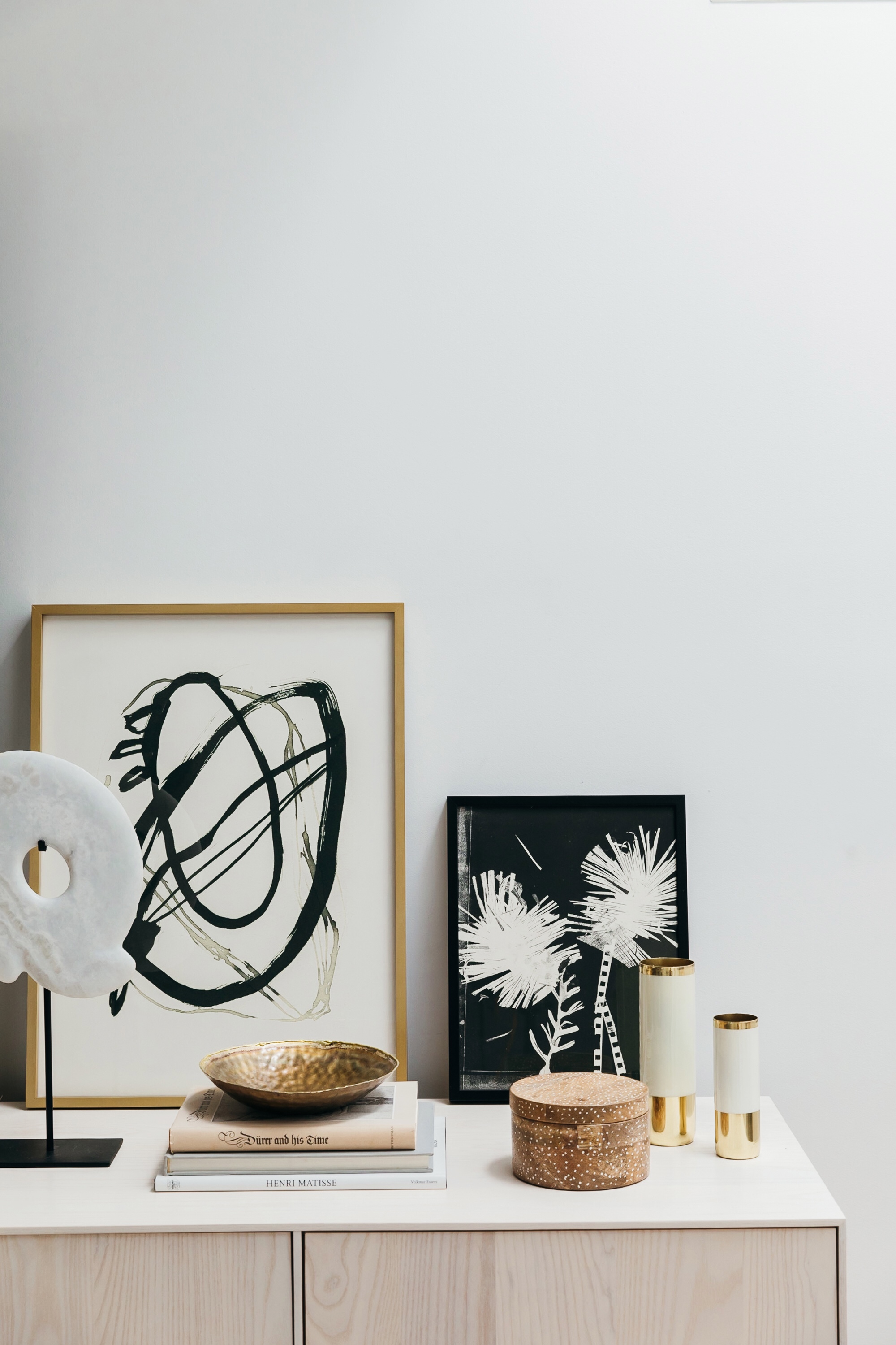
Over the media console, we decided that leaning the framed prints was the best way to incorporate art into that vignette without damaging any walls. Again, Minted came through in a major way with a blend of landscape and botanical photography, abstract paintings, and unusual graphic prints!
1. Yesterday Collage Art Print 2. Aurum Sand Gold Abstract Painting Art Print 3. Paper Flower 1. Black and White Art Print 4. Black 01 Drawing Print 5. Praia da Ursa Beach Photo 6. Gather & Gaze Black and White Leaf Photo 7. Composed Figure Drawing Print 8. Wistful Figure Drawing 9. Standing Figure Drawing Print
Finally, over the bench in the entryway, we figured it was worth a few holes in the wall because this oversized Patagonian Winter Landscape Photo is everything! We loved how tonal and abstracted it feels even though it’s a photo—and it has such a beachy feel although it’s actually a winter landscape. Art should be a conversation starter that makes you look twice, and this piece definitely does exactly that!
Phew, what a journey that was! I’ve got a closer look at our rug choices coming your way, so keep your eyes peeled for that. And in case you missed ’em, here’s our original minimalist modern design inspiration for the space plus a deep dive into my process for designing a gallery wall and for choosing mix and match accent tables. Thanks for following along on this project, fingers crossed you love the final design as much as Kim and I do!
Photos: Monica Wang Photography.
