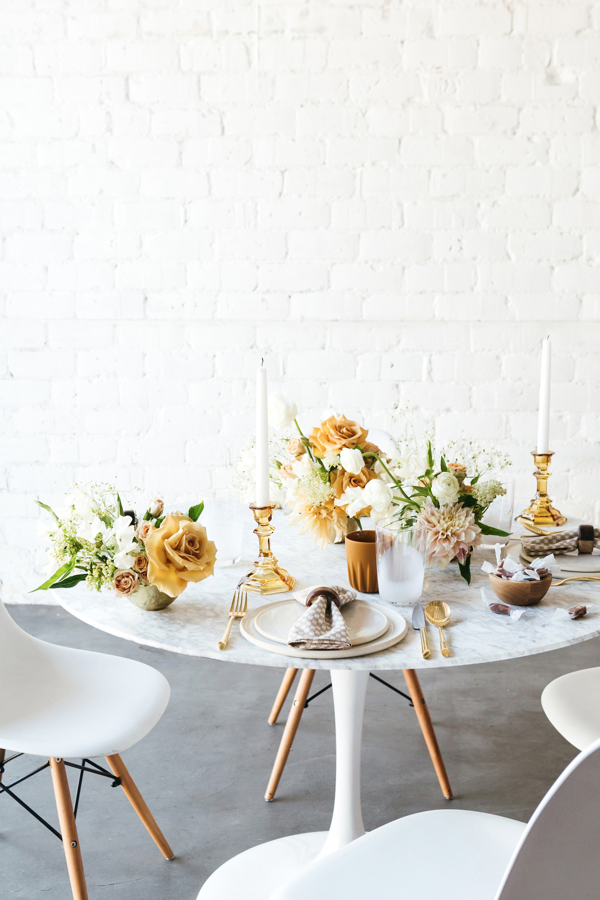
One question I get asked a lot is, “Where do you find your inspiration?” The answer I always give may not be the most useful, but it’s definitely the most honest: “Everywhere!” Because the truth is, even the most unexpected source can provide a wealth of ideas for any project, from decor makeovers to entertaining spreads and beyond. What’s more, successfully connecting the dots between two seemingly unrelated subjects is an incredibly satisfying creative exercise—and the finished product is often so much more than the sum of its parts. So when Skinny Cow asked me to create a tabletop inspired by their newly updated recipes and just-revealed packaging makeover, I dove into the challenge with relish. And sure enough, the result is one of my favorite styled shoots ever! Read on for the inside scoop at my process and tons of summertime tabletop inspiration.
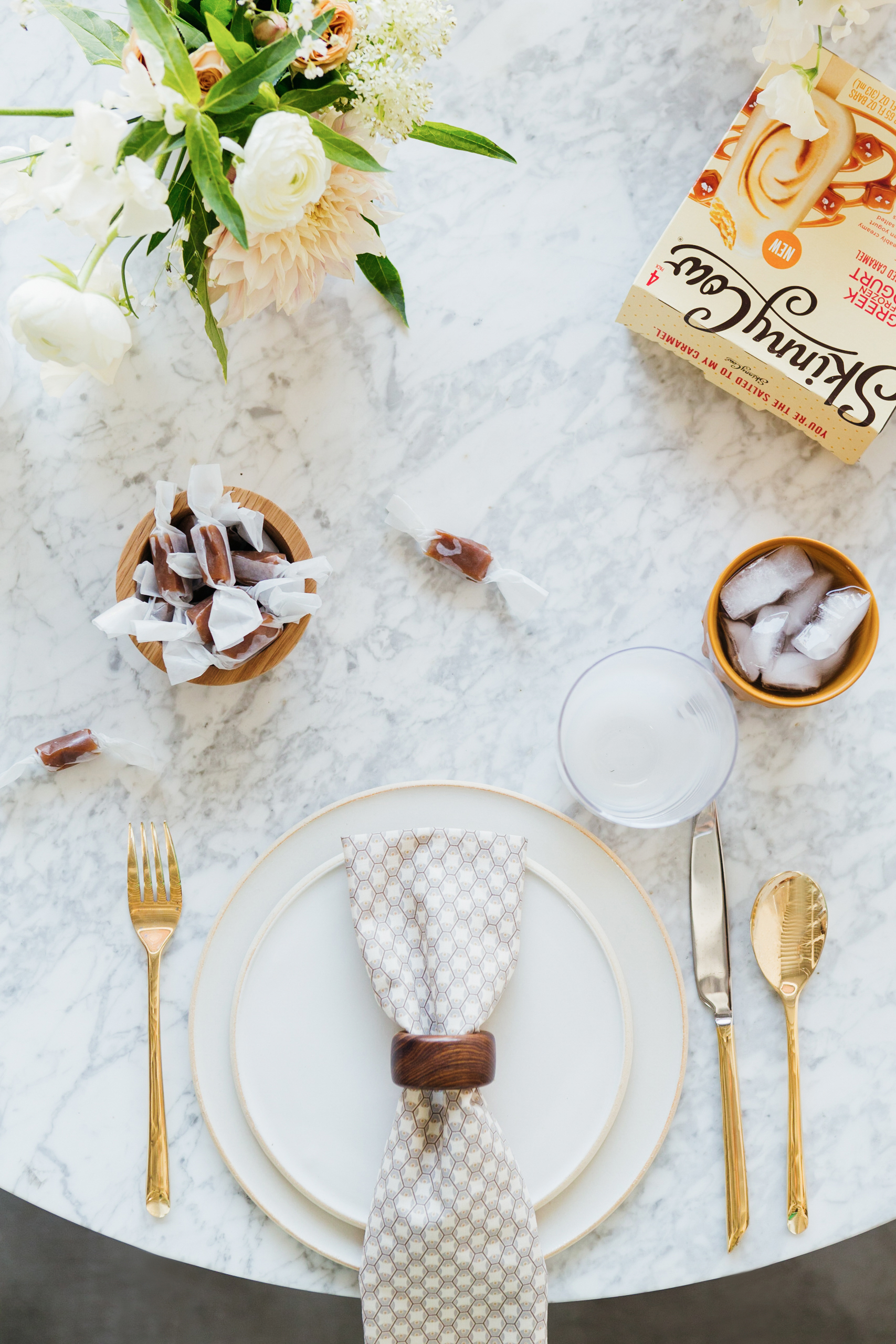
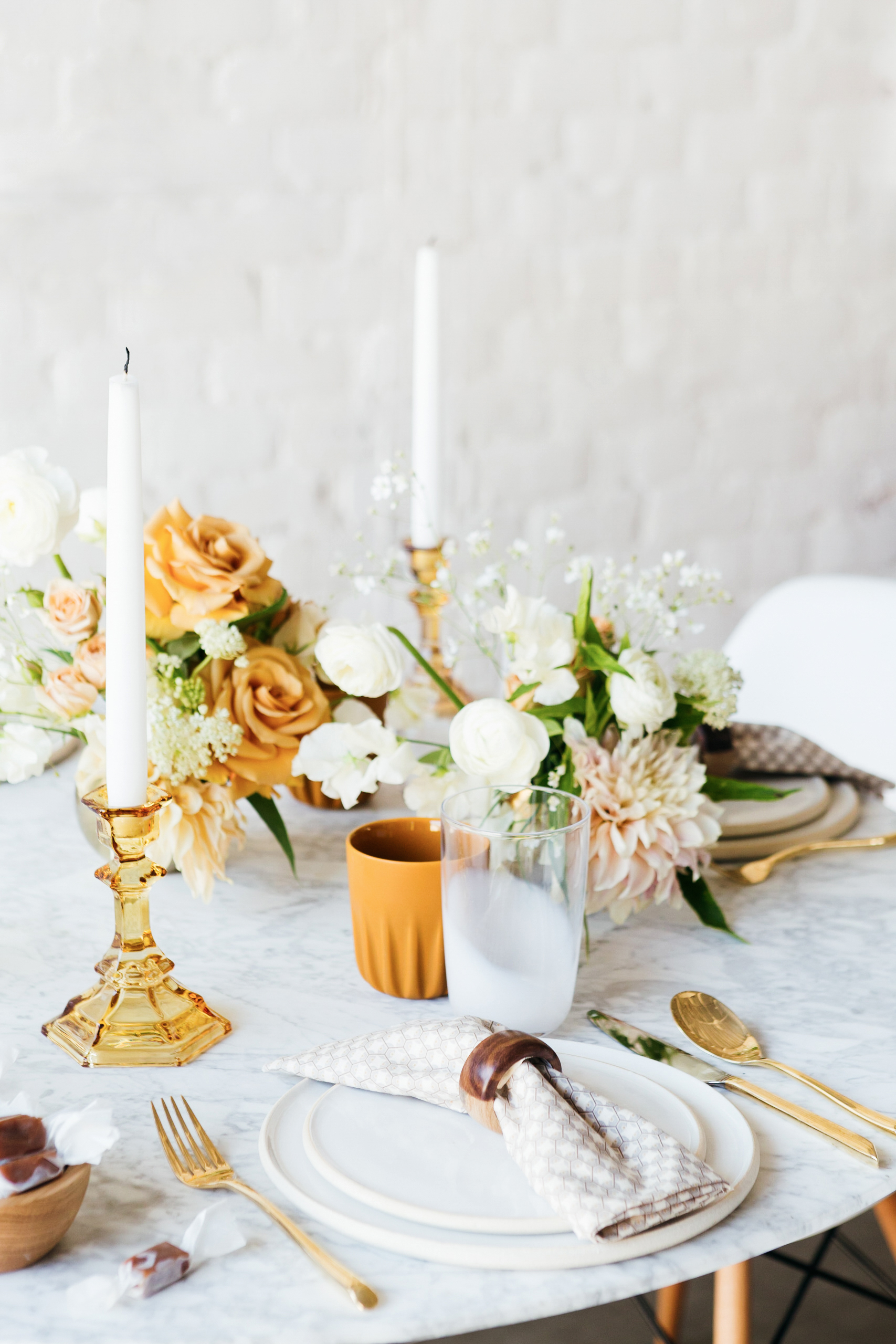
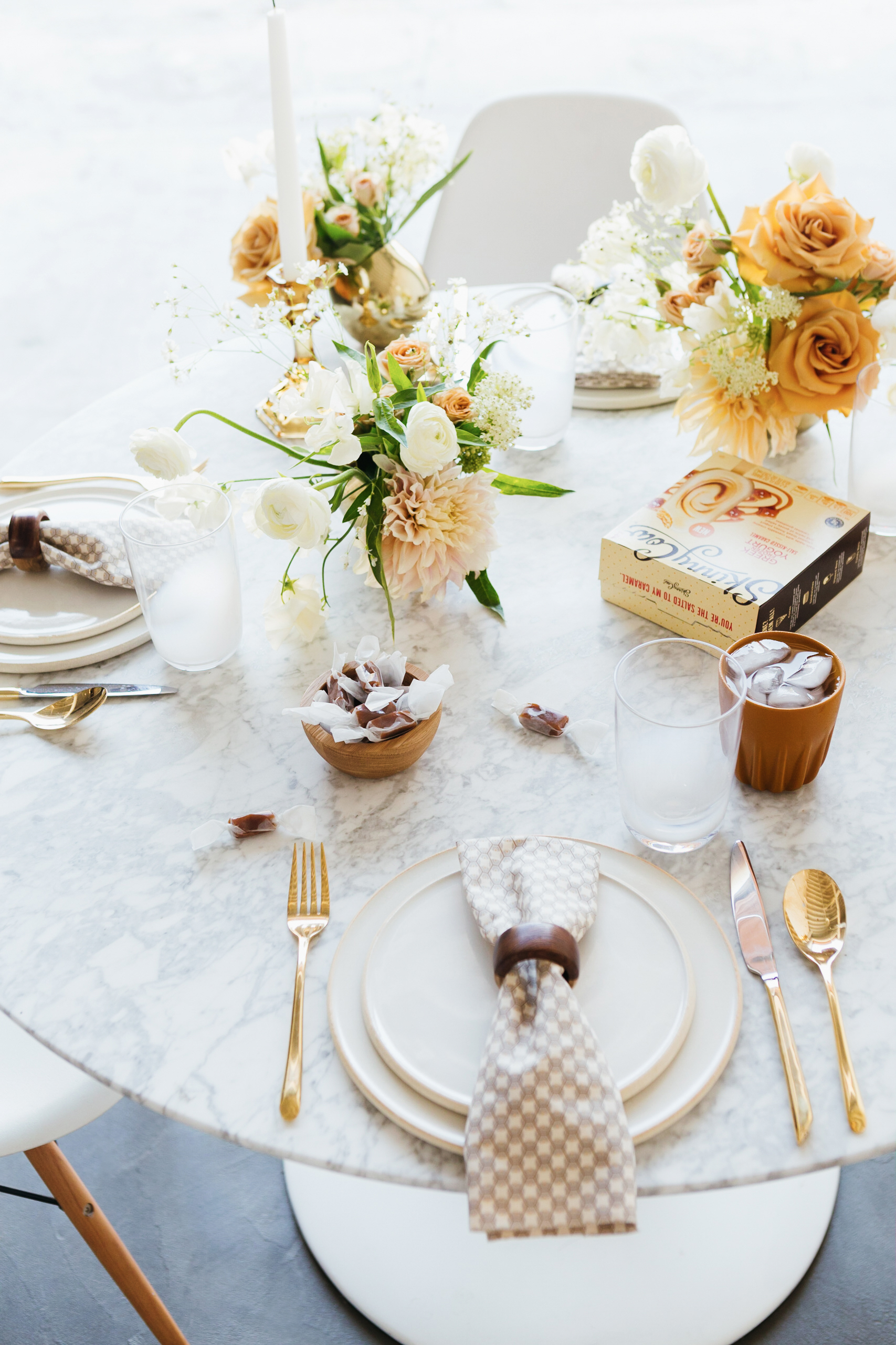
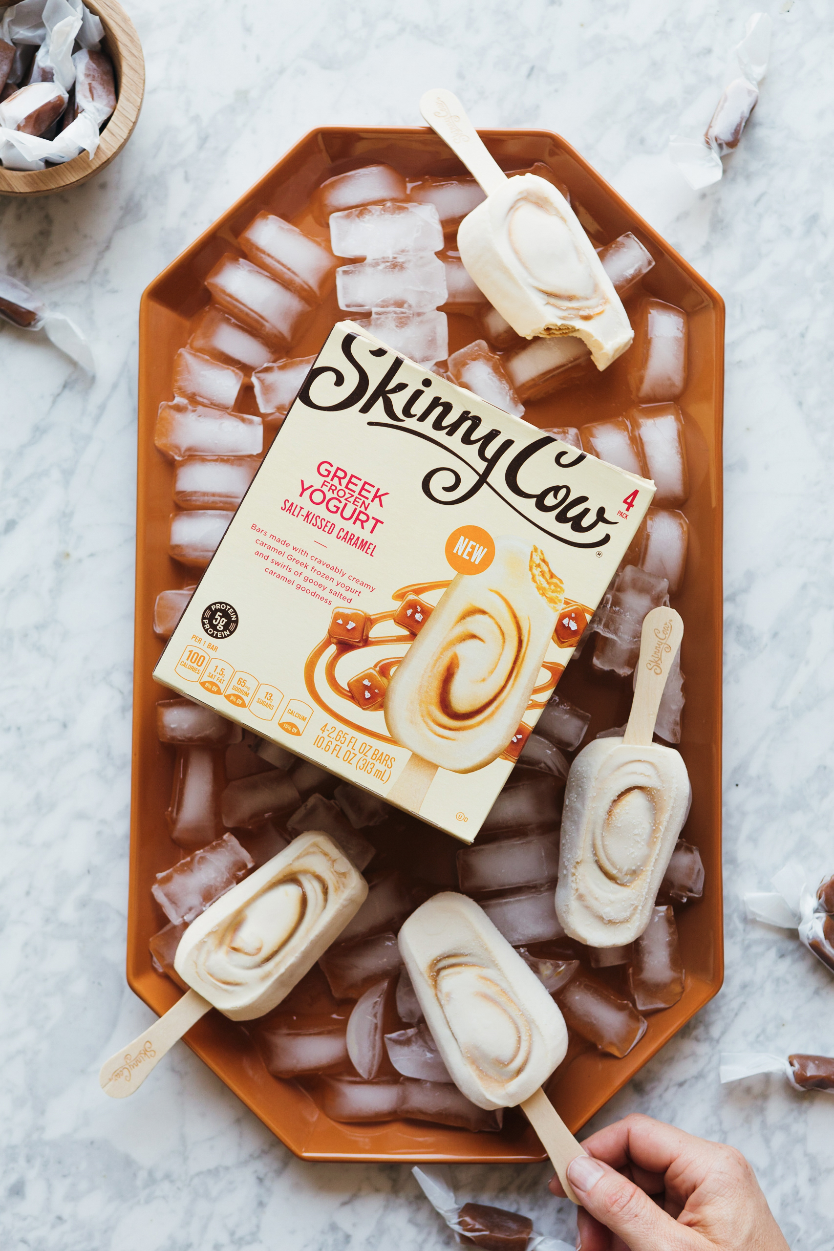
Color is often my starting point when concepting a table vignette, and this setup was no exception. The creamy yogurt and gooey caramel in Skinny Cow’s Salt-Kissed Caramel Greek Frozen Yogurt Bars lent themselves perfectly to this sophisticated combination of warm, tonal whites and deep, golden browns. A mix of glass and ceramics—some hues are opaque, others translucent, but they’re all in the same family—gives the palette a layered effect that plays on the swirls of the ice cream bars.
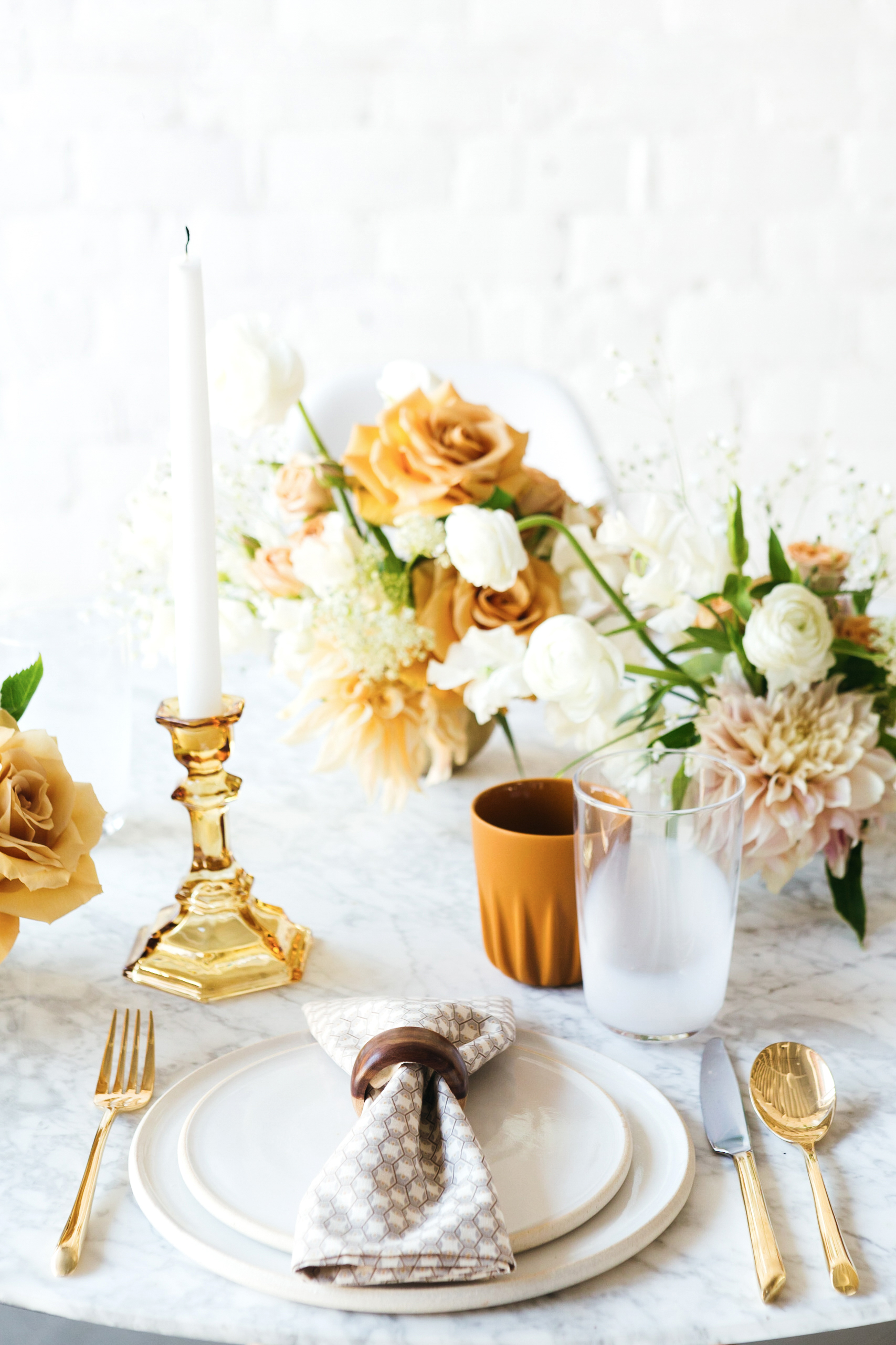
Once I’d determined my palette, it was time to hone in on texture and style. The simplicity of Skinny Cow’s new recipes—no funny business, no unpronounceable ingredients!—were my cue to use just a few impactful elements. I chose napkins in a quiet, modern print that feels as subtly cool as the new Skinny Cow packaging looks. A few subtle wood accents are a nod to the popsicle stick that holds the treats together. Oh, and finding that frosted glassware was a total coup; it’s so evocative of the bars’ frozen yogurt base. You should have seen how overjoyed I was when I stumbled upon it while pulling props!
Last but not least, I considered the overall mood that I wanted for our scene! Skinny Cow is all about feeling good about what you eat while still enjoying your daily indulgences. Having it all, in other words! So I focused on establishing a vibe that was inviting, low-stress, and welcoming, but special too. Floral arrangements with a touch of romance make an elevated statement, and gold flatware kicks it up even further. Yet at the same time, the clean, uncluttered and generally unadorned plates, cups, and serveware foster a serene and soothing sensibility. The take-home? In styling, as in ice cream, less is always more!
Photography: Monica Wang. Florals: The Nouveau Romantics. Disclosure: I partnered with Skinny Cow to concept, style, produce, write, and share this post. All opinions are and always will be my own. Thank you for supporting the brands that enable me to bring you fresh inspiration daily!
