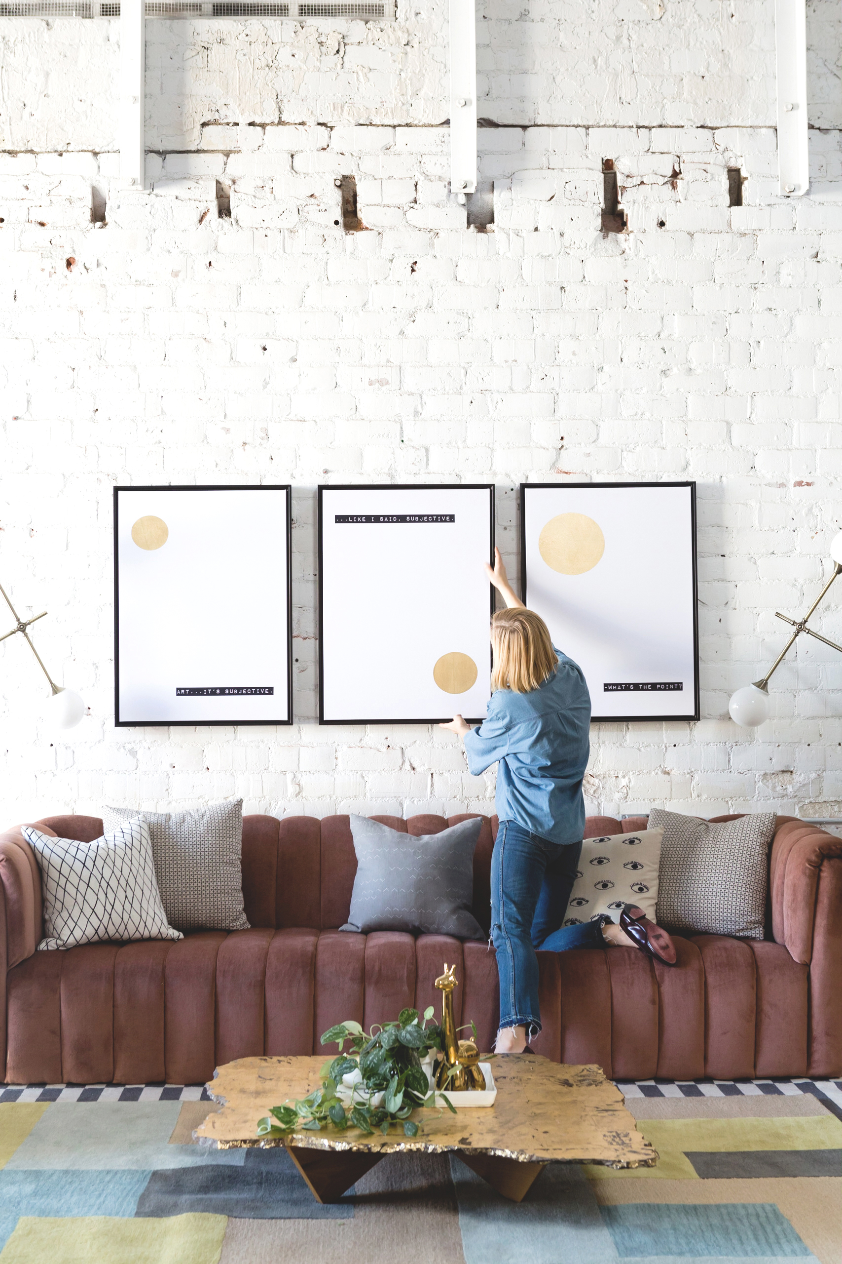
We just celebrated the one year mark of opening Light Lab to the public, and boy does it feel great to be humming along! Our first nine months in the space were fraught with the many headaches and roadblocks of the renovation, but since then it’s been smooth sailing. We love to welcome visitors to the space, to enjoy their delight when they see it in person after spotting it so much on Instagram, and of course to watch them put their own creative stamp on it for photo shoots and events! Steady and stable feels pretty darn good, if I do say so myself.
But of course, we’re creatives at heart—and we get a little antsy when things are too steady. We started itching for a decor update right around the time we hit our first anniversary, exploring the idea of an update not only to indulge our own impulses but because our business depends on keeping a fresh and forward-looking public face. So when Art.com asked me to highlight some of the latest additions to their massive online collection of canvases, prints, and home decor, I knew exactly how I’d put the pieces to use!
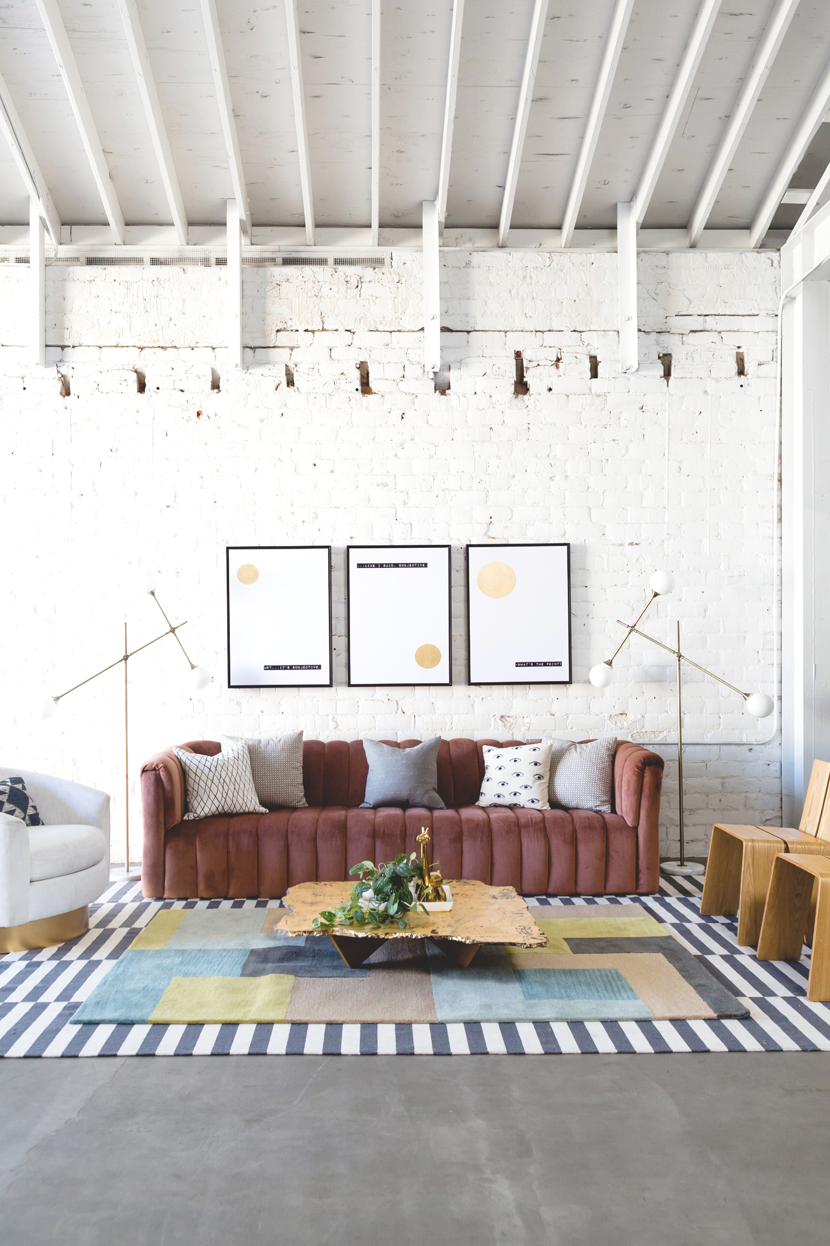
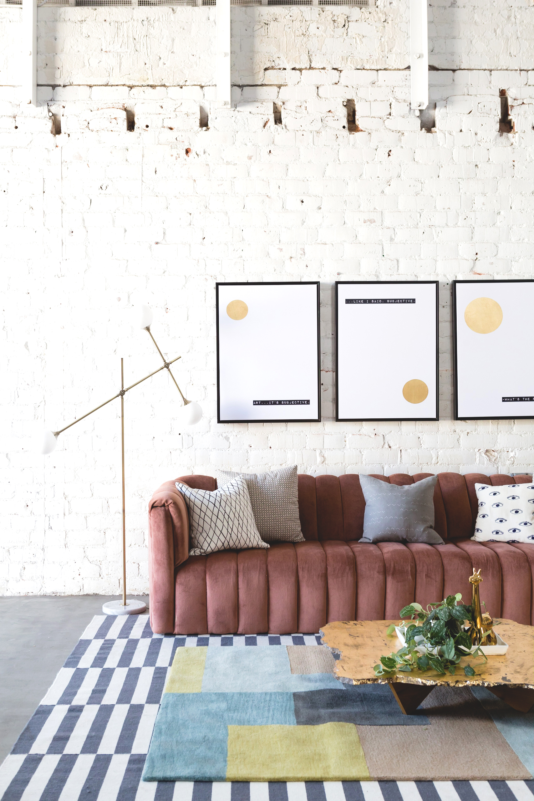
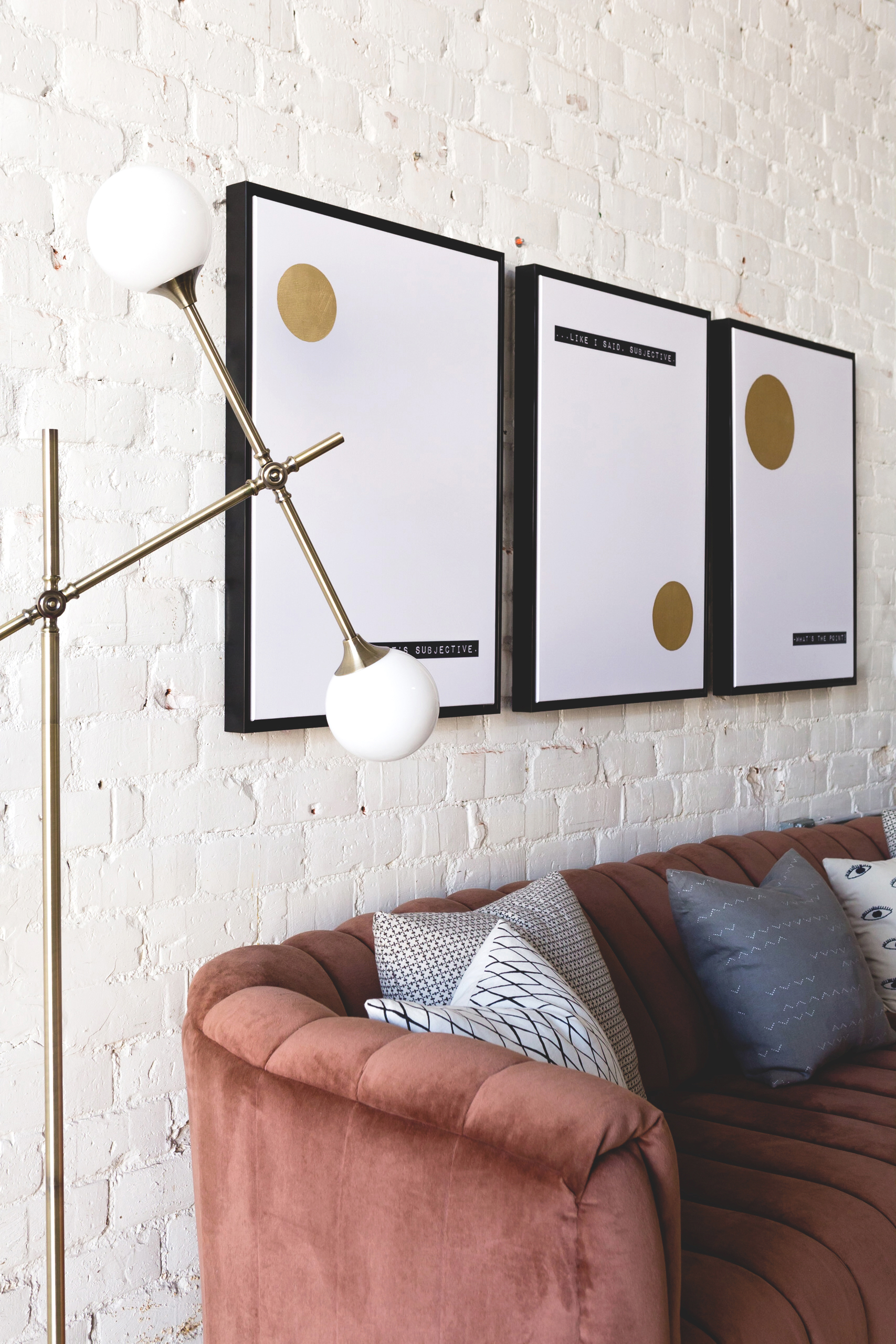
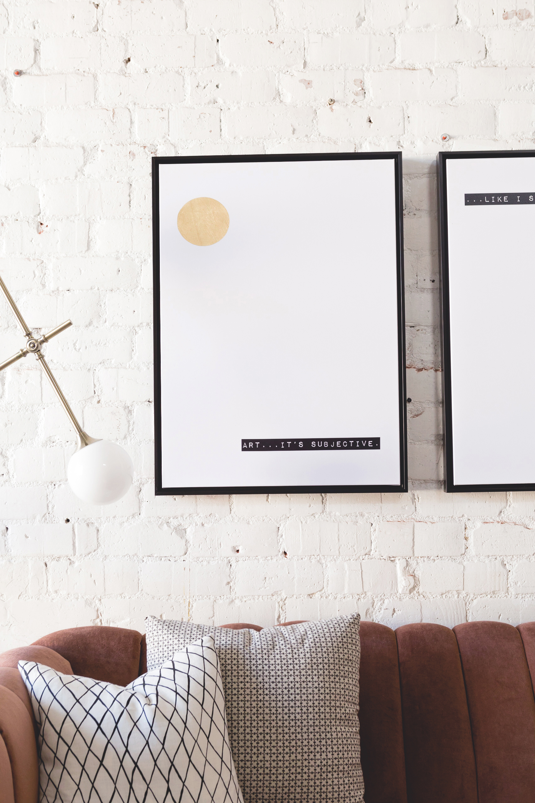
Using art as a starting point for designing a space is a great way to ensure that you end up with a space that’s both cohesive and inspired. In this case, we’ve been loving the current craze for pure formalism, and the focus on simple shapes in Art.com’s collaboration with celebrated interior designer Bobby Berk is a brilliant example of the trend! The repeated circles in his hand embellished canvases and pillows feel at once playful and bold, and they remind me of 1920’s Bauhaus or Italian midcentury motifs. So chic!
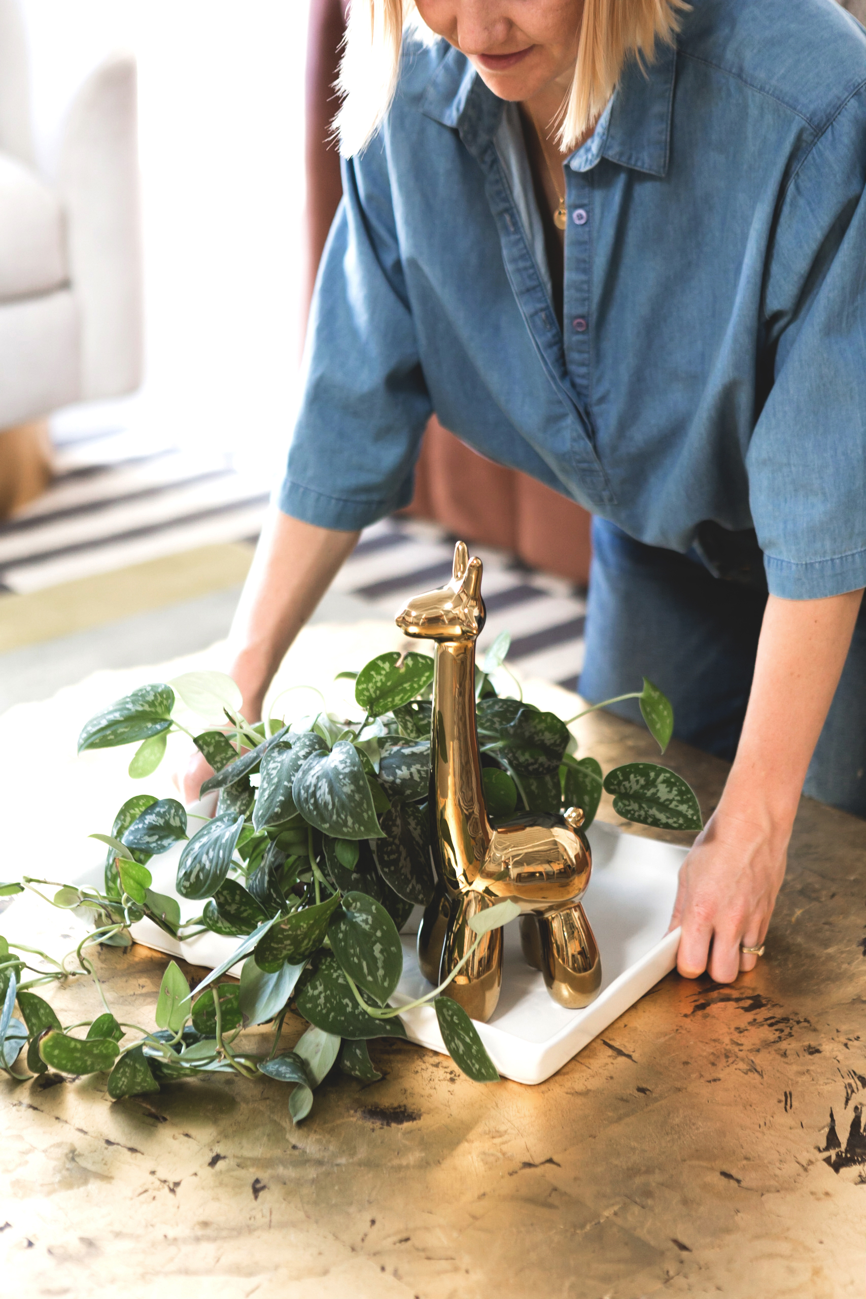
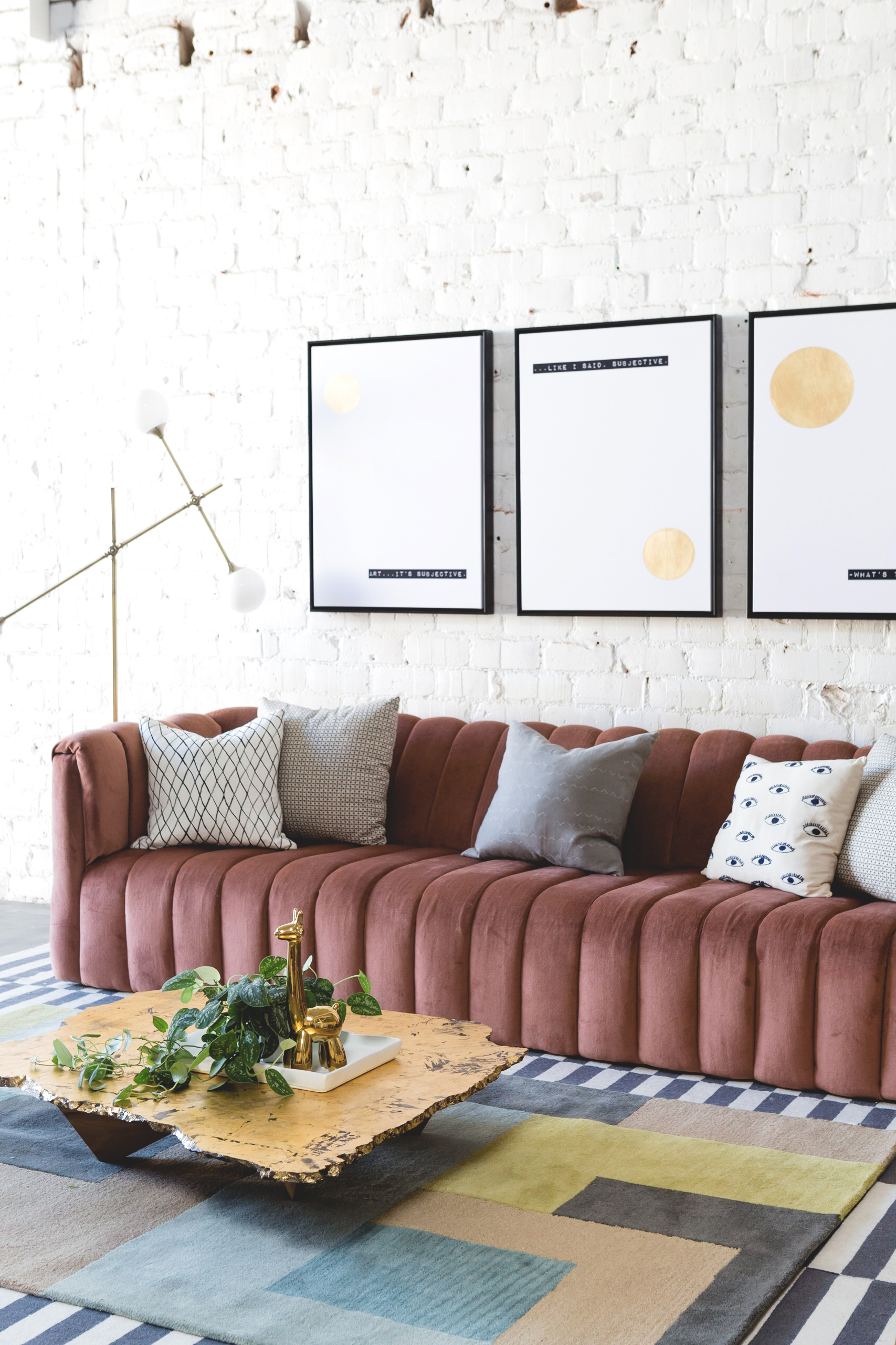
Selecting decor pieces to complement the art canvases was fun and easy, since Art.com has an extensive offering of lighting, rugs, and accent pieces. The globe shades of the floor lamps nicely echo the shapes in the artwork, as does the bubbly silhouette of the gold giraffe on the coffee table. (Because he reminds us of a Jeff Koontz sculpture, we’ve of course named him Jeff!) As for that rug, well, its taupe, olive, and blue shades bring a subtle layer of color to the area, while its grid pattern is in keeping with the strong, straightforward shapes we chose as our theme. The final result feels fresh, focused, and fabulous—yet also remains recognizably Light Lab. What’s more, it couldn’t have been easier to pull together. I’m so excited to see the smiles on the faces of our visitors when they step in the door and discover our updated new look!
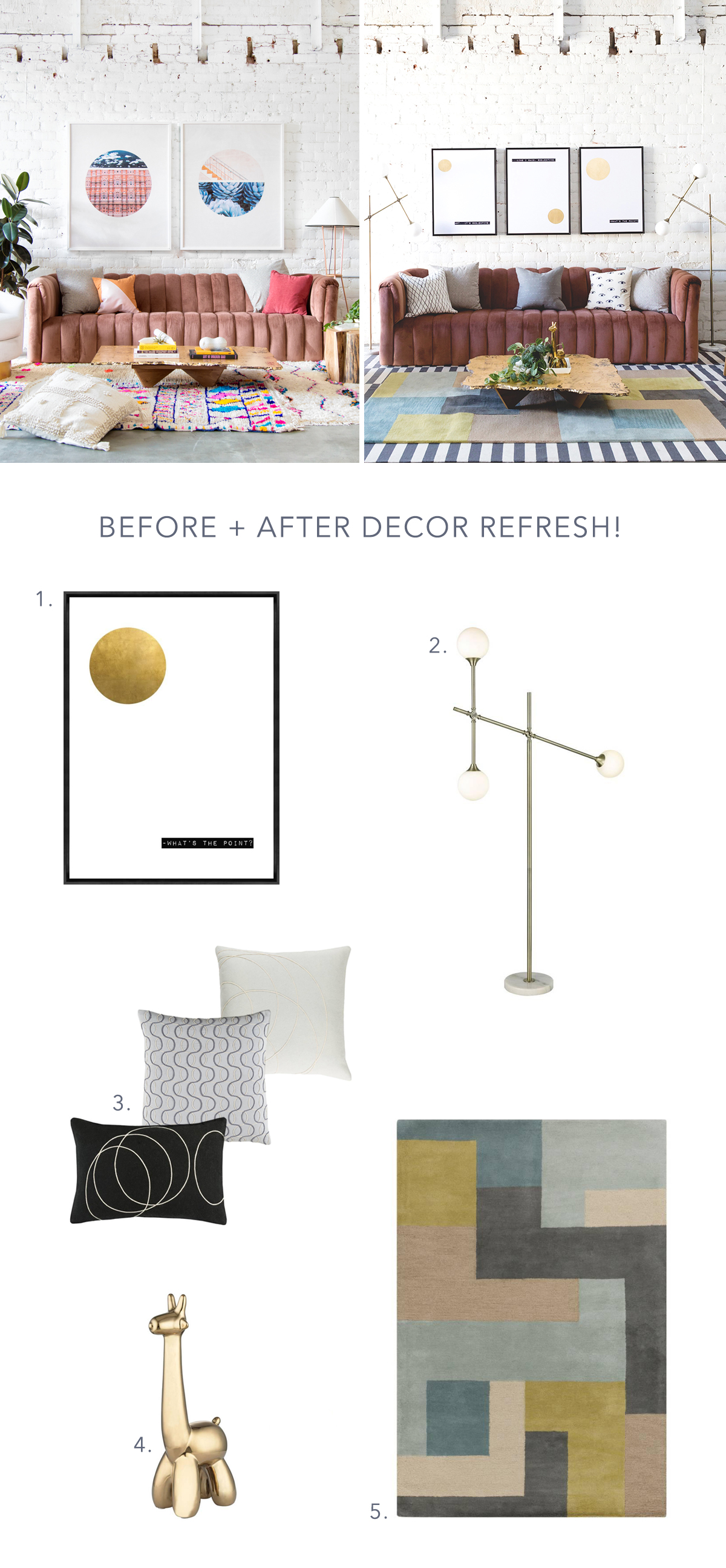
Shopping Guide: 1. Minimalist Art Canvas 2. Brass Globe Lamp 3. Graphic Pillows 4. Gold Giraffe Statue 5. Color Block Rug Photos: Monica Wang Photography. Disclosure: I partnered with Art.com to concept, style, produce, write, and share this post. All opinions are and always will be my own. Thank you for supporting the brands that enable me to bring you fresh inspiration daily!
