Last winter, my work wife Caroline and I embarked upon what might be our most epic project yet. That’s saying a lot, considering the 9 month renovation process at our studio Light Lab! But for that space, we had some experts on hand to support with the technical aspects of the buildout; this time around, it was alllllll us! The backstory? Caroline’s sister Margaret and her husband Corey, a super talented filmmaking team, had just signed a lease on their first office space—and Caroline and I jumped on the chance to design it ourselves from the ground up. We had a vision of a workspace worthy of our collective creativity, one that would allow us to push the boundaries with some of our current design trends, and one that Margaret and Corey would be excited to call their second home!
Before I get into the juicy details of the reveal, I absolutely have to give credit to Margaret for being the best client ever. Not only did she trust Caroline and me implicitly, no matter how zany our ideas became, she was also willing to put in some seriously grueling hours in order to bring them to life (including painting that checkerboard ceiling entirely by herself). She made this time lapse video of the entire process, and you must watch it to get a sense for how completely the studio was transformed. It truly went from shabby to stupendous!
Okay, now onto the nitty gritty. Before we could even think about furnishing this place we had to do something about its architectural envelope. Our starting point was a drab shell of beige cinder block walls, water-stained ceiling tiles, and a flooring material we still can’t find the words to describe. We initially thought of painting the walls a solid color, but when we spotted this soft peach self-adhesive wallpaper from Drop It Modern, I immediately texted Margaret and asked if she’d be open to rolling up her sleeves and putting it over the cinder blocks. The pattern is called Shape Shifter Mural, and I absolutely adore its eclectic pattern and subtle ombre gradation!
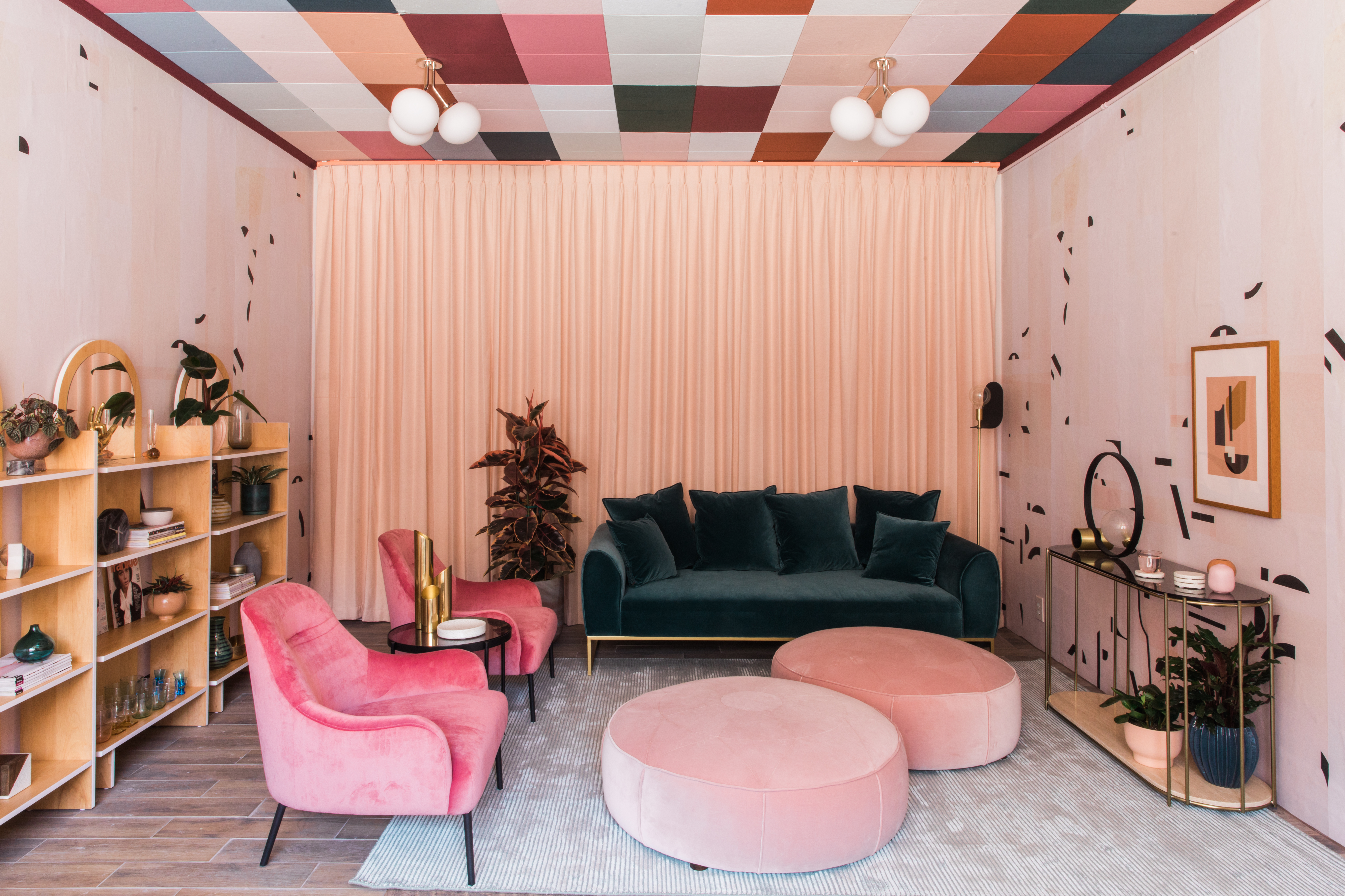
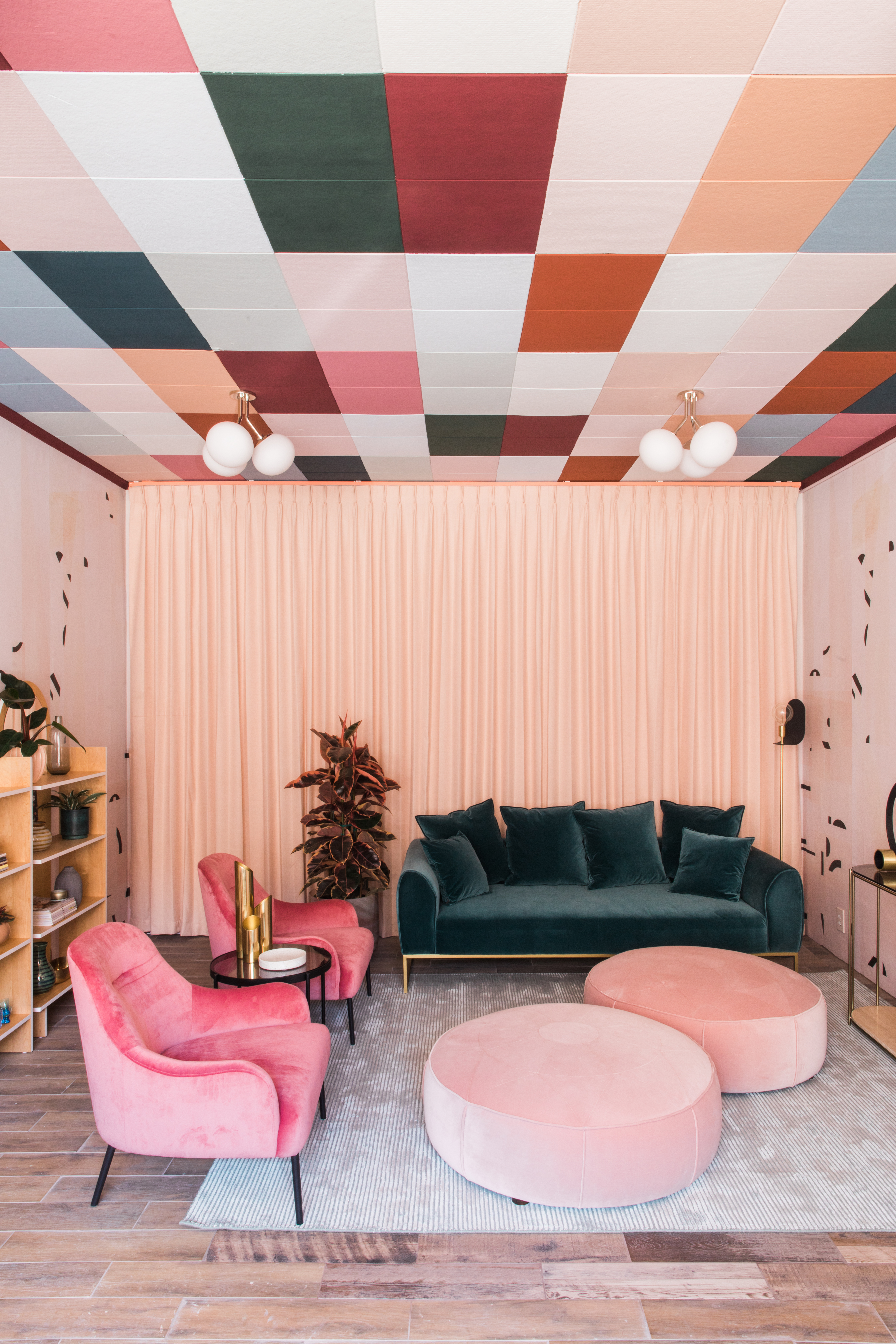
My biggest worry, though, was the ceiling tiles. I was concerned that if we didn’t somehow disguise them, their abhorrent presence would overshadow all the other upgrades we did to the space. Then, when I was lying awake at 2am worrying about this project (I get all my best worrying done at that hour!), the idea struck me to paint them using the existing tile grid as the guidelines for a color-blocked pattern! I picked up swatches from Portola Paints, and settled on a 13-color palette consisting of El Mirage, Ancient Scroll, Angel’s Landing, Limelight, Drizzle, O
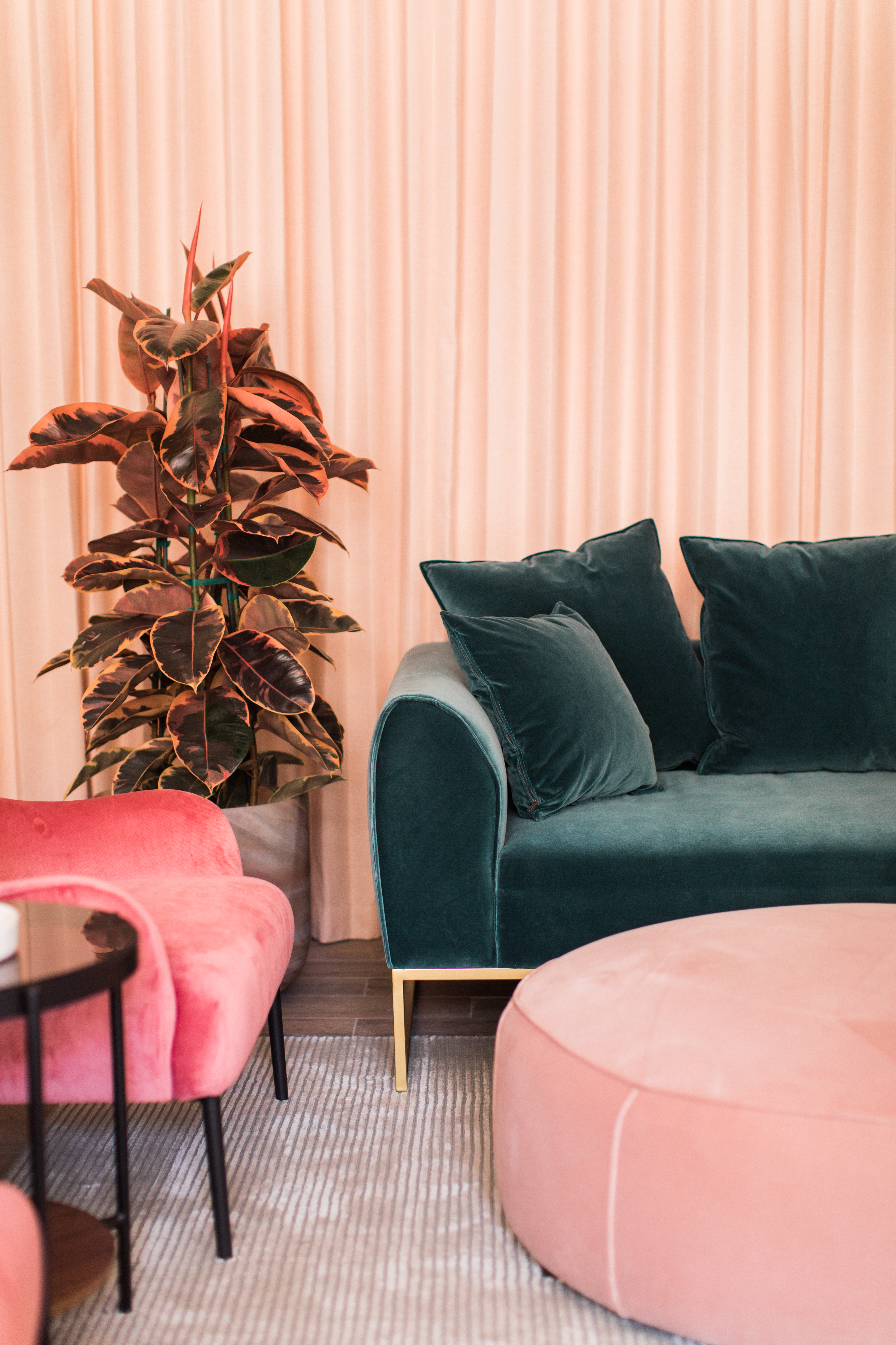
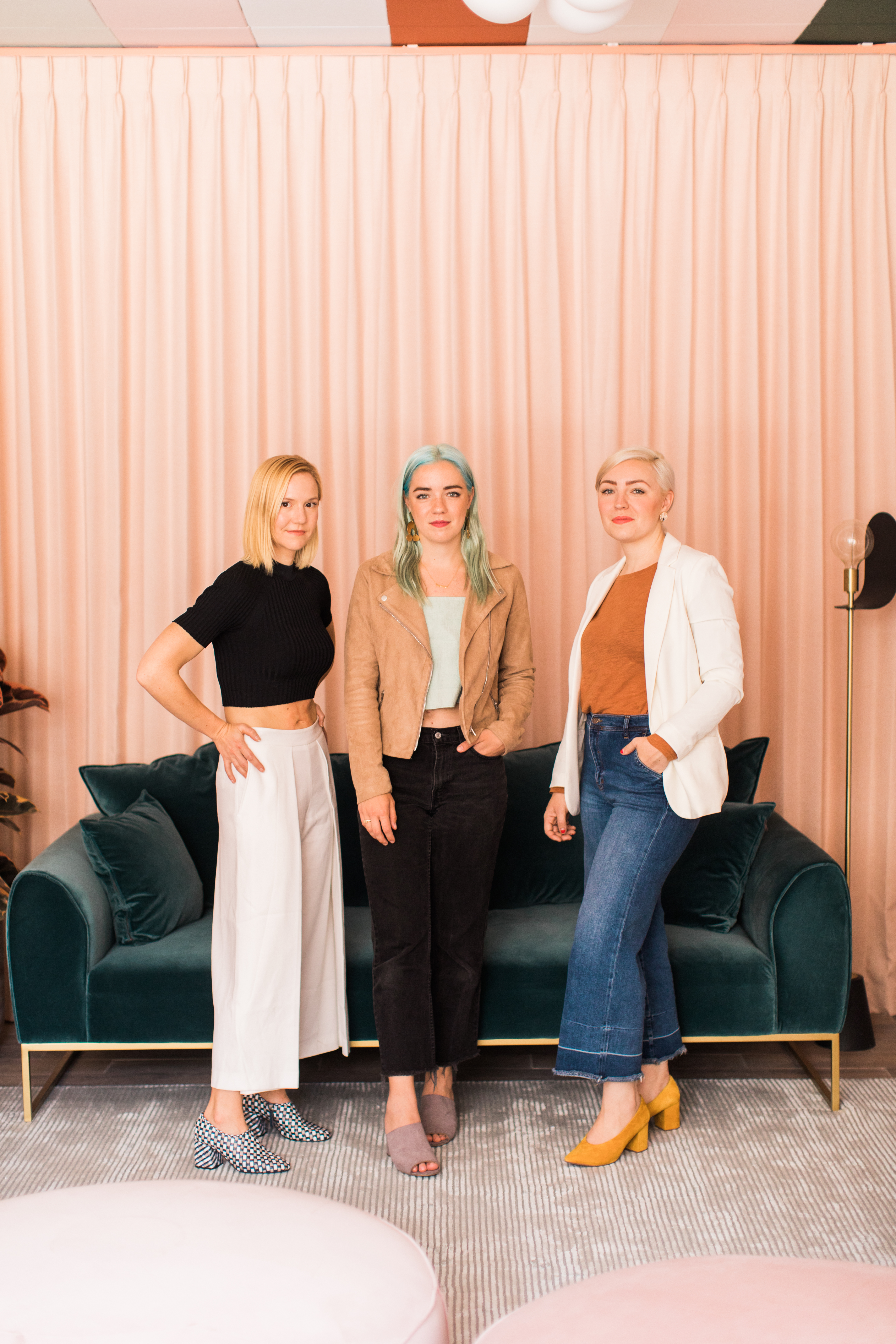
Once we’d dealt with the lackluster architecture, it was time for furniture! All the upholstered pieces in the space are from Article, a favorite site lately for design savvy and well made pieces that don’t break the bank. The goal was to create a luxe, inviting seating area that Margaret and Corey could retreat to when they needed a break from work, so we chose the Kits Pacific Blue Sofa, two Embrace Rose Pink Chairs with a Vitri Walnut Side Table between them, and a pair of Orbis Blush Pink Ottomans. Their low, deep profiles are just right for afternoon lounging! To bring a touch of life to this corner and the rest of the space, we tapped Danae of Folia Collective for her magical ways with all things plants. She found us a rubber tree whose pink leaves coordinate masterfully with the room!
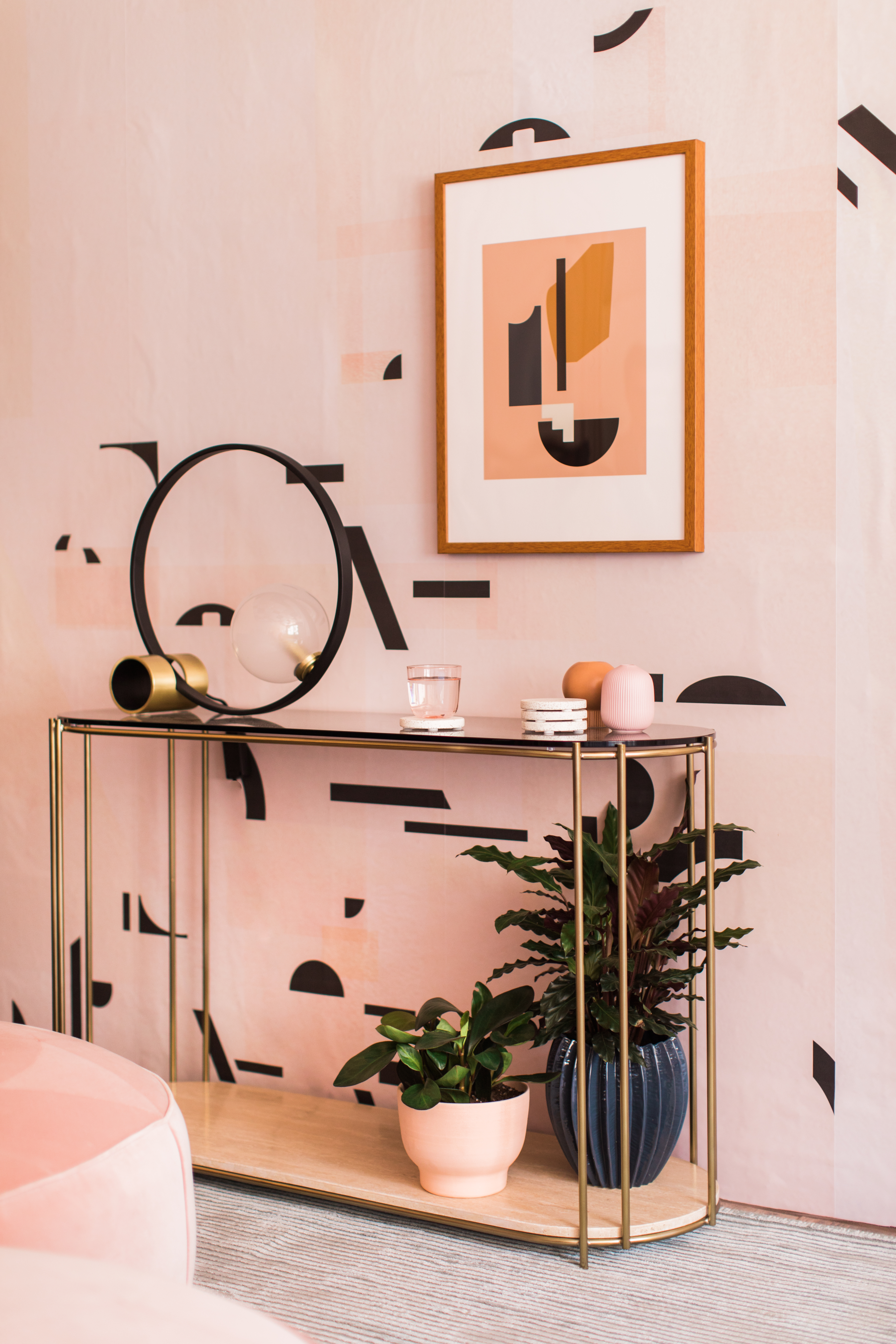
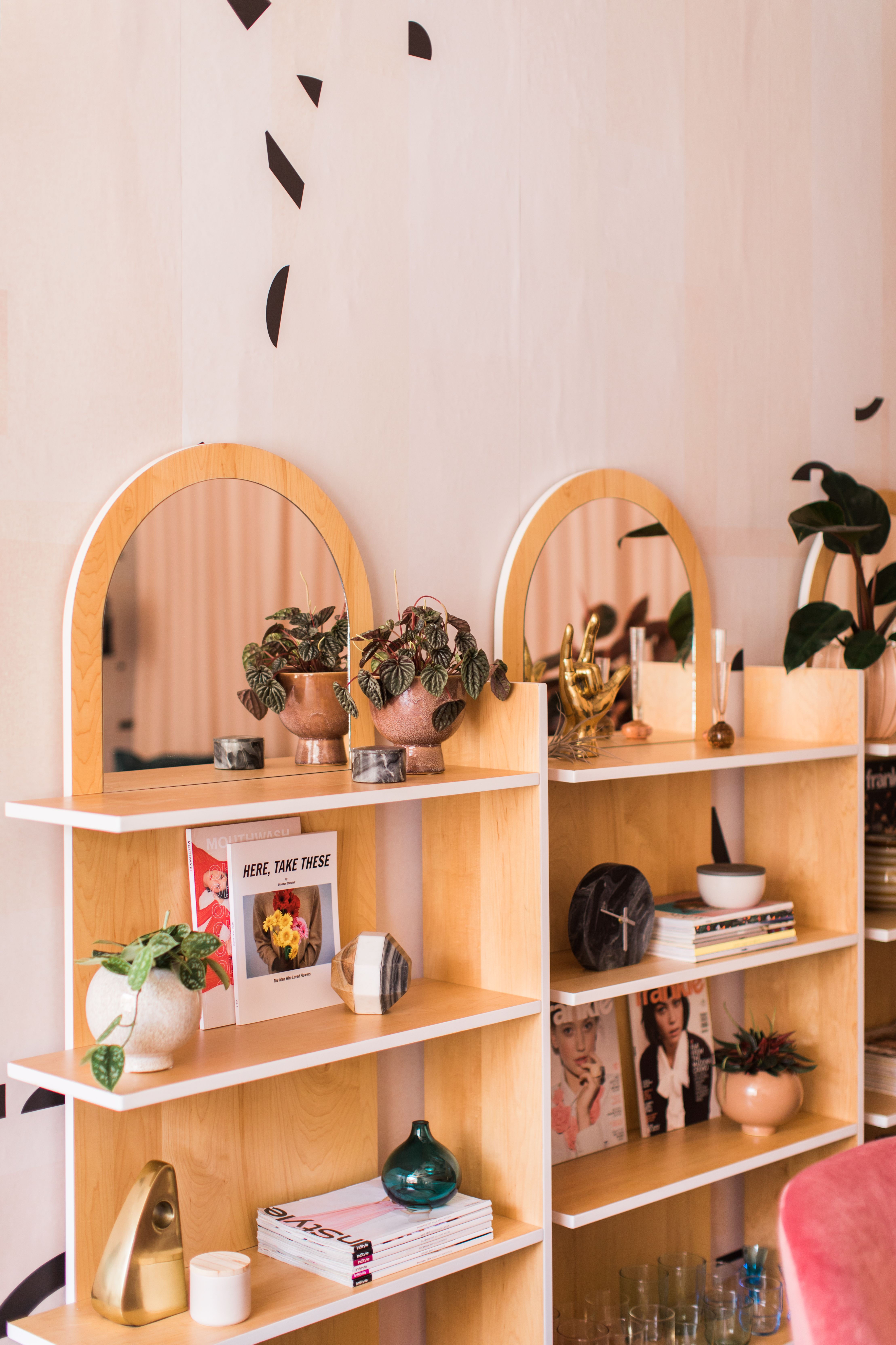
We wanted Margaret to have plenty of surface area for displaying treasures, so opposite the chairs we positioned the Messina Console from West Elm. Its delicate legs contrast so strikingly with the weighty smoked glass and veined marble that comprise its top and bottom! The artwork above the console is called Shape Study #1, from Society 6; and the lighting in this corner, as well as in the rest of the space, is all by Mitzi. They do a fabulous job offering unusually shaped lights that feel like sculptures, as evidenced by the Leah floor lamp, the Petra table lamp, the Zena console lamp, and all of the Estee ceiling fixtures! Behind the chairs, a trio of natural wood shelves from Urban Outfitters provide a welcome contrast to all the color in the room; I intentionally styled them a bit sparsely so that they didn’t look too crowded. A trip to Target, yielded most of the small decor, including the terrazzo coasters, ceramic candle, brass bookend, terrazzo tray, marble clock, and terrazzo + wood sculpture.
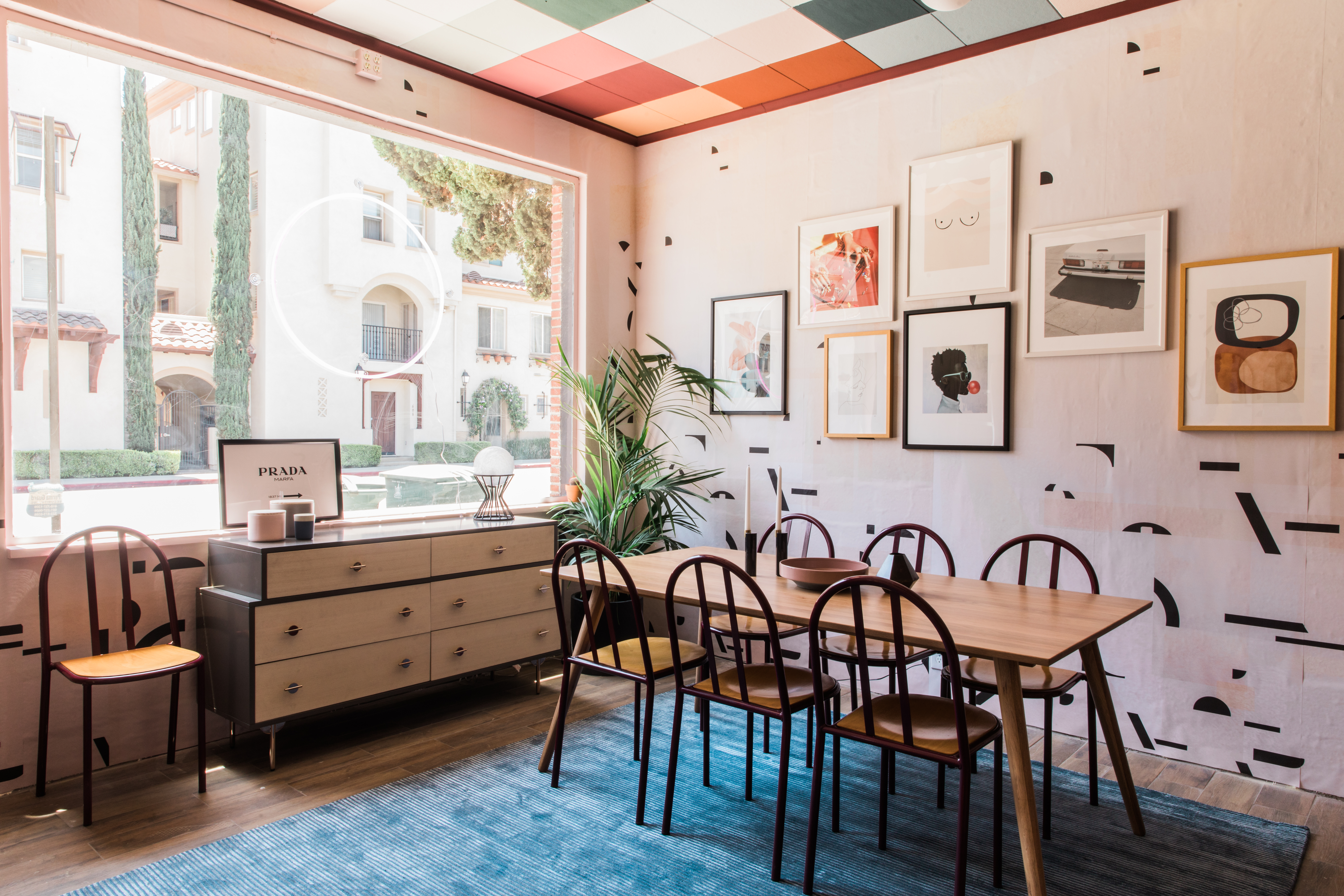
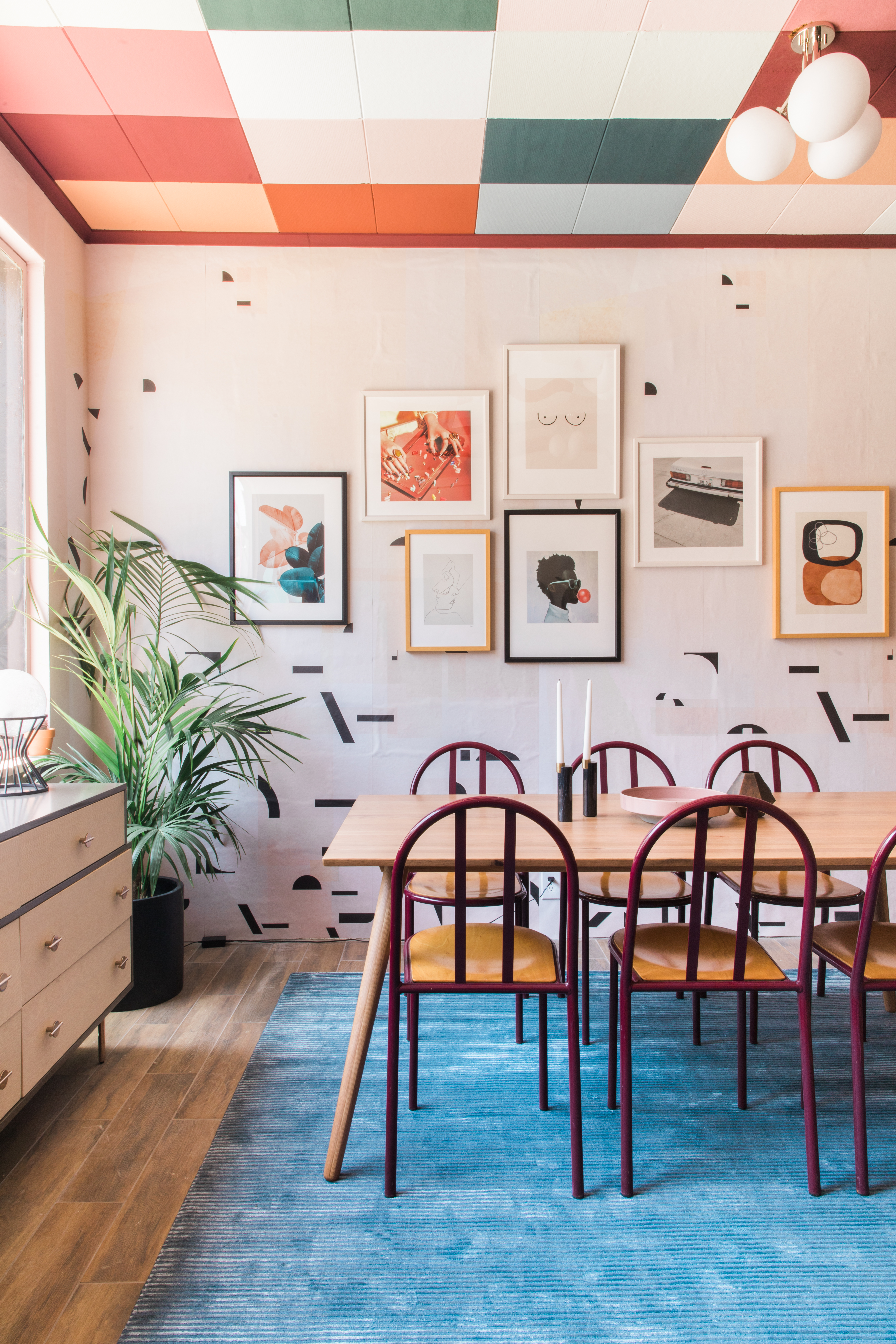
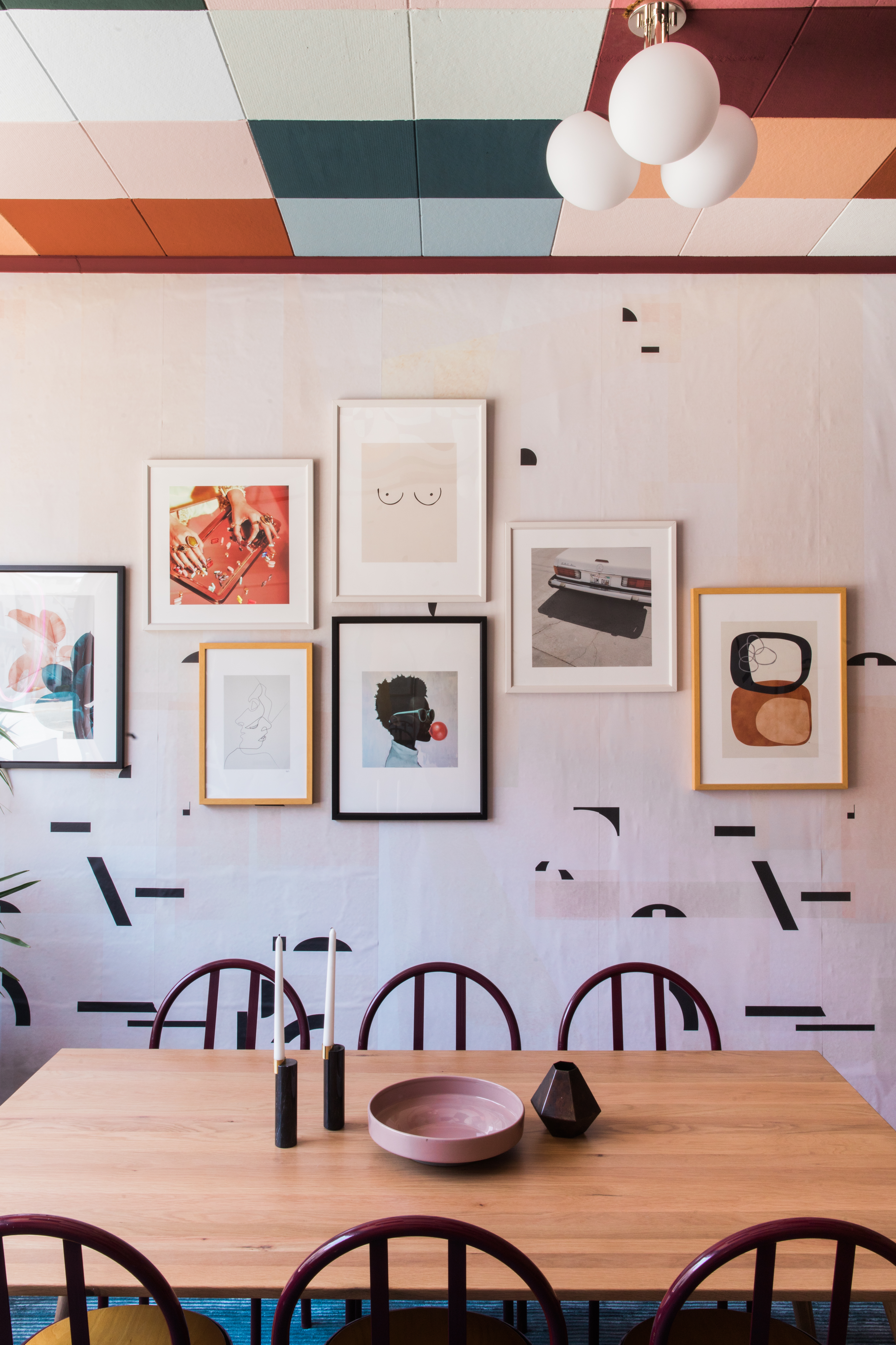
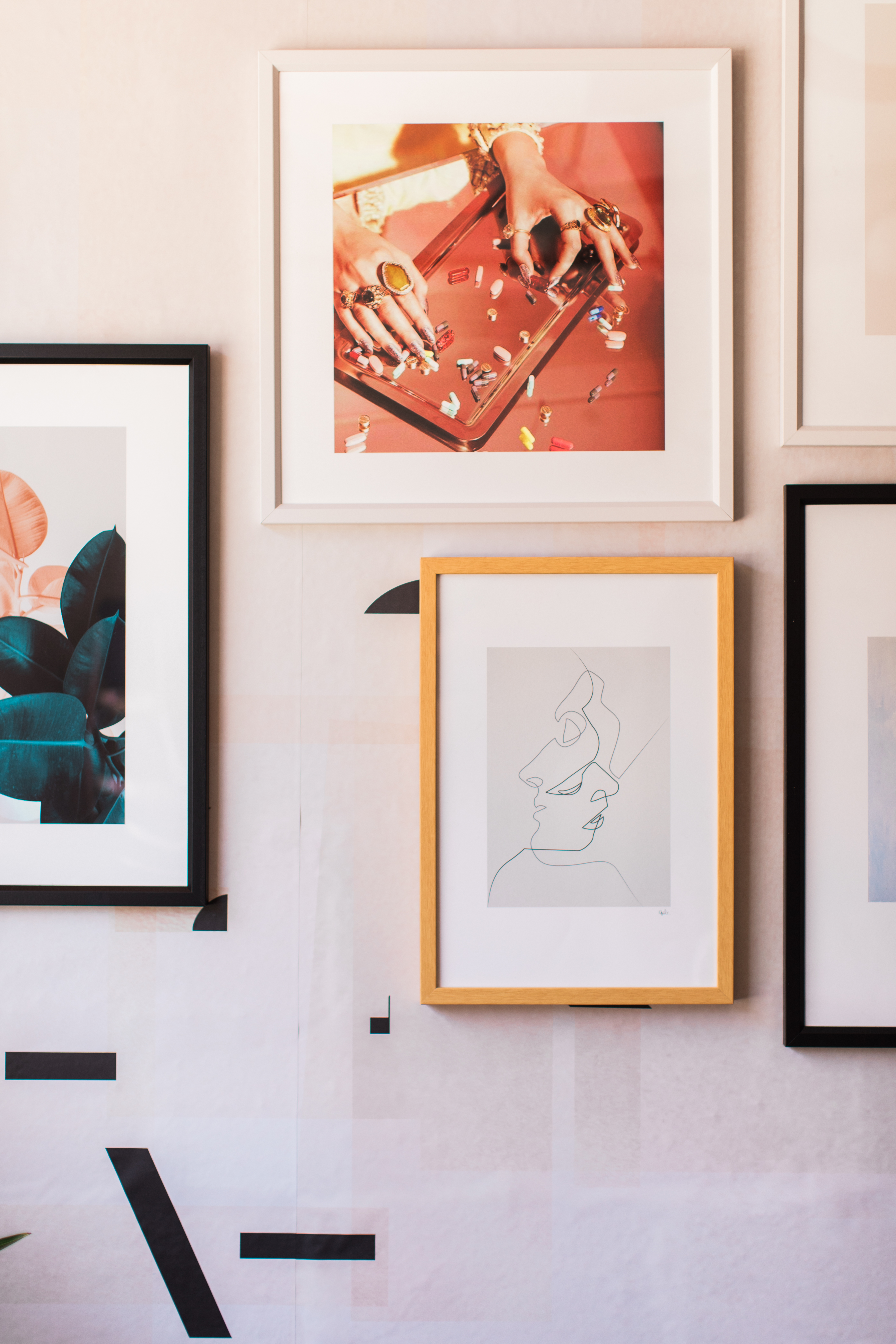
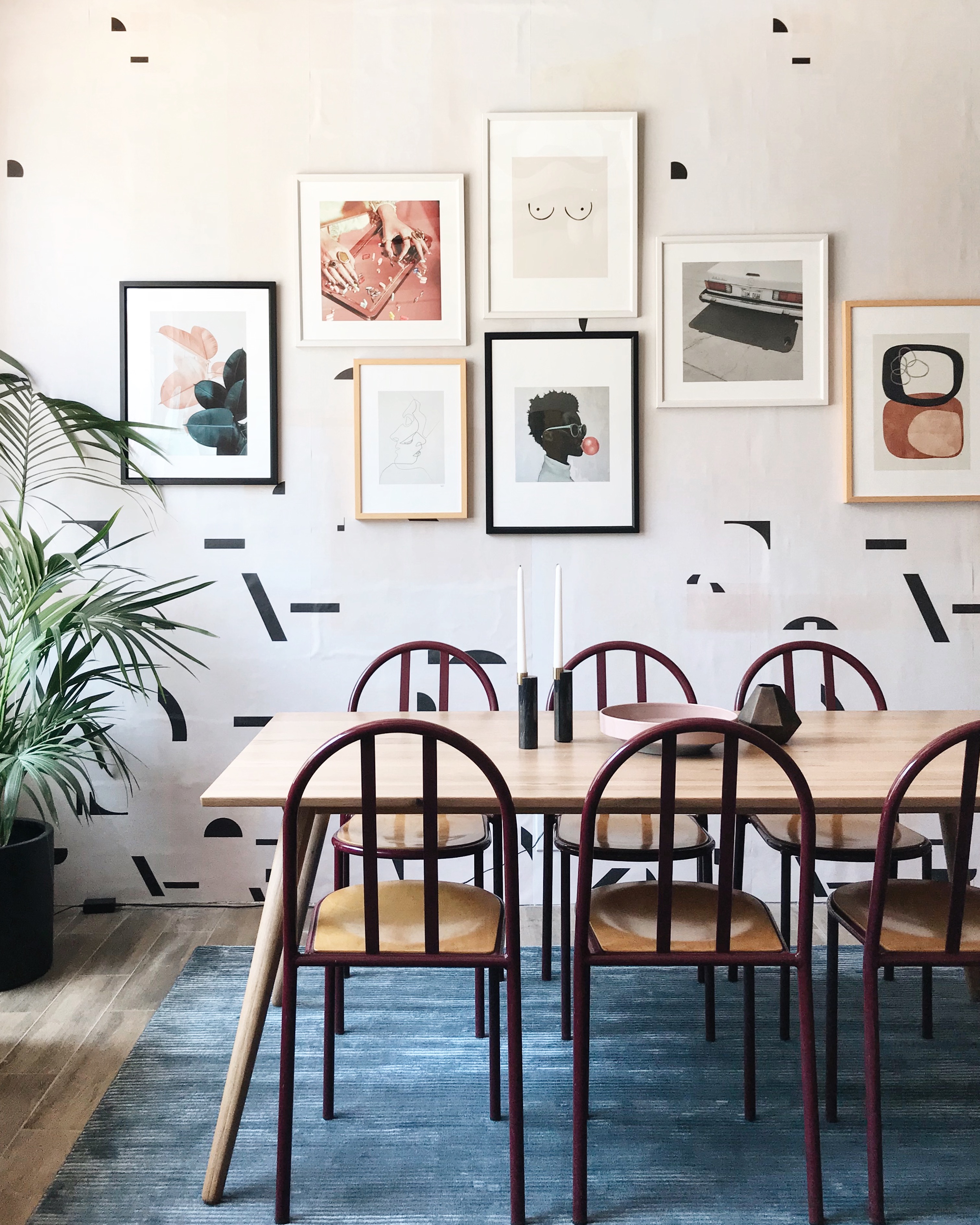
Okay, now onto the workspace! We opted for a single large table over desks, so that Margaret & Corey can use the studio for group brainstorming sessions—as well as after-hours dinner parties! The Seno Oak Dining Table from Article coordinates nicely with the shelves at the back of the room, especially when paired with the curved shape of six vintage metal Thonet chairs from Amsterdam Modern (are you starting to notice our repeating motif of arched silhouettes?!) Overlooking the table is a gallery wall consisting entirely of art from Society6, with each piece echoing the same playful, irreverent spirit of the project as a whole. They artworks are, from left to right: Blush and Blue Leaves, Weekend by Wanker & Wanker, Close by Quite, Boobs, How Far Is a Light Year, Um Duh by Almost Makes Perfect, and Equinox by Tracie Andrews.)
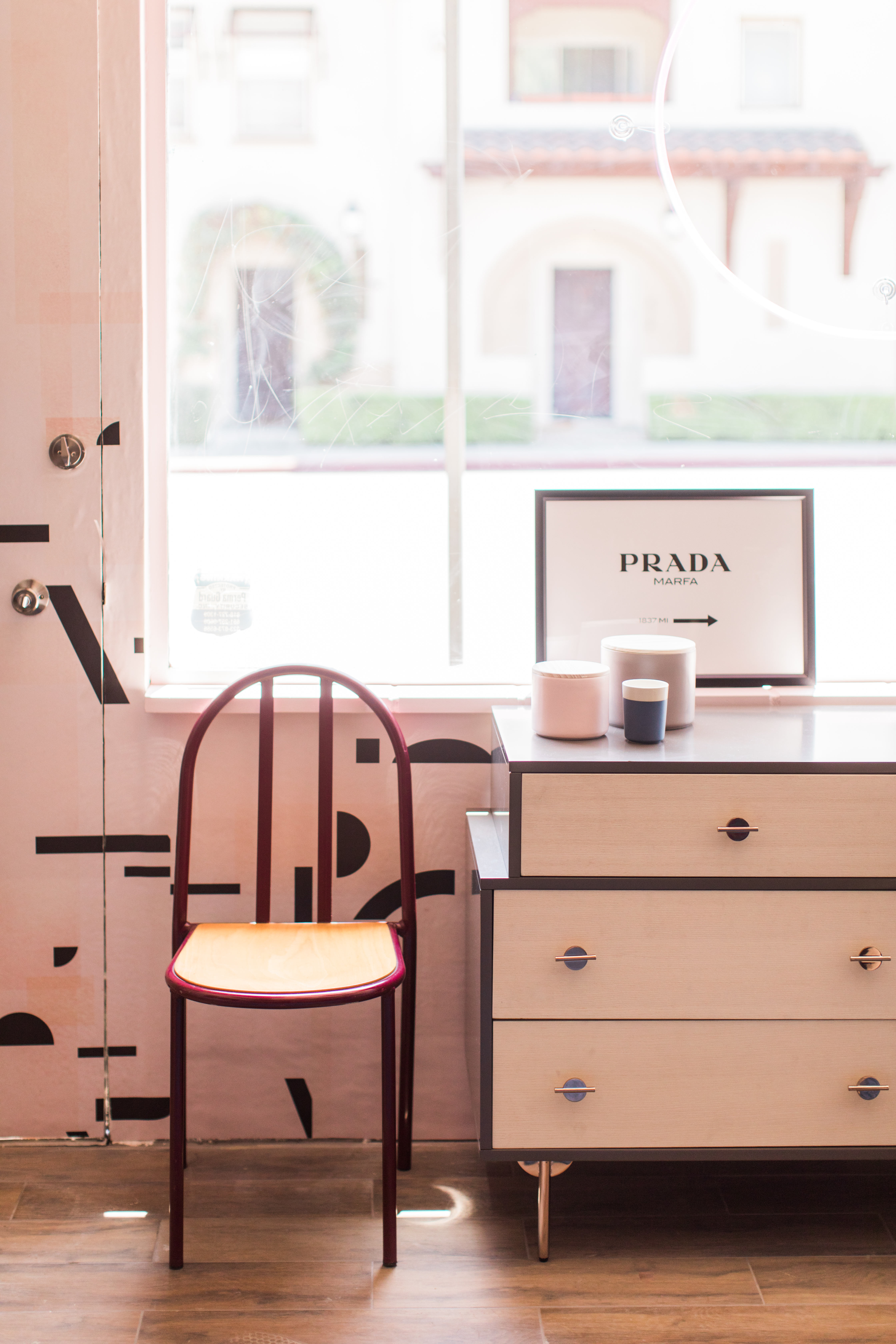
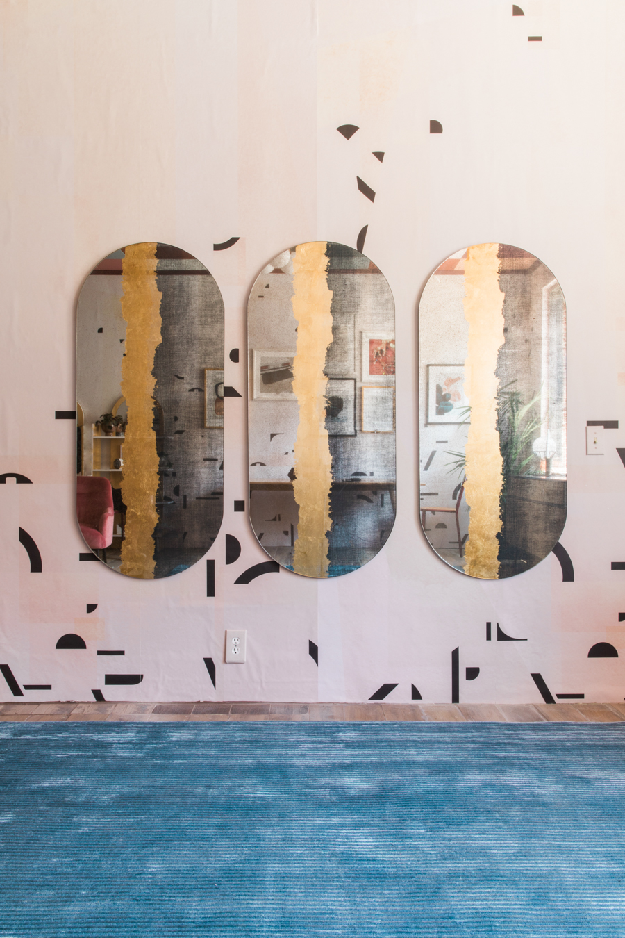
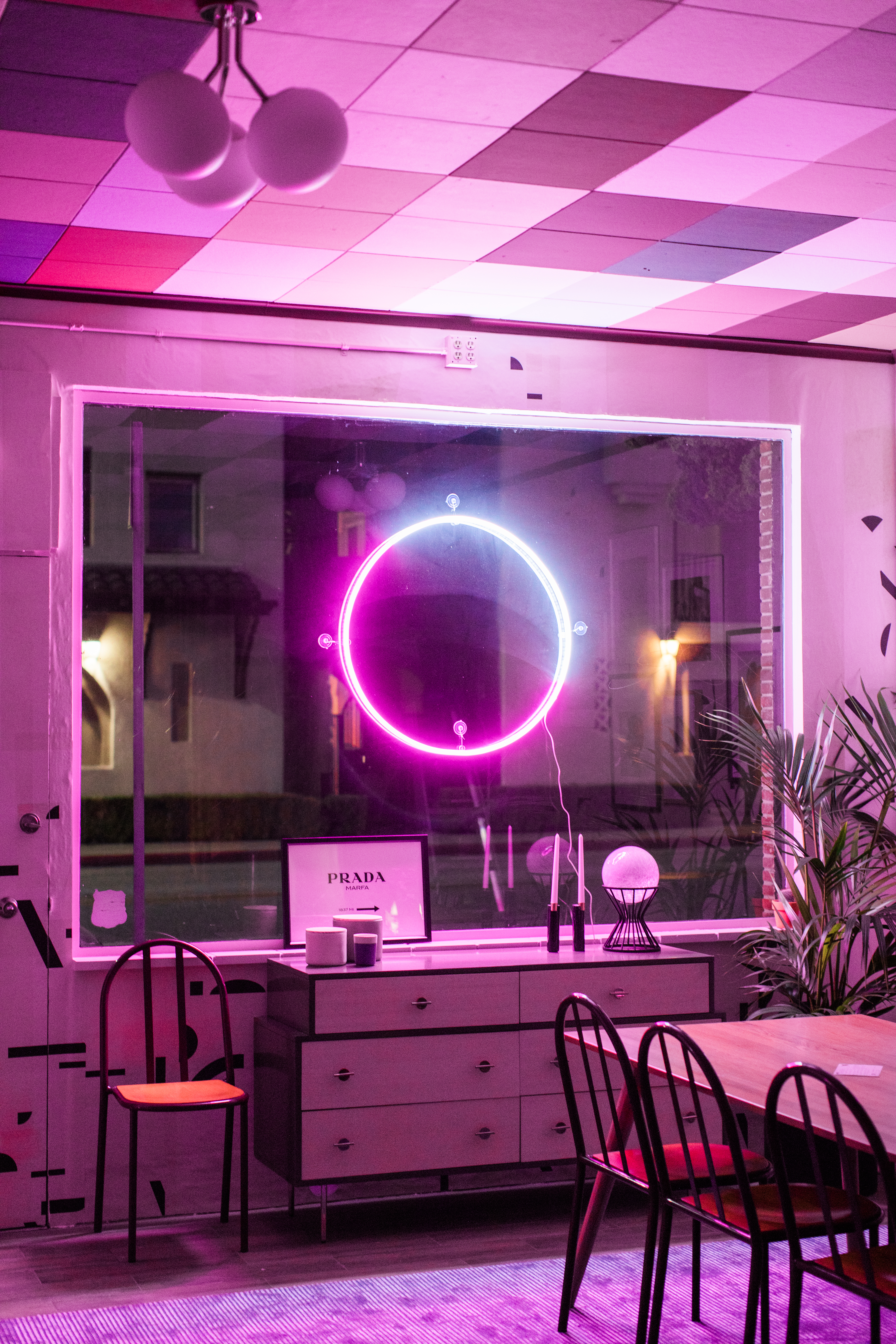
Finally, a few finishing touches took the studio from extra to EXTRA extra. To give Margaret and Corey a bit of storage for office supplies, we placed the Greta 6-Drawer Dresser from West Elm beneath the window. It has an Art Deco vibe that I’m really into lately, thanks to its stepped construction and round, rose gold handles. Across from the table, 3 Sparkler Wall Mirrors from West Elm open up the space (and mimic the row of three shelves kitty corner to them). A Prada Marfa Sign print provides a cheeky typographical touch. And last but not least, we designed a custom neon sign with the folks at Brite Lite Tribe to give those after-hours gatherings I mentioned some extra panache!
A truly complete reveal of this space wouldn’t be complete without a shoutout to my BFF in work and life, Caroline. She had the seed of the idea for this project in the first place, and her commitment to communication and timelines kept us going strong ’til the end! She’s the ultimate driving-force yin to my dreamy-vision yen. I’m so grateful to call both these ladies my collaborators and friends…and I’m so excited to say that this project is really just the first of many. So stay tuned!
Images: Echo + Earl. Video: Margaret & Corey.