Remember when I told you I’ve got a zillion interior design projects on my plate? I wasn’t kidding! Here’s another one in the works, also for Kim of Eat, Sleep, Wear. Kim is due with her first child (a boy!) on August 29, and we’re slipping in just under the wire with a sophisticated nursery that reflects her love of layered neutrals and beachy textures. I’d never designed a space for a baby before undertaking this space, and it’s been fun exploring outside my usual realm of expertise!

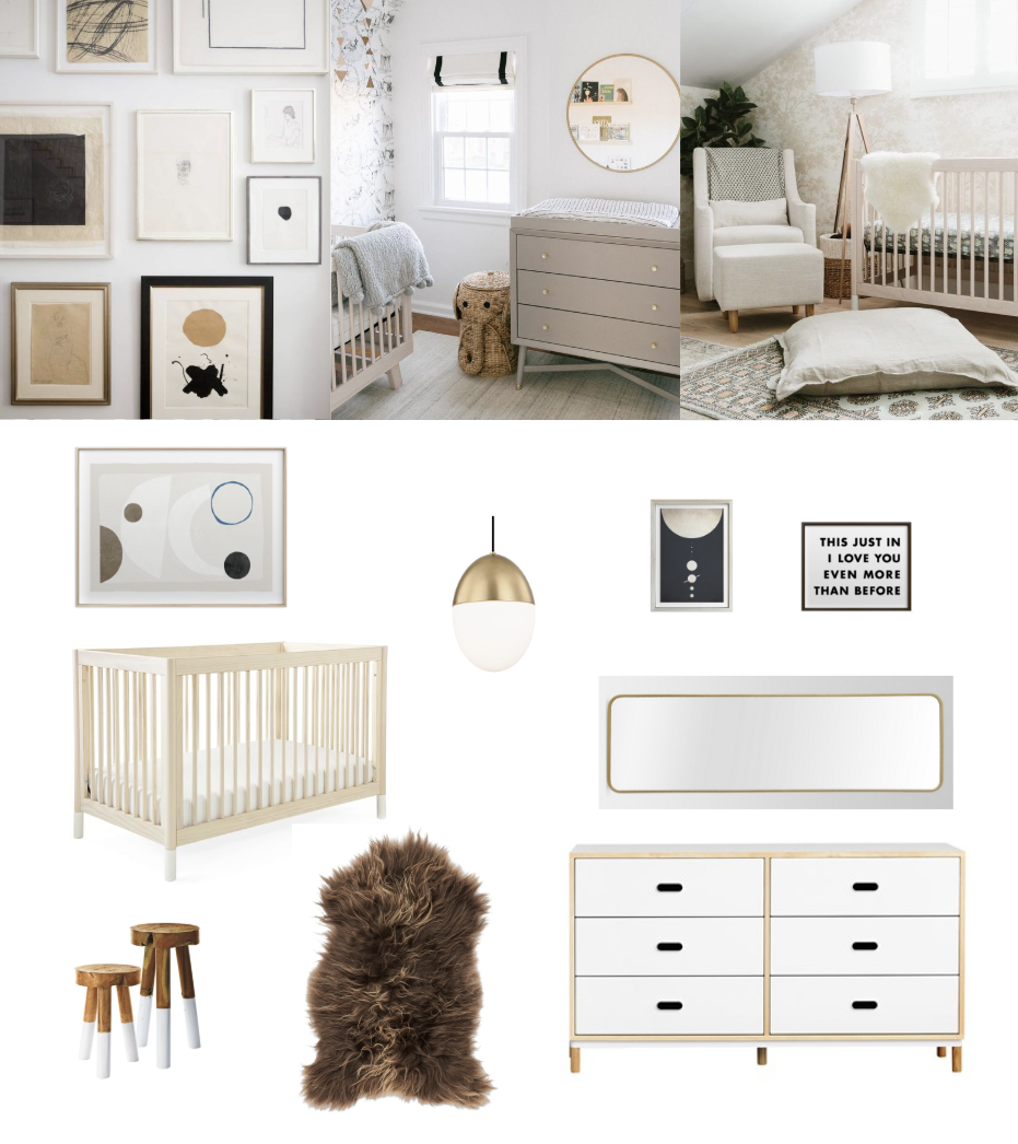
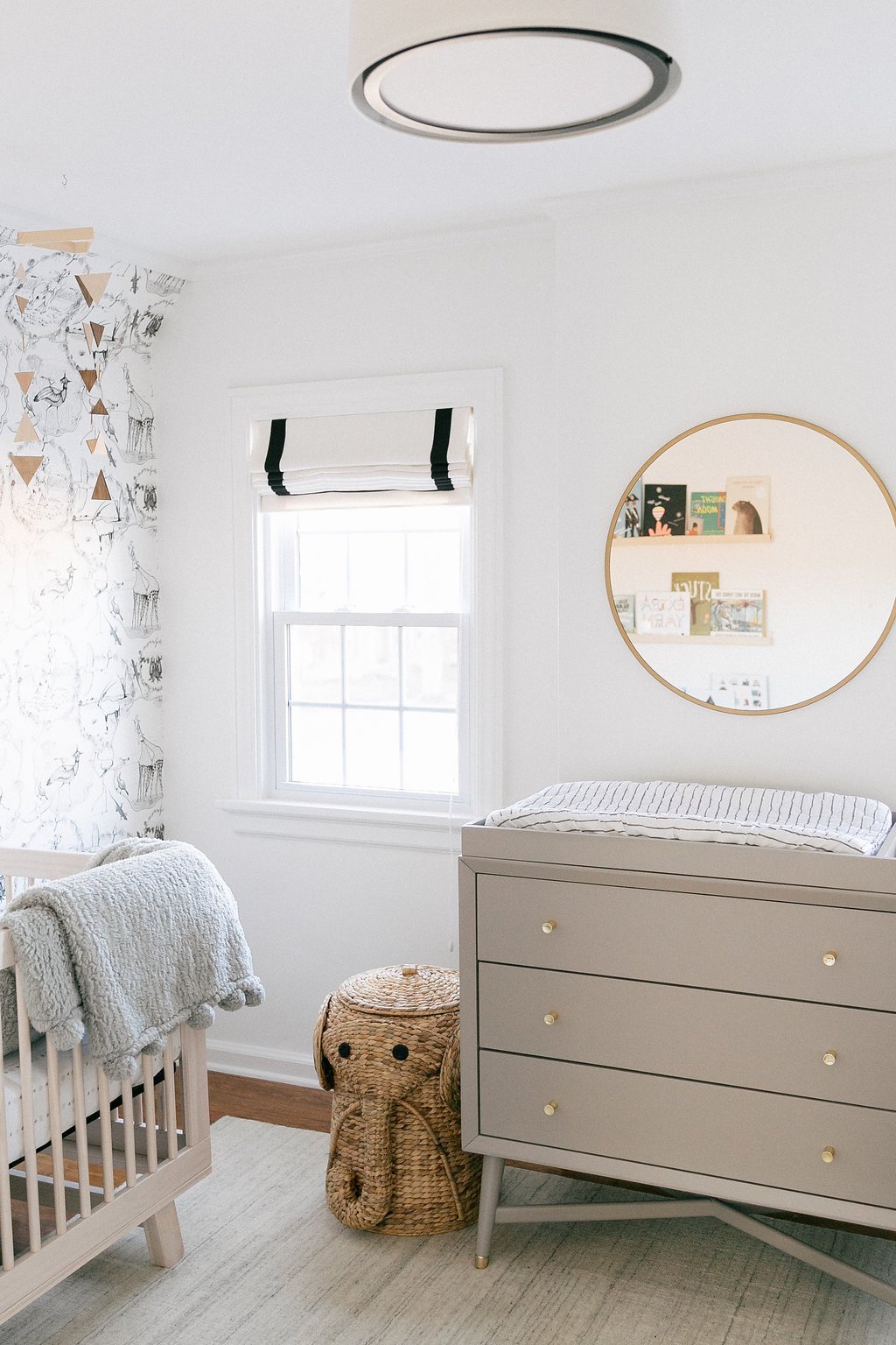
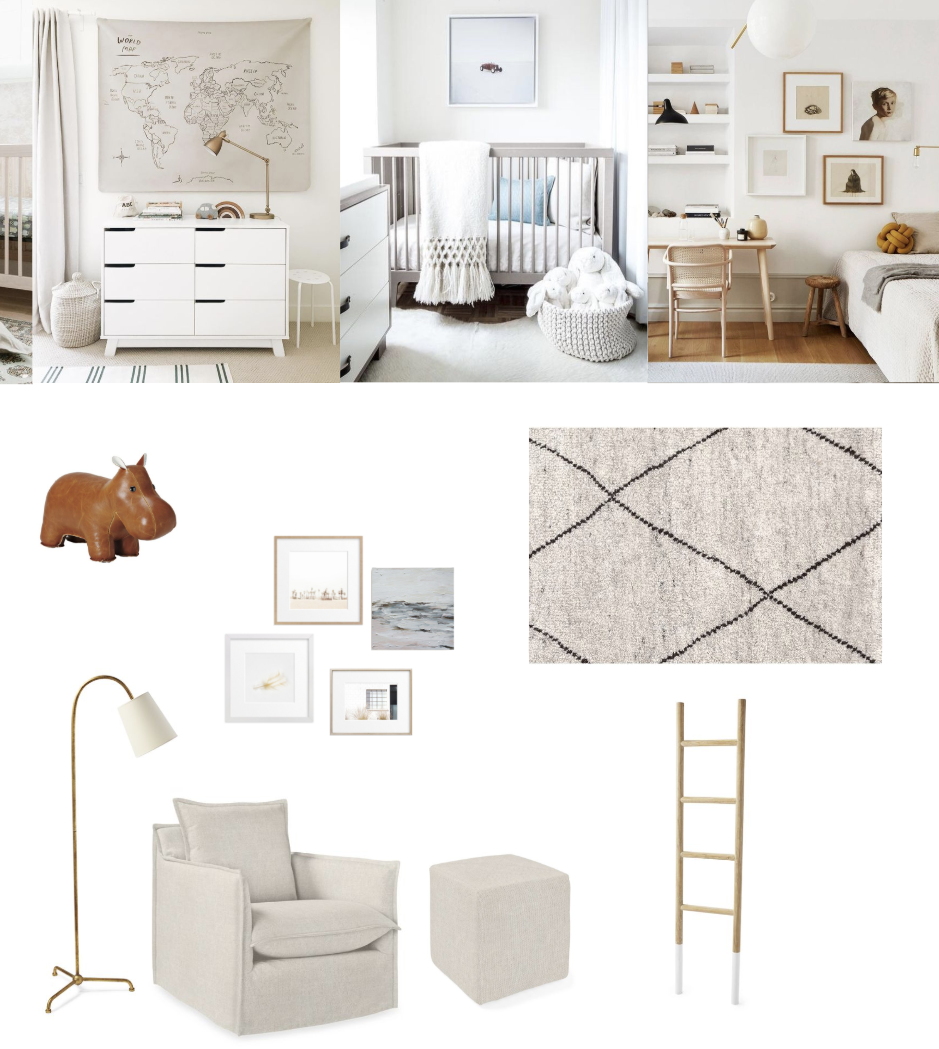
I started by pulling as much design-forward neutral nursery inspiration as I could find, and I gotta say, it’s slim pickings out there! Our goal was to create a room that was stylistically elevated, just like the rest of Kim’s home. But much of the world of nursery design is either very boho (think teepees and macrame wall hangings) or cutesy (I love a good framed animal photo as much as the next person, but does every crib vignette really need one?). So I did what I do with every project: focus on a dynamic mix of materials, clean and harmonious shapes, and carefully considered extras. I’m super pleased with how it’s coming together!
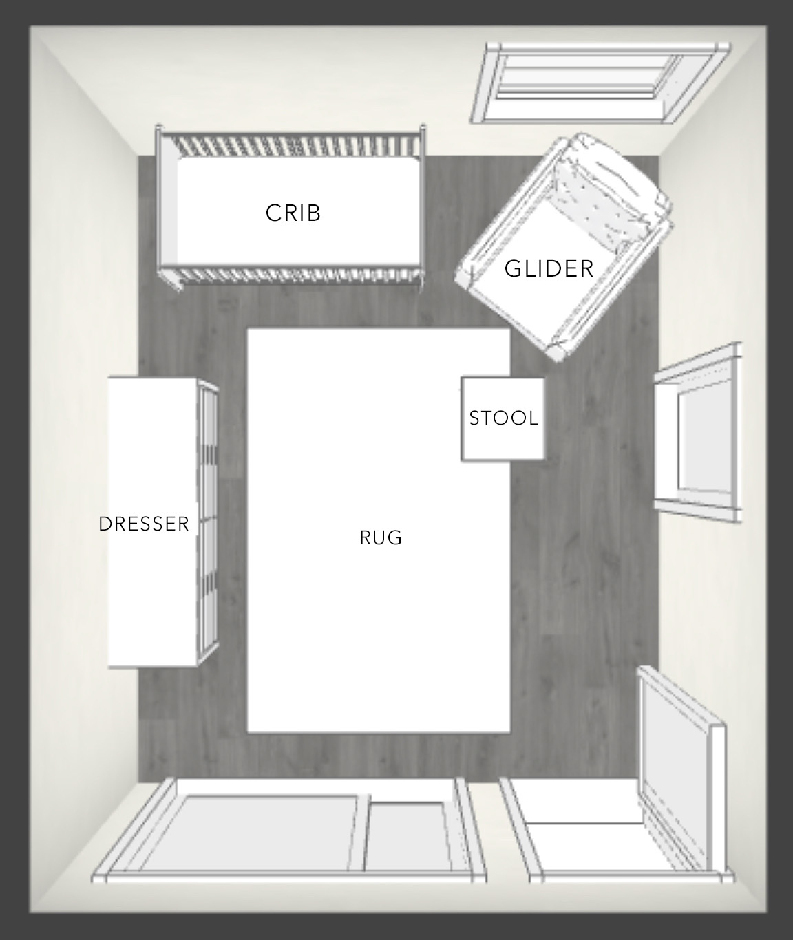
There’s definitely a bit of a Scandinavian influence here, since I’m loving blonde wood furniture lately and that crib and dresser really fit the bill. I made sure to include touches of brass since Kim has a soft spot for warm metals. And there are plenty of inviting textiles like a nubby linen glider and a wool tufted rug. My favorite part was curating the art selection, but more on that later. We’re just waiting on a few final pieces to arrive before we can shoot, but with the floor plan below you can get a pretty solid idea of how great it’s going to look!


