One of my favorite categories of interior design is restaurant design. Not only do the functional aspects of the space have to be spot on, but designers tend to take more risks, pushing the envelope to make a serious visual statement. Especially in the age of Instagram, a striking restaurant design has become a marketing must. Get your guests sharing photos of your space organically, and the hoards will come running!
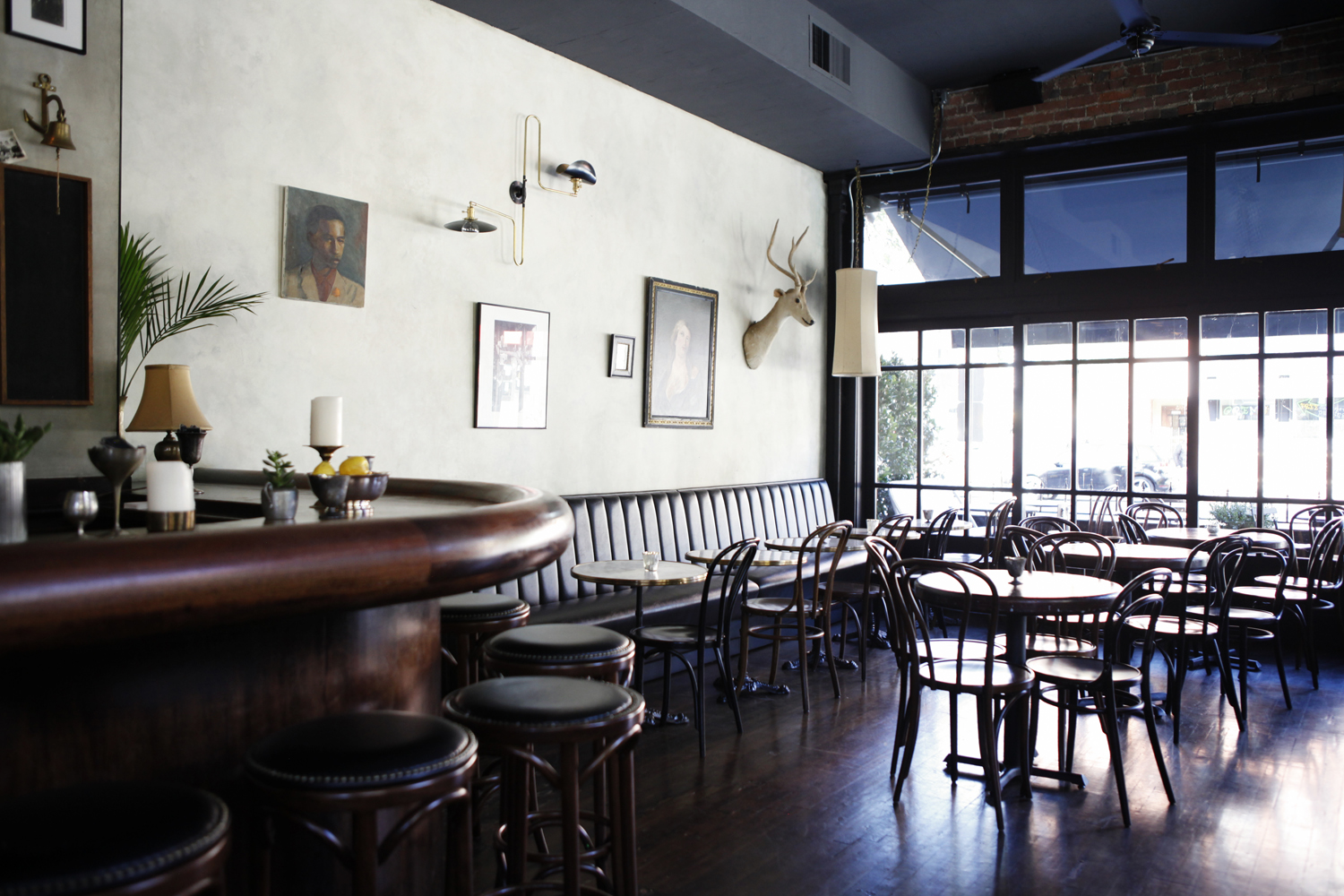
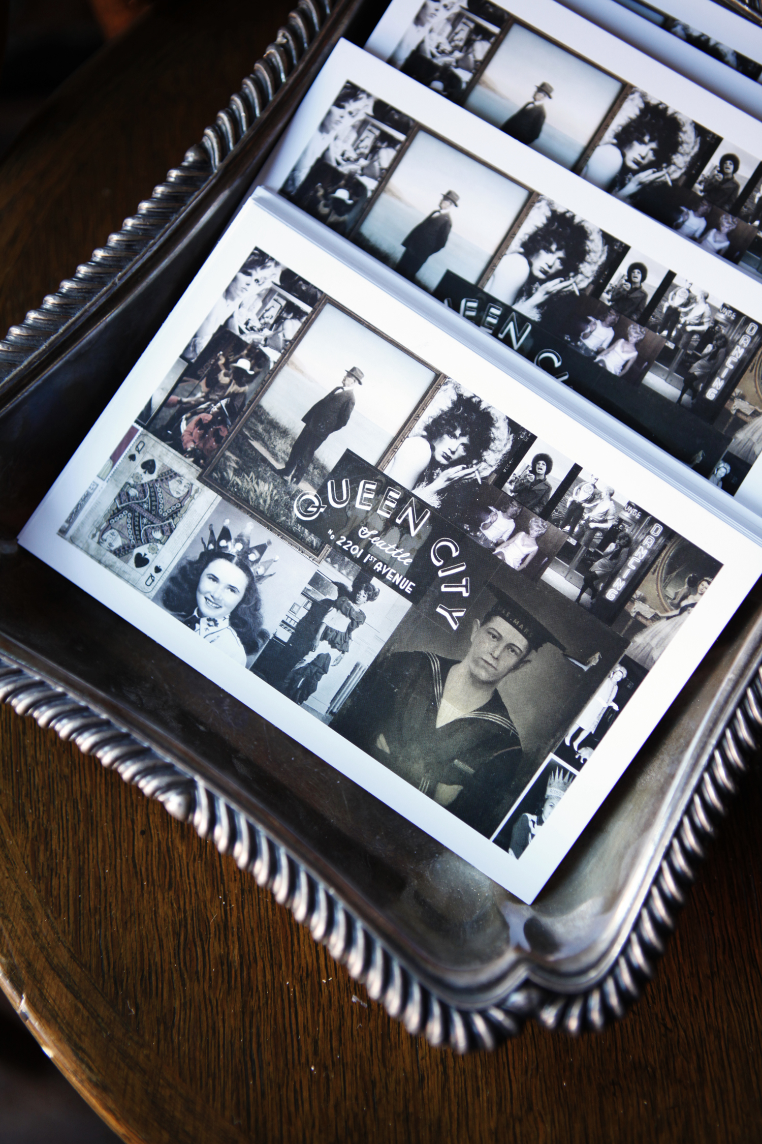
And the hoards will definitely be running to Queen City, a just-opened Seattle restaurant located in a building that’s been a tavern since the 1890’s! It’s full of vintage decor inspiration in a monochromatic palette for a thoroughly modern feel. Queen City is the latest hospitality project from Linda Derschang, who’s launched 12 Seattle properties since opening the now-iconic Linda’s Tavern in 1994. As with all her previous restaurants, Linda did the design of Queen City herself, paying homage to the building’s history while also giving it a much-needed refresh that’s at once stylish and soulful.
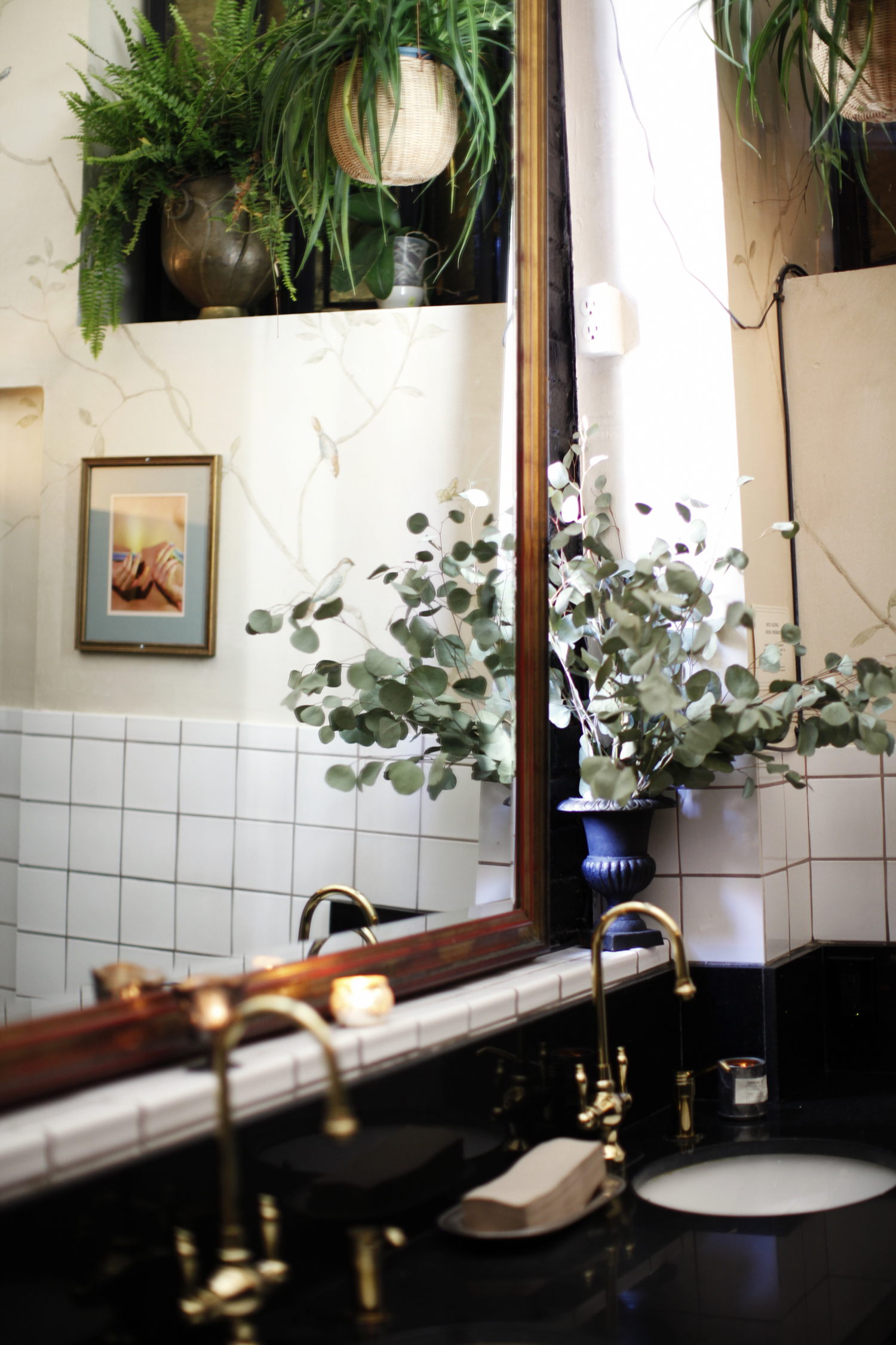
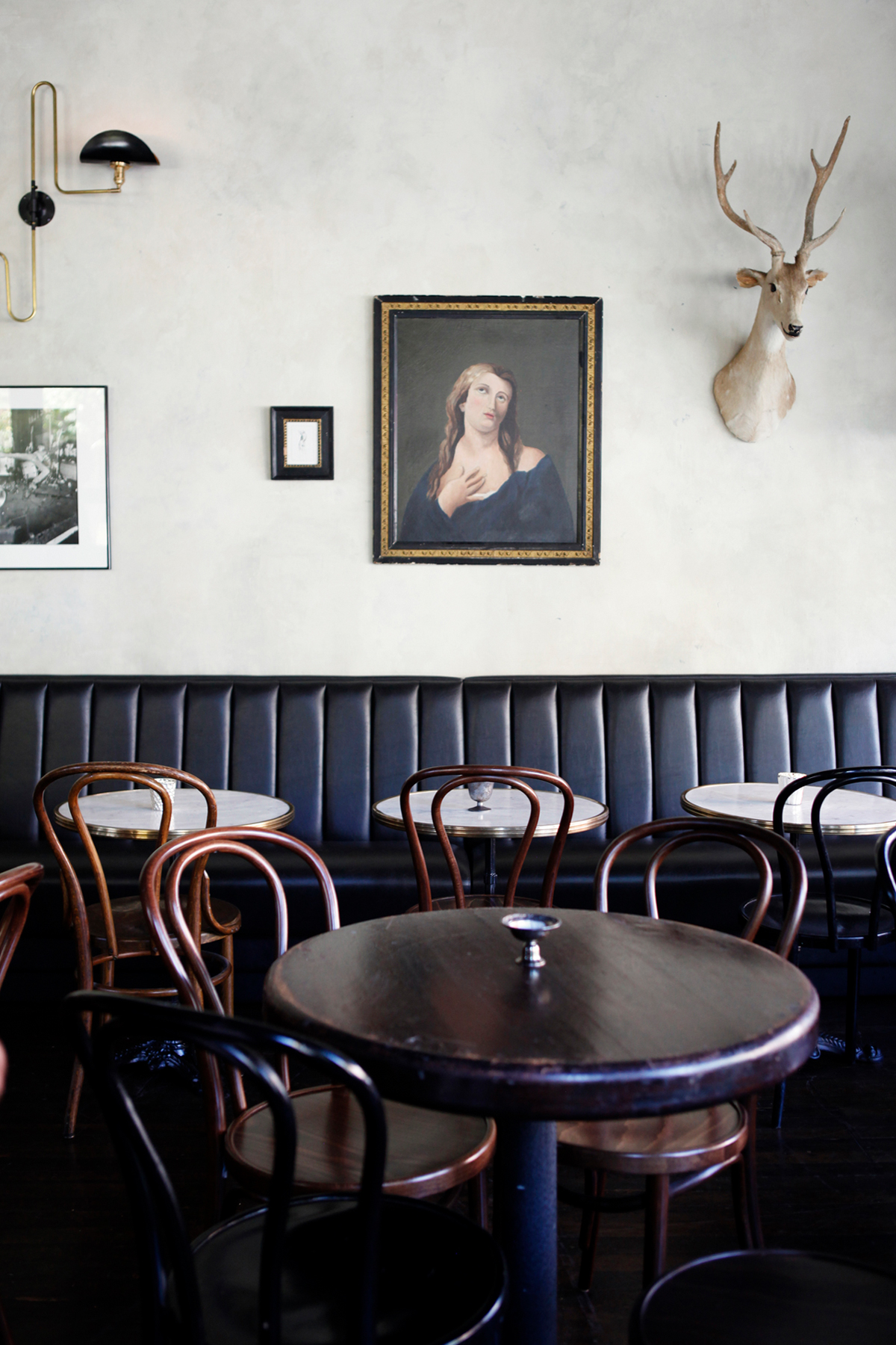
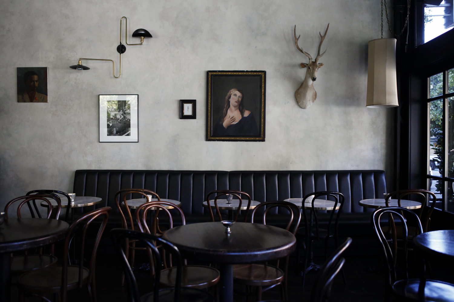
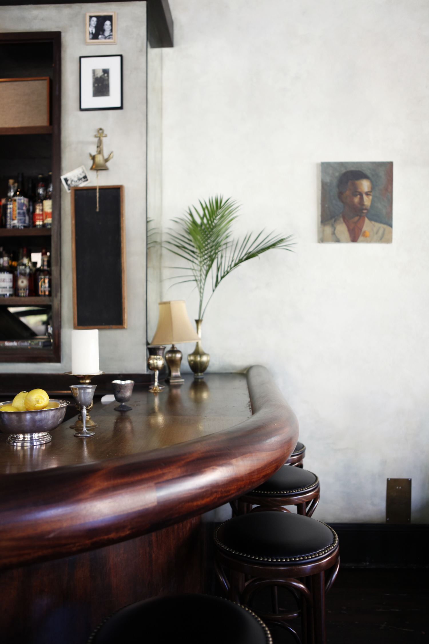
Linda preserved existing elements like 12 wooden booths and the original bar, and also uncovered some of the building’s original fixtures too. Era-appropriate bentwood chairs combine with a long channel tufted leather bench to further enhance the Belle Epoque vibe, while the eclectic mix of paintings and photography injects an irreverent touch. A sinuous wall sconce by French lighting company WO & WÉ has a sexy, sculptural presence amongst the framed artwork. Finally, the limewash wall finish bounces light from the abundant windows for a lustrous glow throughout the restaurant—one that’s enhanced by the highly polished wood surfaces throughout. This is a space that will feel cheerful and welcoming by day, chic and intimate by night—and infinitely Instagrammable at any time of day!
Images courtesy of Queen City.
