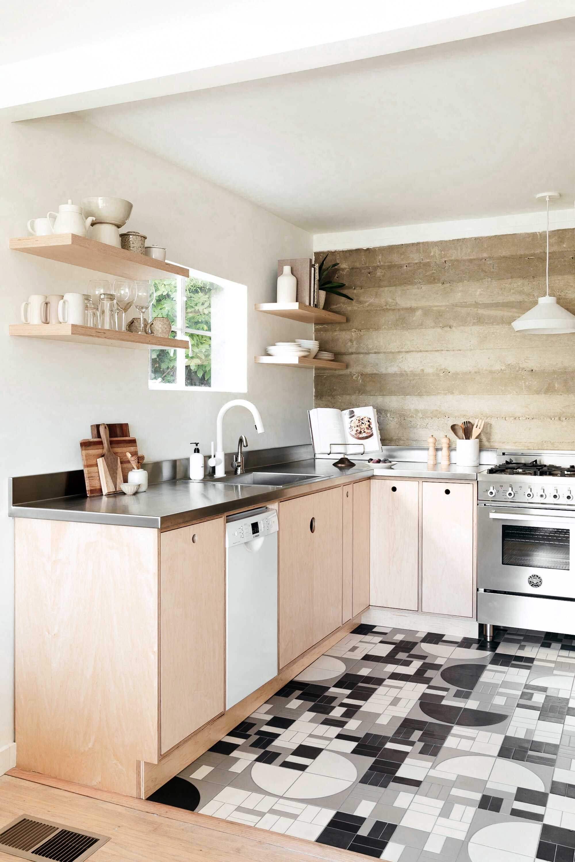
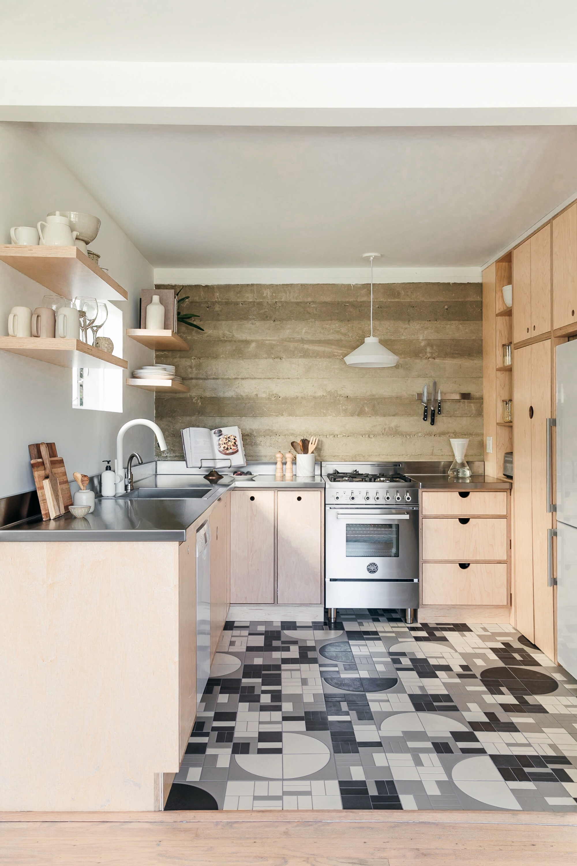
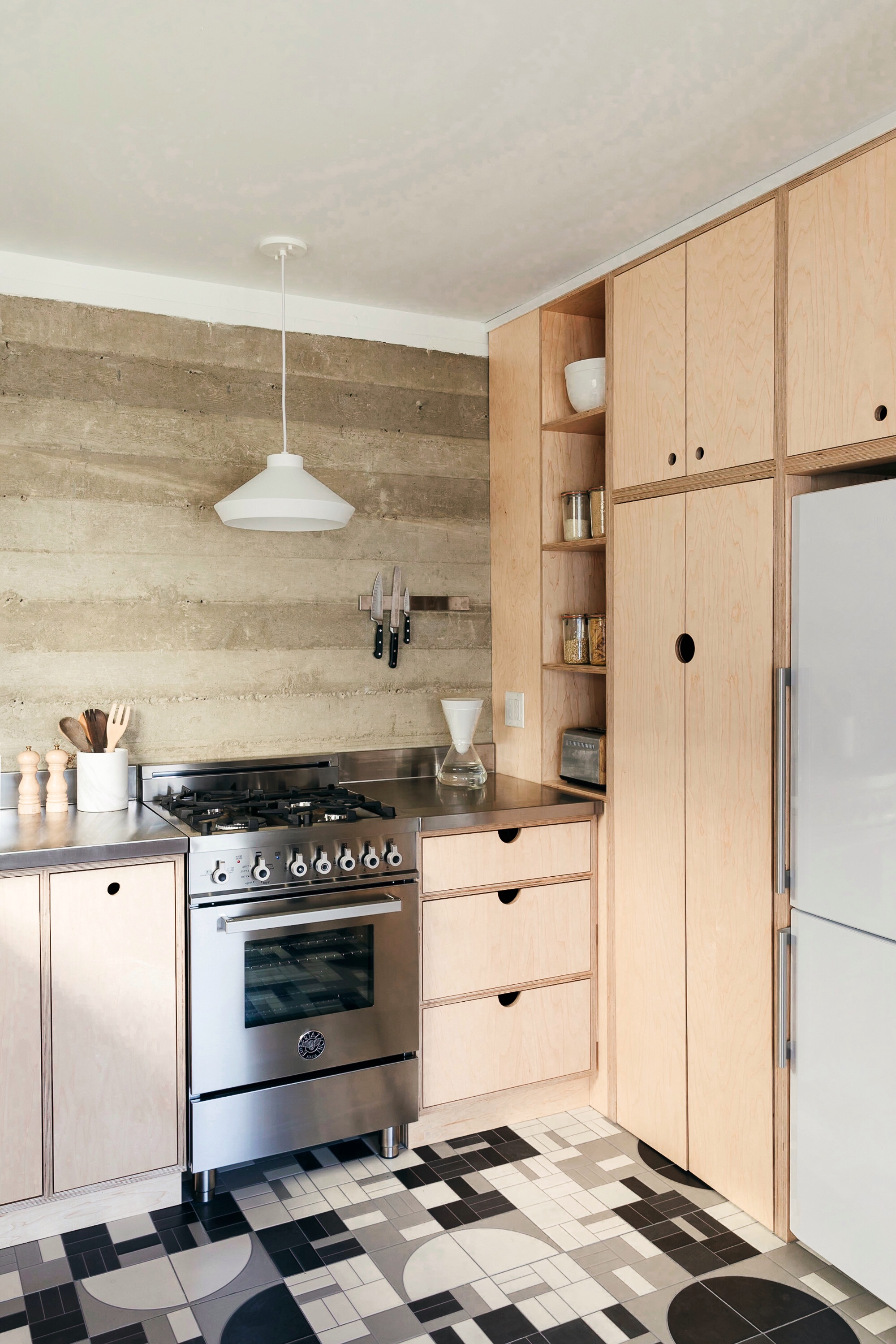
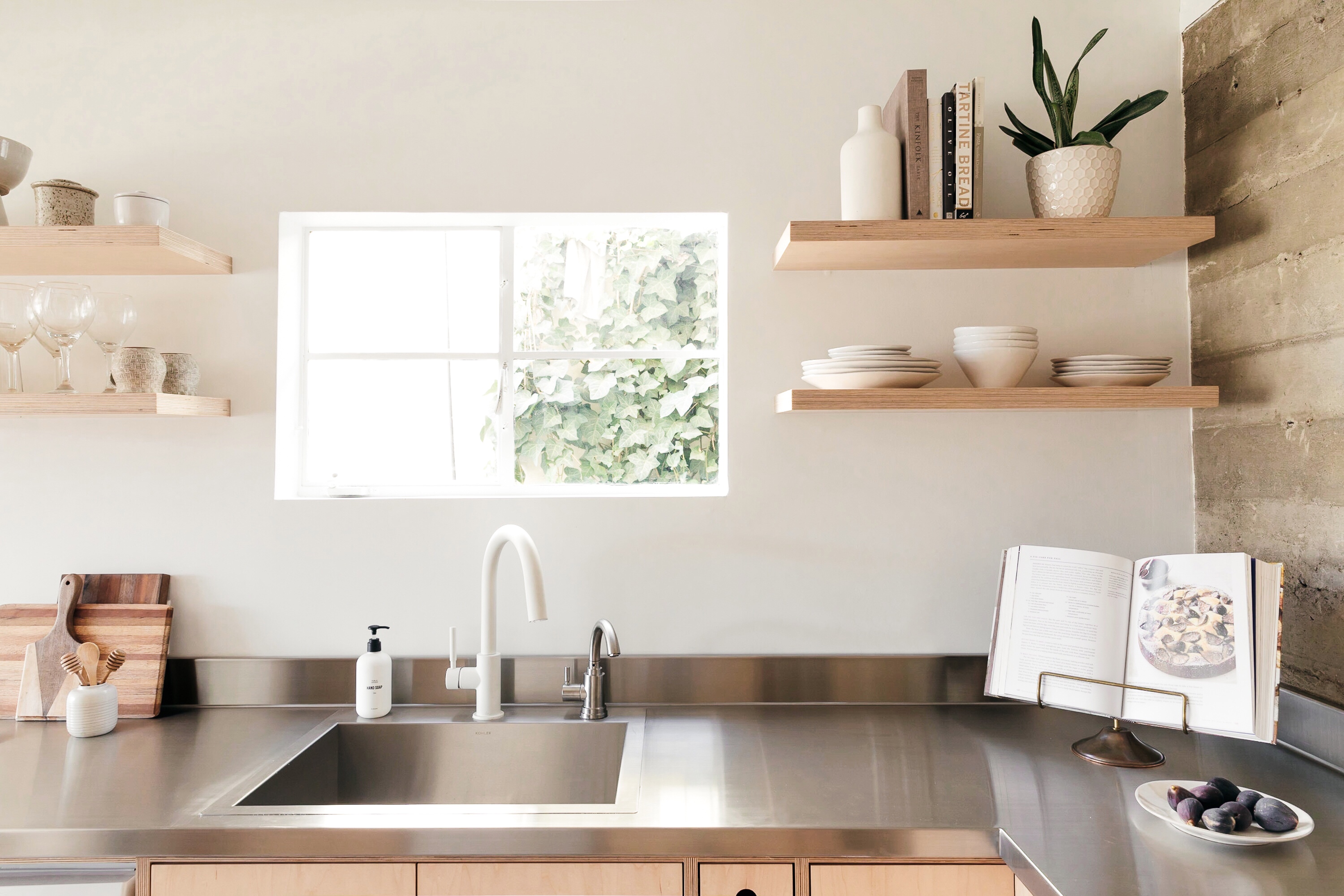
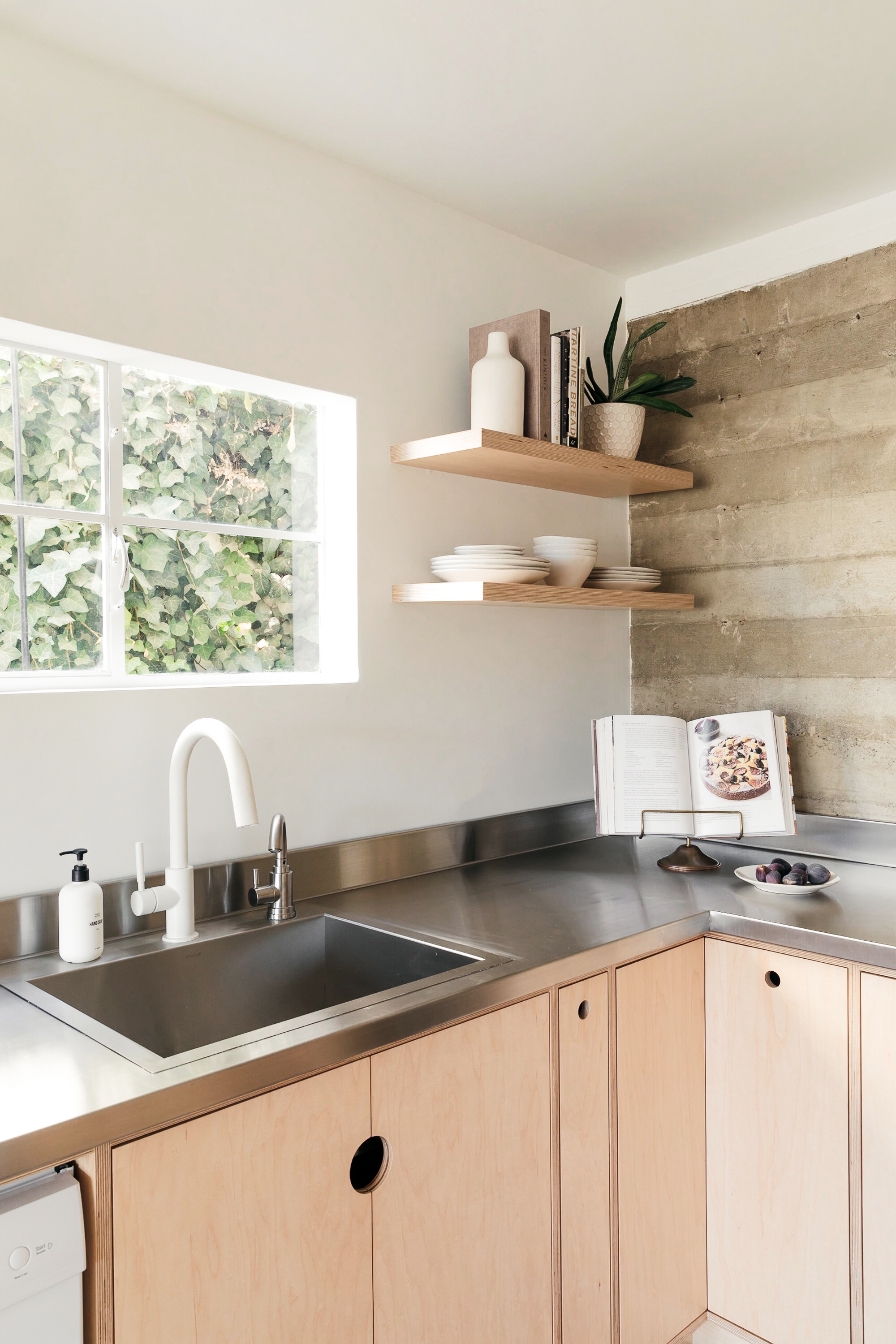
Remember a few months back when I shared the inspiration for a space saving kitchen design that my good friends Taylor + Taylor were implementing in their new house? Well, I’m so excited to be posting the final result here at last, because gosh darn is it goooooood! This petite, utilitarian kitchen came together so beautifully with a little help from Build.com, and it really puts to rest the idea that you need a ton of space to have a ton of style. In reality, the opposite couldn’t be more true! You don’t need a huge footprint to make a fabulous and functional design statement; you just need ingenuity, creativity, and a willingness to take a few risks!
Jess and Jonathan, the husband-and-wife team behind Taylor + Taylor, were first-time home buyers when they purchased the house last spring. Their hope was to find a property that had a guest unit they could rent to friends, thereby making home ownership more affordable—and they got exactly that in a charming 1950’s split level! They purchased the home from its original owner, and while the house had been well-maintained over the years, it had never been updated. The downstairs kitchenette, i.e. the kitchen in what would become the rental unit, originally had only a sink, a mini fridge, and orange laminate countertops…and the only light came from a vintage light-up Schlitz beer sign! When the Taylors first saw the space, they knew they could open the walls and expand slightly into the basement behind them to create the small but fully functional kitchen you see here!
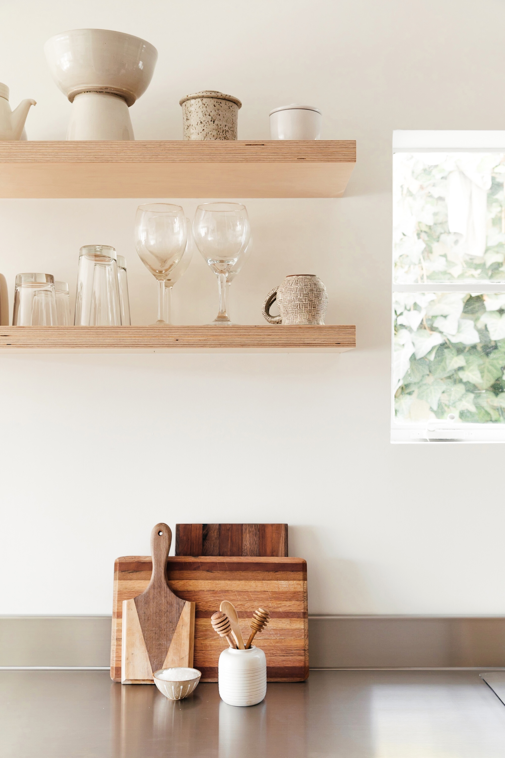
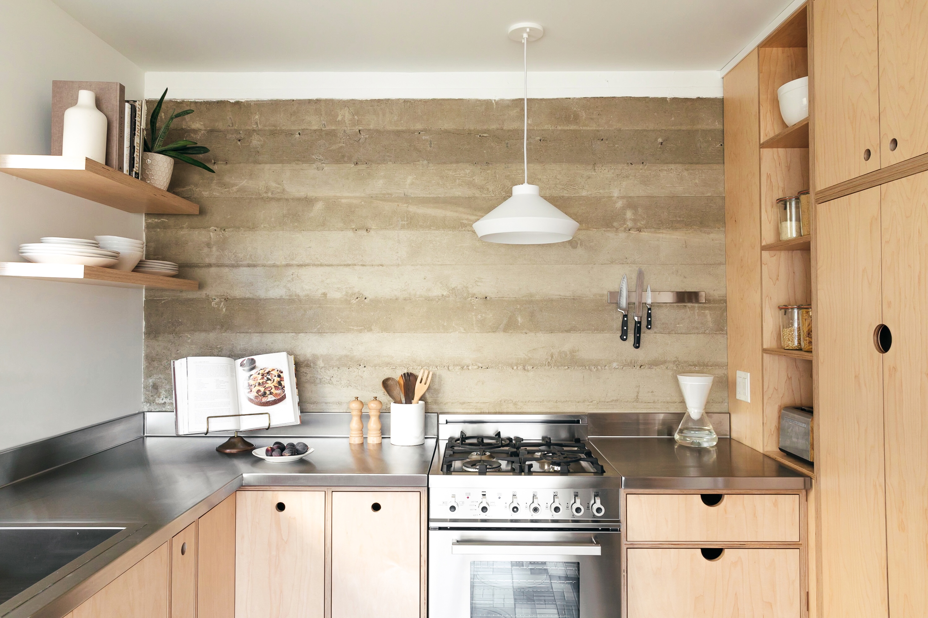
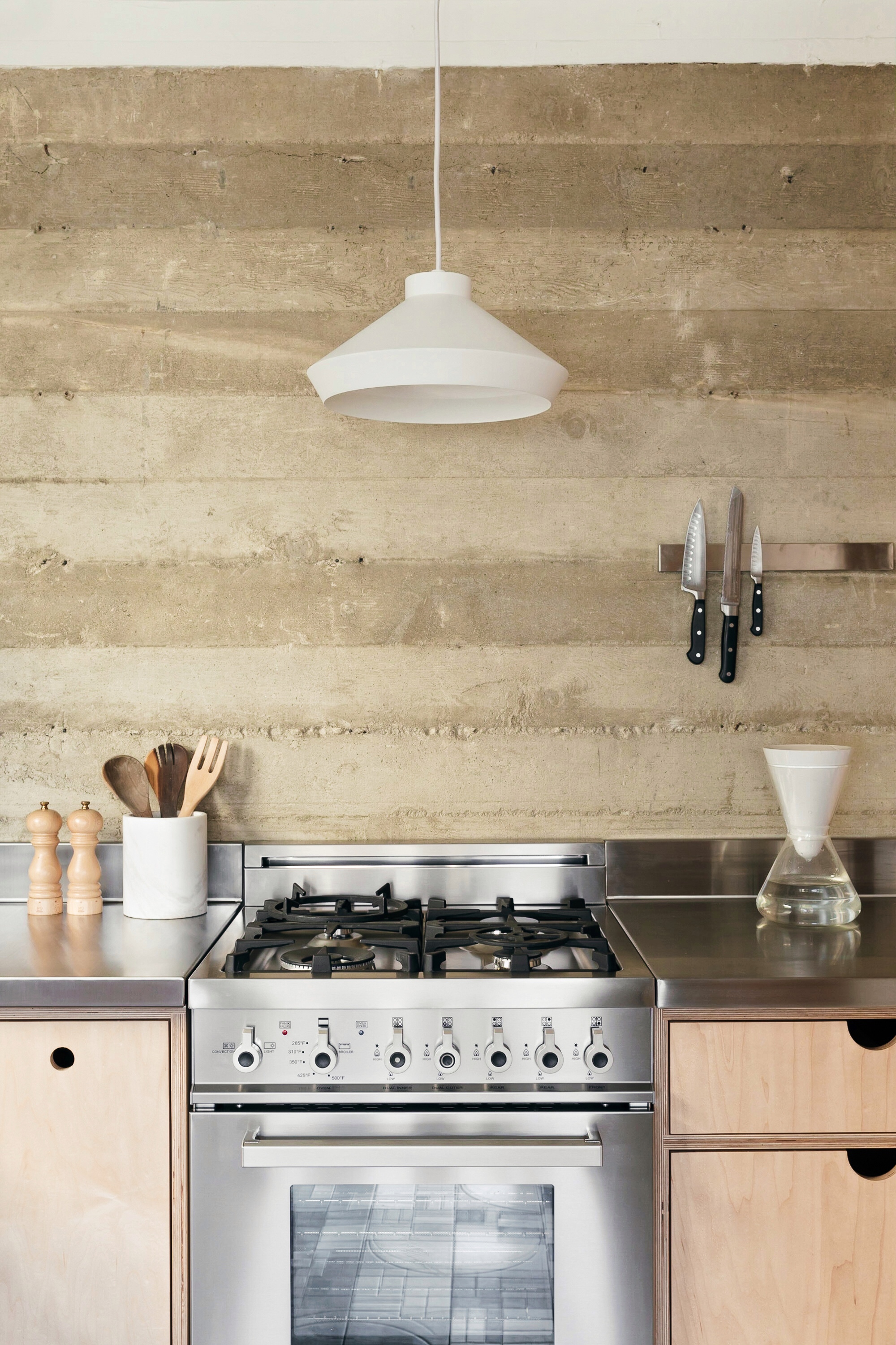
As interior designers, Jess and Jonathan knew that this task would prove difficult given the overall dimensions. Yet they were also excited by the challenge, so they set out to fulfill their goal of to creating a kitchen with a modern utilitarian vibe. Since they loved the original board-form cement foundation that ran the length of the basement, they decided to use that as the kitchen backsplash and as inspiration for the materials and color tones in the space. With cabinets made from marine plywood, stainless steel countertops, and a salvaged steel window from the 1950’s, they embraced the idea of “deconstructed” kitchen!
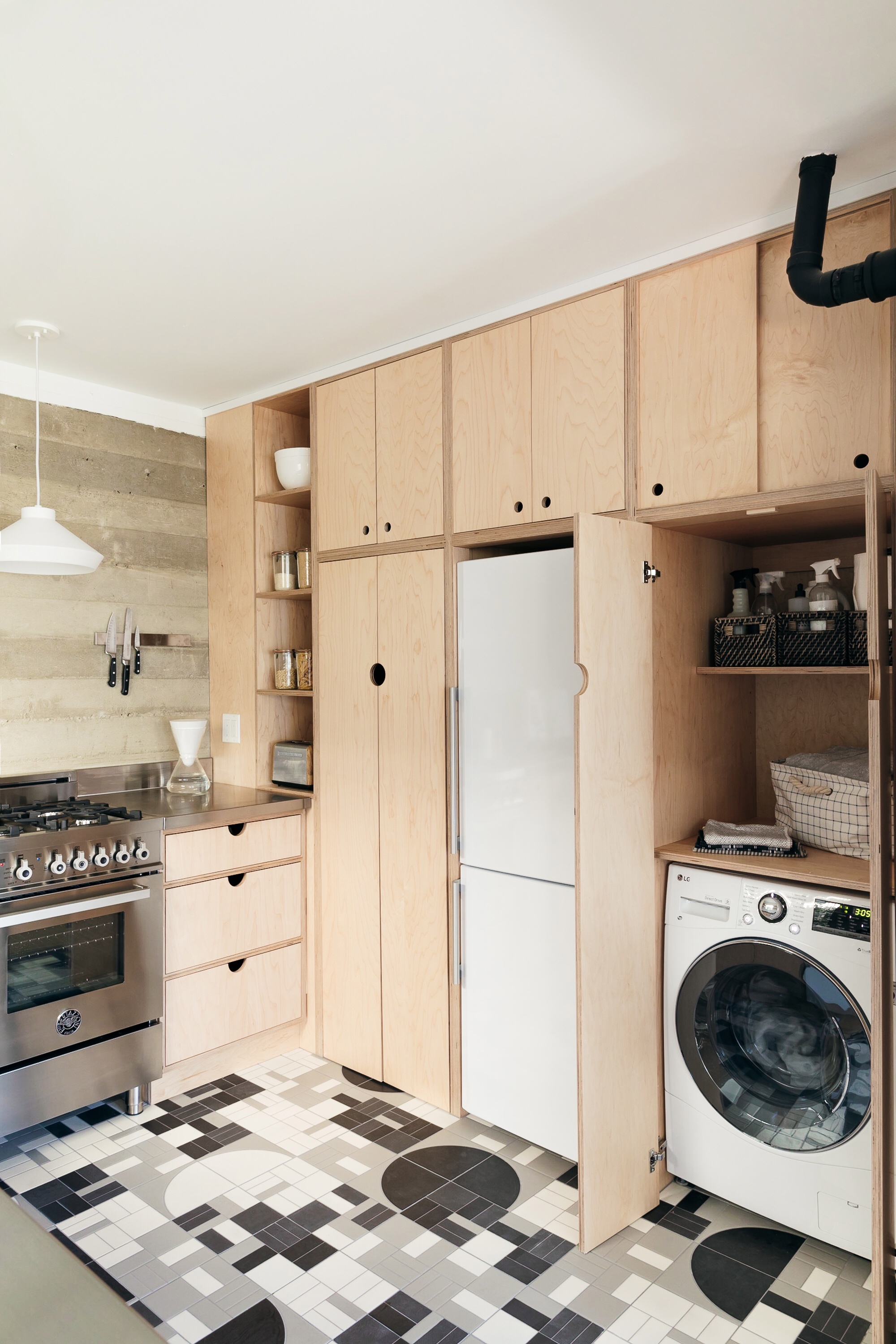
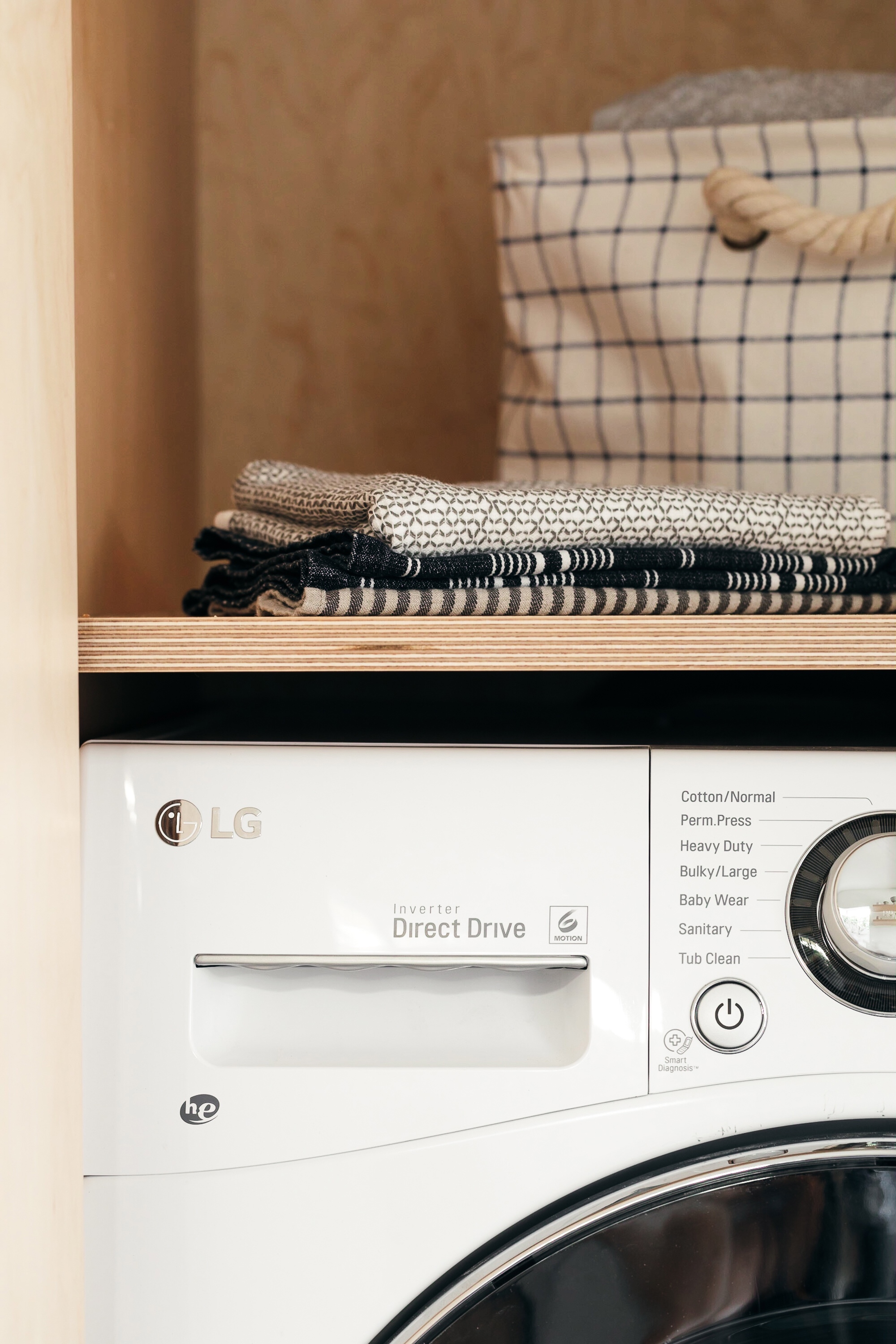
The somewhat confined space required the Taylors to embrace using small appliances. They found European makers to have the best options, and fortunately Build.com makes available a wide selection of European appliance brands here in the US! They landed on a 24” Bertazzoni range, an 18” Bosch dishwasher, and a narrow Blomberg fridge. And since they had ripped out the main laundry downstairs to make it an office for the guest unit, they also had to incorporate laundry into this already packed kitchen! An LG all-in-one unit allowed them to have a single appliance for washing and drying clothes, freeing up precious space for storage.
Build.com also proved to be an exhaustive one-stop resource for fixtures and fittings (especially important when you’re managing a renovation and don’t want to have to track shipments from multiple sources!). The Taylors selected a Kohler stainless steel sink to create a streamlined look with the countertops, and then added a matte white Brizo faucet and white Sonneman pendant for a pop of contrast against the wood and concrete in the space. (Don’t those matte white fixtures feel so fresh and unexpected?) Hidden Lithonia can lighting provides extra illumination without distracting from the overall clean lines of the room.
Oh, and the Taylors even managed to find room for the little luxuries! Even though this kitchen is small and utilitarian, they sought subtle ways to elevate the experience of cooking in it. After all, a tight floor plan doesn’t mean you can’t enjoy those special extras! For example, a Brizo beverage faucet at the sink takes up no space at all, but delivers filtered water on demand from an under-sink filtration system; and a compact, extra-quiet garbage disposal makes for easy cleanup in a small kitchen. The end result? An earthy, modernist kitchen that blends a primitive organic feel with streamlined surfaces and major function…all in less than 85 square feet!
P.S. Stay tuned for a whole post entirely about that Fireclay Tile floor, because it deserves a special feature all its own! Images: Monica Wang.
