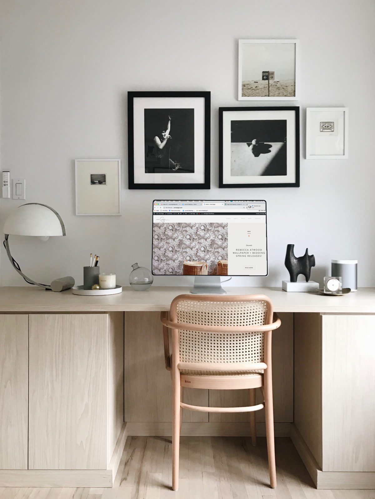
You may have noticed a little facelift around here, and no, I’m not talking about the Botox I got last week! Hah! Last fall I began working on a small website refresh to give the blog a more user-friendly look and feel. I worked with Marbury Co on the design and Alchemy + Aim on the backend implementation, and I can’t recommend both of them highly enough! Our goal was to tweak the homepage to be more reflective of how we consume content these days—Pinterest and Instagram are king, after all!—so we eliminated the endless scrolling that existed on the blog’s previous iteration.
It’s a small but significant change, one that makes it easier to see what’s new and then narrow in on the stories that feel most relevant to you. We also fleshed out my “About” page to have a fuller biography and descriptions of the many types of work I’m available for. The last time I updated the blog’s layout was in 2015, so this website refresh feels long overdue. I hope you love it as much as I do!
