I’m so excited about a new client project that I just started! My dear friend Monica is opening an event venue called The Revery in downtown Los Angeles. I’ve seen some of the initial plans, and it’s going to be an exquisite space! So when Monica asked me to design the office area from which the venue’s staff will work, I didn’t even hesitate to say yes. I’ve spent the last few weeks concepting The Revery’s modern studio design direction, and I’m chomping at the bit to show you my initial work here!
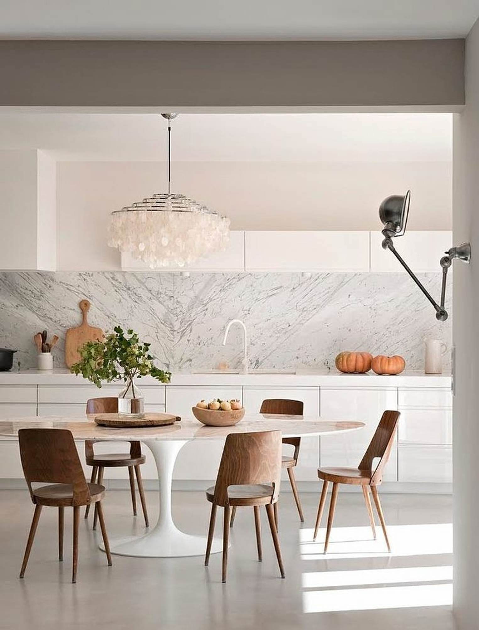
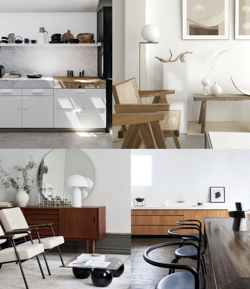
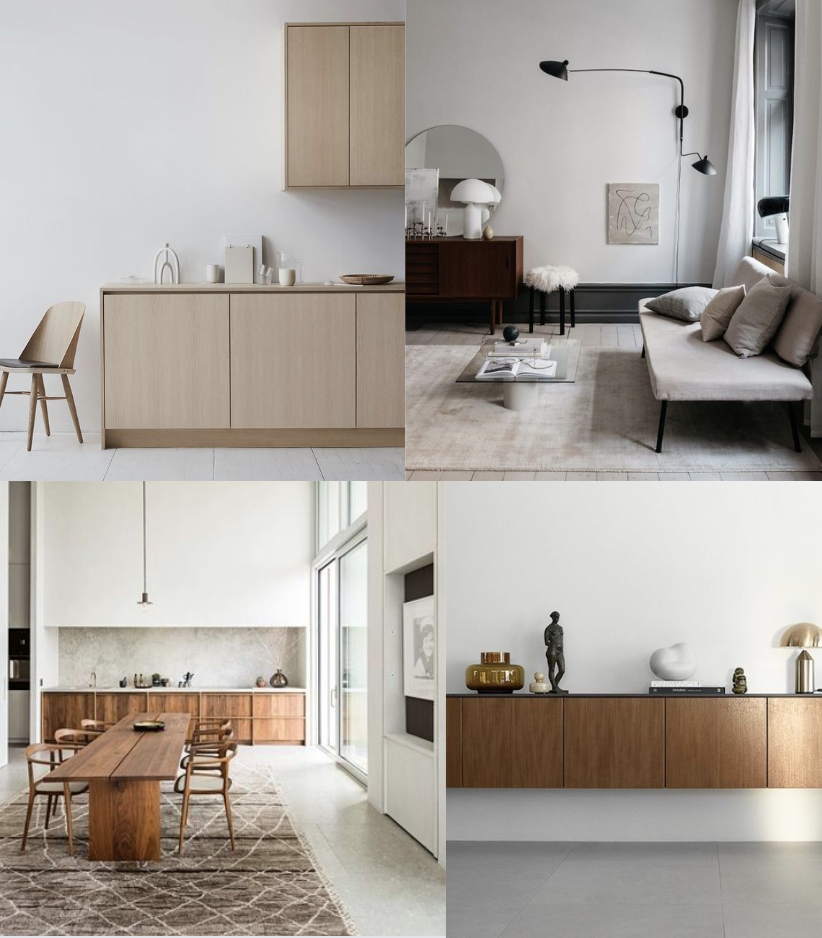
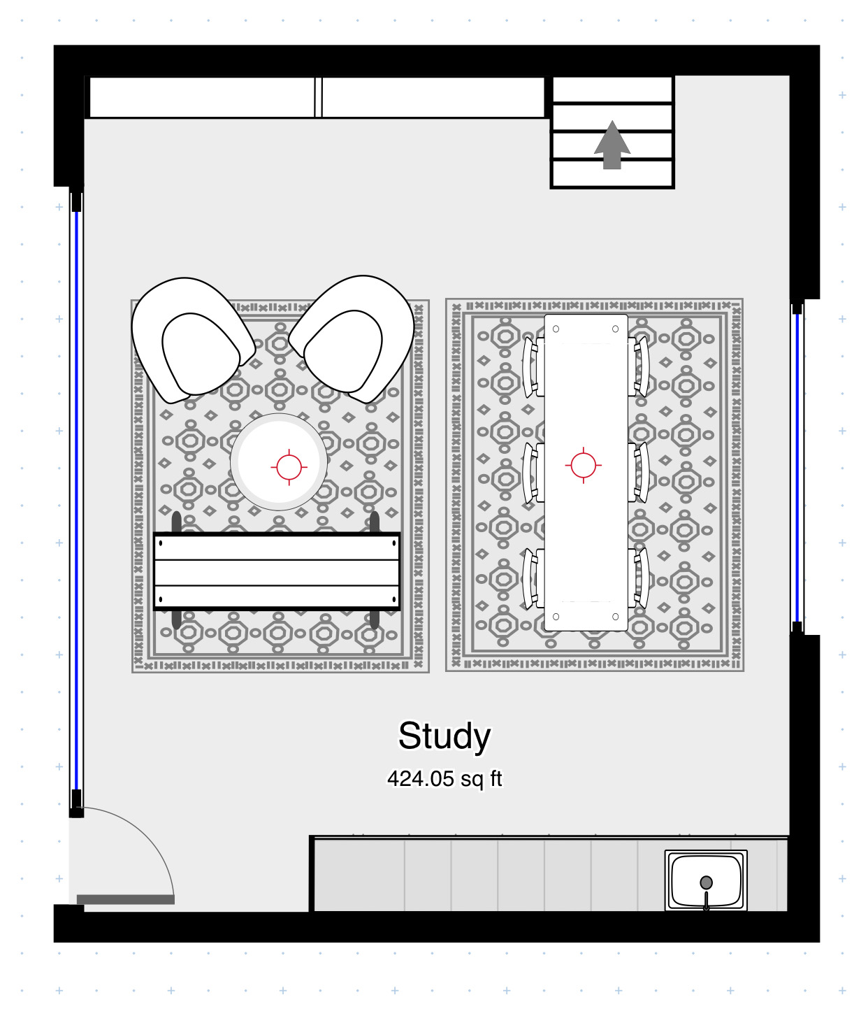
Overall Vision + Floor Plan: Monica kicked the design process off with her wishlist of elements for the office area. She wants a kitchenette, a long table for meetings and work sessions, and a lounge area for relaxing. My first step was to create a floor plan that accommodated all those elements. At the same time, I presented Monica with a set of images that encapsulated the visual direction I was picturing for the space. We imagined lots of grained wood cabinetry, a marble backsplash and open shelf, and an eclectic mix of minimalist furnishings. Because I know Monica pretty well, she loved almost everything I presented and had very few requests for revision!
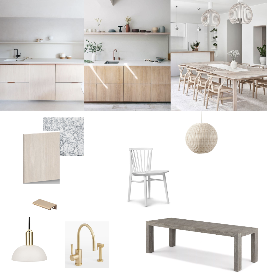
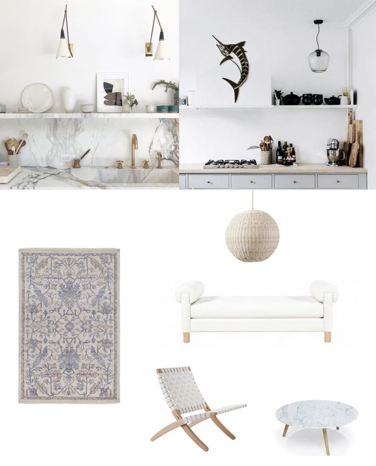
Design Option 1: The next step was to create two different design directions using actual finishes and furnishings to get the look that we were envisioning. One comment Monica had on my initial design inspiration was that she’d like to see lighter wood finishes than the dark cherries and mahoganies I initially suggested, so you can see that adjustment reflected in both these design options.
Option 1 has an airy, coastal modern vibe that features a long grey driftwood table and white Windsor-style chairs. Kitchen highlights include beech wood cabinetry and a black-and-white speckled stone countertop. I fell hard for this dome pendant and love the idea of grouping several along the countertop instead of sconces. In the lounge area, a fabulous daybed from Nate Berkus’s Living Spaces collection takes center stage. The overall effect is sophisticated and feminine but in a youthful, organic way.
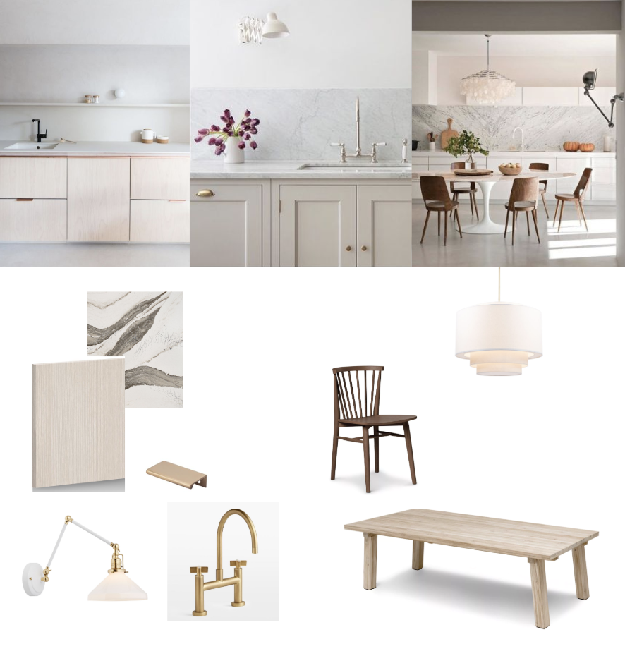
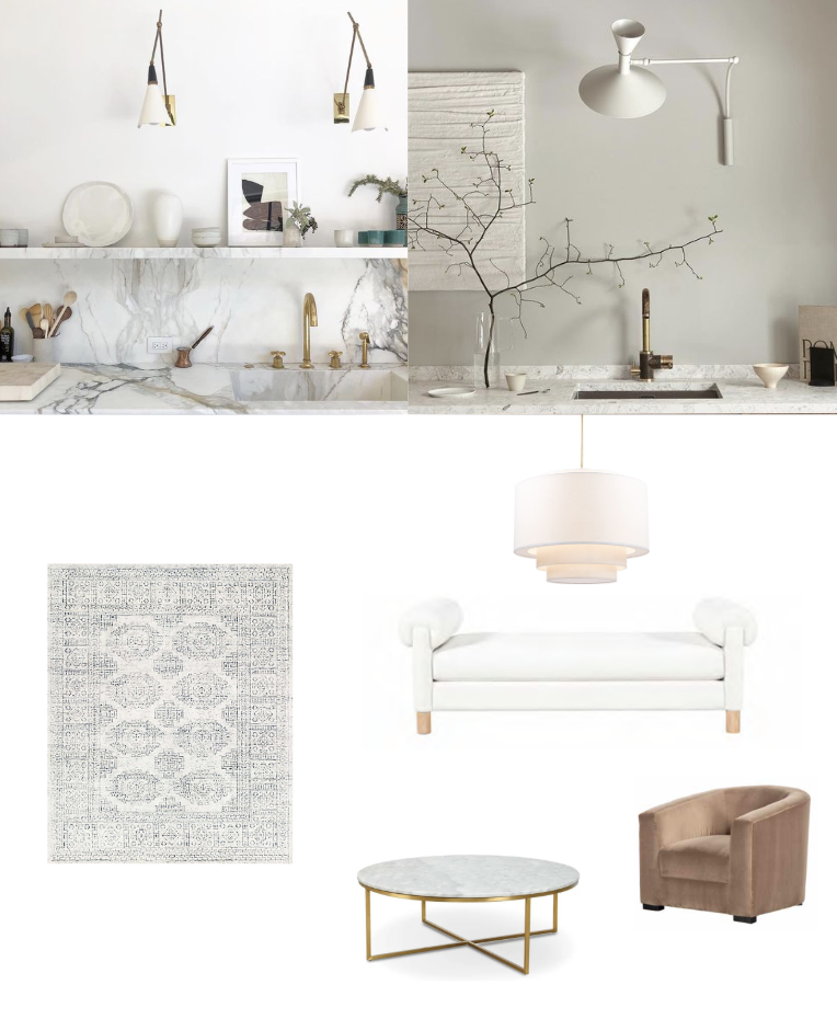
Option 2: Option 2 has much in common with the first design plan but veers in a slightly more grown up direction. The faucet and kitchen sconces have a decidedly traditional/transitional feel, in contrast with Option 1’s overtly modern fixtures. I also brought in a warm shade of brown for richness in the dining chairs and the velvet lounge chairs. The cabinet choice remains the same, but the speckled stone is replaced by a stone with striking gold and black veins throughout. I had a feeling that Monica would choose this second option, since it has a very downtown sensibility that suits her venue’s location. And sure enough, in the meeting we had this afternoon, she loved them both but selected Option 2 as her desired direction!
Now that we have a clear picture of where we’re headed, it’s time to source and install all the pieces—and of course fill in all those fun finishing touches like artwork and small decor. I’ll continue to share updates on this project as it progresses. It’s going to be a stunner for sure!
