When I was little, I’d spend hours on end decorating and redecorating my bedroom. Helping my mom choose whimsical wallpaper—and then as a teen, enrolling my friends into helping me paint—was the beginning of a lifelong love of design!
Ideally, a child’s bedroom should inspire creativity and encourage exploration. It should be a space that meets their current needs yet gives them room to grow.
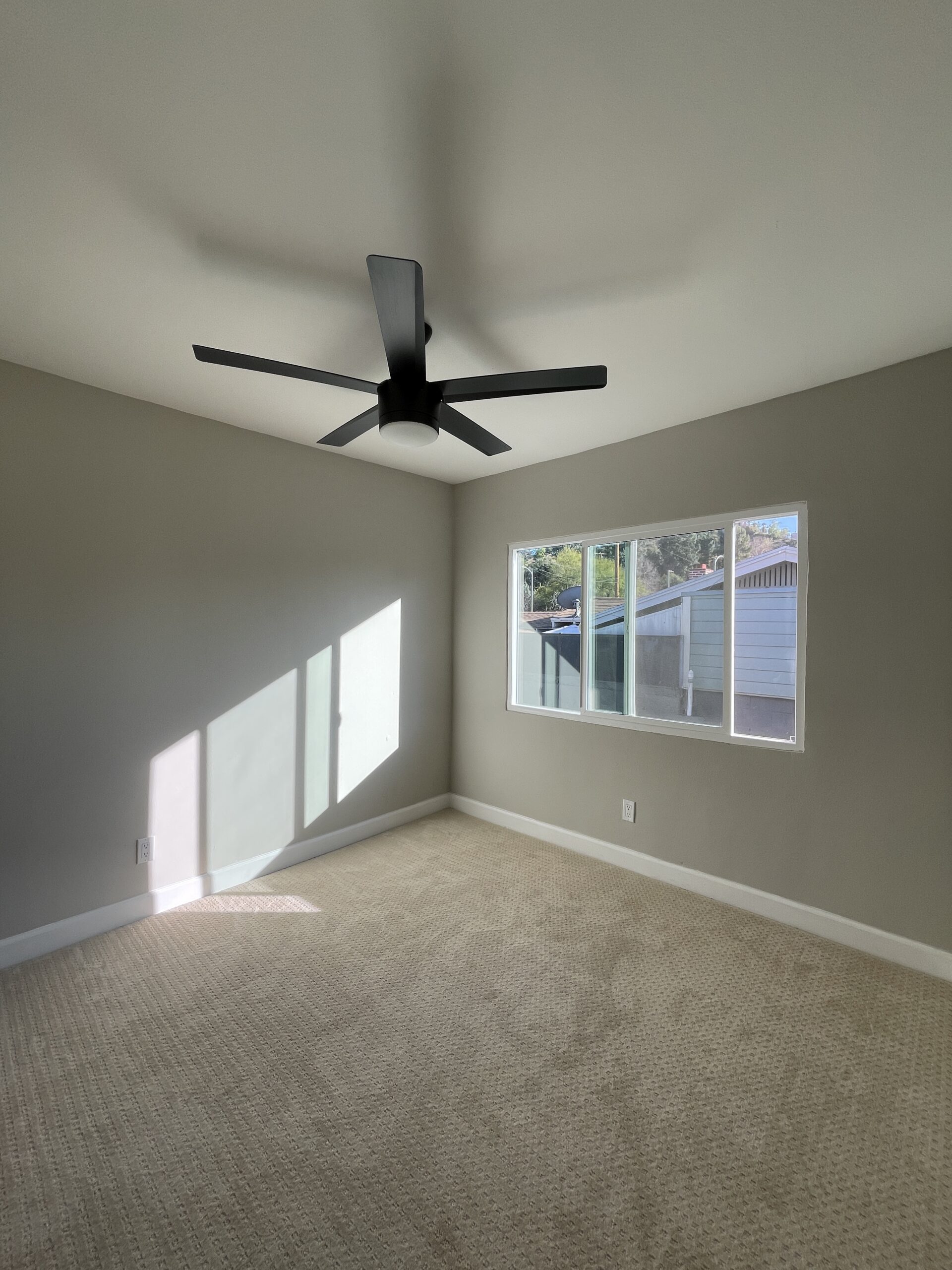
But the kid’s room in my client’s builder flip was anything but inspirational. Between the drab wall color and the lifeless carpet, nothing in this kid’s room was engaging for a youngster.
We wanted to transform this unexciting room into a special place that would support his son’s development from 5 years old through adolescence.
Here’s how we brought this imaginative, adaptable space to life!
Transforming a Blank Slate into a Dreamy Kid’s Room
Whimsical wallpaper, of course.
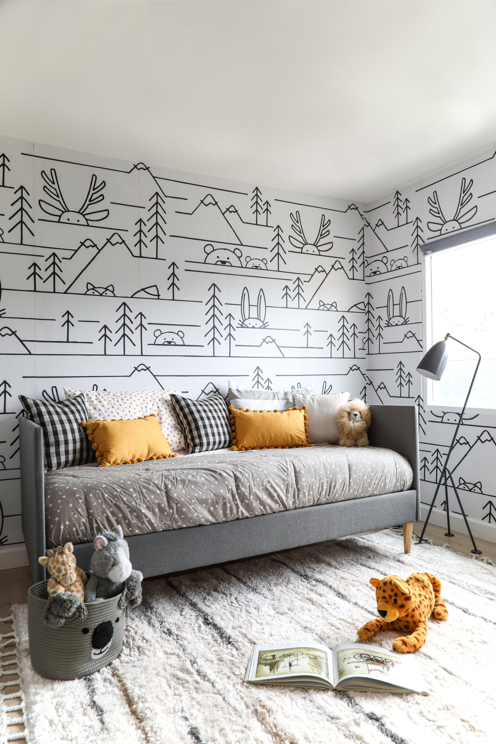
This design all started with wallpaper. We fell in love with this adorable graphic woodland creature print from Minted. (I mean, come on, who doesn’t love cute little woodland animals?) The modern, black-and-white design laid a simple, versatile foundation for the rest of the room. Because it’s so neutral, we could add in whichever accent colors we wanted. The boy’s courageous father even suggested that his son could color in the walls, like a coloring book!
Personally, I’m not quite ready to let my kid take crayons to our walls. But wallpaper doesn’t have to be a long-term commitment. We chose a peel-and-stick option that they can take down whenever they’re ready to switch things up.
Budget-friendly tip:
Keep your whimsical wallpaper affordable by installing the print on one wall instead of the entire room!
Multi-purpose furniture.
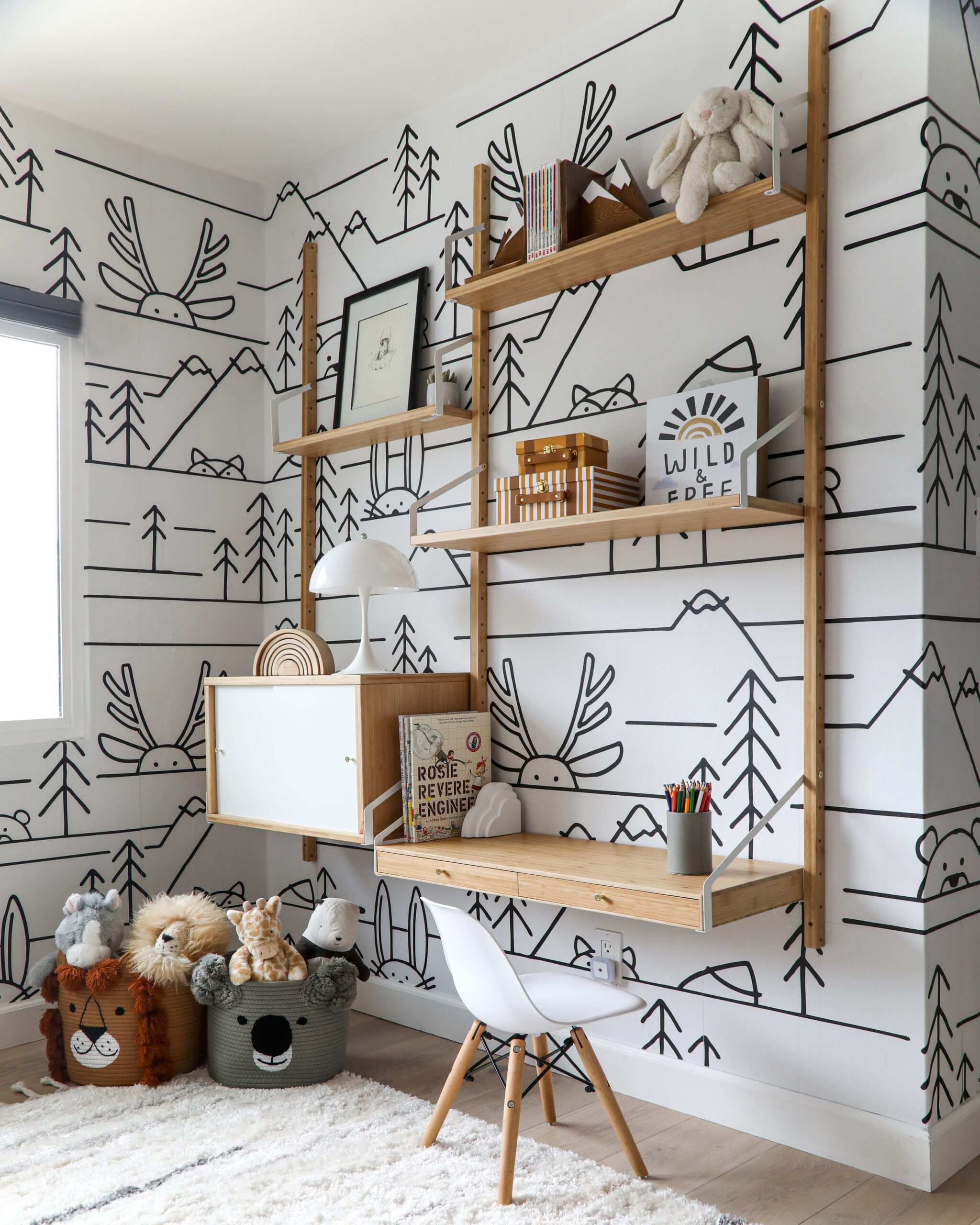
We needed to choose furniture strategically for this small room. To maximize space, we selected multifunctional pieces that serve various needs. For instance, the daybed provides a space to lounge during the day and sleep at night. And the IKEA desk system doubles as a storage space to display favorite toys and a desk for coloring or school-from-home.
Using multi-purpose furniture is also a great way to create an adaptable space. As the boy ages, the daybed will become a spot to hang out with friends, and the desk will become his homework zone.
Simple colors and design.
Over the years, your kid’s tastes will change. For example, the bright lilac paint I applied to my walls when I was 13—inspired by the ‘Friends’ apartment, of course—didn’t last long to say the least!
But timeless, simple furniture will stay in style for the long haul. Classic pieces like the white mid-century chair get more longevity than an elaborate piece in a bold color. Plus, selecting simple furniture helps keep design more affordable!
However, choosing simple, neutral shapes and tones doesn’t mean that your space will be boring—it’s a kid’s room after all! Through decor, like the pillows and the soft animal-themed storage bins, we incorporated fun, thematic colors that infuse life into the room.
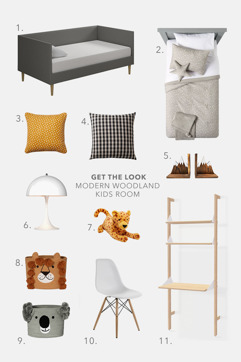
- Daybed 2. Bedding set 3. Mustard throw cushion 4. Checkered throw cushion 5. Mountain bookends 6. White lamp 7. Stuffed animal 8. Lion storage basket 9. Koala storage basket 10. Desk chair 11. Ladder shelf
Looking for more kid’s room designs that will stand the test of time? Check out this neutral nursery for more inspiration!


