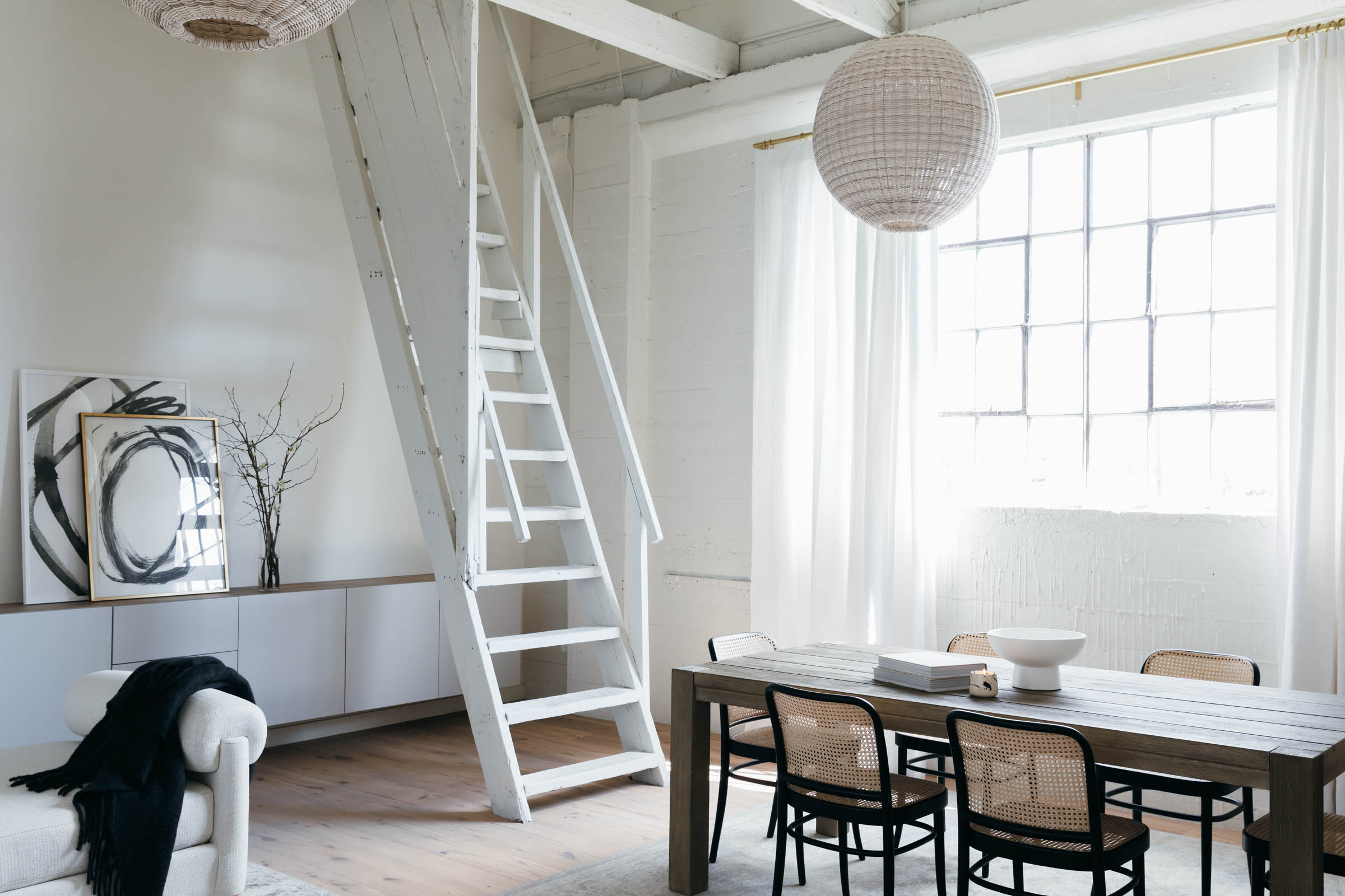
Two weeks ago I finally visited my modern luxe living room design for The Revery! The install had been finished shortly after Halo was born. Then, of course, quarantine struck. So after waiting weeks and then both testing negative for COVID-19, Monica and I decided an in-person needed to happen! It was so wonderful to see the space for myself at last. It was a breath of fresh air after being at home. As well, I was able to give myself a pat on the back for a job well done!
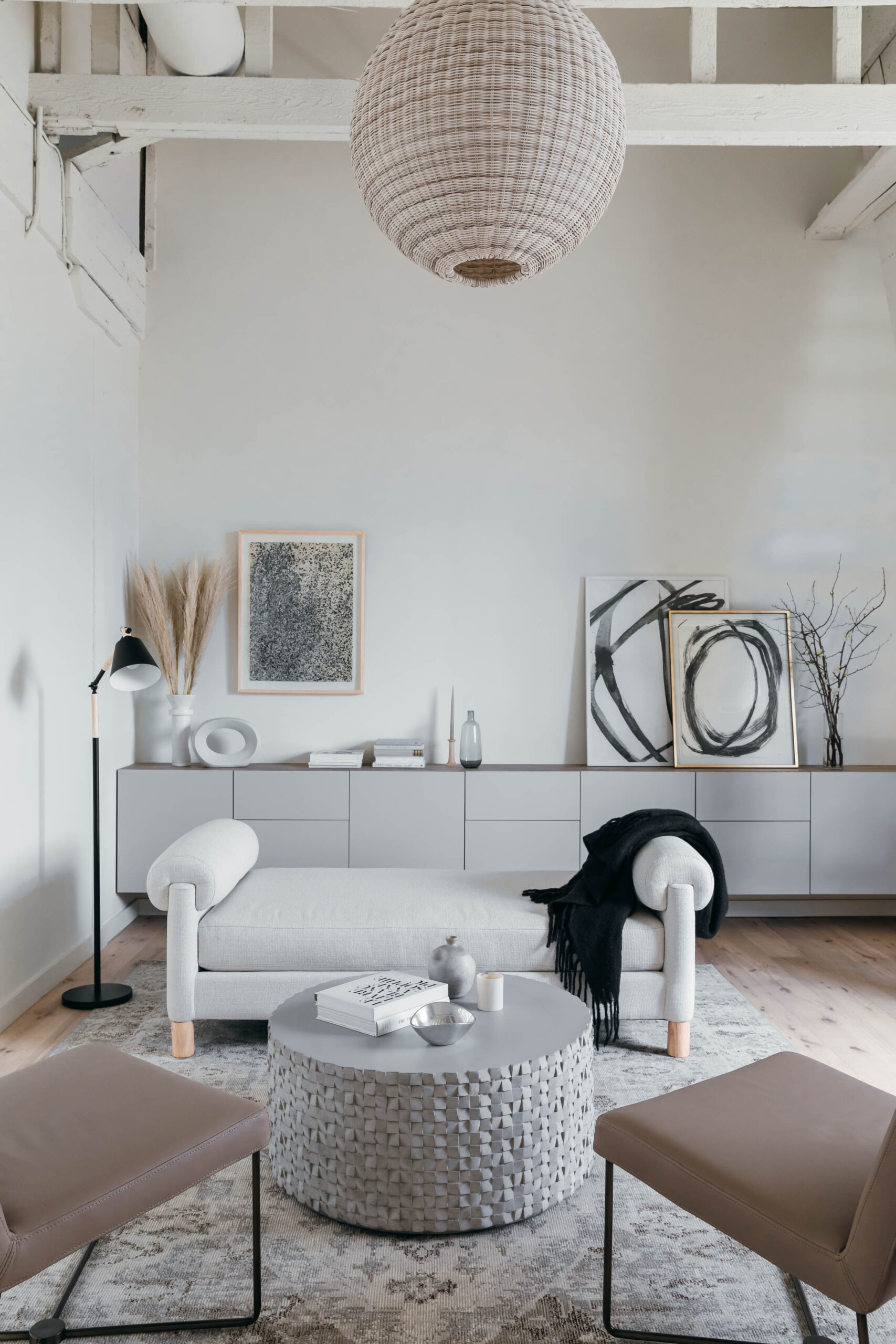
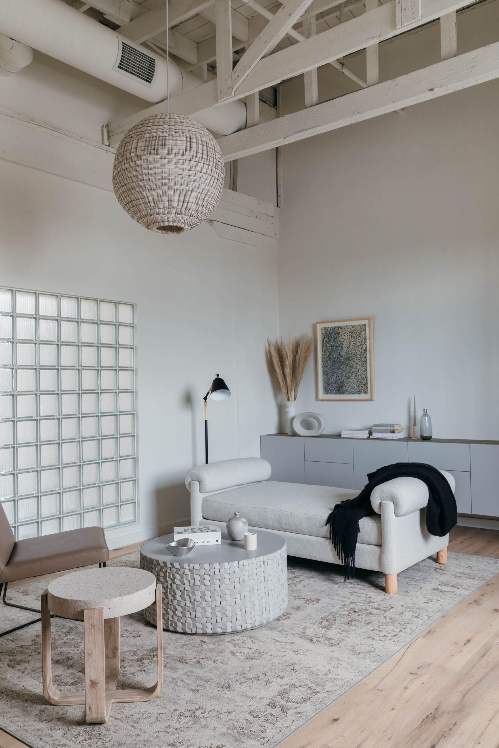
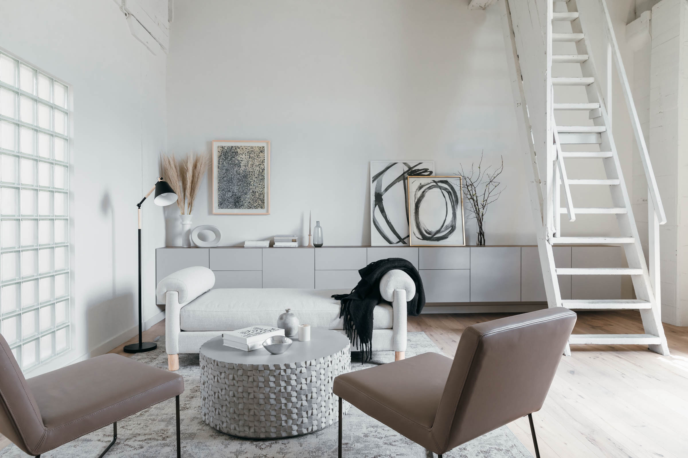
When Monica asked me to design an office space for her team at The Revery, we agreed that we wanted to carve out an inviting seating area in the open-concept room. This is where Monica plans to have meetings with clients and shoot lifestyle content. As with my design for the kitchen, we focused on a neutral palette of whites, greys, blacks, and taupe. The goal was an airy, organic lounge that felt warm yet sophisticated!
As is always the case when designing with a neutral palette, elements like texture and shape become all the more important due to the absence of color. The key to success in this space was my attention to the mix of materials and silhouettes! Most of the furnishings came from Living Spaces, and I was really pleased with the brand’s selection of clean, elegant pieces that had unique personality.
To ensure a sense of balance, I created pairings throughout the space. For example, the two accent tables are constructed of rough stone materials. The blonde wood legs of the end table echo those on the daybed. The sleek faun-colored leather of the chairs is the same hue and finish as the lacquered top of the media console. The slim black legs on the chairs reflect the same matte black of the lamp. And all of the furniture shapes have a rounded sensibility in keeping with the soft, welcoming mood we wanted to set!
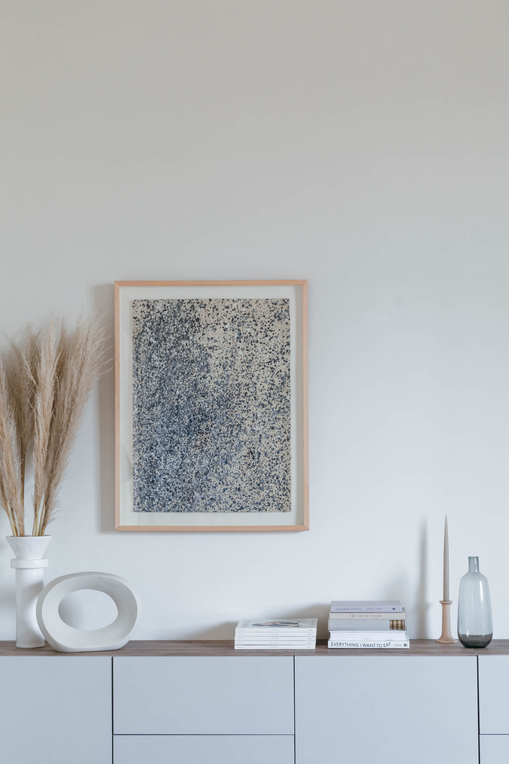
I was especially excited to use a daybed instead of a sofa in this arrangement. Not only does it feel special, like a Parisian boudoir, but it allows for greater appreciation of that bank of built-in storage units in the background! As for those units themselves, they look high-end but are just several wall-mounted IKEA units installed end-on-end to look like a single custom piece. I can’t wait to go back to the Revery again soon, perhaps to film some some coffee table or console styling tips. This space was made for shooting, exploring, and having fun!
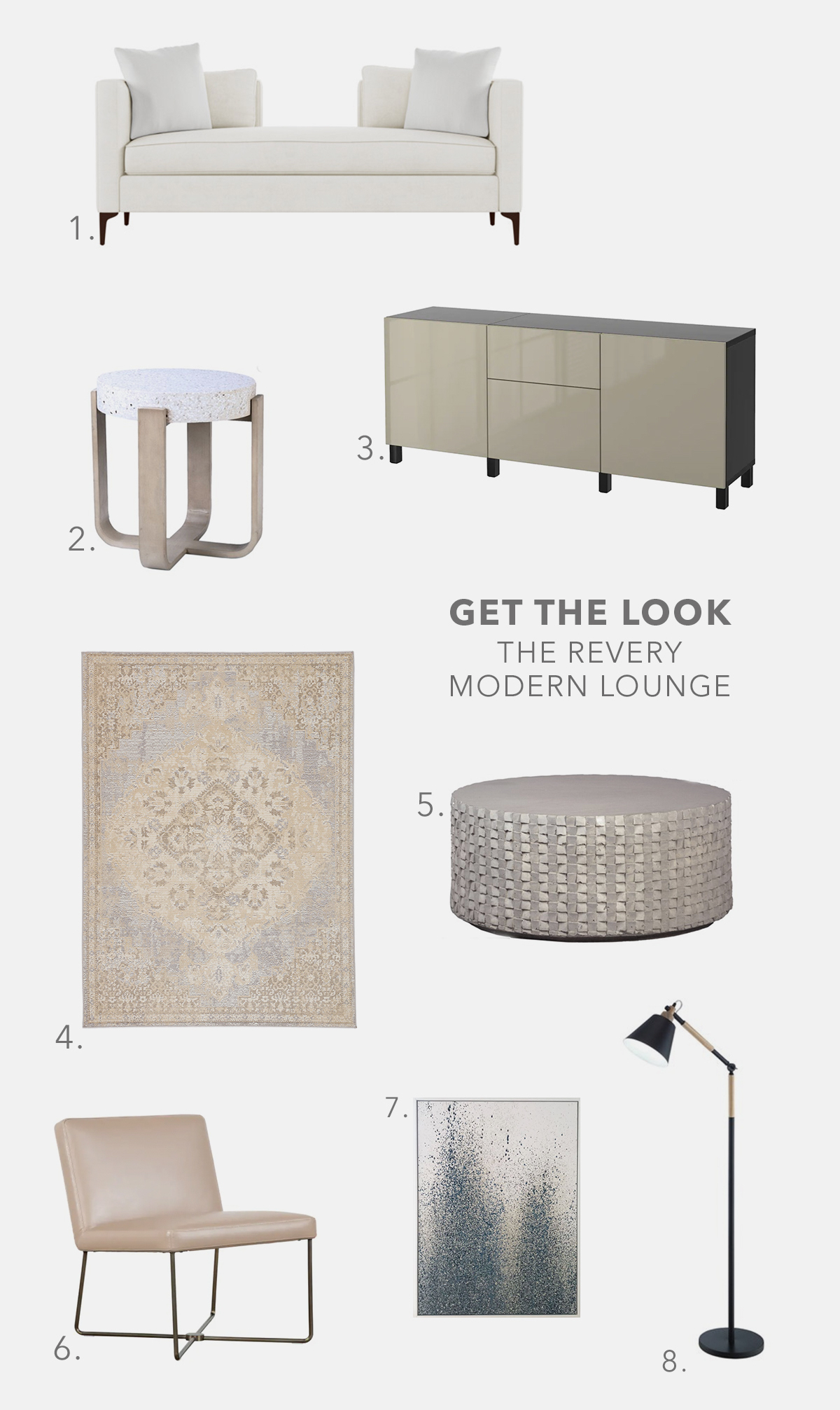
Modern Luxe Living Room Shopping Guide: 1. Living Space White Daybed 2. Living Spaces Terrazzo Accent Table 3. IKEA Besta Media Console 4. Jaipur Living Vintage Inspired Rug 5. Living Spaces Round Cement Coffee Table 6. Living Spaces Taupe Leather Chair 7. A.E.U. Studio Abstract Painting 8. Living Spaces Matte Black Floor Lamp
