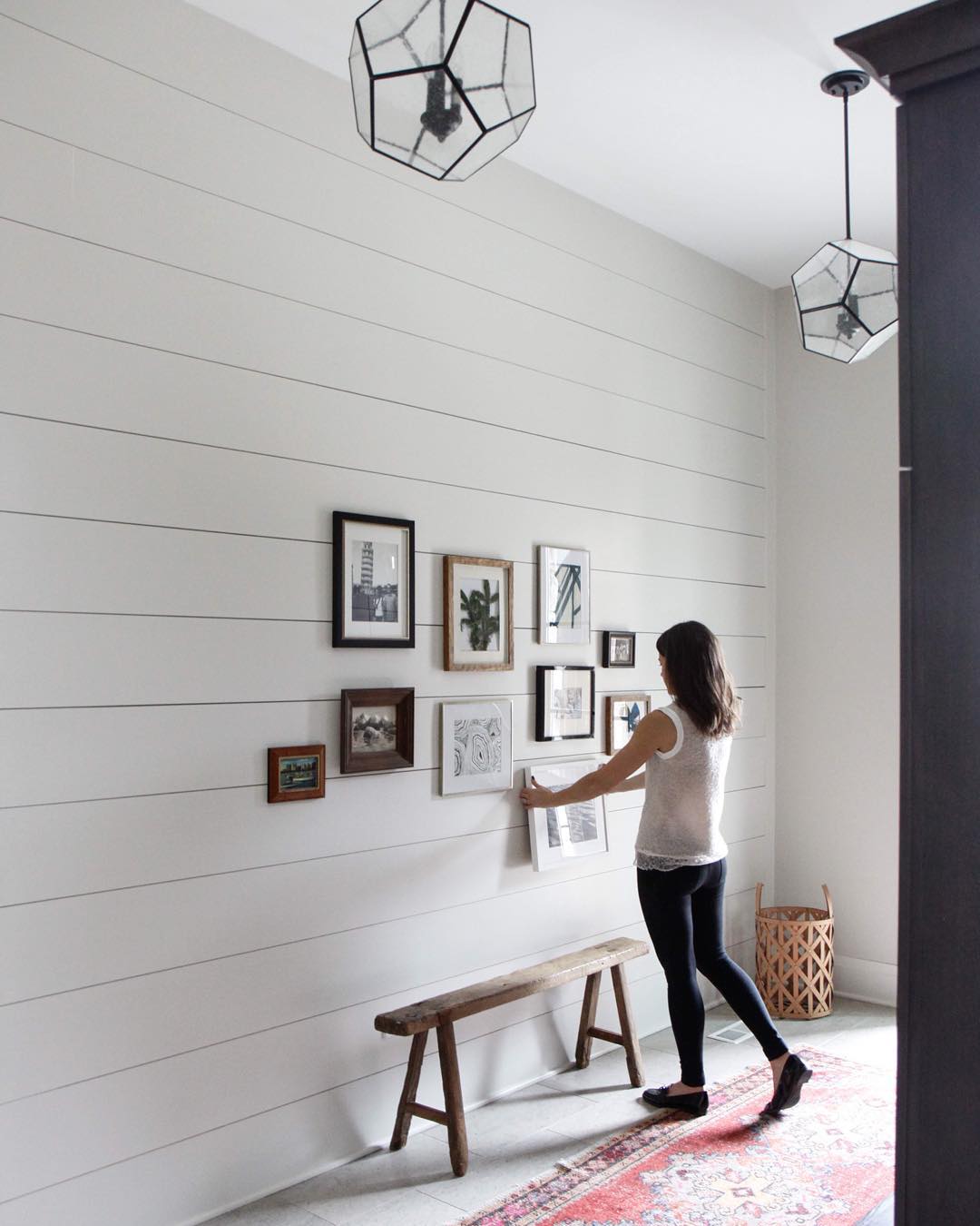
Do you ever stumble down an Instagram rabbit hole and happen across a stunning feed that causes you to exclaim, “Holy cow how does this account not have a zillion bajillion followers?” That’s exactly what happened to me last week when I found myself scrolling through Park & Oak Design Instagram. Image after image of the firm’s fresh take on traditional interior design had me wondering who these people were, would they come redo my house, and could they be my personal style consultants and best friends while they were at it?
A little digging on the Park & Oak Design website reveals that the firm is a collaboration between Christina Samatas, an interior designer with over 15 years’ experience, and Renee DiSanto, a stylist and photographer whose personal Instagram feed The Frosting deserves its own massive following. Park & Oak is only a few months old, which explains why they’re not yet an international sensation—but the operative word in that sentence is yet, because it’s only a matter of time before these ladies make a big, beautiful splash.
I use the word traditional to describe Park & Oak’s style, but there’s nothing stodgy or stuffy about their work. Rather, classic colors, materials, and shapes are combined in creative new ways for spaces that feel airy, thoughtful, and utterly inviting. Think deep blues and breathy greys, worn woods and polished marbles, chic Chippendales and cozy roll-arms. Park & Oak is updated traditional at its very best, and I’m not just saying that so they’ll move to LA and be my new BFF’s!
Images via Park & Oak Design Instagram.


What a great instagram feed ! You’re right, they deserve a lot more followers 🙂 Their style feels so bright & airy but also classic. Thanks for sharing !
Charlotte
Love this – thanks for sharing! They are fab!