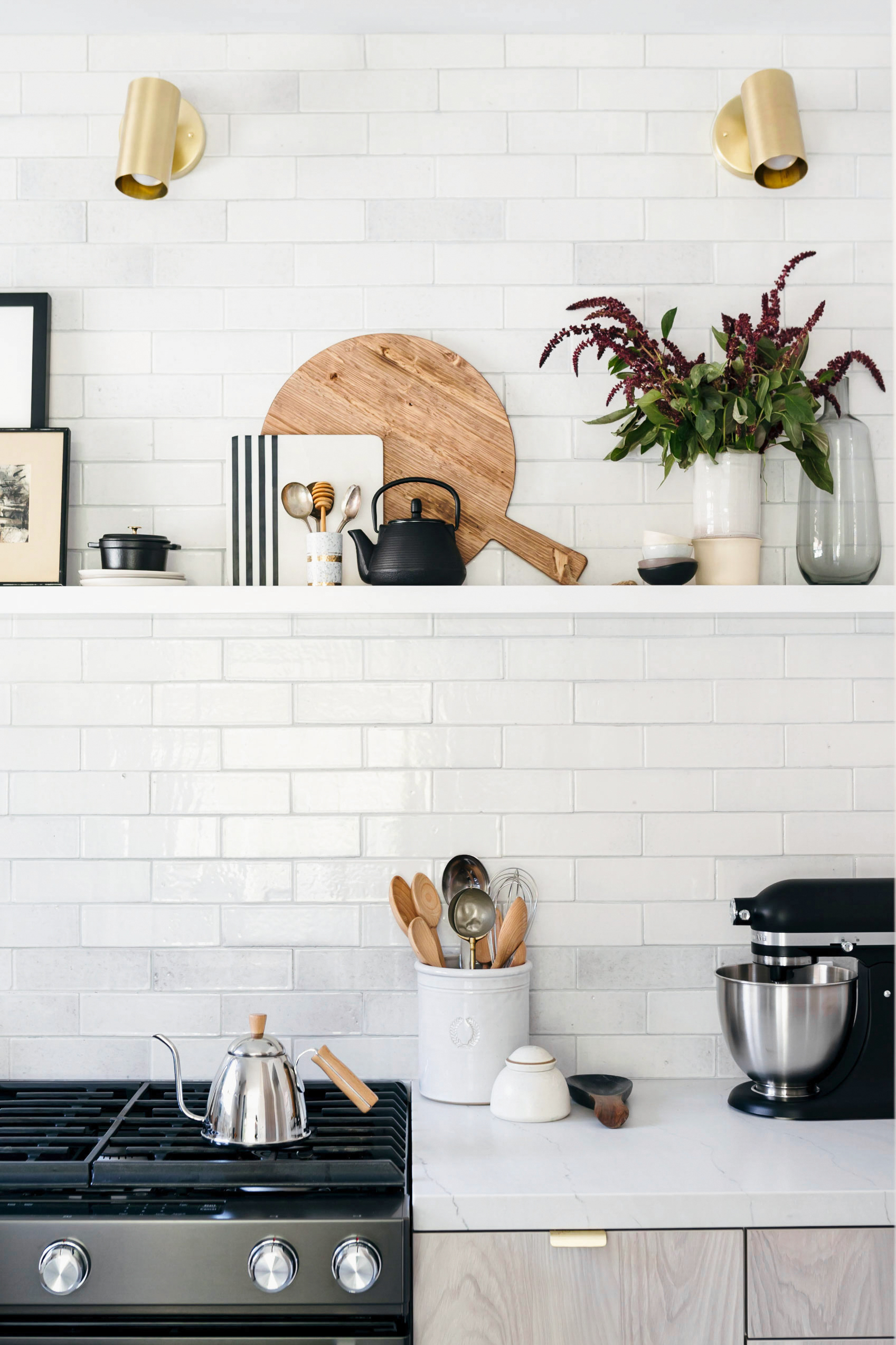
Photos of our completed kitchen remodel have at last been released into the wild! Did you catch the full reveal on My Domaine last Friday? Or how about the complete breakdown that Studio McGee did on our process and all our resources? It’s been such a delight to see the enthusiastic reception that this project is receiving…especially after a year (!) of planning and installing and waiting! Here on the blog I’m going to give a detailed look at each element, including answer some of the most common questions that have come up as we’ve been sharing images over the past week. I’ll start from the outer shell and work my way down to the tiny details—which means that first up is our subway tile backsplash and herringbone tile floor from Fireclay Tile!
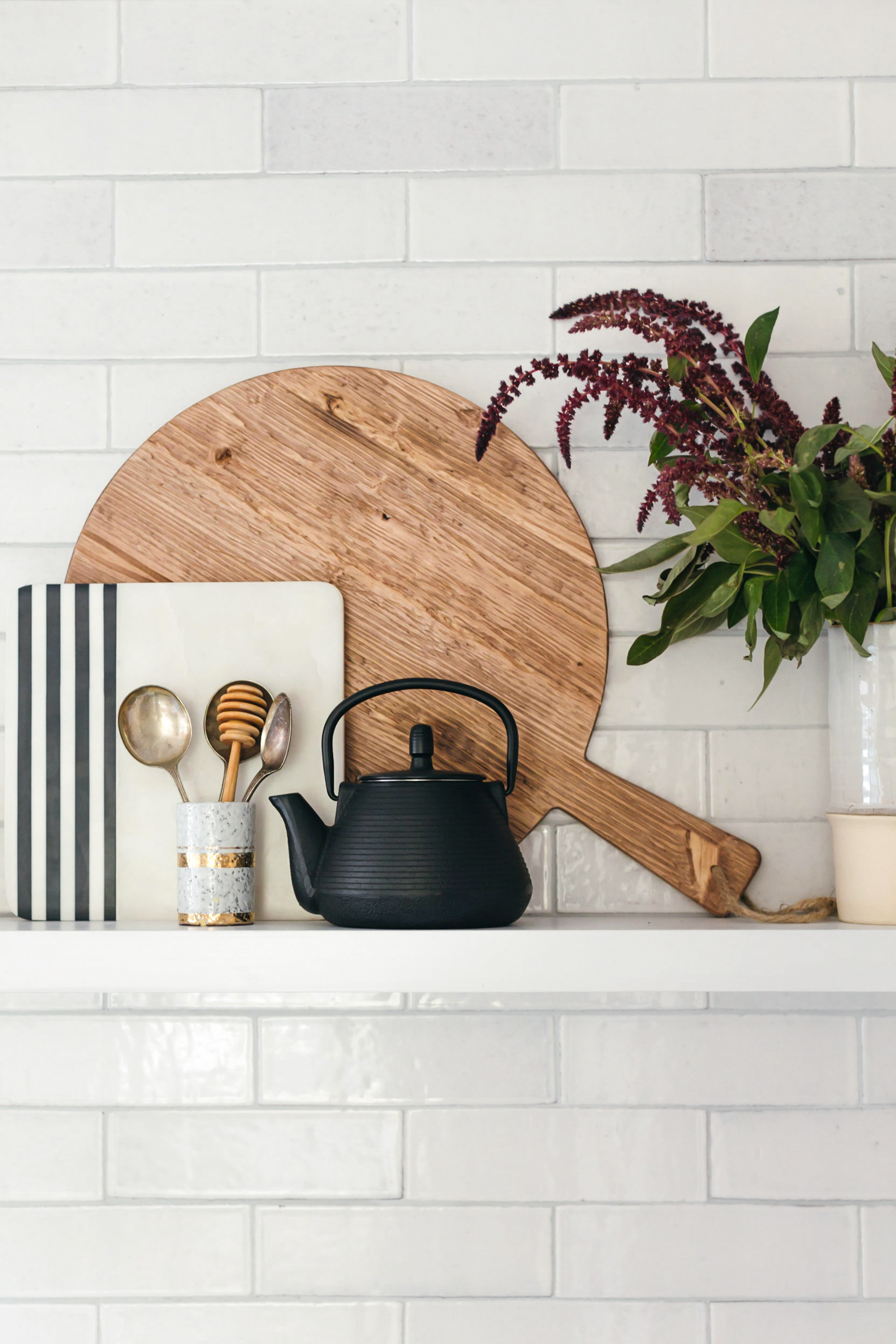
With the floor and three of the four walls being tiled, we knew we had to choose super special materials that would create a beautiful envelope but also stand up to inspection upon closer look. Fireclay Tile is tops in my book, not only because their handmade tiles are stunning but because they pride themselves on creating a positive work environment for their employees, as well as promoting environmental sustainability through the use of recycled materials in their manufacturing process. For the subway tile backsplash we used their 3″ x 6″ Brick in the color Ceres. The original design that Studio McGee presented to me actually used a 3″ x 12″ tile with a crackle finish (which would have looked gorgeous of course, especially with that unusual dimension!) but on a whim I also ordered a sample of the Brick and once I saw it in person I loved the heft and earthy character it brought to the space. I really wanted this to feel like a California kitchen, which to me meant incorporating raw, unpolished touches here and there. When the boxes of tile arrived, I toyed with the idea of installing the tile in a stacked grid arrangement rather than offset, but that felt too modern and I ultimately decided to stick with Studio McGee’s original recommendation of a subway tile for the air of classic warmth it provided. We chose a pale grey grout that echoes the midtone grey present in some of the tiles; each one is slightly different, since they’re made individually by hand, and that not-too-dark, not-too-light grey grout really ties the unique variations together!
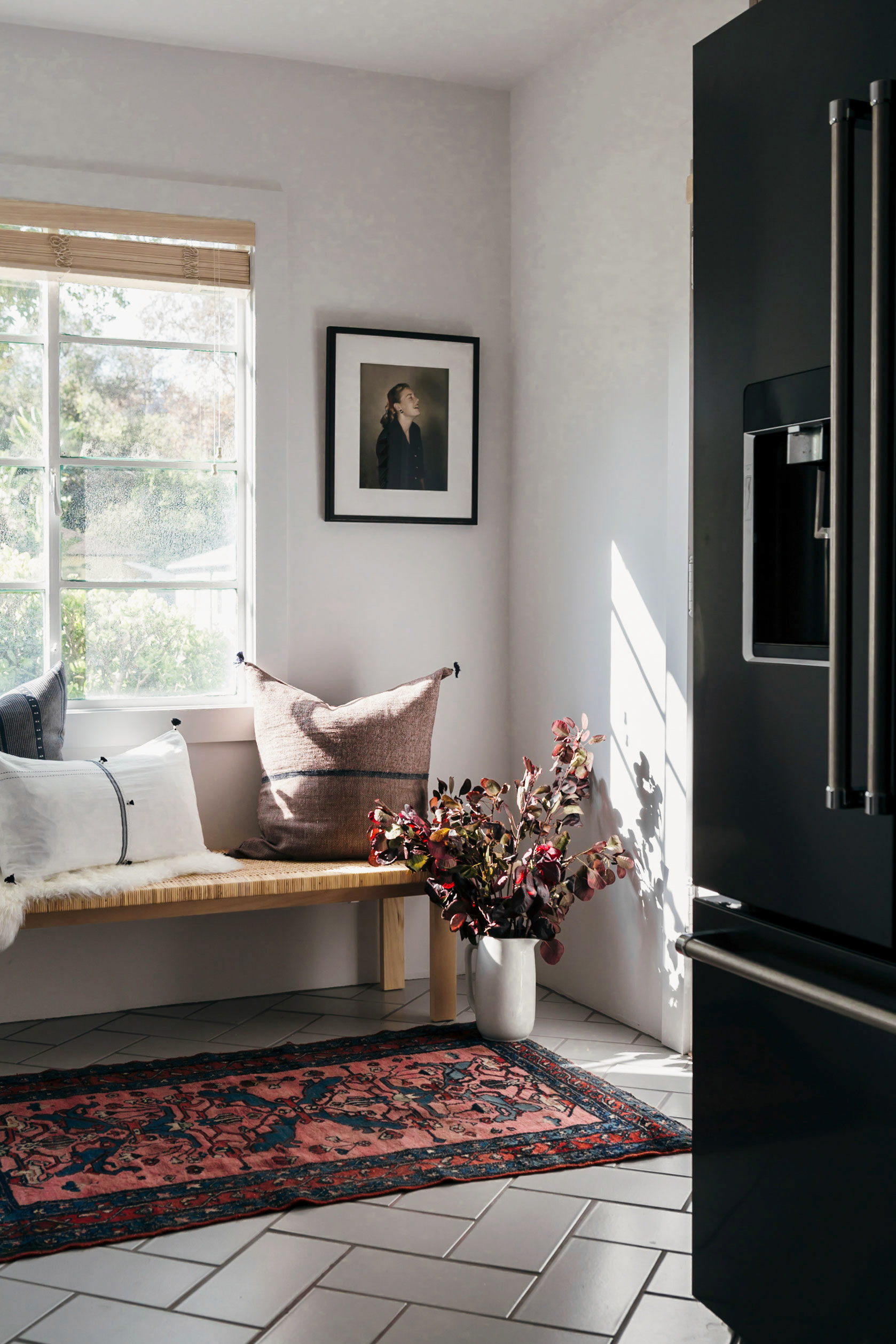
For the floor, when Studio McGee suggested a herringbone pattern I was over the moon. I have always wanted weathered herringbone wood floors (you know, the kind that every chic Parisian apartment seems to have!) so it was like Shea and her team were reading my mind! The pattern has a very old world elegance to it, but the 6″ x 12″ tile in the color Gypsum counters that traditional vibe with a super clean, crisp, contemporary finish. We tried out different orientations of the herringbone’s directionality, ultimately settling on elongating the length of the kitchen to make it seem bigger. (When we tried it width-wise, it had the not-so-flattering effect that horizontal stripes can sometimes have on a person’s figure!) For the grout we went with a darker grey to emphasize the herringbone. I mean, if you’ve got it, then flaunt it, right?
P.S. A great tile professional is paramount no matter what kind of tiling project you have, but it’s especially pivotal when working with handmade tile. They subtle variations from piece to piece can make layout tricky, and when not done properly the result may leave you less-than-satisfied. Be sure to vet your tilers by visiting previous projects they’ve done and chatting with previous clients. A reliable tradesmen will happily share his past work with you!
P.S. Stay tuned for more deep-dive into our kitchen remodel, and feel free to shoot me any questions about tile that I haven’t addressed here! Photos: Monica Wang Photography.


