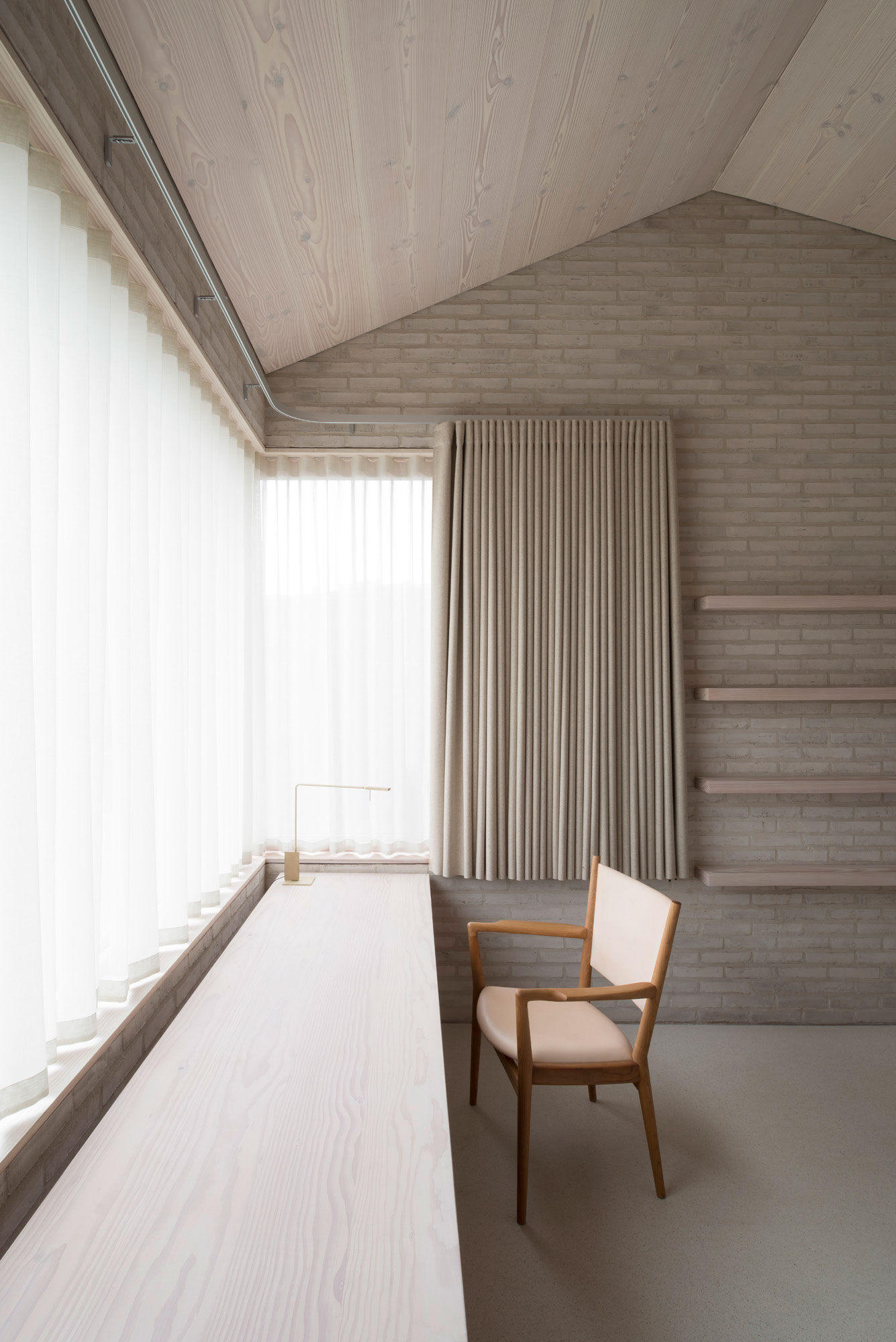
This past week I’ve been scurrying to pull together the last details on my makeover of Ivan’s home office, since it’s one of my top January to-do’s to complete the room by the end of the month. Whenever I’m designing for my own home, I’m always struck by how much harder it is to make decisions for my space than it is to do it for others. Maybe it’s because I’m the one who has to live with my choices in the long term, or maybe it’s simply because there’s no one forcing me to make them in a timely manner, but whatever the reason, I get caught with a serious case of analysis-paralysis. A perfect case-in-point is the fabric selection for the Roman shade we’re ordering from Blinds.com. I hemmed and hawed over it so much that you would have thought it was a life or death decision, not one as straightforward as designing a Roman shade!
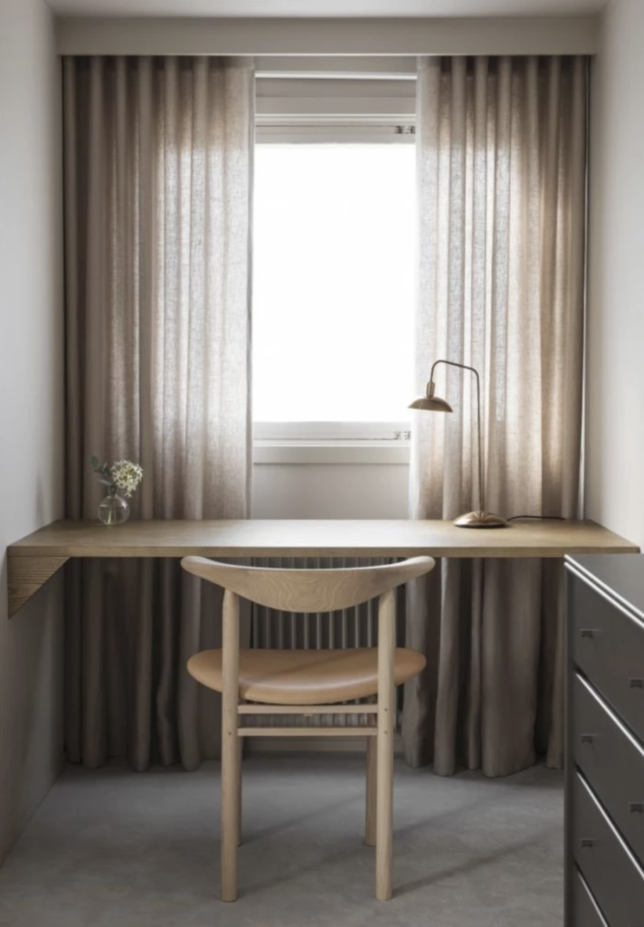
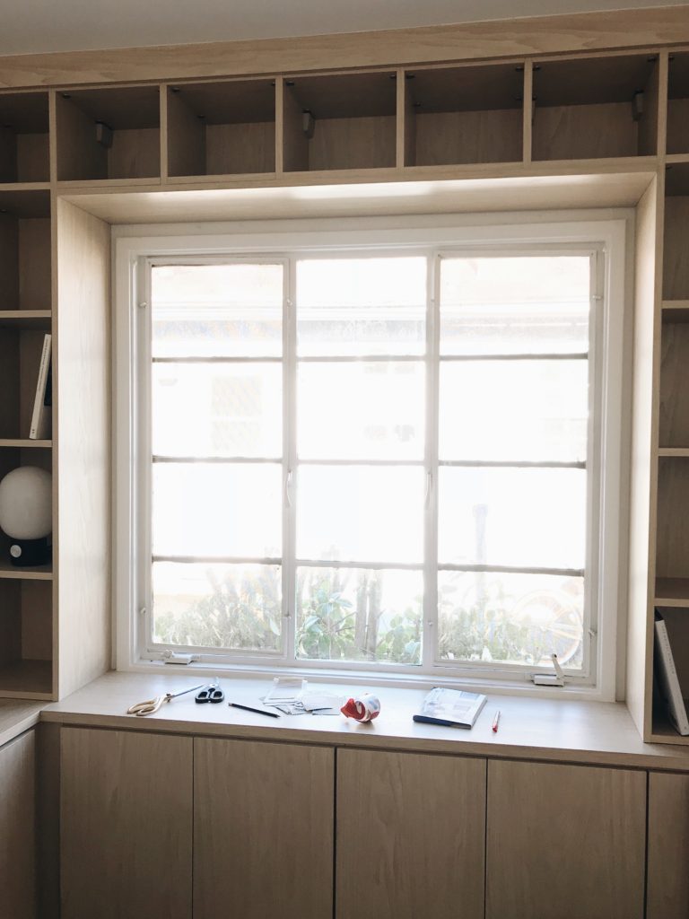
My early inspiration images for the space as a whole featured a lot of tone-on-tone touches, including monochromatic draperies such as the ones pictured here. I was drawn to the sense of texture and movement they provided, and appreciated that they didn’t detract from the soothing personality of the space. I knew I wanted to recreate the same look in Ivan’s office As you can see from a shot of the space below, the shelves that surround the window create a unique space and don’t allow much room for curtains to be installed. Hence, my selection of a Roman shade as the window covering of choice. Roman shades feel crisp, clean, and modern, just like the rest of my home; and when they’re in their open position, the folds still provide a similar textural effect to the draperies I admired so much in these photos.
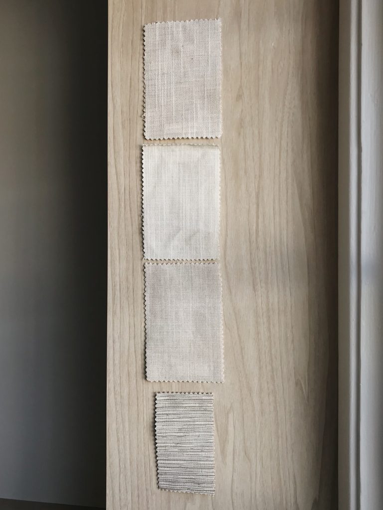
That’s probably another reason why I struggled so much to choose the fabric. In the absence of simply mimicking my inspiration images outright, I really had to nail my color selection to ensure the end result matched my vision of a monochromatic wonderland! It also didn’t make it easier that Blinds.com sent about a dozen really strong textile options my way. (They even overnighted the swatches to me, which was so appreciated!) Once I received the swatches, I managed to narrow it down to the four shown above, then spent about a week deliberating on my final choice. I carefully observed how each one looked at different times of day, I debated whether it was better to go with a subtle pattern over a true solid, I considered abandoning my plan to match the fabric to the surrounding wood and thought of introducing a bit of contrast instead, and I even had a last-minute change of heart and looked into the possibility of doing curtains after all.
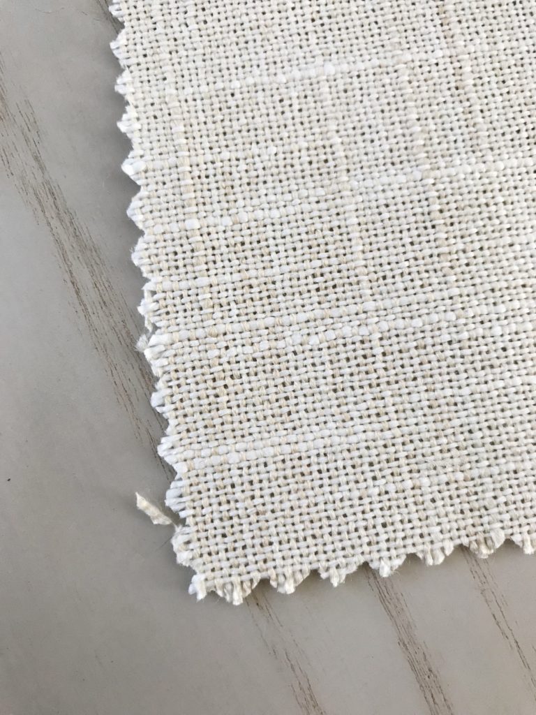
In the end, of course I went with the fabric that I’d liked best from the very beginning. (Why is it so hard to trust my gut sometimes?!) The fabric is a 100% linen called ‘Alabaster’ from Blinds.com’s Somerset fabric collection, and ultimately what sealed the deal for me was the layered tones integrated into the weave. It beautifully echoes the colors in the wood grain of the shelving, and when all installed together I’m confident that I’ll get exactly the look I’ve been craving! The shade is being sewn right now, and it arrives later this month—so be sure to stick around to see the final result!
