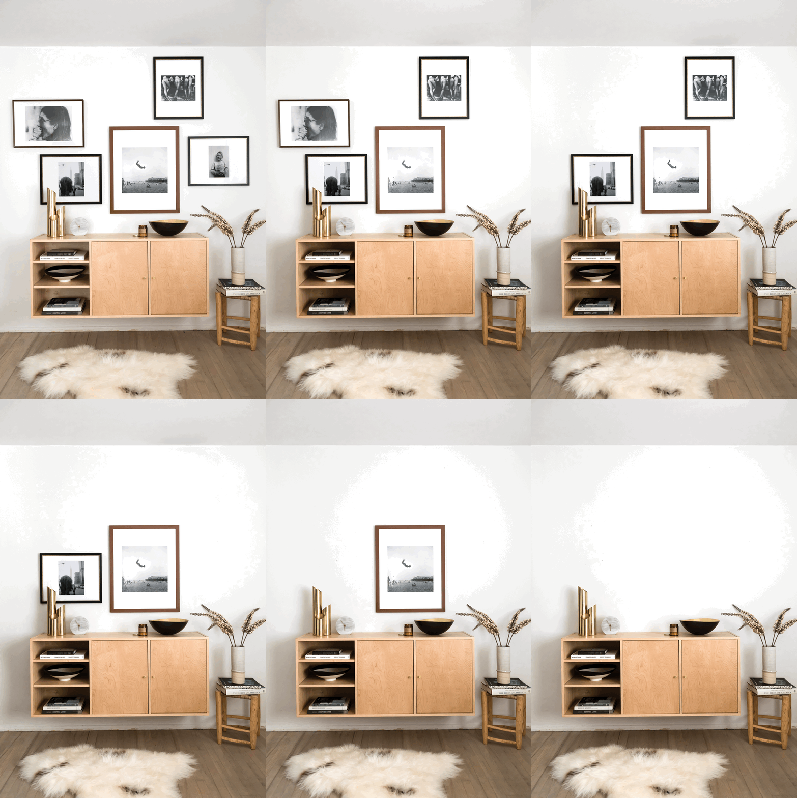
Interiors trends come and go, but one thing that’s here to stay is gallery walls. Pausing to admire a successfully executed one, whether in person or on Pinterest, fills me with delight. It’s almost like the wall is sending a love letter my way—one with a sense of order and harmony that makes me feel at ease. What doesn’t make me feel at ease, however, is process of designing and hanging a gallery wall. Selecting the art pieces and their positioning is largely trial and error, which can be frustrating and often leads to disappointment when the frames are finally on the wall. But now, Art.com has released two new tools within the Art.com app that make building your own gallery wall ridiculously easy and fun! The first one, ArtView™, is a patented augmented reality feature that lets you see your prospective gallery wall your space; and the second, the Gallery Wall Designer, offers up pre-set frame layouts that you can pop your favorite artworks into until you settle on a combination you like! I used the two together, and as a result the total time I needed to design and hang the arrangement in this post was less than 60 minutes. Snag the foolproof 1-2-3 process I used to get my own custom gallery wall in under an hour, so that you can create your own!
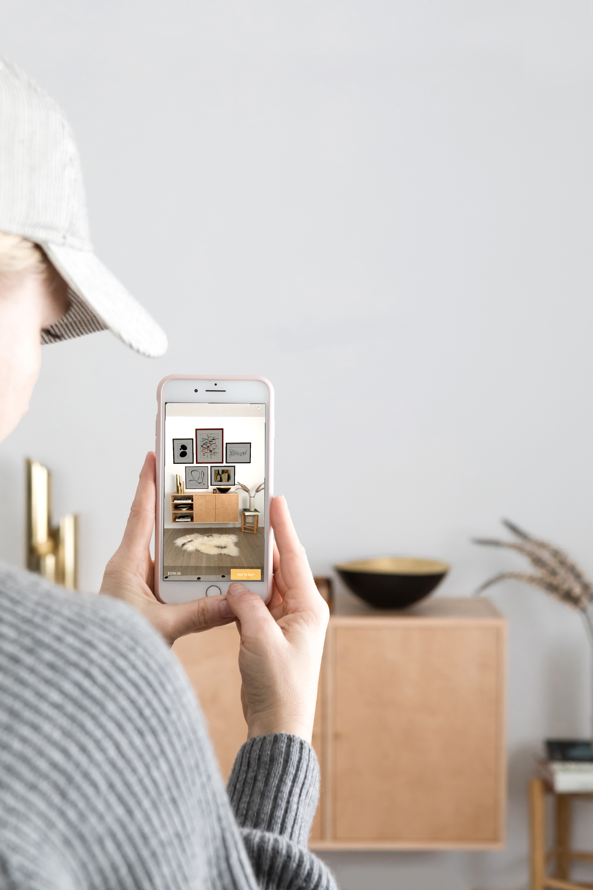
1. Select Your Frame Style + Layout: Download the the Art.com app here, and select the Gallery Wall Designer. You’ll be given a selection of frame styles and layout options, all of them containing suggested art pieces to get your creative juices flowing. Sample them on a wall in your house by tapping on the “View In Room” function, then follow the tutorial to watch as—like magic!—your phone’s screen layers the real-world scene in your camera’s viewfinder with a virtual, to-scale layout of the gallery wall you chose. You’ll be able to get a feel for exactly how the art will look in your home, with your existing furniture and decor, all without nailing a single hole in your plaster!
2. Choose a Category of Artwork or Color Palette: Now comes the really fun part! It’s time to start honing in on your art choices from the thousands of pieces in Art.com’s massive catalog. I like to give myself narrow parameters so that I don’t catch a case of indecision paralysis. In this instance, I went for black and white photography, since I’ve been growing increasingly fond of that medium of late. But feel free to make it your own, of course! You could go for all figurative works, in a mix of photography, painting, or illustration. You might choose mixed media but limit your color palette to Impressionism-inspired pastels, or Warhol-inspired brights. Whatever arbitrary structure you assign yourself, just select those filters in the Art.com app’s search tool, and you’ll immediately have a shortlist of possible options!
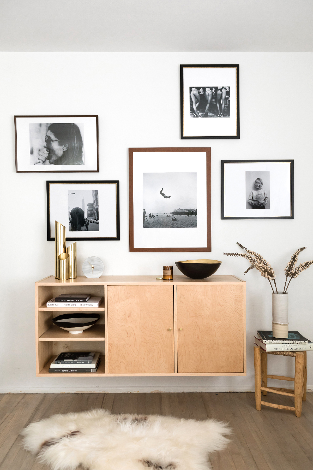
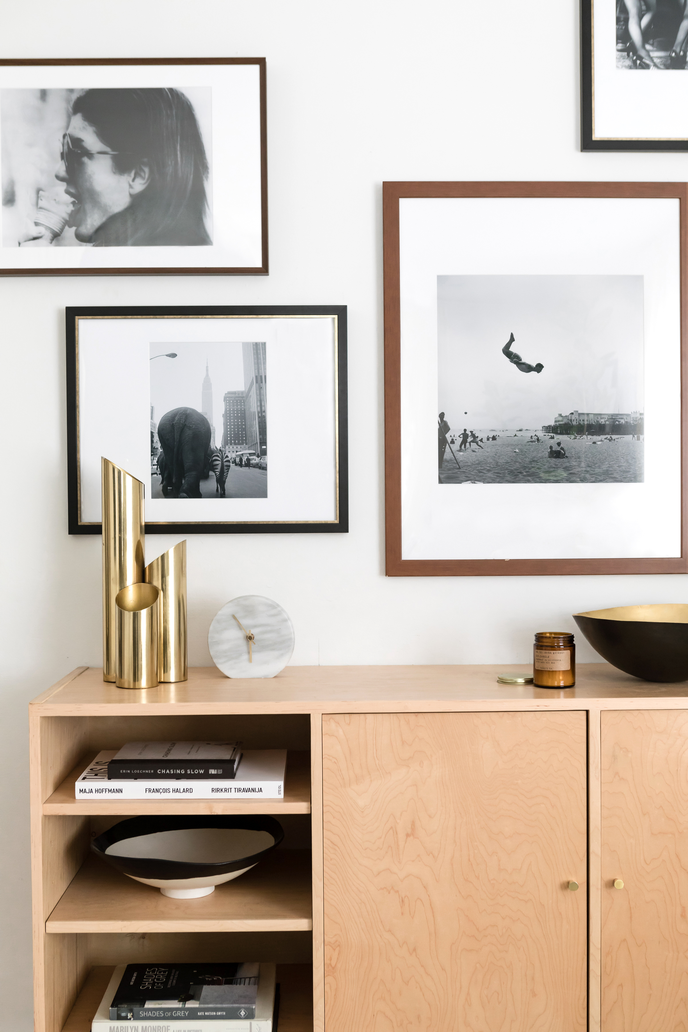
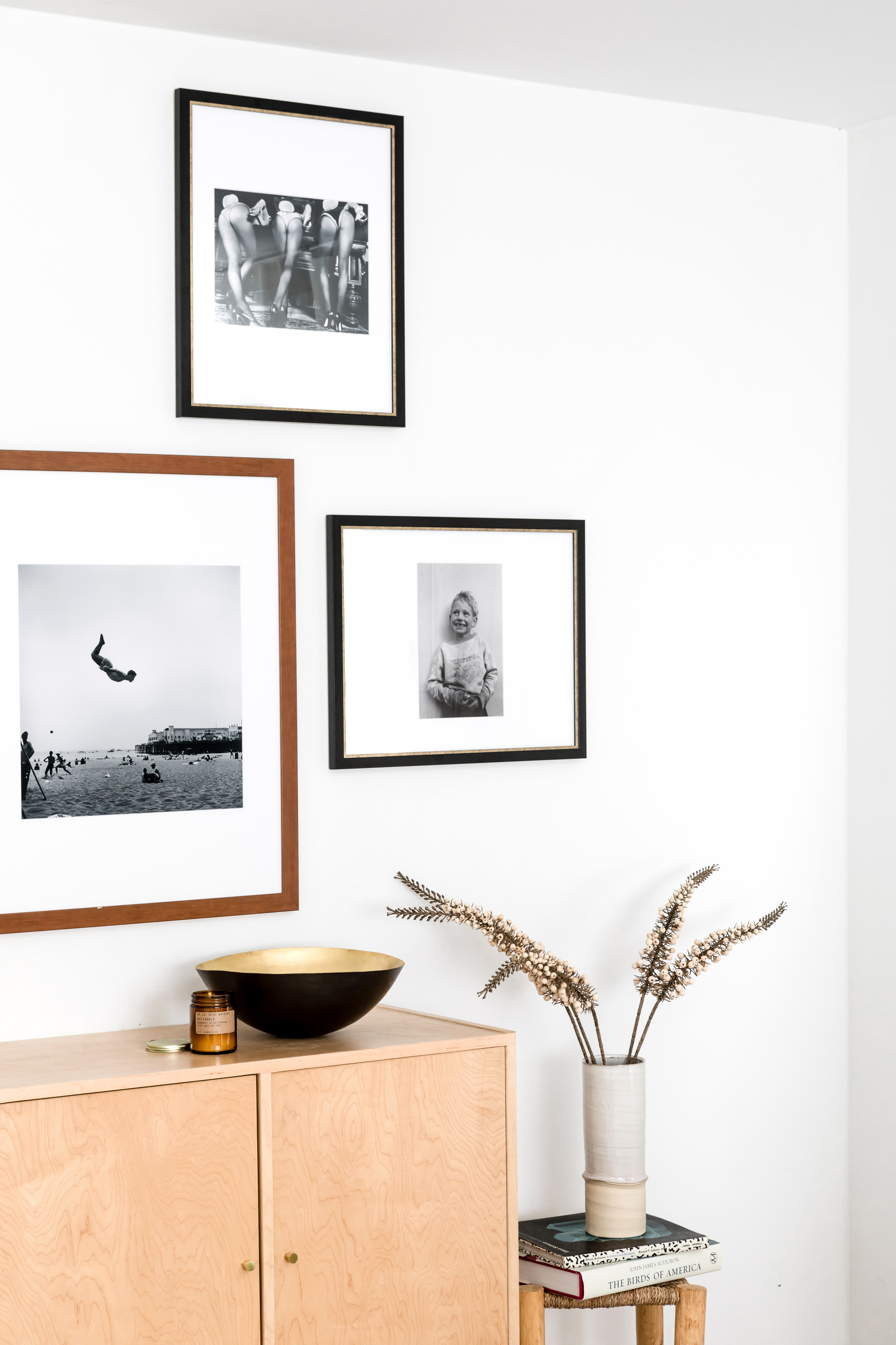
3. Finally, Decide on a Theme or Mood: Here’s where it really gets good. Ask yourself what emotions you’d like to evoke each time you walk past your gallery wall in your home? Art is all about adding personality, after all, and you as the designer get to control exactly the mood you create with it! For example, you might lean towards words like soothing and serene, or bold and energetic. For this project, as I was scrolling through the black and white photography section in the Art.com catalog, I was immediately drawn to the image of Jackie O. eating an ice cream cone—so I decided to run with the concept playfulness and make it my theme. As I browsed the rest of the artwork at my disposal, I tapped on the heart icon to favorite anything that sparked joy in me. A backflip at the beach, circus animals in Manhattan…let’s just say the five that made the cut to appear here were just a sampling of all the good stuff in my favorites folder!
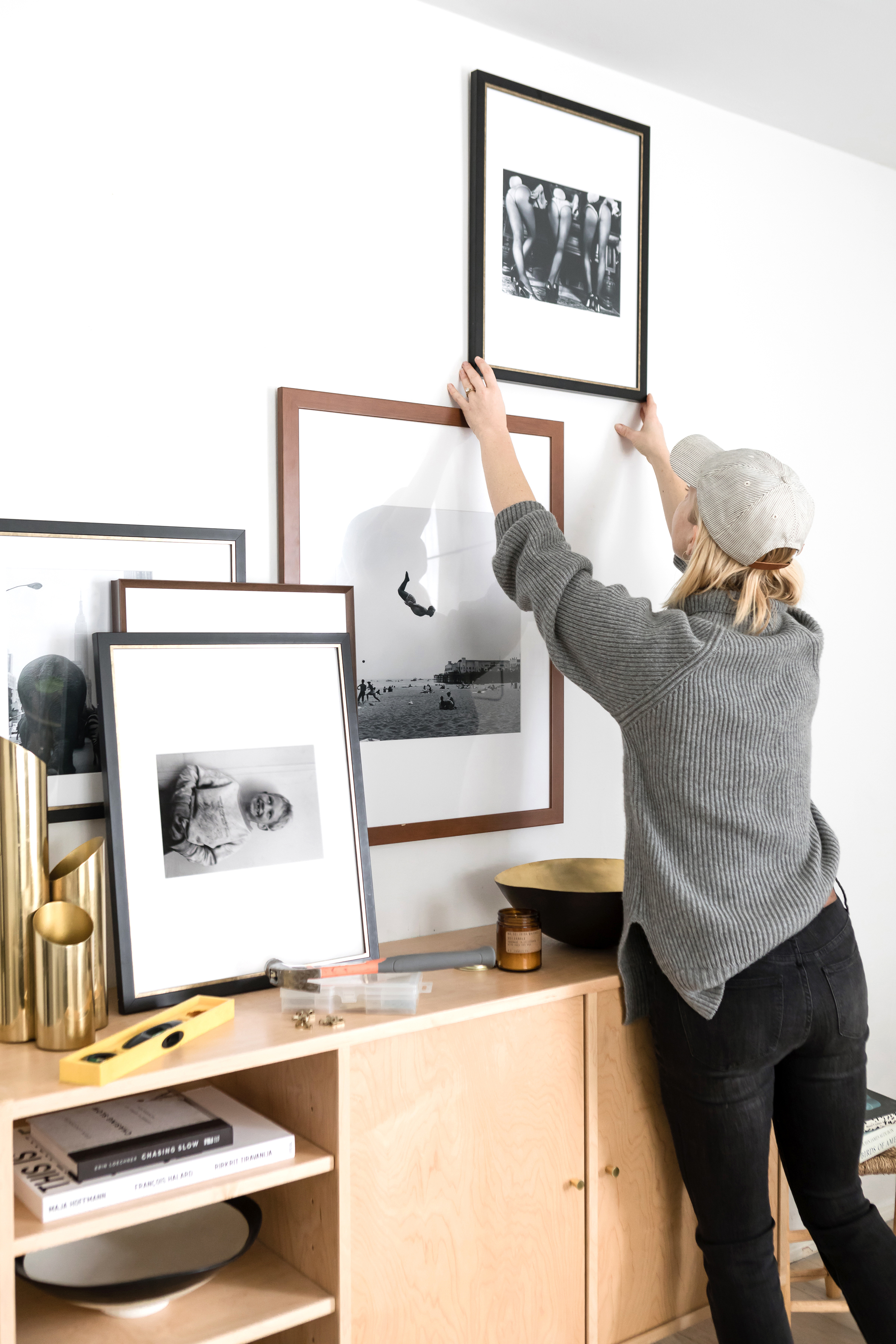
Once you’ve rounded up a good quantity of favorites, all you have to do is plug them into the frames of your selected layout! I could have spent years exploring all the many permutations, but ultimately I went with my gut on what felt right to my eye: a good balance of light and dark, negative (i.e. empty) space and positive space, and in this case, a varied mix of subjects and angles to help the pieces feel diverse and dynamic. Mix and match to your heart’s content, but trust me when I say that you’ll know when you’ve landed on your perfect gallery wall. It’ll feel right. And with a tap of the ‘Buy Wall’ icon, it’ll be just days away from hanging IRL in your house! Oh, and to make it even easier to love your wall, Art.com is giving away five $500 shopping sprees so that you can build and hang your own Gallery Wall with ArtView™! Pop over for the deets on how to enter, and then share your gallery wall vision using the #LoveYourWall hashtag. I can’t wait to see what you create!
Disclosure: I partnered with Art.com to concept, produce, style, shoot, write, edit, and style this post. All opinions are and always will be my own. Thank you for supporting the brands that enable me to bring you fresh inspiration daily! Photography: Monica Wang Photography.
