The deep dive into my process for our home office continues! Today we’re talking about our original art from Saatchi Art, which from the beginning was one of the elements I considered most thoroughly. At the outset of this project, I asked Ivan what he really wanted in his office. He told me art that reflected his interests and personality was at the top of the list. I loved that answer from him! He’s usually such a pragmatist that I expected his entire focus for the office to be solely on function.
Yet hearing that art was key for him meant that he was invested in co-creating a space that really felt like his. And certainly, there’s nothing like unique artwork to express the personality of a room’s inhabitant. As soon as it became clear that great art was mission critical for him, I knew I needed to level up from my usual resources. So I focused my selection on tons of limited edition and one-of-a-kind art from Saatchi Art for the makeover.
The mission of Saatchi Art is to demystify the art buying process by bringing the gallery experience online. They not only create easy access to original paintings, drawings, photography, and sculpture for any budget, but they also enable working artists to make a living selling their work! Their have a catalog of over 60,000 artists around the world is truly massive, so I took full advantage of their free art advisory service to help me narrow the field.
I was assigned a curator who asked me about the general aesthetic I was looking for, any specific pieces I loved, and what types of art I was especially drawn to. Based on my answers, she then sent me links to dozens of pieces she thought I’d like, as well as suggestions for artists whose body of work I might want to take a closer look at. It made the process of culling from tens of thousands of artworks so much more manageable!
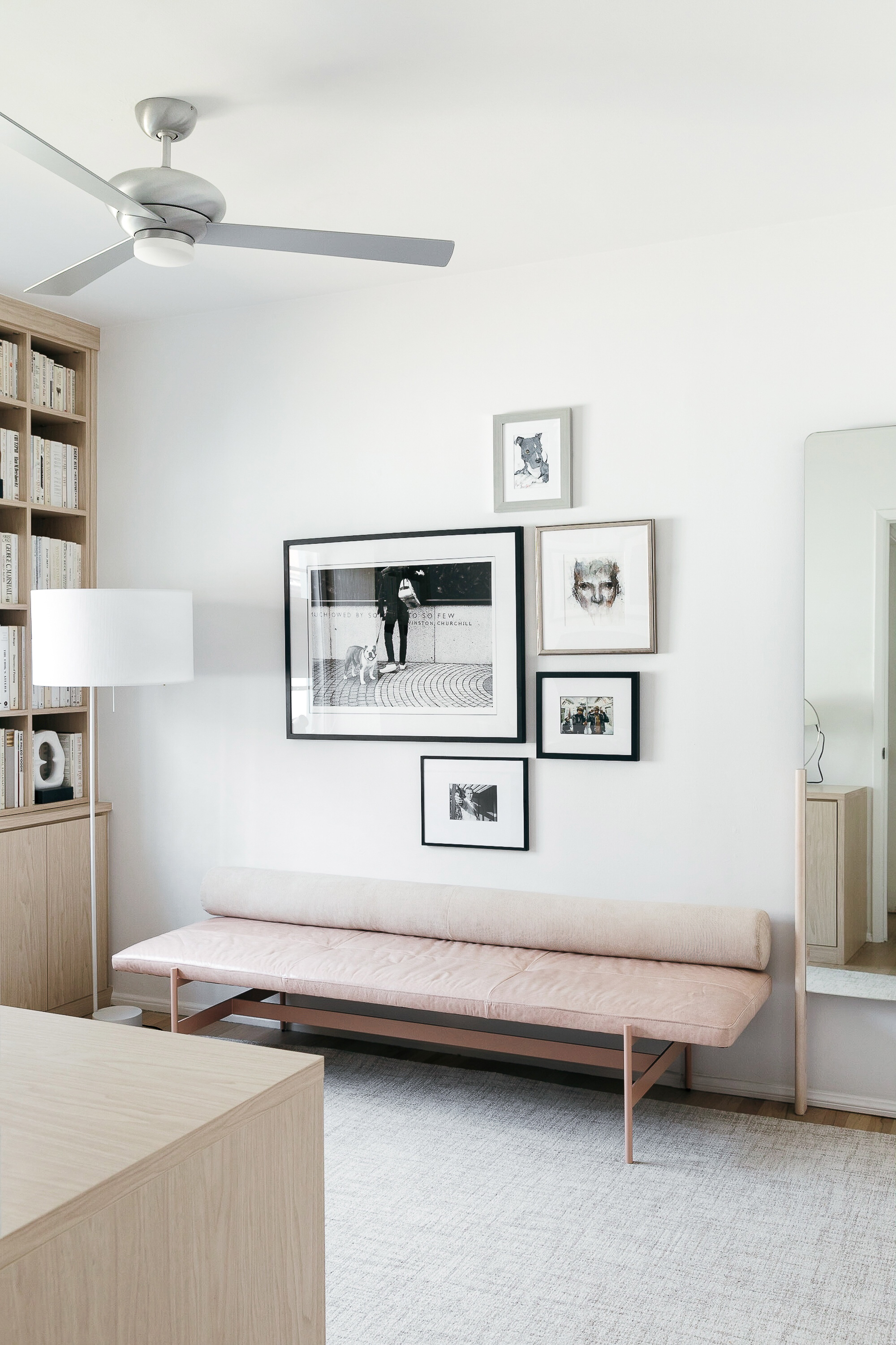
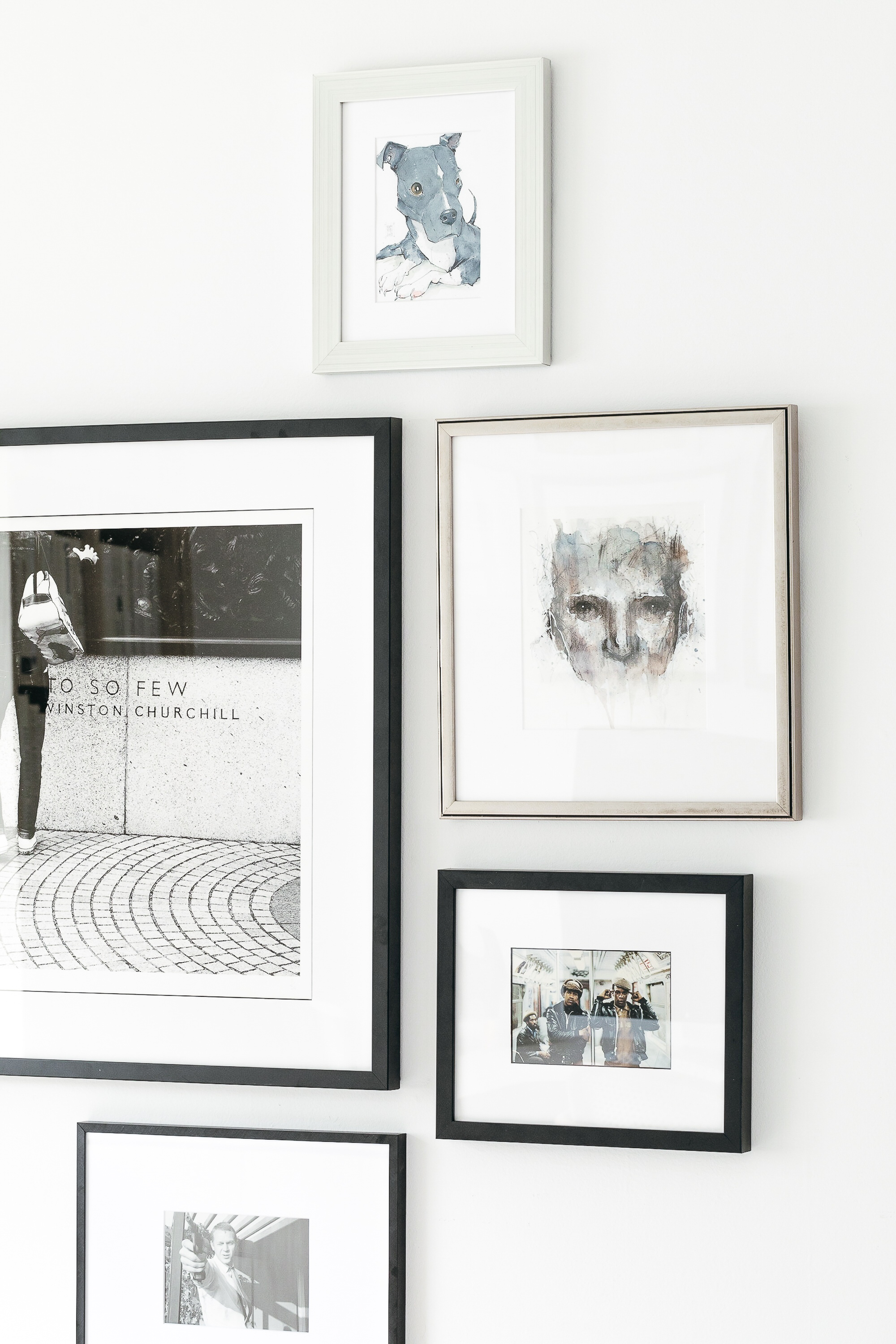
From the outset, I knew I wanted the art to echo the same monochromatic, textural vibe I was creating with the rest of the office components. That meant choosing artwork in black-and-white or muted tones, with lots of rich details like pen or brushstrokes. Yet I also kept in mind Ivan’s request that the artwork reflect his interests. He’s a huge dog lover, so I knew we had to include this fabulous black-and-white Bulldog Spirit photo in the mix!
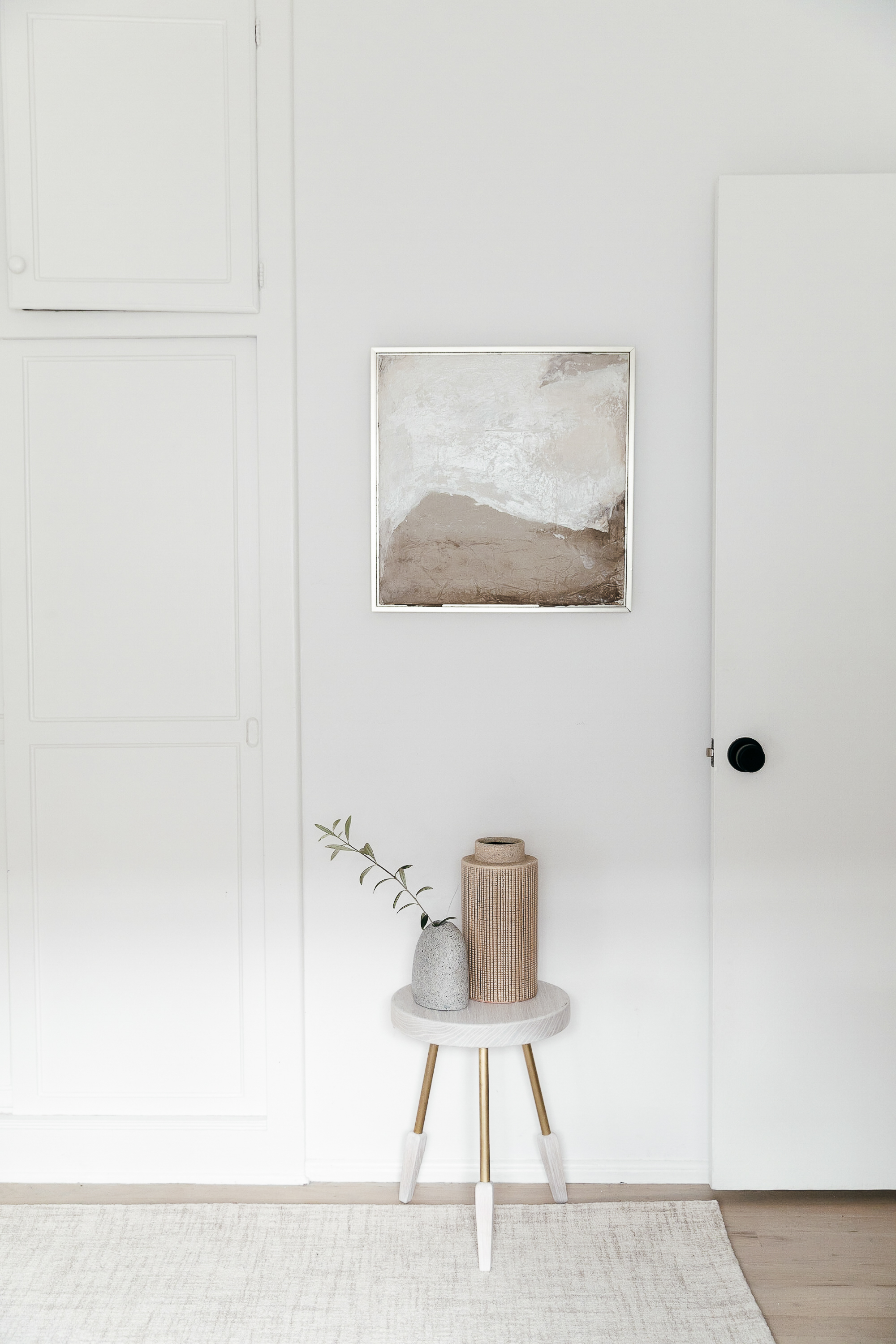
Ivan is also a huge music nerd, and some rock and hip-hop photos I’d previously given him for his birthday nicely rounded out the photography selection for the room. So I turned my attention to other formats to add a mixed media dimension. This “Untitled” ink and watercolor portrait reminded me of Ivan in its intensity of feeling (those eyes!); and this abstract oil painting entitled “Paper Landscape” was just plain gorgeous!
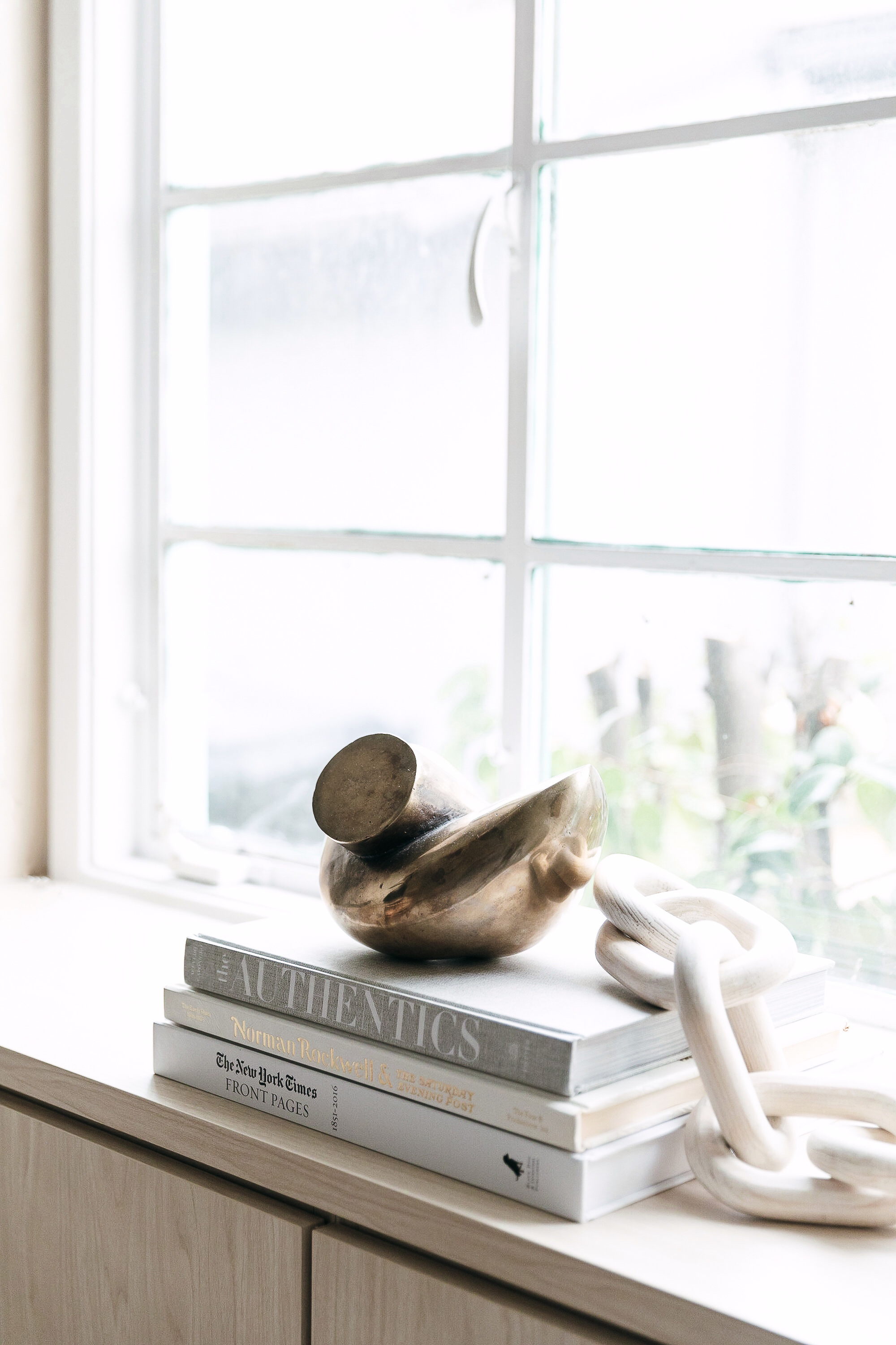
Finally, since the offerings of original art from Saatchi Art also include sculpture as well as paintings and photos, I chose this stunning solid brass sculpture called “Twist”. In my mind’s eye I could see it making a major statement on the shelf beneath the window—and that’s exactly what it does!
Once I’d chosen our artworks and gotten Ivan’s seal of approval, Saatchi helped me place the order and get everything into my hands ASAP. The cost of shipping was included in the price of the artwork, and even though I chose pieces from artists around the globe, Saatchi Art handled all aspects of international shipping and customs for delivery that was smooth and seamless. Plus, Saatchi’s 7-day 100% money-back guarantee meant that if anything hadn’t worked as we’d hoped, I could have returned it with no questions asked. That type of shopping confidence is practically unheard of in the world of original art!
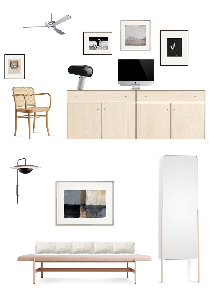
One thing to note about my art selection process for this space—and which you can see illustrated in my early mockups above—is that the final hanging arrangements turned out quite differently than my initial layouts. Once I saw the pieces in person, in the room, I changed my mind a zillion times about how I wanted them hung. I’d even ordered one abstract painting that I initially planned to hang over the bench, then ended up not putting in the office at all. As it turned out, I vastly preferred it in our living room!
At first I was a bit down on myself for this unexpected detour from my plan. (I should have been able to predict how it would all look, I told myself.) Then I reminded myself it’s actually quite normal for an evolution from the original vision to occur. An important part of design is rolling with those changes. What mattered most was that I’d chosen pieces that looked great together no matter how I arranged them: pieces that were consistent with the overall aesthetic I had in mind, pieces that will be one-of-a-kind treasures in our lifelong art collection, pieces that both Ivan and I absolutely adore!
Photography: Monica Wang.
