Nothing excites me more than sharing a completed design project with you guys, and the one I have for you today is extra juicy! You may recall a while back when I shared inspiration for a glam, modern powder room that Caroline and I were working on for a friend. Well, the finished space is ready for ogling! From the bold pattern mixing to some seriously ingenious construction details, this is definitely our proudest interior yet. Here’s how it all went down!
Our client was Christy, a mom of 3 who’d slowly been updating her midcentury house one room at a time. She’d done what so many moms would do: Focused on the common family spaces before thinking about creating a space for herself! She’d done an incredible job designing and installing her previous projects, and we were lucky to be working with a client who has both fabulous taste and a thorough knowledge of the renovation process.
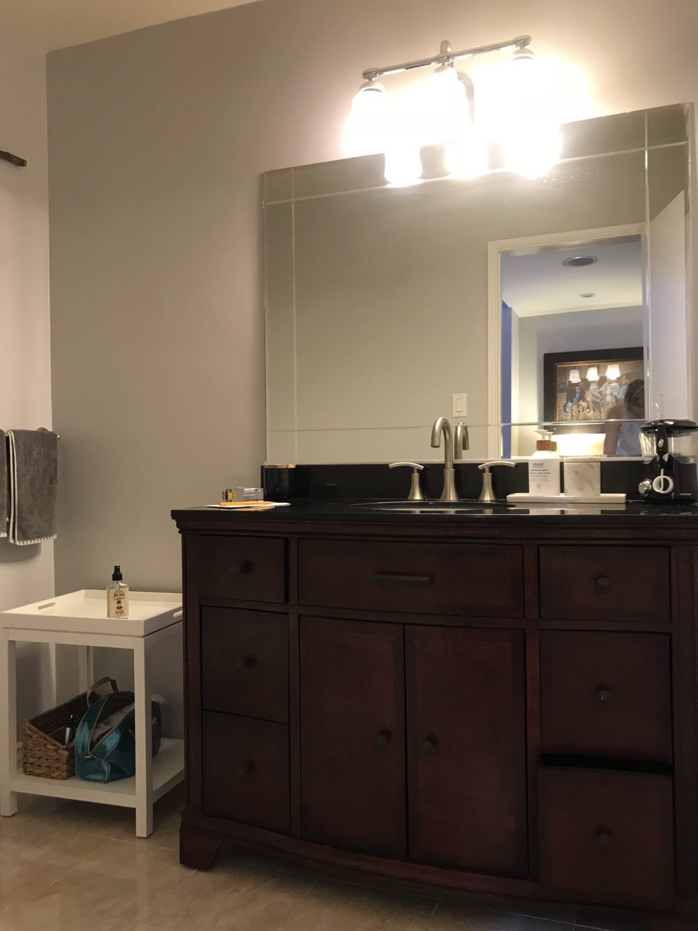
This modern powder room was the last bathroom awaiting an update, and it’s the one that Christy planned to use as her own. She reached out to us to design it because she knew we’d push the envelope beyond what she’d already done in the rest of the house. Our goal was to present her with a just-for-her sanctuary that feels really special—one that reflects how incredibly stylish she is, and one that would make her feel a little spark of joy every time she walked through the door. As you can see from the below before photo of the space, there was nothing joyful about the bathroom in its existing state!
Even though Christy plans to use this modern powder room as her own me-time space, it also needs to serve as the guest bath when visitors come to stay. For that reason, she wanted to keep things pretty streamlined and straightforward, functionally speaking. In terms of the aesthetic, Christy went with a relatively modern, neutral palette in the rest of the house, so she wanted this room to be in keeping with the tone she’d previously set elsewhere. But she was open to having fun and making a bold statement within those stylistic parameters—which was music to our ears!
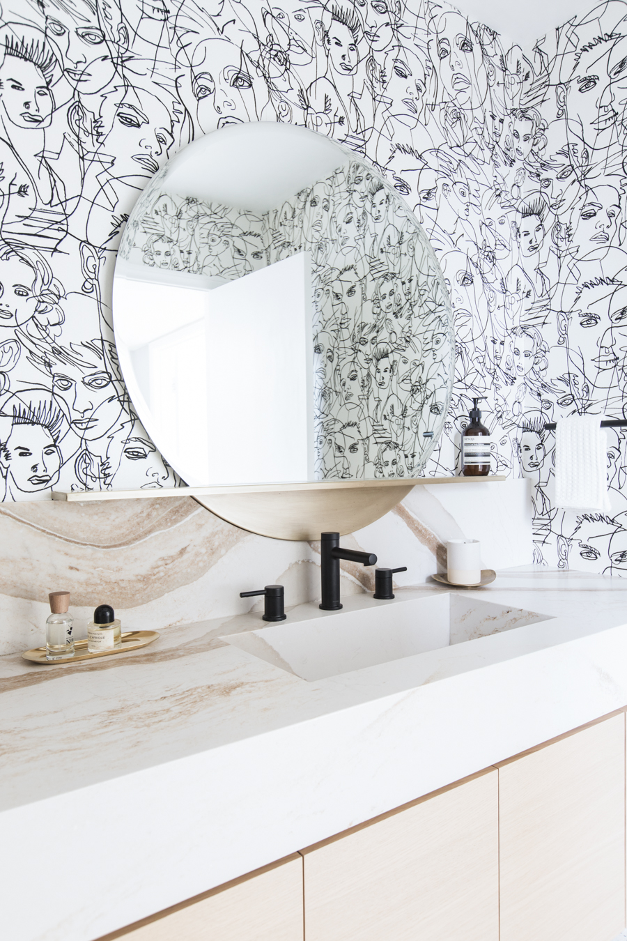
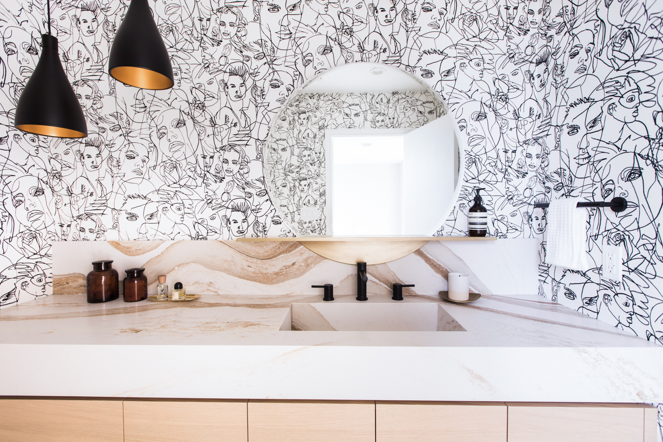
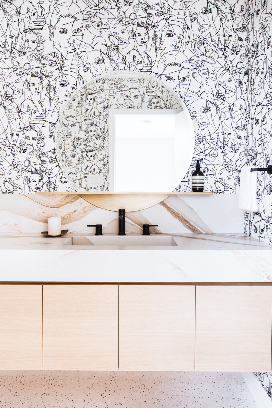
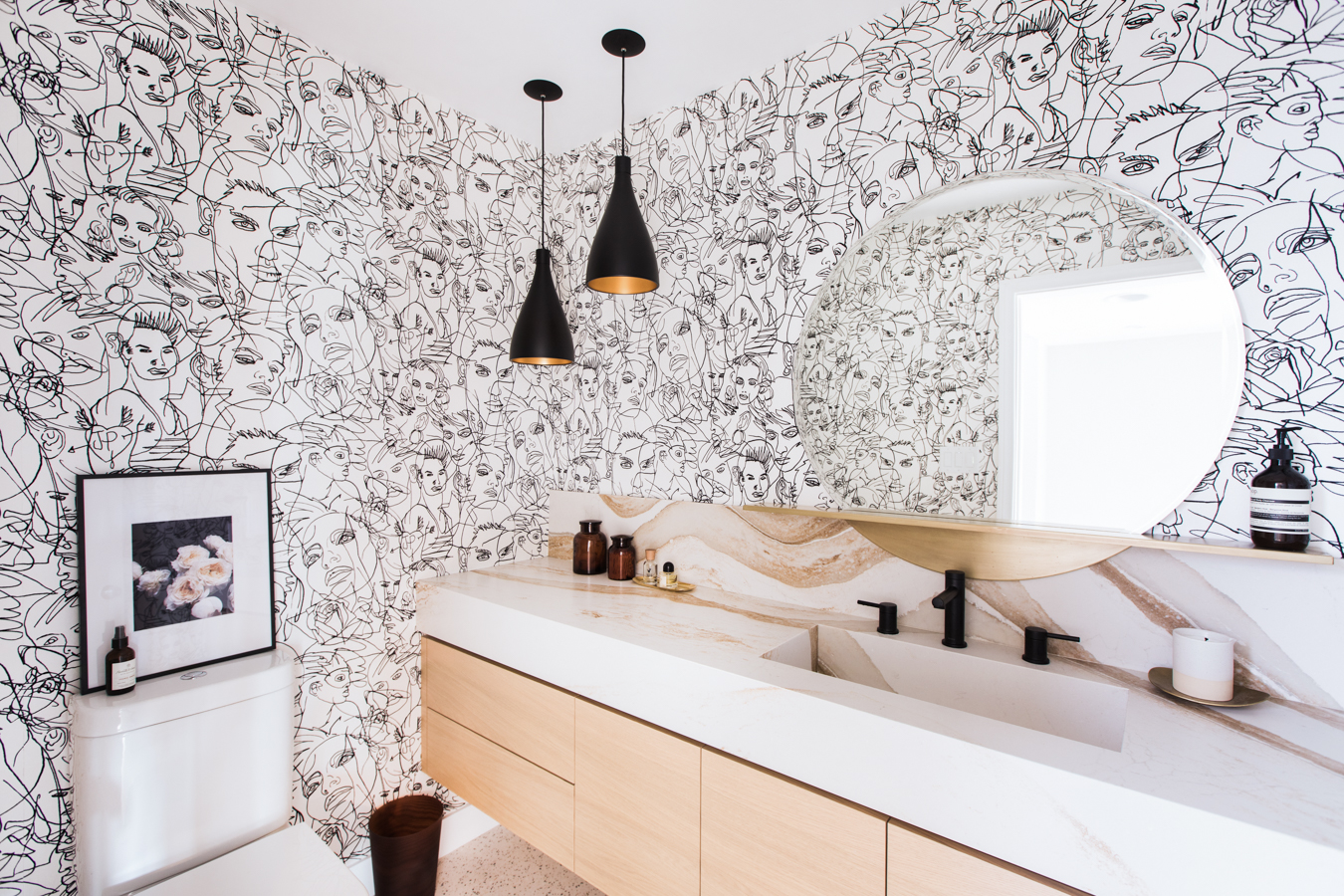
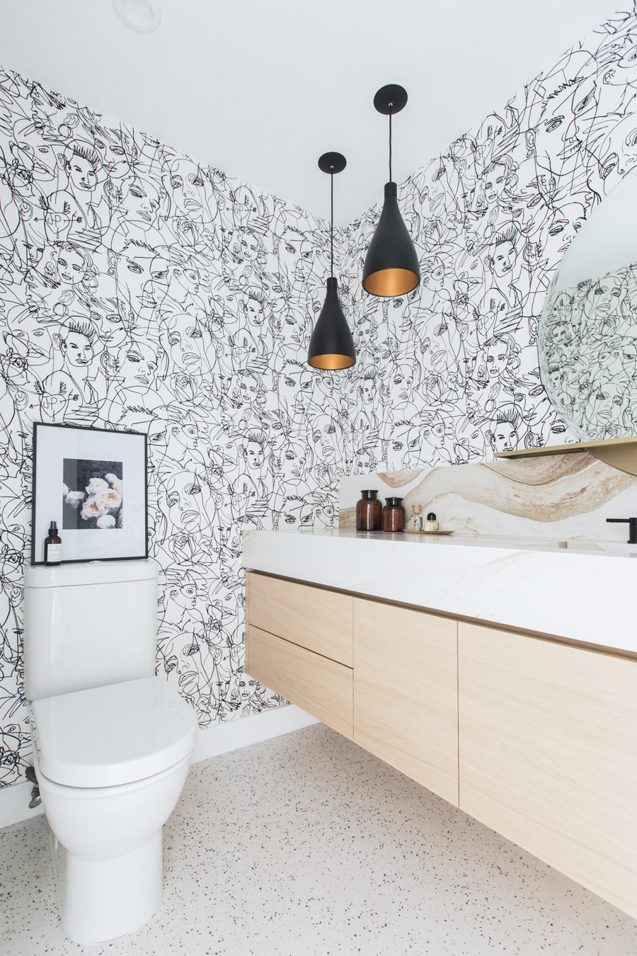
Let’s just say this definitely wasn’t the most spacious floor plan we’ve ever worked with! It’s pretty narrow, as you can see from the photos, and what little space that was available wasn’t being maximized with the existing fixtures. Our biggest functional choice was to install a floating vanity that spans the length of the room, in order to provide as much storage and counter space as possible for Christy’s bathroom essentials. We also made the integrated sink 24” x 12”, somewhat longer and narrower than is standard, so that Christy could have a sizeable basin for washing.
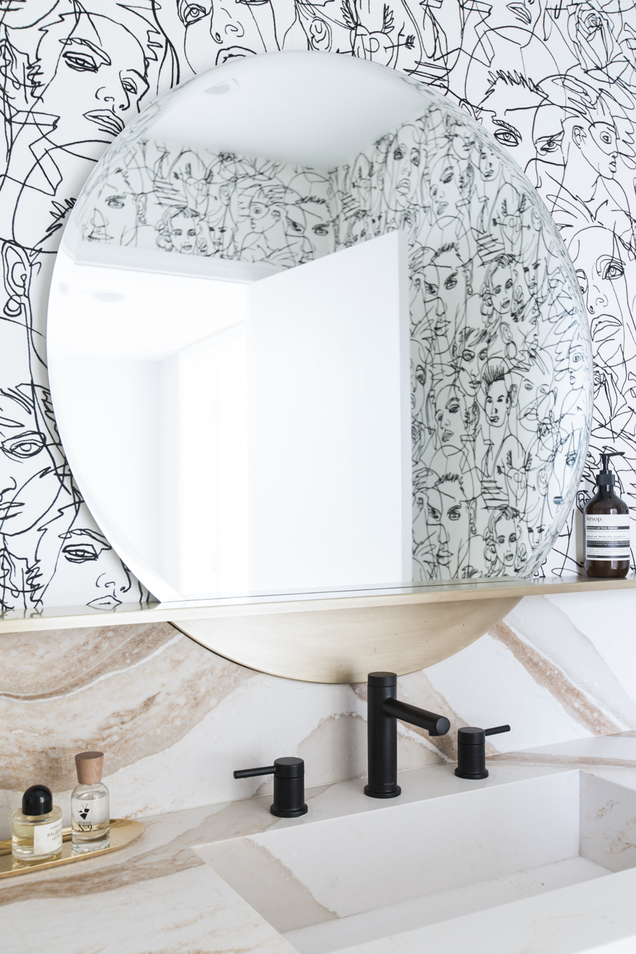
Our most important materials choice was using Cambria for the countertop. For starters, their natural stone surfaces are incredibly durable and resilient, perfect for a bathroom setting because water and cosmetics can be wiped clean away without any lasting damage. As well, their slabs are incredibly versatile and can be cut and installed according to even the most unique specifications—which was important since we were working in a tight space and wanted full control over our dimensions, especially for the integrated sink design. Finally, the stunning striations in their Britannica Gold design perfectly suited our vision of a neutral palette with bold, memorable patterns.
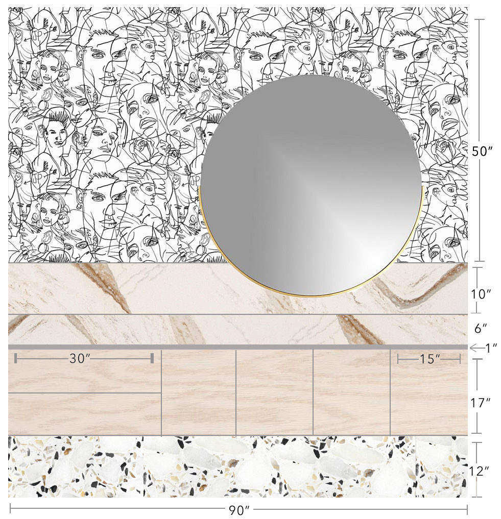
Sometimes my best ideas come to me in the middle of the night, and that was definitely the case with one of our favorite details in this room! We’d fallen hard for CB2’s Perch mirror, both for its aged brass finish and for the strong architectural statement of its built-in shelf; but we were having trouble envisioning how it would be mounted given the tall backsplash. Then, Anne was noodling over the problem while she lay awake at 2am, and a lightbulb went off in her head: Why not ask the Cambria fabricator to cut the stone so that the mirror could fit into the backsplash, with the shelf fitted snugly over top of it? Sure enough, he was able to do exactly that—giving an incredible custom look to this ready-purchased mirror!
As for that wallpaper, when Christy first approached us and we were throwing around ideas for the powder room, it became clear that a statement-making wallpaper should be our main inspiration point for the design. Powder rooms are such a great opportunity to use incredible wallpaper, after all! Because it’s a small space, you can take a risk that you might otherwise avoid in a larger room. And of course, because the square footage is limited, the cost of wallpapering a modern powder room is much more manageable. Finally, given our vision of a fashion-forward escape for our very chic client, an impactful wallpaper seemed like a no-brainer!
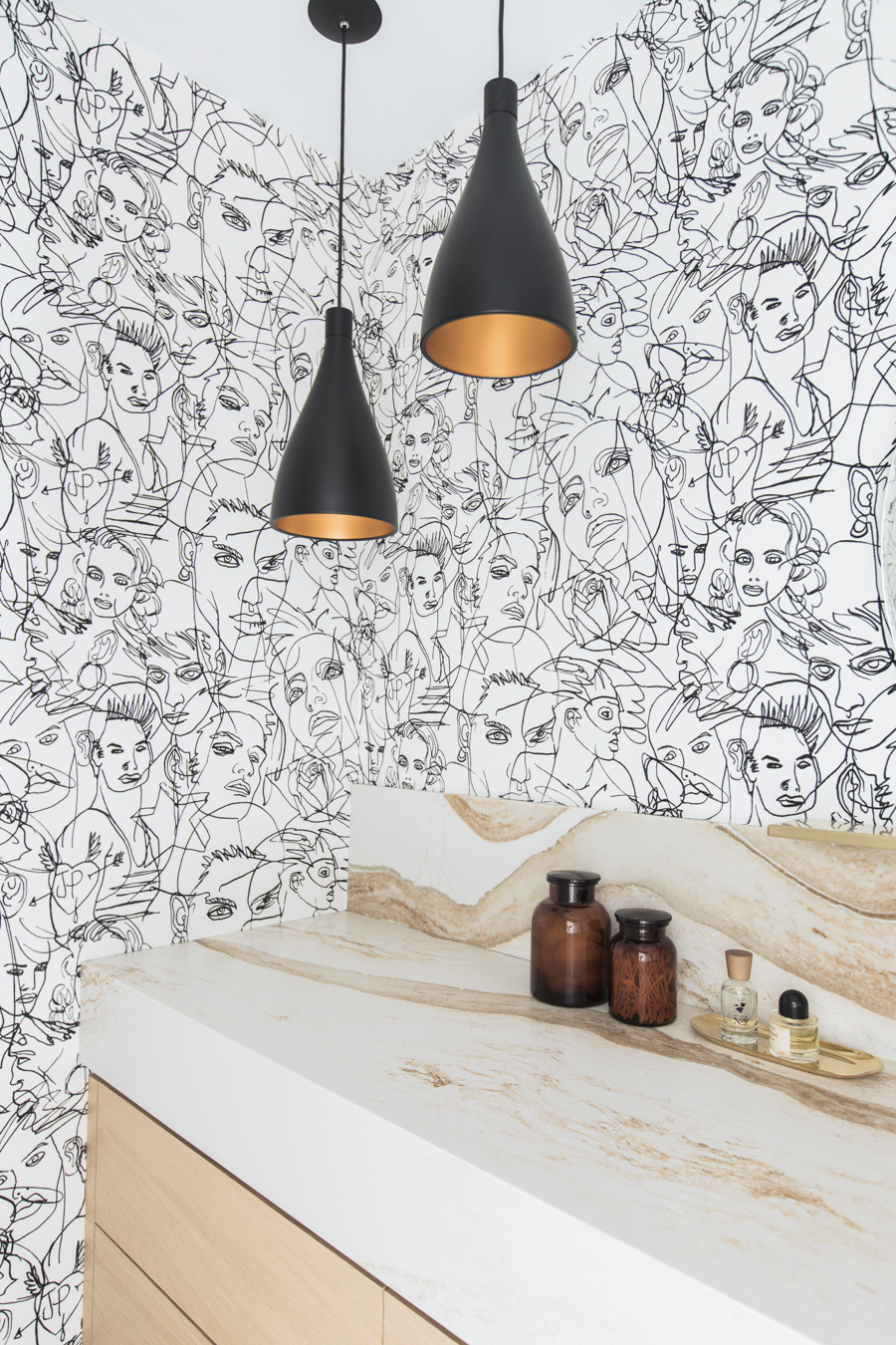
We ordered samples of about 75 wallpapers before narrowing it down to three that we presented to Christy, and this flocked velvet design by Jean Paul Gaulthier was the clear winner. The pattern is called ‘Croquis’ and we chose the black/ecru colorway. Its both fun and sophisticated at the same time—just like Christy herself!—and we loved how the flocked outlines of the faces brought a tactile element to the room. We also adored how the paper has a subtle sheen to it, for a quiet touch of glamour. To protect the paper from water damage, we made sure that our backsplash was plenty high; this choice had the added bonus of really emphasizing how beautifully the wallpaper and the Cambria stone play against each other!
The pattern layering continues in the terrazzo floor, which is a natural stone aggregate from Concrete Collaborative. The company has existing patterns but we had a specific vision of what we wanted our terrazzo to look like, in order to complement the other elements of the space. We sent them example photos of what we were picturing and they were able to create a custom aggregate just for us! We were especially happy that we were able to do a seamless, poured finish, rather than separate tiles, for an especially streamlined look.
We selected the blonde oak of the floating vanity for its light presence that keeps this small space feeling bright; while the wood’s natural grain adds a welcome organic element. Christy had worked with contractor Fardad Zaghi on her other bathroom installs and raved about his work; we highly recommend him for all LA-area jobs! We chose matte black fixtures with clean, modern lines—the faucet, the pendant lights, and the towel and toilet paper holder—for their strong silhouettes that would stand out against the looser, more abstract lines of the wallpaper.
Just in case you’re into that sort of thing, here’s the scale elevation I did when we embarked upon the install. From demo to finishing touches, this modern powder room project took about 4 months to complete. This was definitely longer than anticipated, mostly due to some delays that arose with our various subcontractors (never let it be said that construction is a smooth process). Needless to say, Christy was beyond happy to have her bathroom back at the end of the day—and she’s thrilled with the final result! Even today, she says, “I’m still loving it so much.” Mission very much accomplished!
P.S. In case you missed it, here’s the two powder room design directions we presented to Christy that she didn’t choose! And here’s more of the fab powder room wallpapers we rounded up when we exploring all our options.
Modern Powder Room Resource Guide: Counter: Cambria Natural Stone in Britannica Gold. Floor: Custom Concrete Collaborative design. Vanity: Custom build by Fardad Zaghi in Ivory Oak finish. Mirror: CB2 36” Perch Round Mirror with Shelf. Toilet: Duravit Darling New 2-Piece Elongated Toilet. Faucet: Moen Align Widespread Bathroom Faucet in Matte Black. Pendant Lights: Pablo Designs Swell 1-Light Single Bell Pendant from Perigold. Towel Ring + Toilet Paper Holder: GERZ Matte Black Stainless Steel Bath Accessories. Canisters: CB2 Almanzo Amber Canisters. Artwork: Fine art floral photography by Anne Sage. Photos: Echo & Earl.
