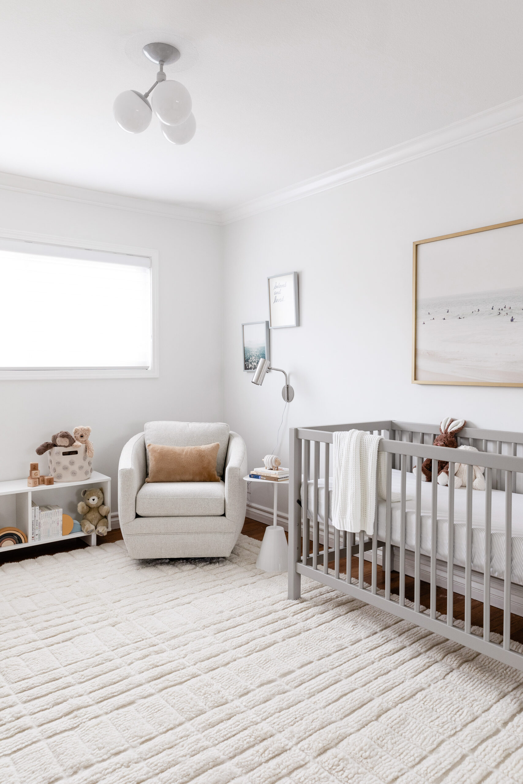
One of my favorite rooms in the house to design is the nursery. And this sweet + simple gender neutral nursery design I did for my friend Kim perfectly illustrates why! There’s something so gratifying about creating the first room in which a new little human will get to know the world around him.
From a design perspective, meeting the needs of parent and baby alike present a fun challenge. After all, moms and dads spend so much time in this room, it’s important that they like it too! Read on for the considerations I took into account when planning and installing this gender neutral nursery design.
This was the second nursery I’ve created for Kim (here’s the first one to refresh your memory!). It was important to us that it felt stylistically related to the rest of the house, yet also distinctly its own. What’s more, Kim wanted pieces that felt sophisticated and versatile enough to grow with her baby through toddlerhood and beyond.
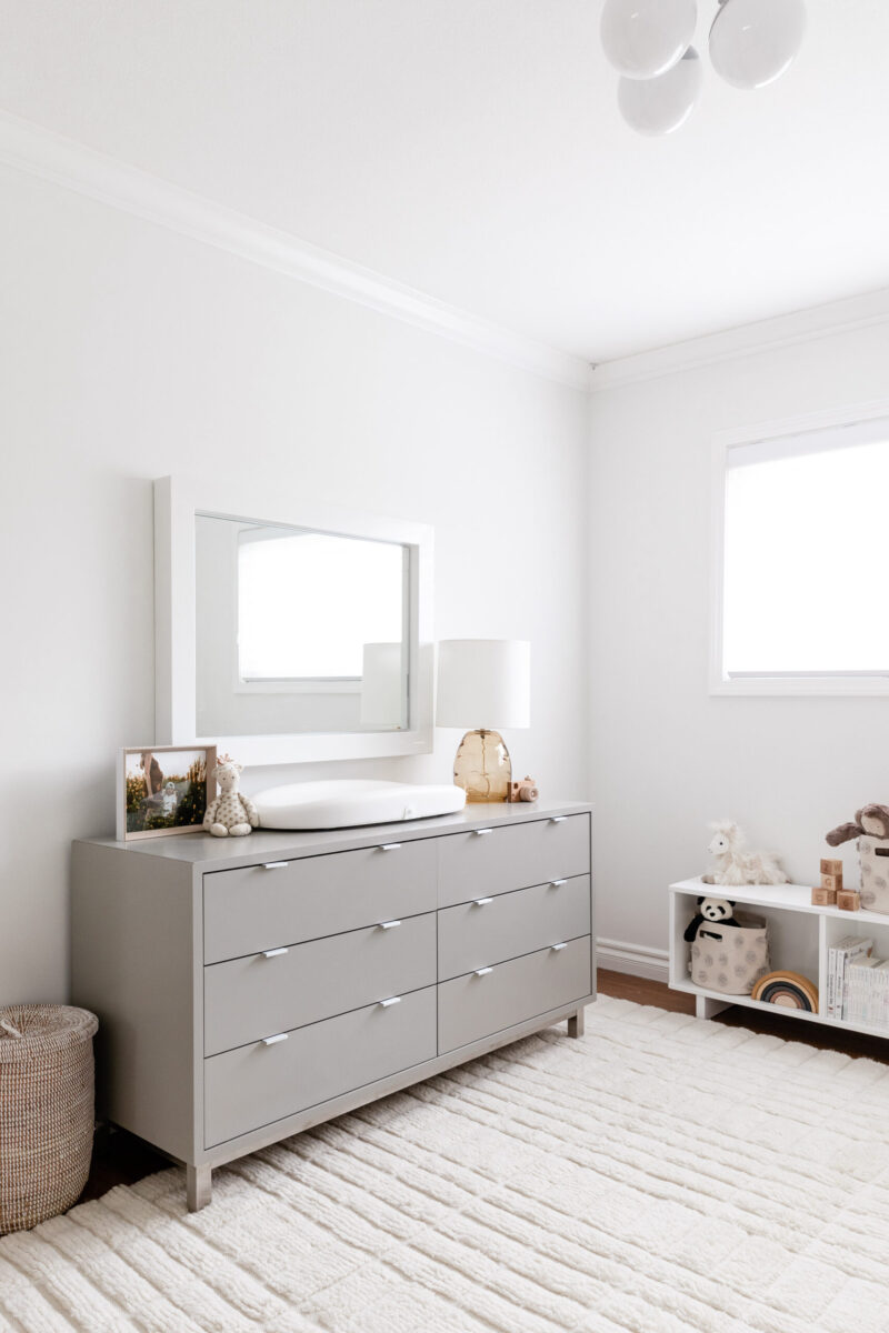
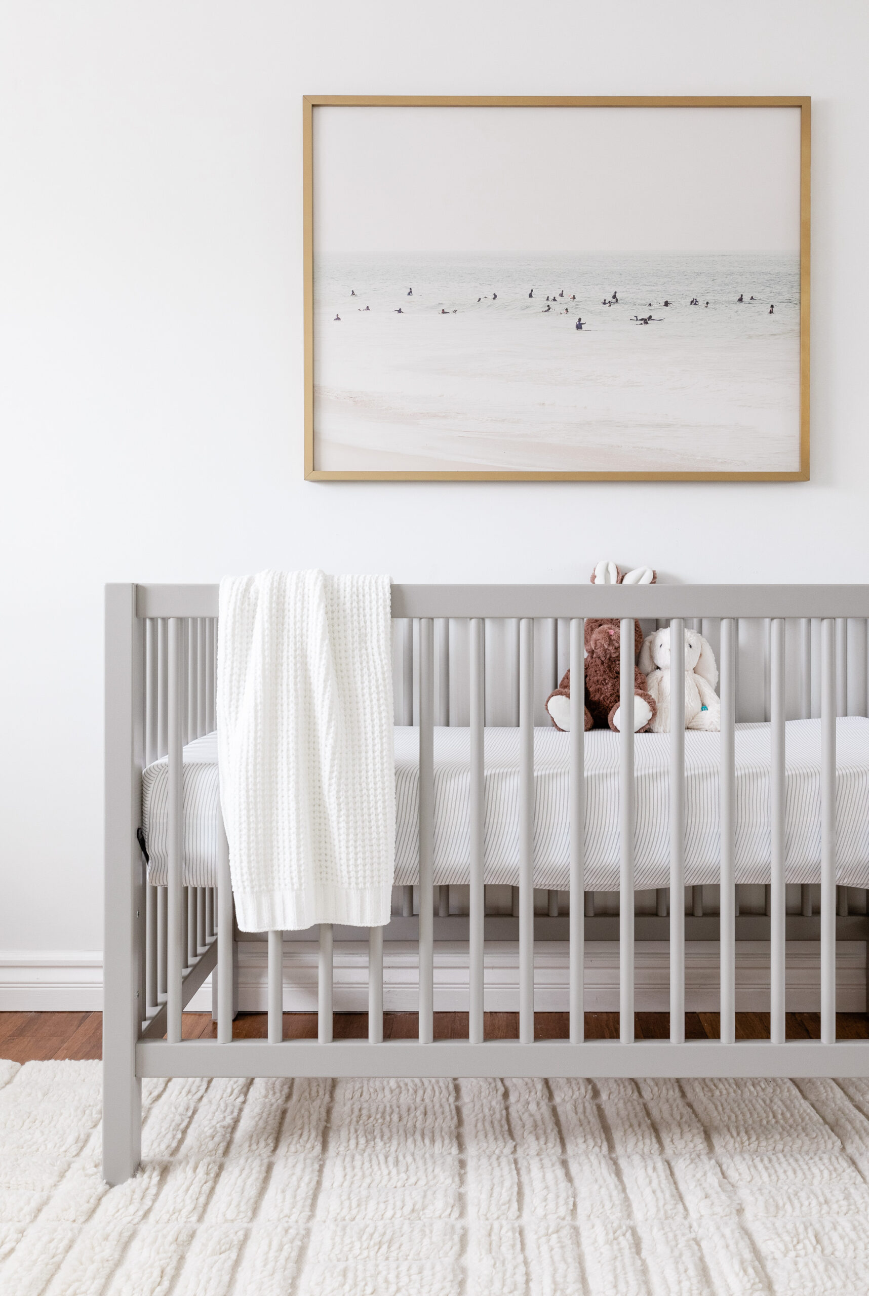
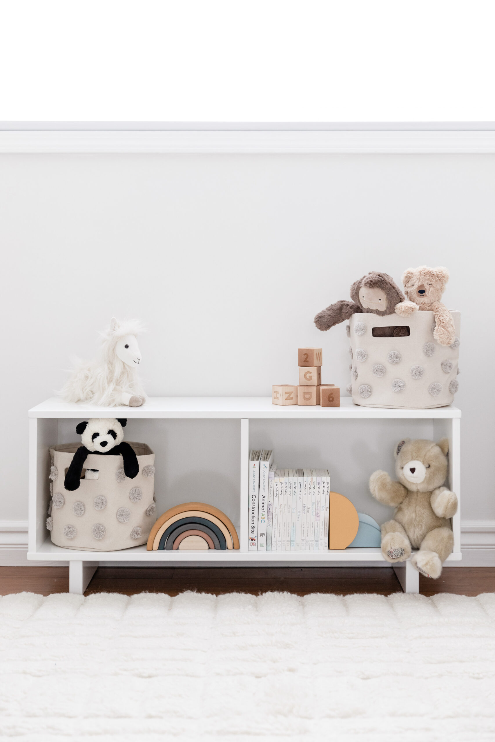
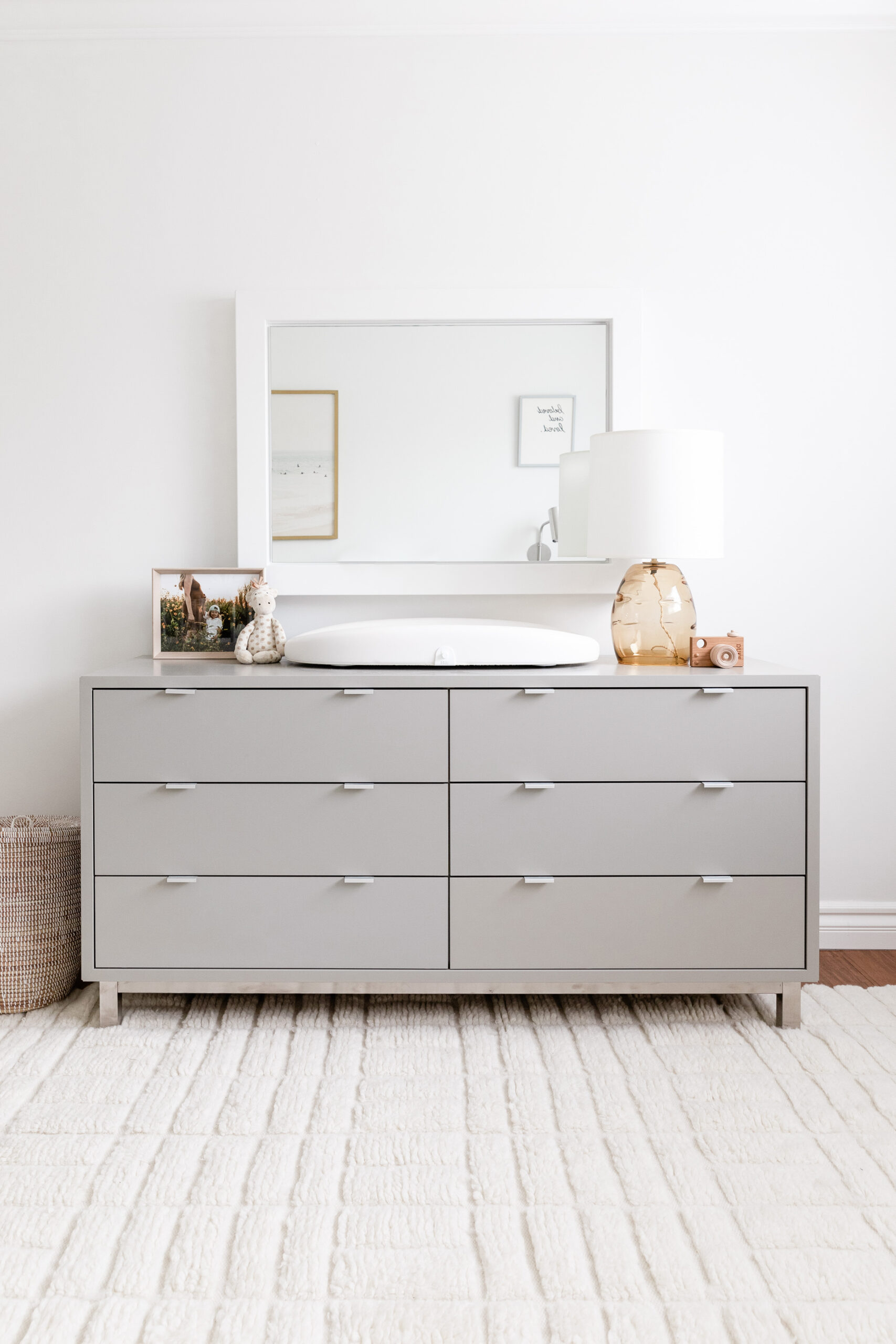
We chose a crib and dresser in a warm shade of taupe-y grey—a nice departure from the natural wood tones in the previous nursery, but still in the same modern Scandinavian family. Both crib and dresser feature clean lines that provide a sturdy foundation for decor changes down the line. The wide-frame white mirror and cubby bookshelf round out the room.
When it came time to choose accents, we took inspiration from Kim and her family’s love of the beach. (seriously, I don’t think I’ve ever known people who love the beach as much as they do!) But we kept the references subtle and sophisticated, to prevent the room from feeling too “theme-y”.
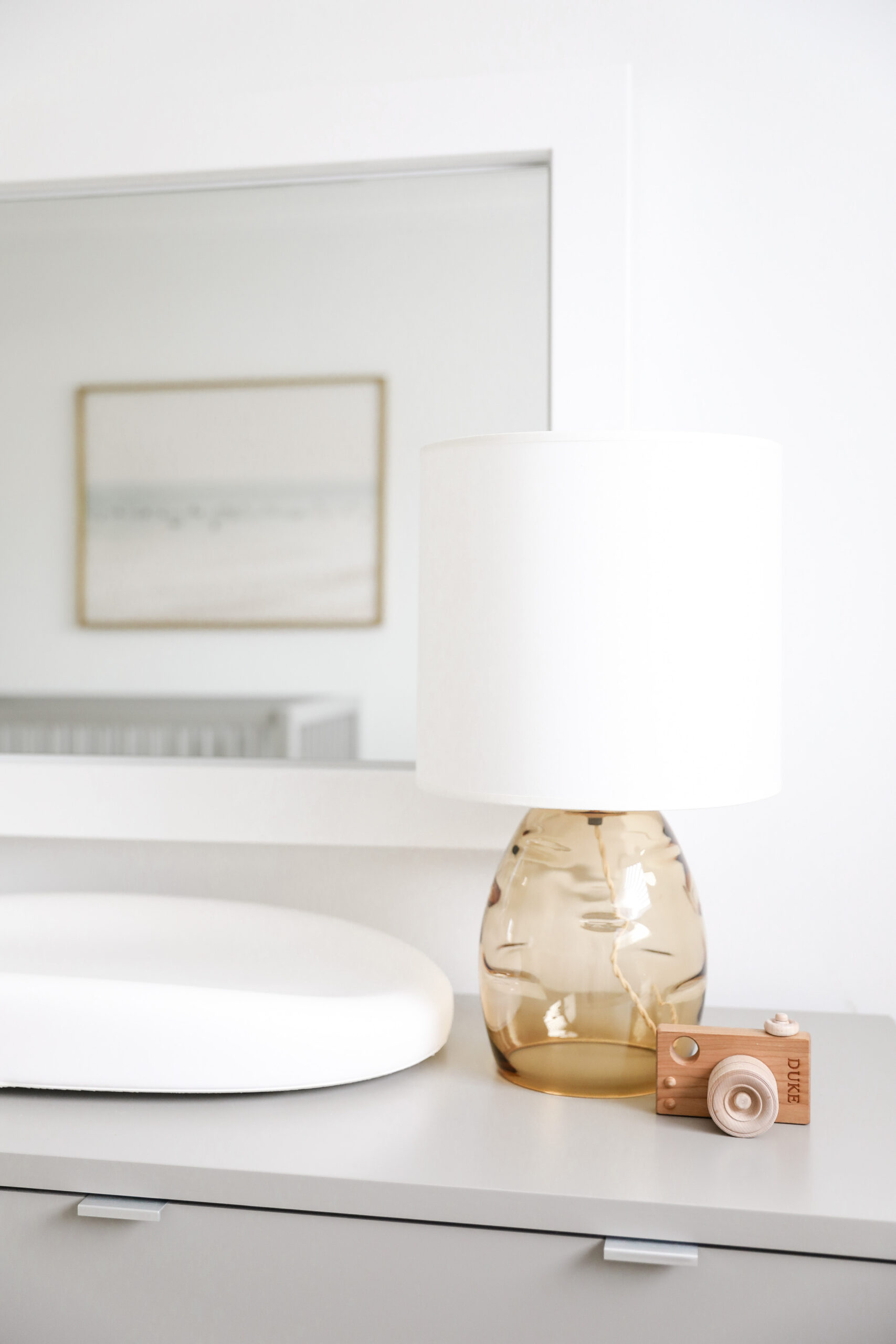
The artwork over the crib, a washed-out and blurry seascape, adds just a touch of coastal color. The amber glass lamp on the dresser reminded me of sea glass. And the high pile/low pile construction of the rug gives a nod to undulating sand dunes! Plus it’s SUPER soft, which is key for tummy time!
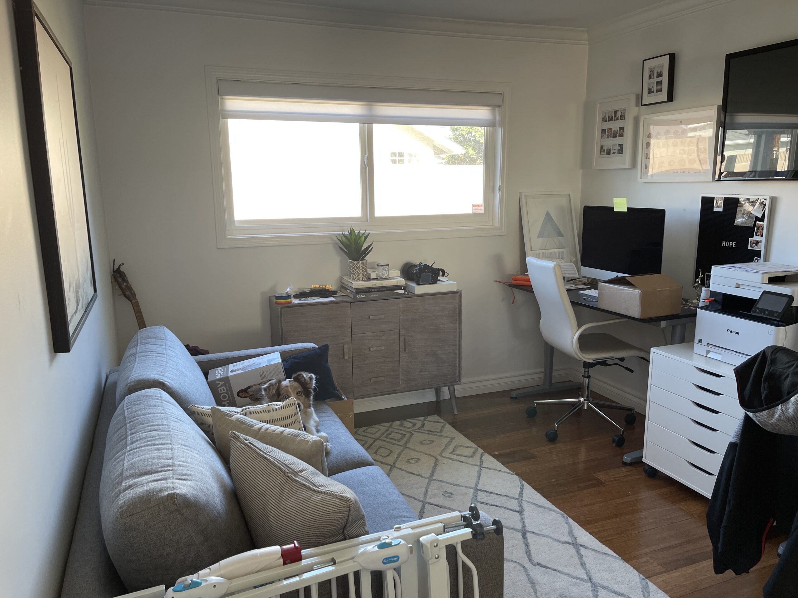
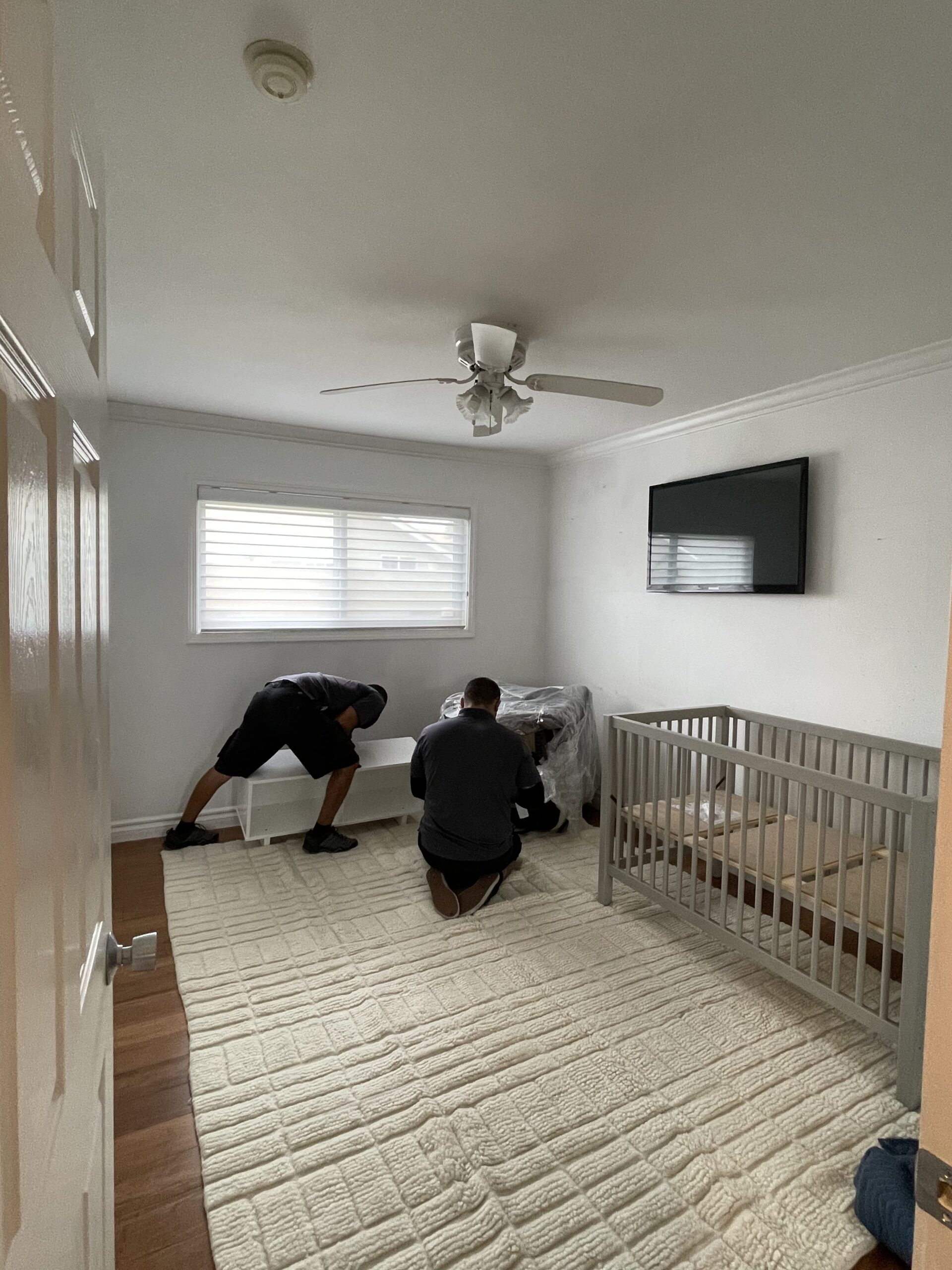
Because Kim’s family was preparing for a big out-of-state move in the lead-up to installing and shooting the nursery, we saved ourselves effort and made very few hard changes to the room. The wall color, floor, and window treatments all stayed the same. The one swap we did make, however, felt pretty key: The kitschy ceiling fan in the before photos below just had to go!
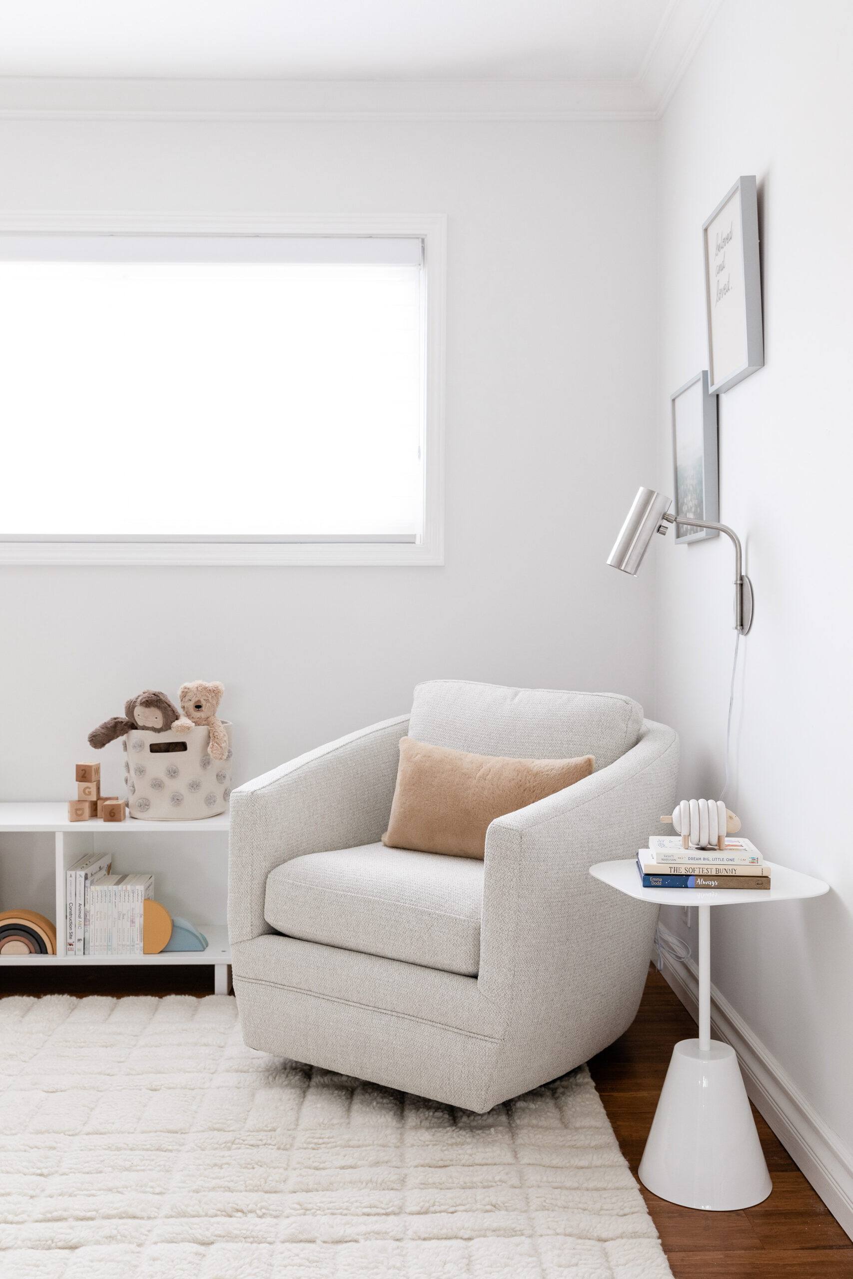
Changing out hard-wired electrical fixtures is one of my favorite low-cost/high-impact design choices. In this case, you can see how much fun personality the globe ceiling fixture brings to the after pics! And since Kim was having the electrician come anyway, we also added a plug-in wall sconce over the chair. That, of course, is something you could even mount yourself!
Can you believe the difference between these before, during, and after pics? It doesn’t even look like the same room! I’m so pleased with how this beachy yet sophisticated gender neutral nursery design turned out, and can’t wait to see how it grows along with Kim’s little family!
1. Crib (color: taupe MDF) 2. Swivel Chair (color: Orla Ivory) 3. Side table 4. Sconce (color: stainless steel) 5. Ceiling light fixture (color: chalk) 7. Cubby bench 8. Dresser (color: taupe MDF) 9. Mirror 10. Lamp(color: honey in size 20″). (All by Room and Board.)11. Rug (size 8×10) 12. Chair pillow Both by The Citizenry. 13. Crib artwork (40″ x 30″), Gallery piece 1 (11×14″) + 2 (11×14″). Art by minted. 14. Crib sheet: Solly baby. 15. Mattress: Newton baby 16. Blanket on crib: Barefoot dreams //. 17. Rainbow stacking toy:: Rose + Rex. 18. Sunset book end + wooden blocks: Etsy. 19. Lovies: slumberkins. 20. llama: pottery barn kids. 21. Wooden camera toy: bannor toys. 22. Sheep toy: Oompa toys. 23. Picture frame on dresser: Target // Changing pad: Hatch baby grow. Hamper: The little market. Pompom Storage Bins: Pehr Designs.
