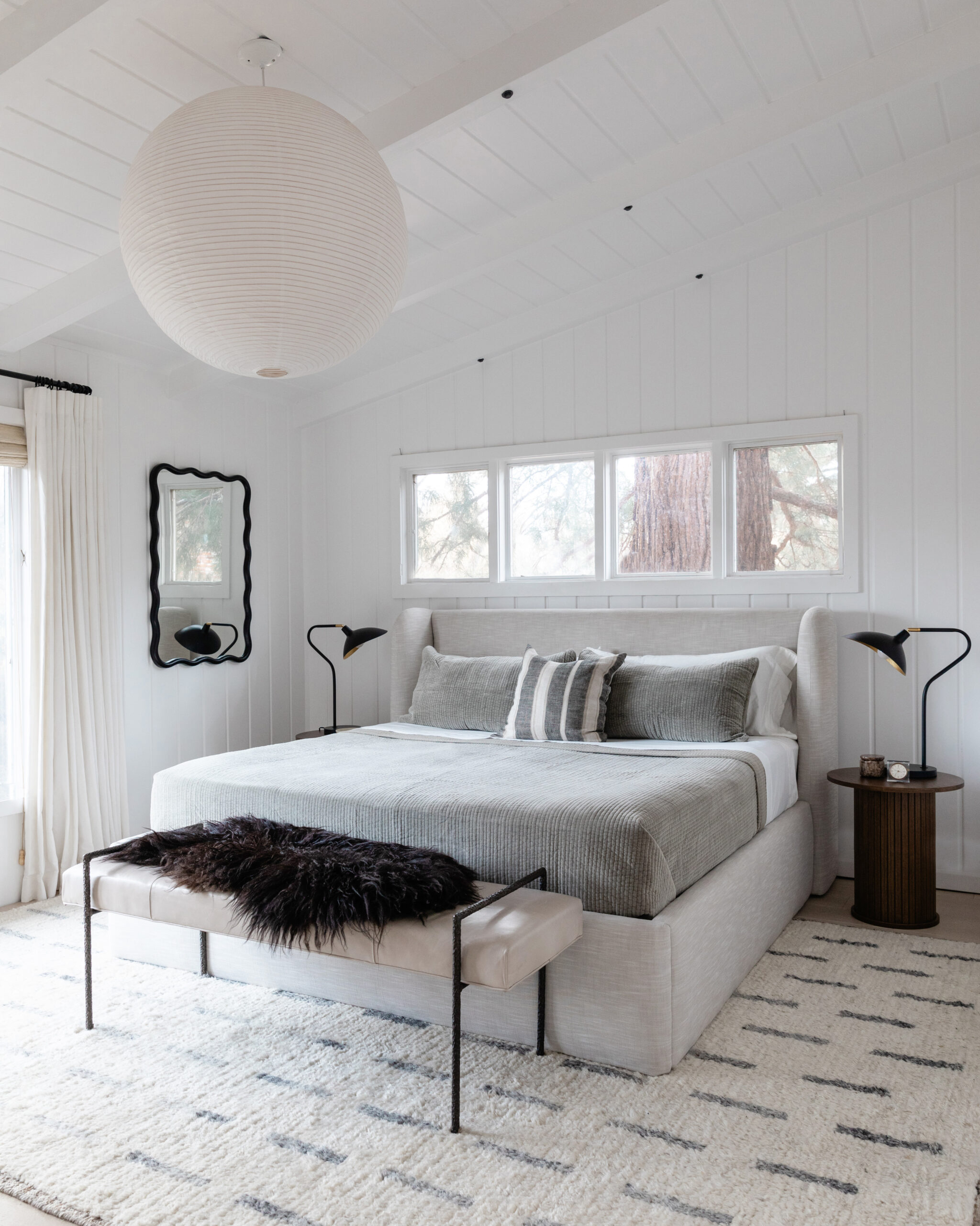
Sometimes rooms evolve over time and get better with age. And sometimes, they become a mishmash of pieces that are individually nice but that don’t work particularly well as a group. Unfortunately, that’s exactly what had happened to our bedroom in the past year. It was feeling flat, boring, and blah—so it was time for a simple bedroom decor update from AllModern to give it new life!
Variety Is the Key to Next Level Bedroom Design
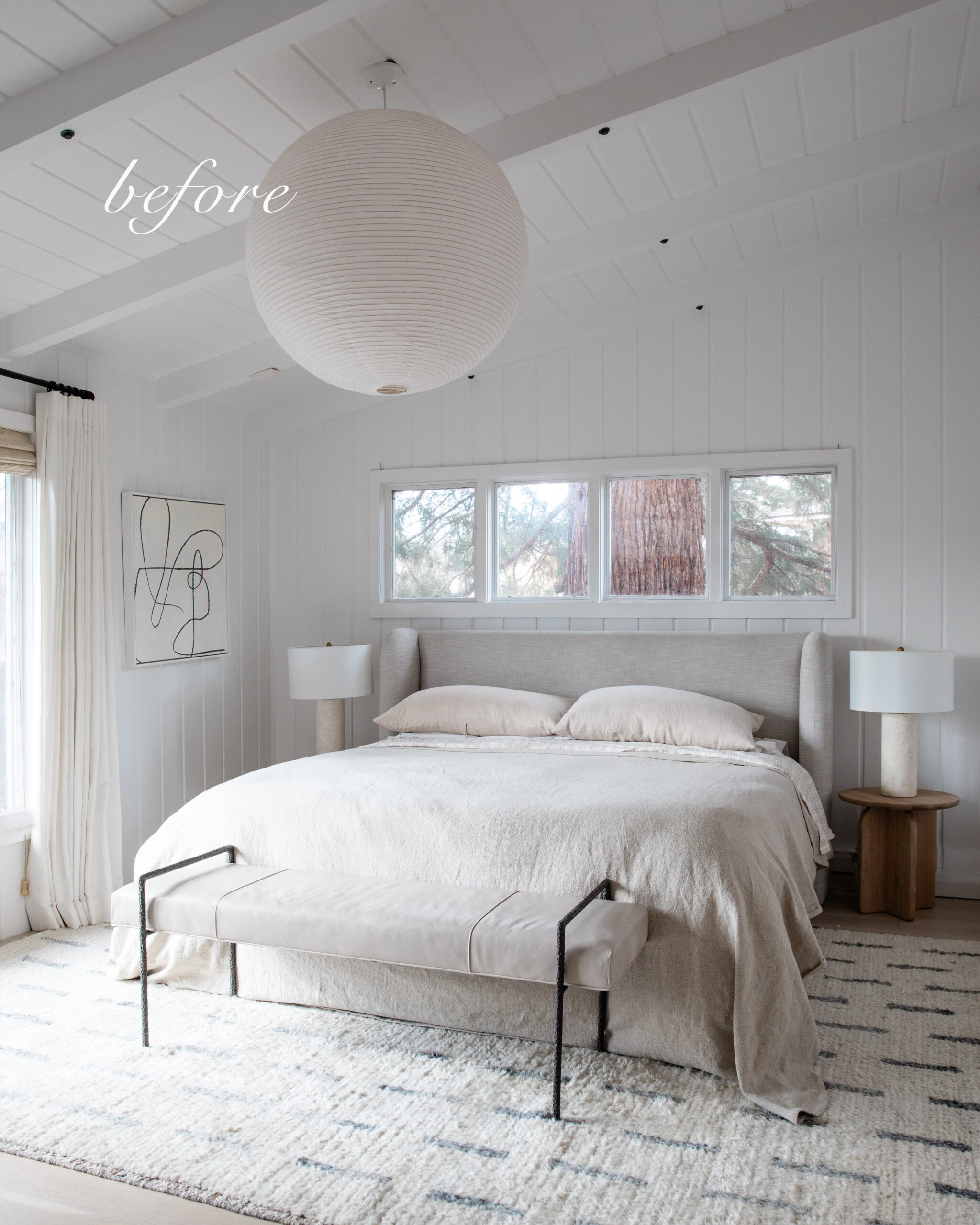
In the photo above, you can see exactly what I mean when I say our bedroom was feeling flat. There’s nothing objectively wrong with any of the items—indeed I chose each one because I liked it—but they’re all the same tonal and textural quality. Incorporating a variety of contrasting finishes, dynamic shapes, and inviting textures makes for a space that keeps the eye interested. I’d need to boost all three of those design elements in order to elevate this boring bedroom.
Add Contrast for Design that Pops
The pale oak nightstands and marble lamps in the previous version of my bedroom were pretty, but they were too subdued and as a result were fading into the background. It was time to insert some contrasting finishes to spice things up a bit!
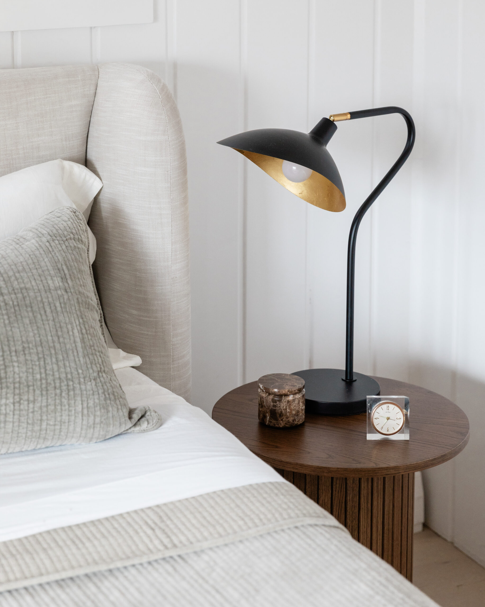
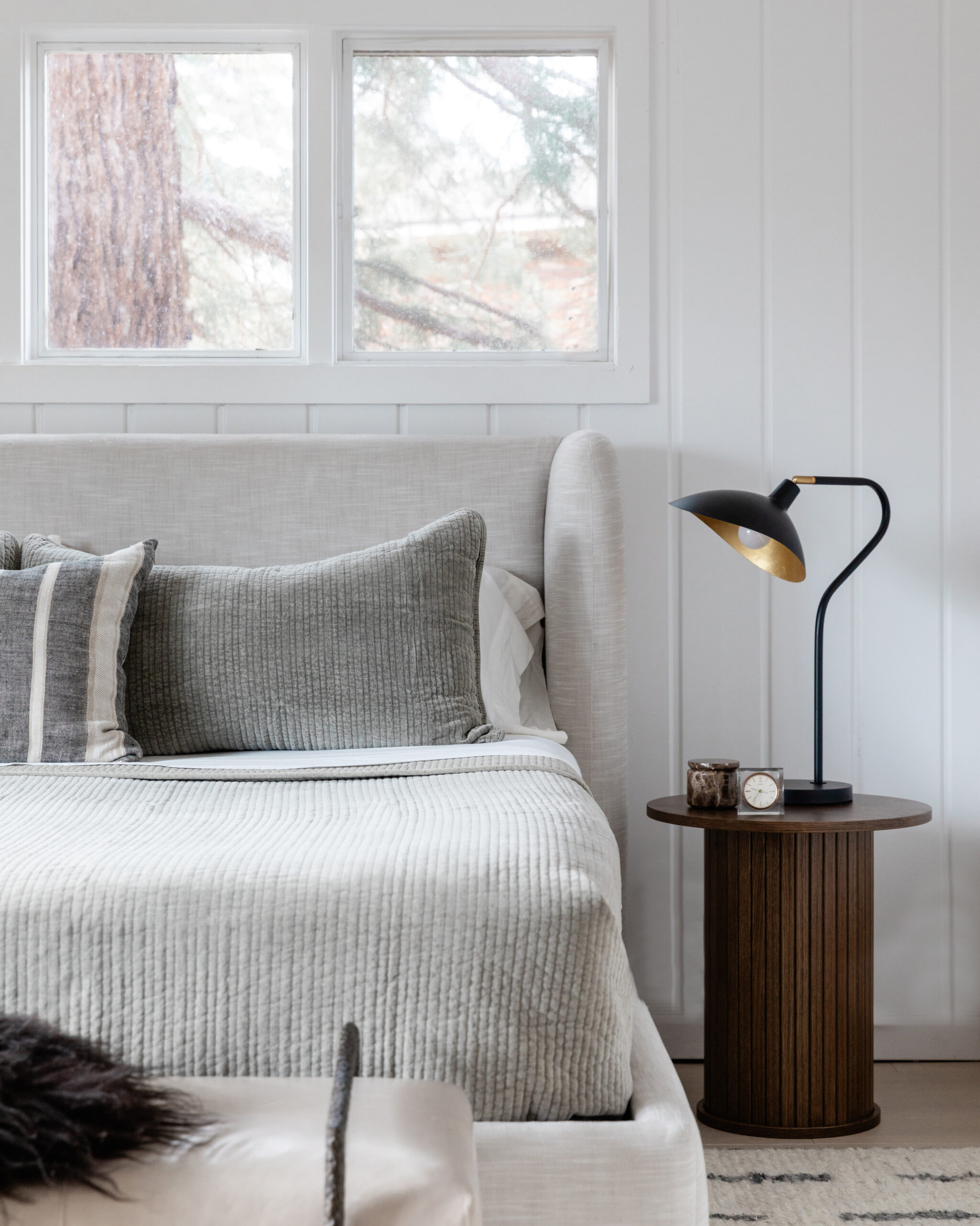
I first selected two round end tables in a deep, smoky brown. They have a beautiful wood grain that brings tons of dimension to the setting. They’re also the perfect resting place for a pair of arched black table lamps. The warm gold finish inside the lampshades is a luxe touch to this otherwise sleek, minimalist bedside setup.
Play with Repeated Shapes and Lines
Considering shape and line is another way to create a bedroom design refresh that has a more cohesive sensibility. I’ve always loved the curved edges of our upholstered bedframe (the exact one we have is no longer available but here’s a similar wingback upholstered bedframe). In this decor update, I decided to look for other pieces with similar curves to really emphasize that motif.
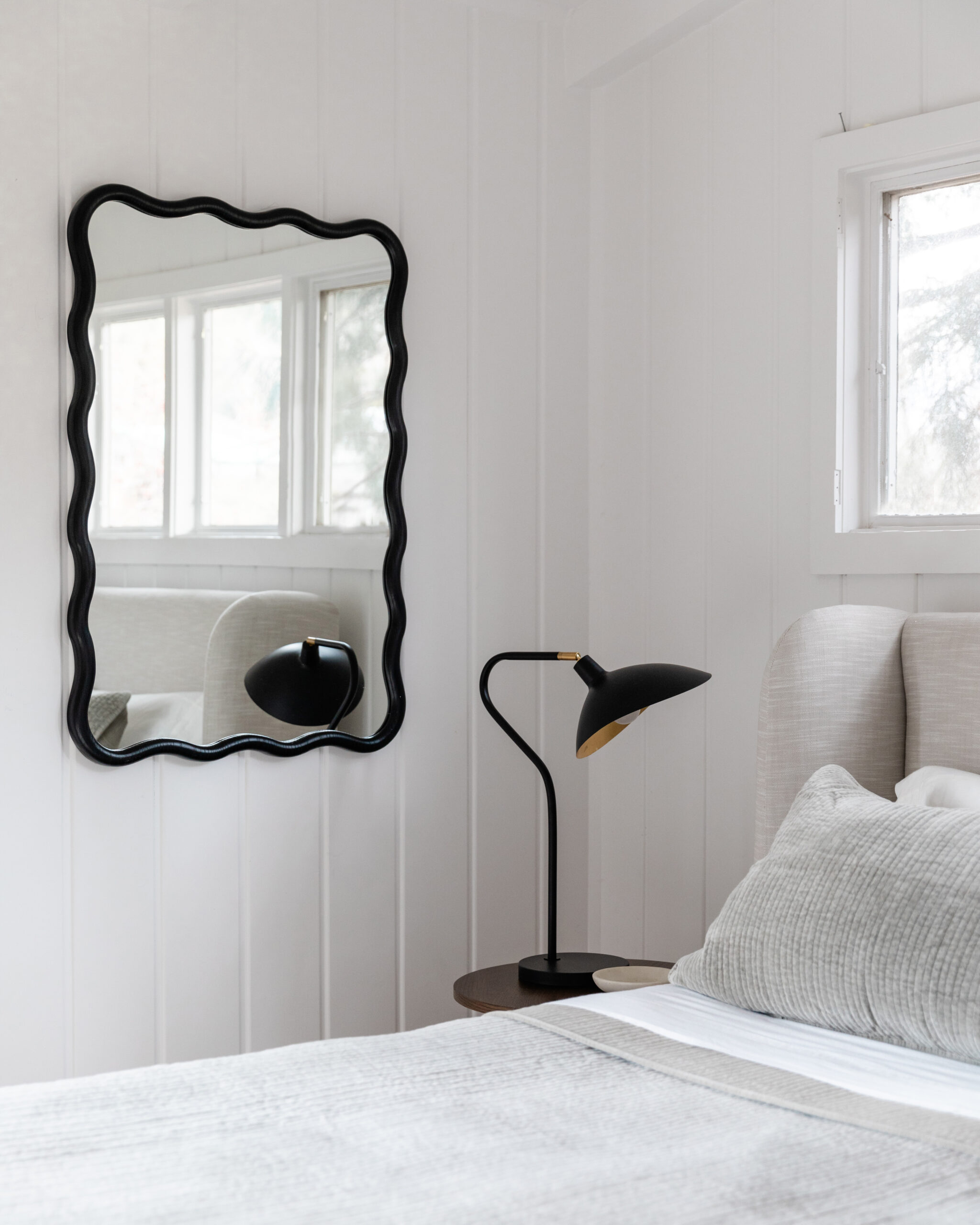
The lamps, with their swooping gooseneck construction, were a great start. Then, a scalloped mirror completed the effect with its sculptural, hand-finished frame. The mirror also has the added benefit of bouncing some light from the windows into the dim corners of the room—a bonus for making the room look bigger, brighter, and more dynamic.
Sumptuous Texture is a Bedroom Essential!
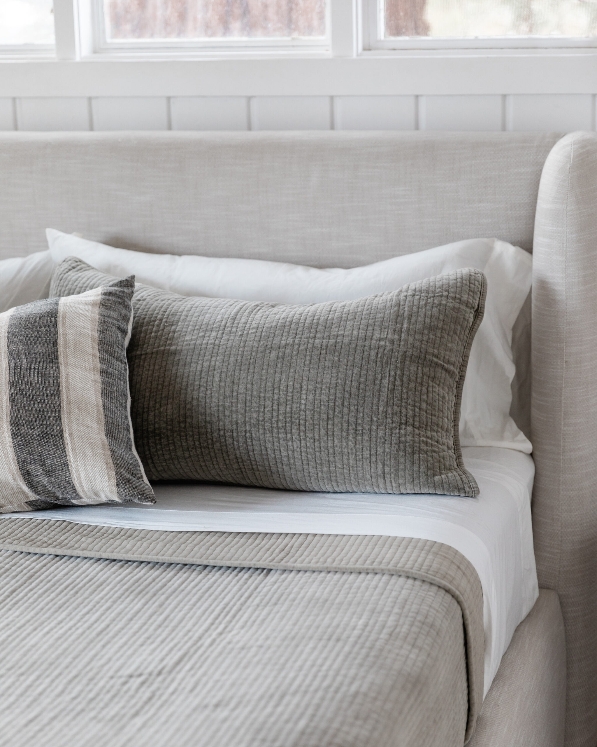
As much as I loved the blanket I had in here before, it was the exact same weave as the upholstery on our bedframe—making the whole bed look like a big, beige blob. Thankfully, trading in new linens is the fastest, most impactful way of all to give your bedroom a refresh.
I opted for a stonewashed cotton quilt and sham set in a beautiful shade of taupe that picks up the charcoal stripes on our rug. The ribbed channel quilting not only adds much needed texture to the room, but it mimics the vertical lines of our board-and-batten walls as well as the slatted columns on the end tables. Talk about cohesive!
The end result is a bedroom decor update that feels inviting and intentional—while still very much in keeping with my neutral, minimalist aesthetic. The best part is that it took only an afternoon to swap the new pieces in, and I didn’t have to replace any of the large pieces in the room. It’s a testament to the power of a few well-chosen accents to inject new life into a space!
Disclosure: I partnered with AllModern to concept, style, photograph, write, and share this post. All opinions are and always will be my own. Thank you for supporting the brands that allow me to bring you fresh inspiration!
