Being asked to choose my favorite design project is like being asked to choose a favorite from a litter of kittens. Each one is perfect in its own way! But if I had to pick the acme of my design accomplishments, it would be this space. Introducing The Revery, a stunning new event space in Downtown LA! Owned by my good friend and longtime collaborator Monica Wang (you may recognize her as the talented photographer who shoots ALL my work), the buildout for this incredible concept began almost two years ago. Monica asked me to do The Revery’s office and minimalist modern kitchen design, for the area where she and her staff will spend their days. Of course I said yes!
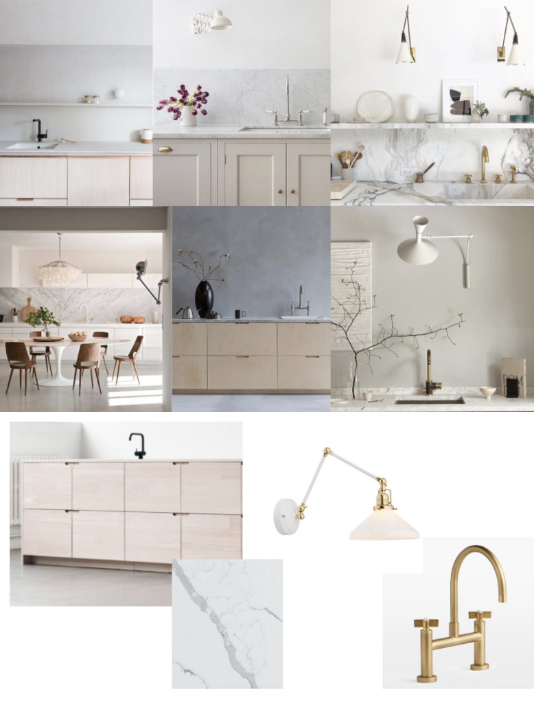
There are three separate functional zones in this office space, and I’ll break down the design process for each one in an individual post. First, we knew we wanted a little kitchenette where venue employees could fix themselves lunch (or end-of-day cocktails!). And because The Revery is an events and photo venue, we also wanted this corner of the facility to be extremely photo friendly—since clients may want to rent even this little office area for more intimate gatherings or styled shoots. As you can see from the inspiration above, I had a few minimalist modern kitchen design elements I’d been dying to implement in a project. I knew Monica’s space was the perfect opportunity to do so!
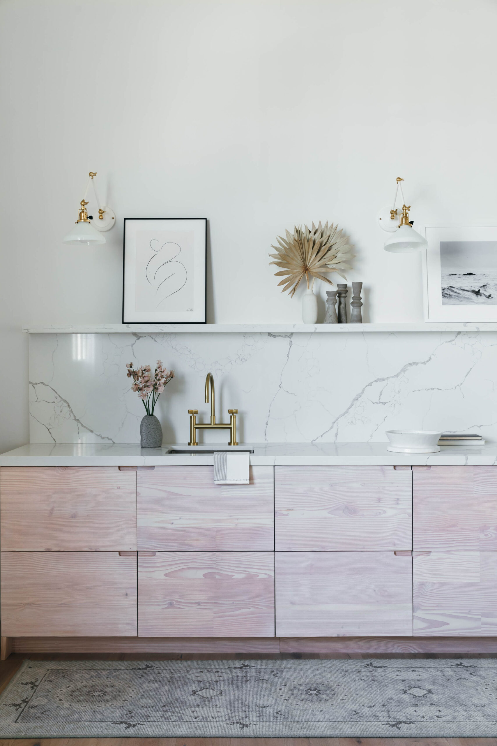
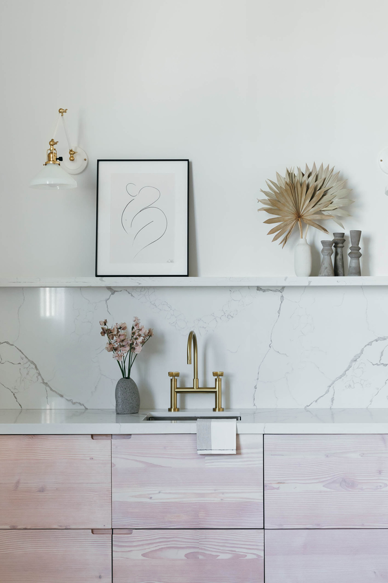
First up was that marble-look counter, backsplash, and display ledge. I absolutely adore the streamlined appearance that results from constructing those three elements from the same material. It’s got an air of understated luxury that makes my heart race! The quartz we chose sits especially nicely atop restrained wood grain cabinetry from Reform Copenhagen. And the grid layout of the drawers contrasts so beautifully with the natural whorls of the reclaimed Douglas fir. The result is a study in juxtaposition, cool stone meets warm wood in a dialogue of structured organicism.
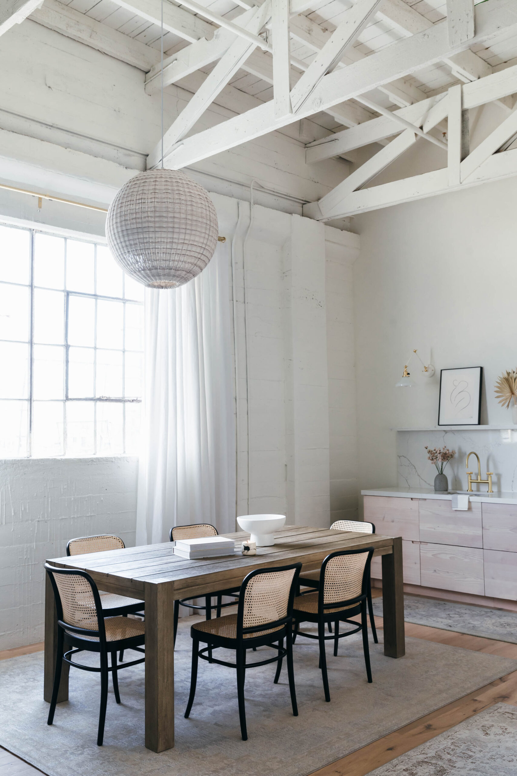
Since the layout of the kitchenette was extraordinarily simple—just a long, galley-style bank of cabinets—the only other fixed elements we had to choose were the faucet and lighting. For those pieces, we tapped Rejuvenation for their classic-meets-modern approach to fixtures. The brass faucet has a bridge design that recalls a vintage butler’s pantry, yet its crisp, unadorned silhouette brings it into the 21st century. As for those sconces, the articulating arms serve a utilitarian purpose (it’s always nice to be able to direct the light onto the counter as you work!) but also add visual dimension to all the flat surfaces in the kitchenette. The finishing touch? A softly hued handwoven runner rug from Jaipur Living! The rug ties the kitchenette in with the large worktable that anchors the second functional zone in the office…more of which is coming soon so stay tuned!
Photos: Monica Wang. Sources: UP Reclaimed Wood Cabinets by Reform Copenhagen. Mikado Quartz Countertop in Calacatta Tree. Rejuvenation West Slope Kitchen Faucet in Aged Brass. Rejuvenation Imbrie Articulating Sconce. Jaipur Living Kai Runner.


